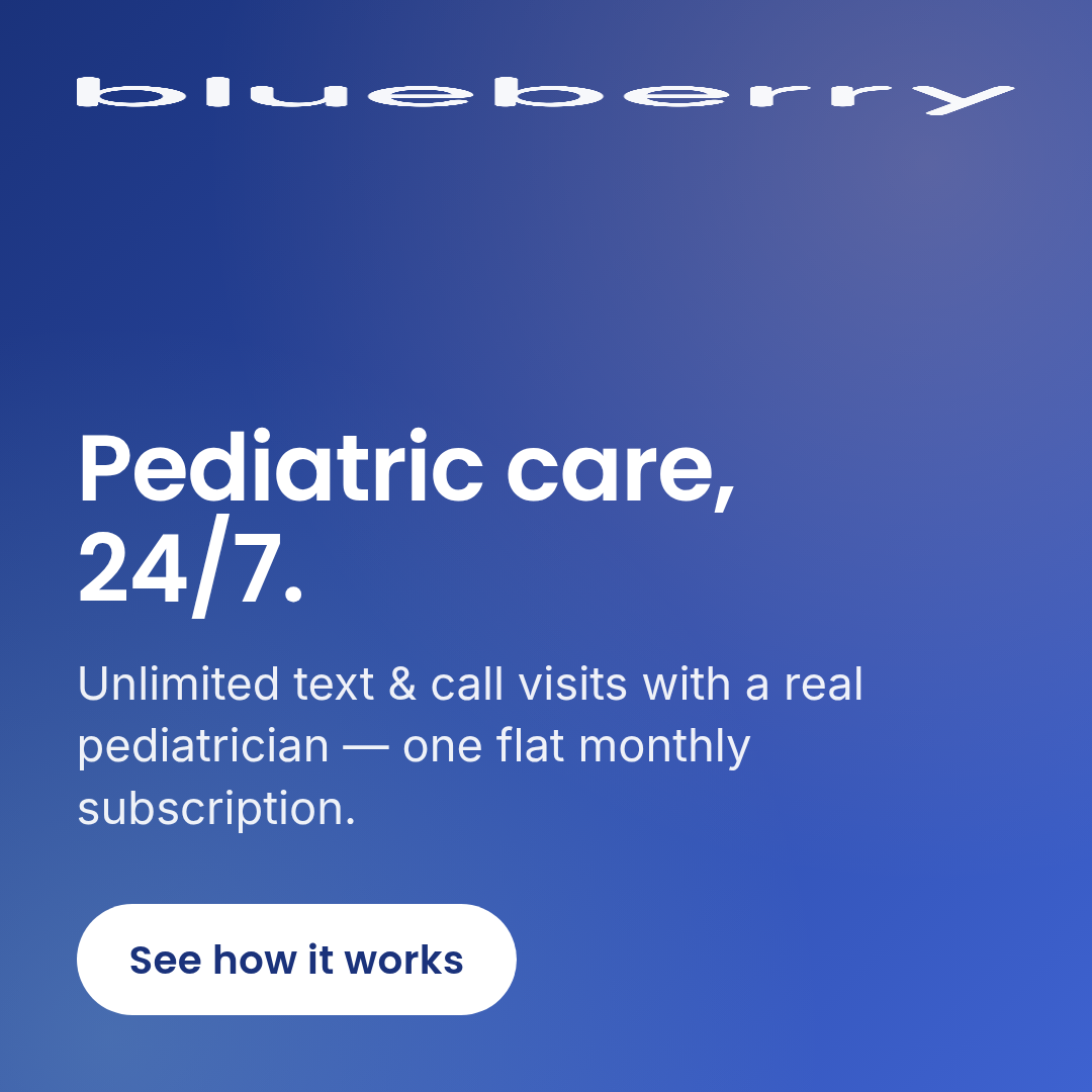
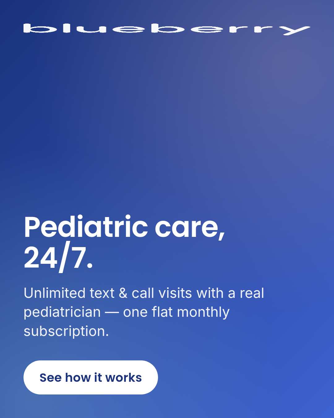
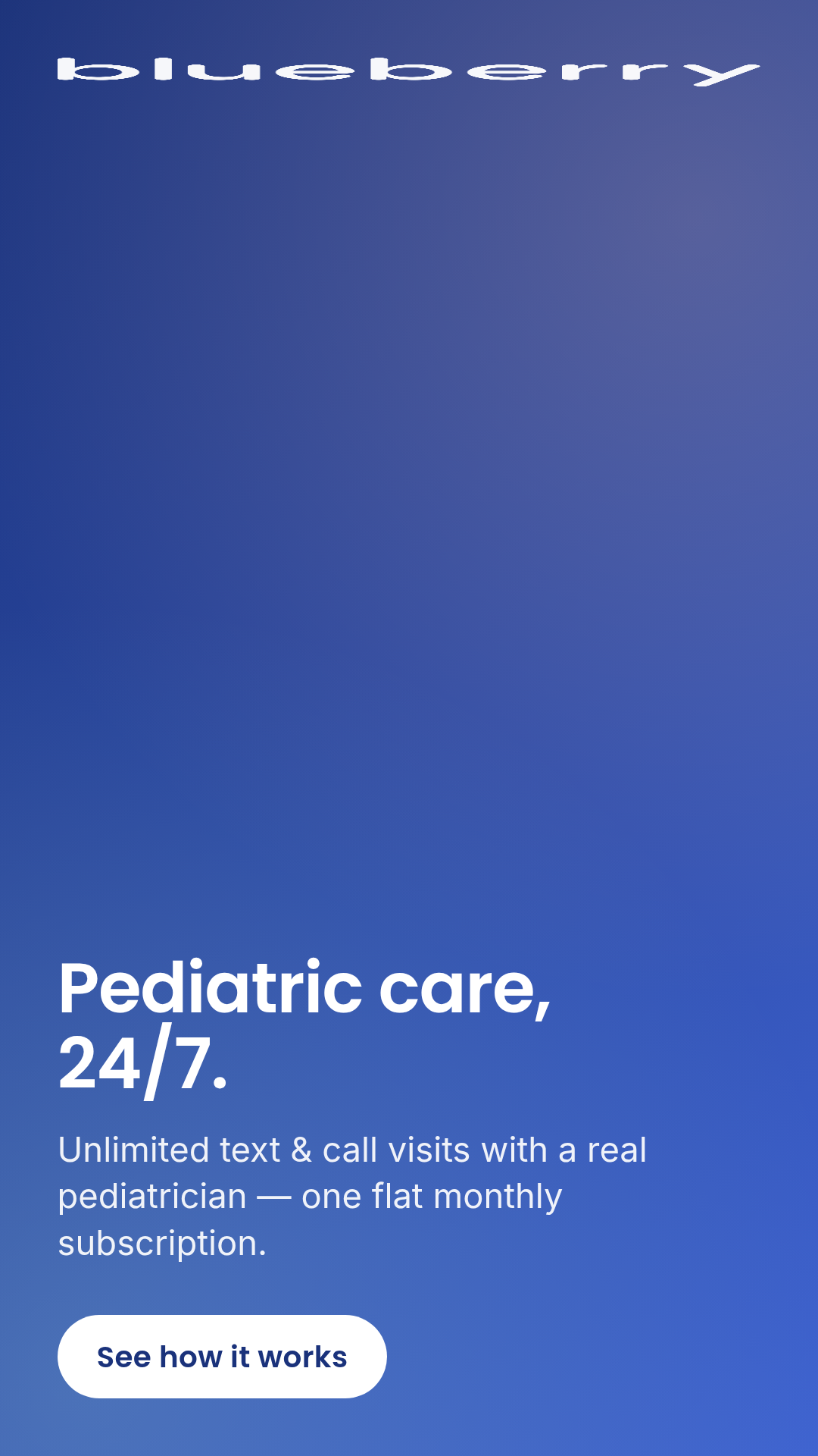
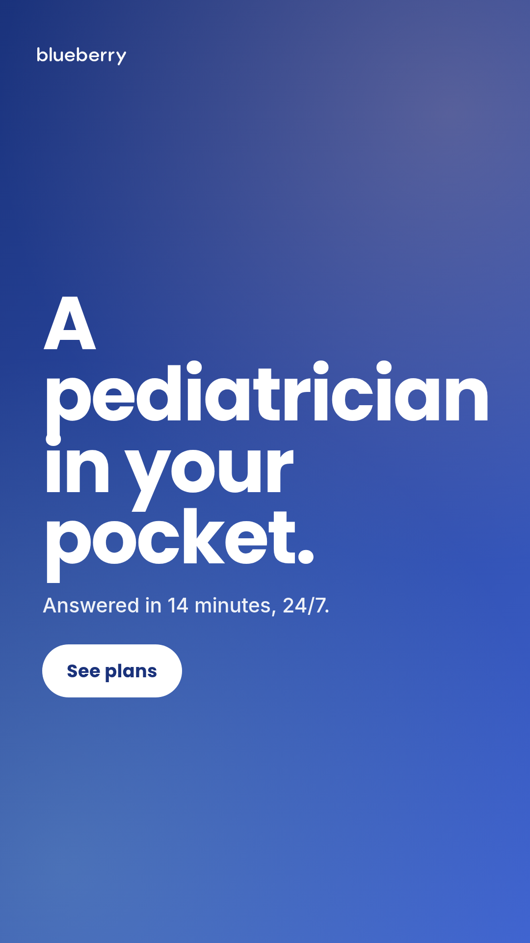
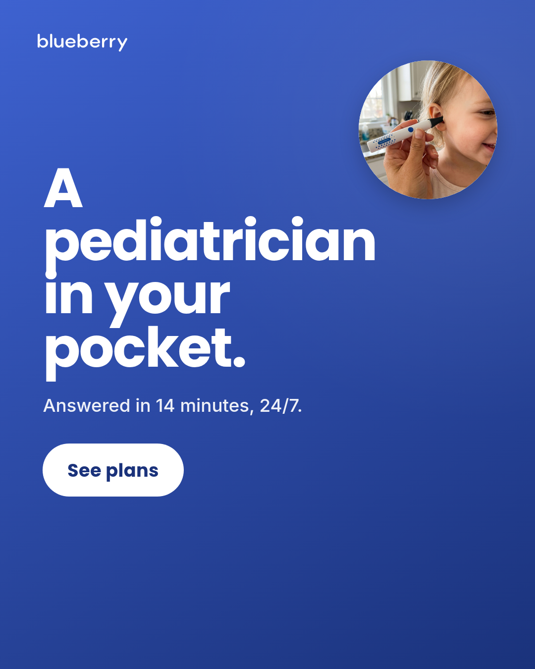
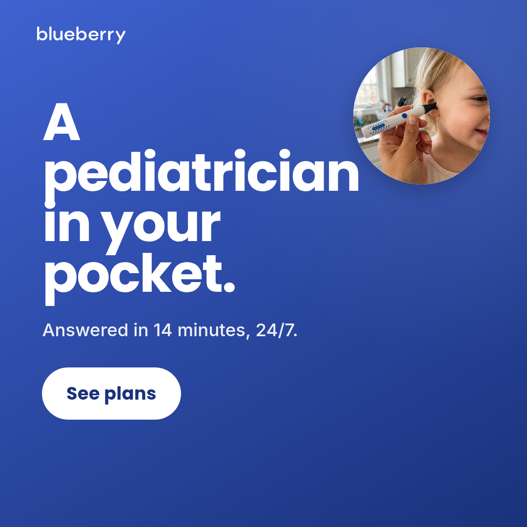
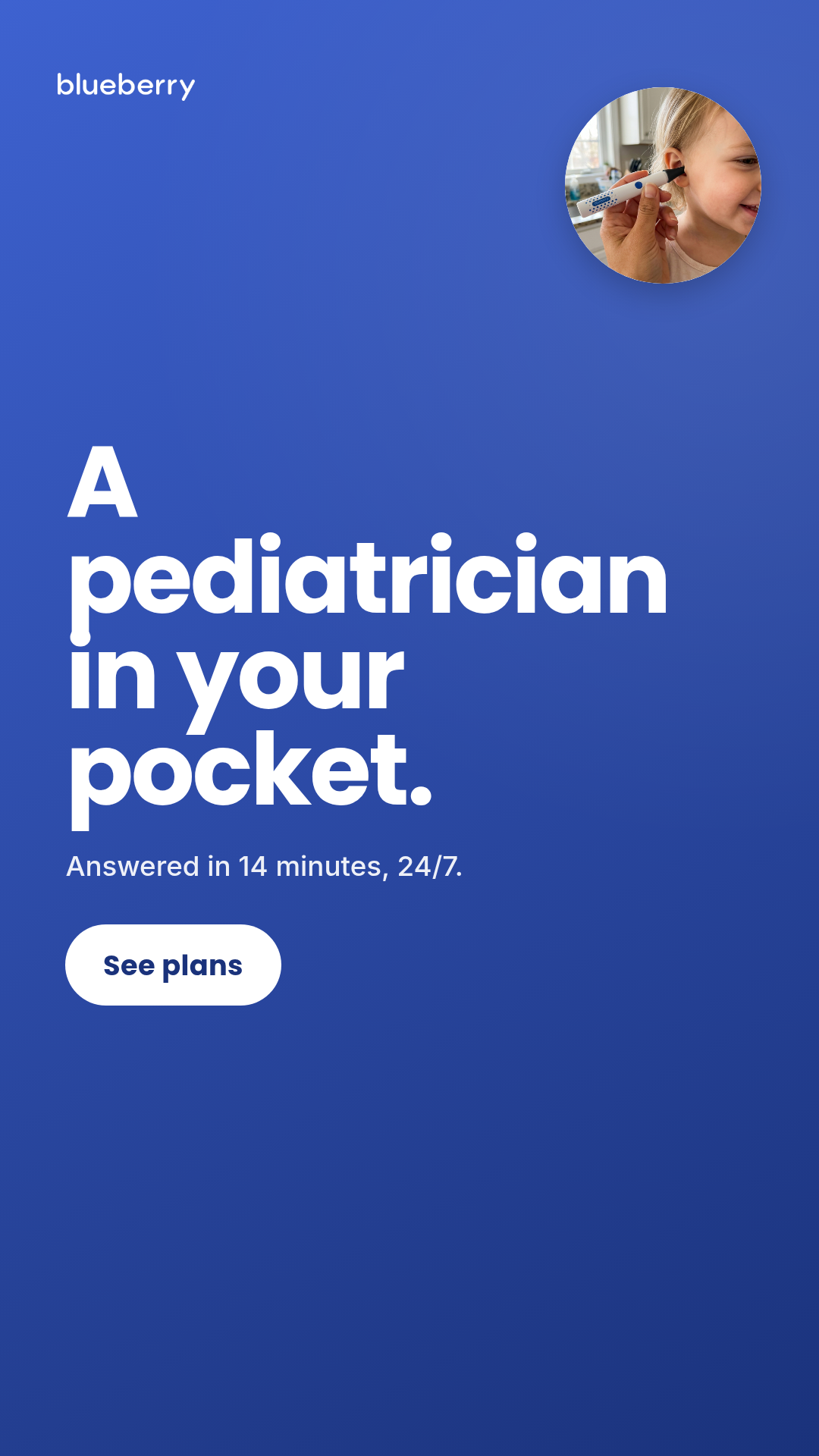
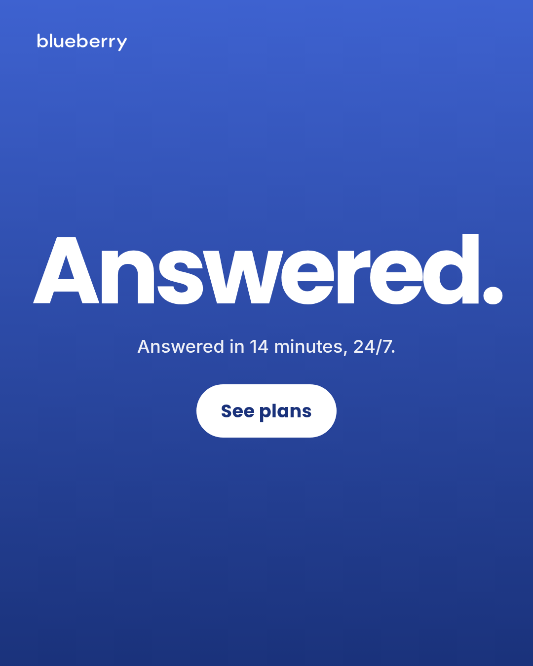
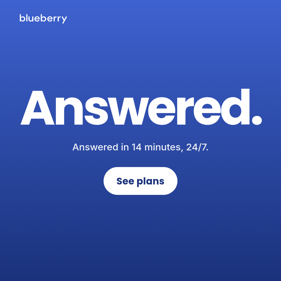
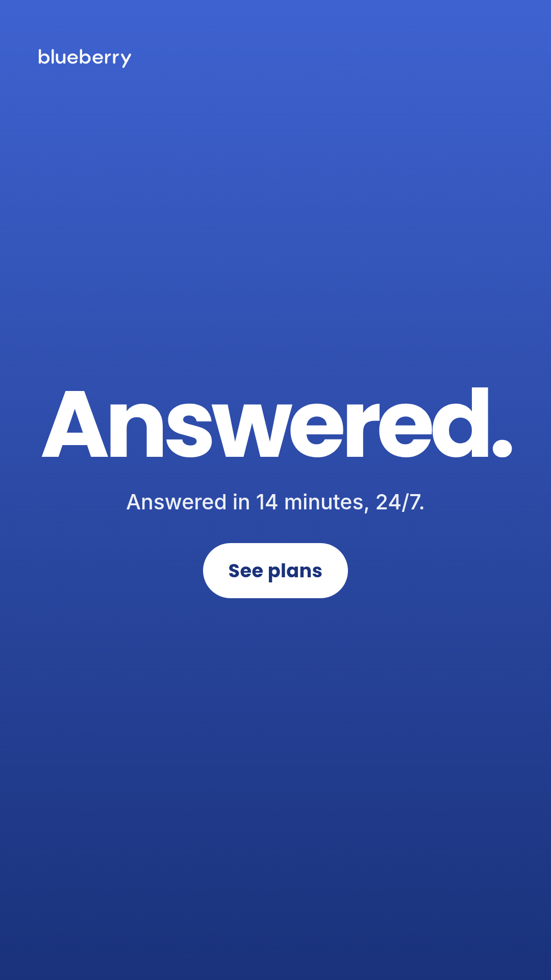
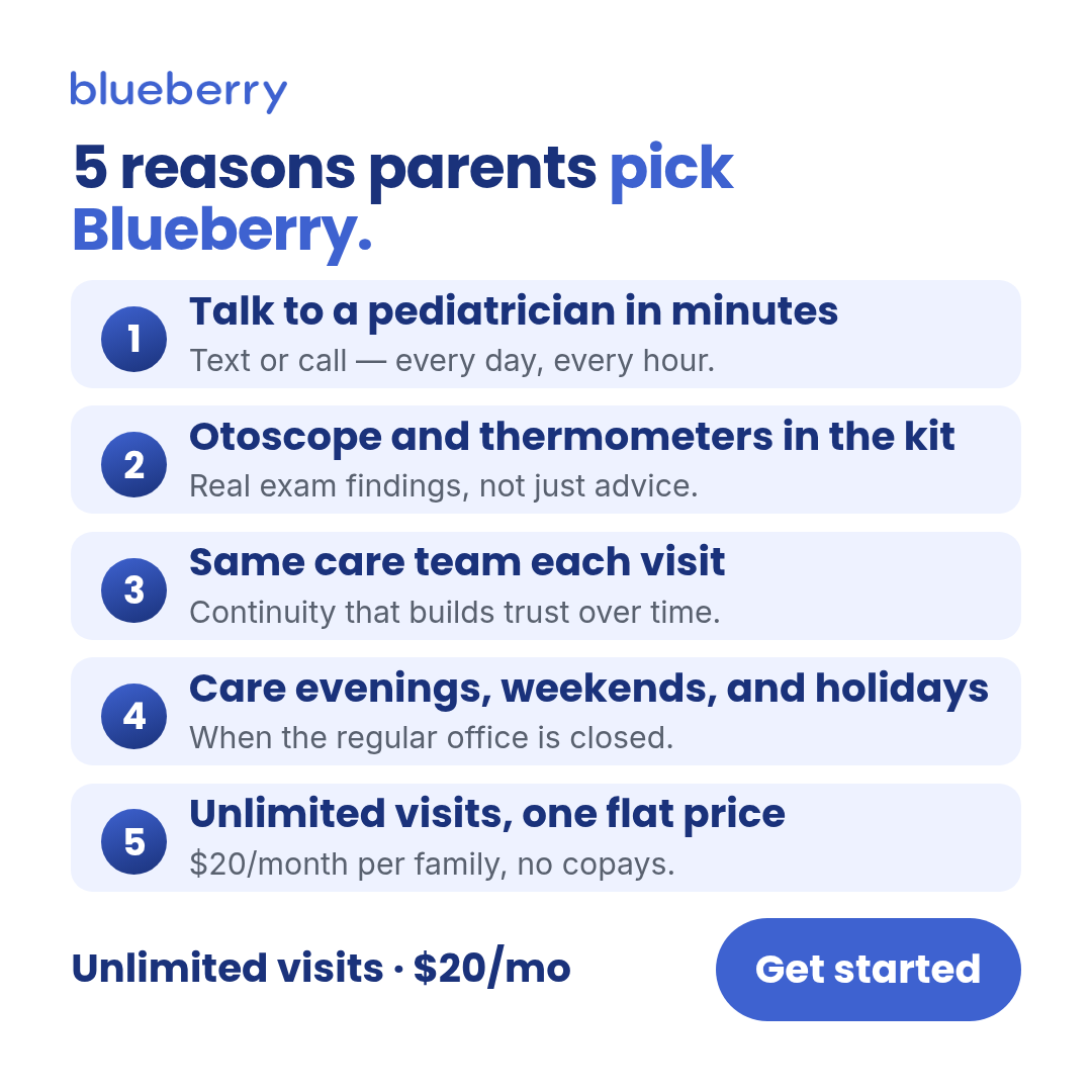
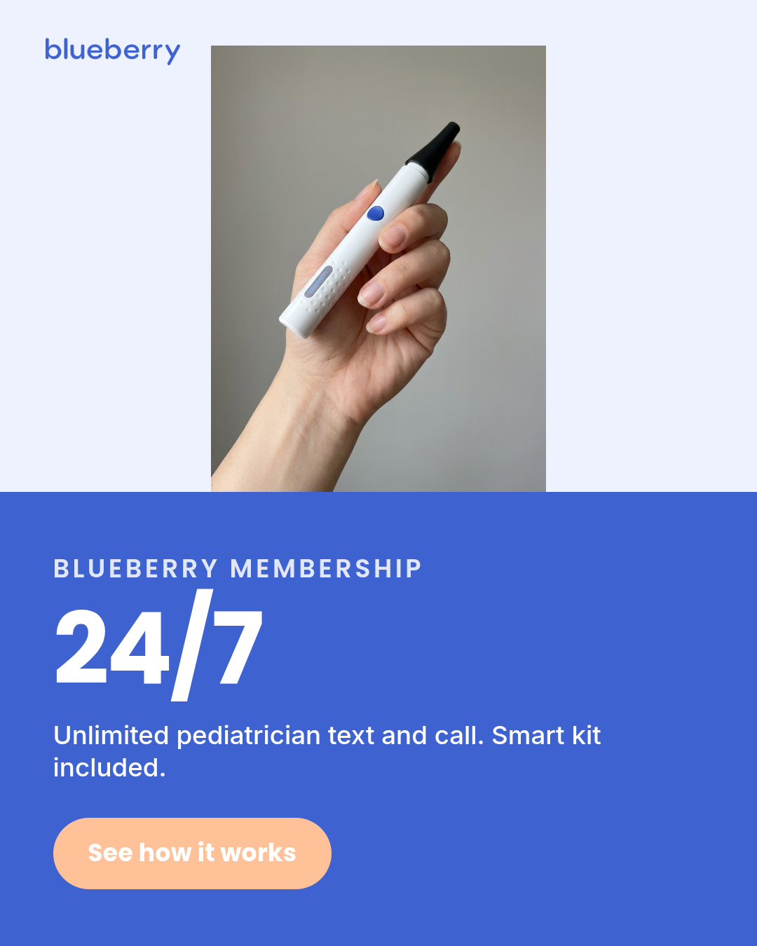
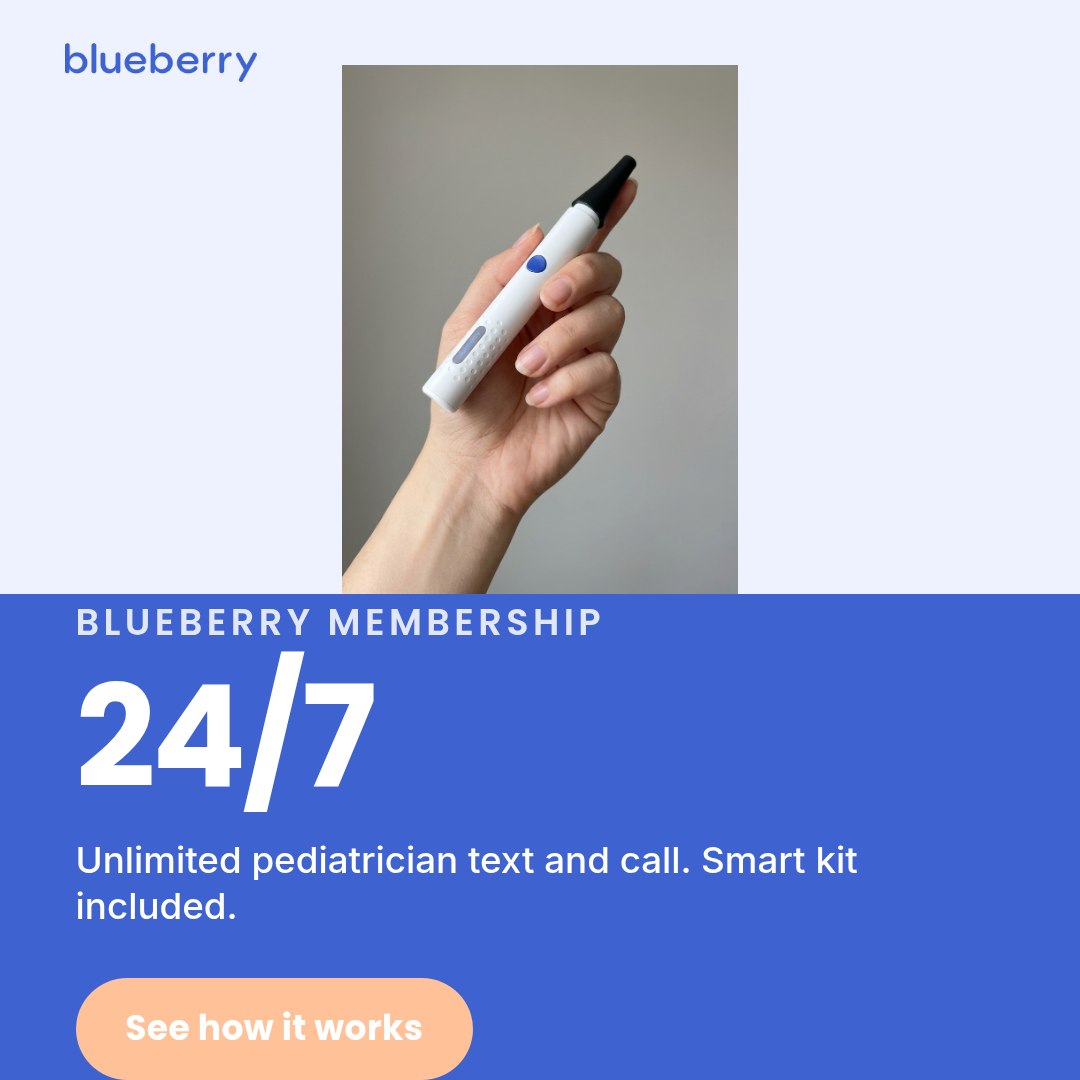
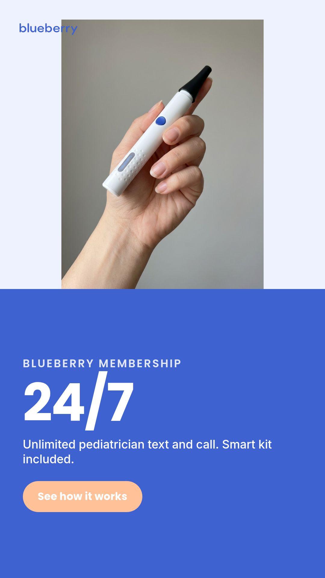
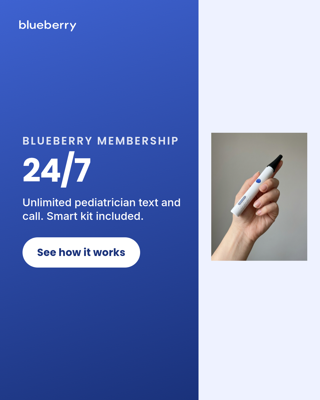
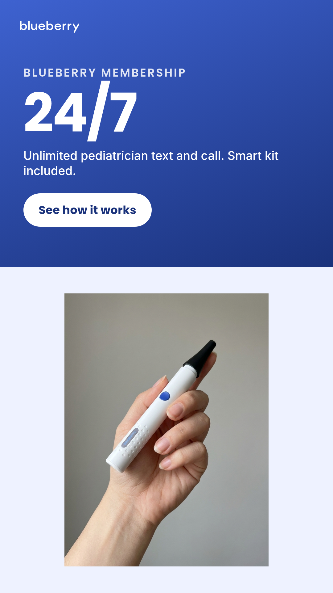
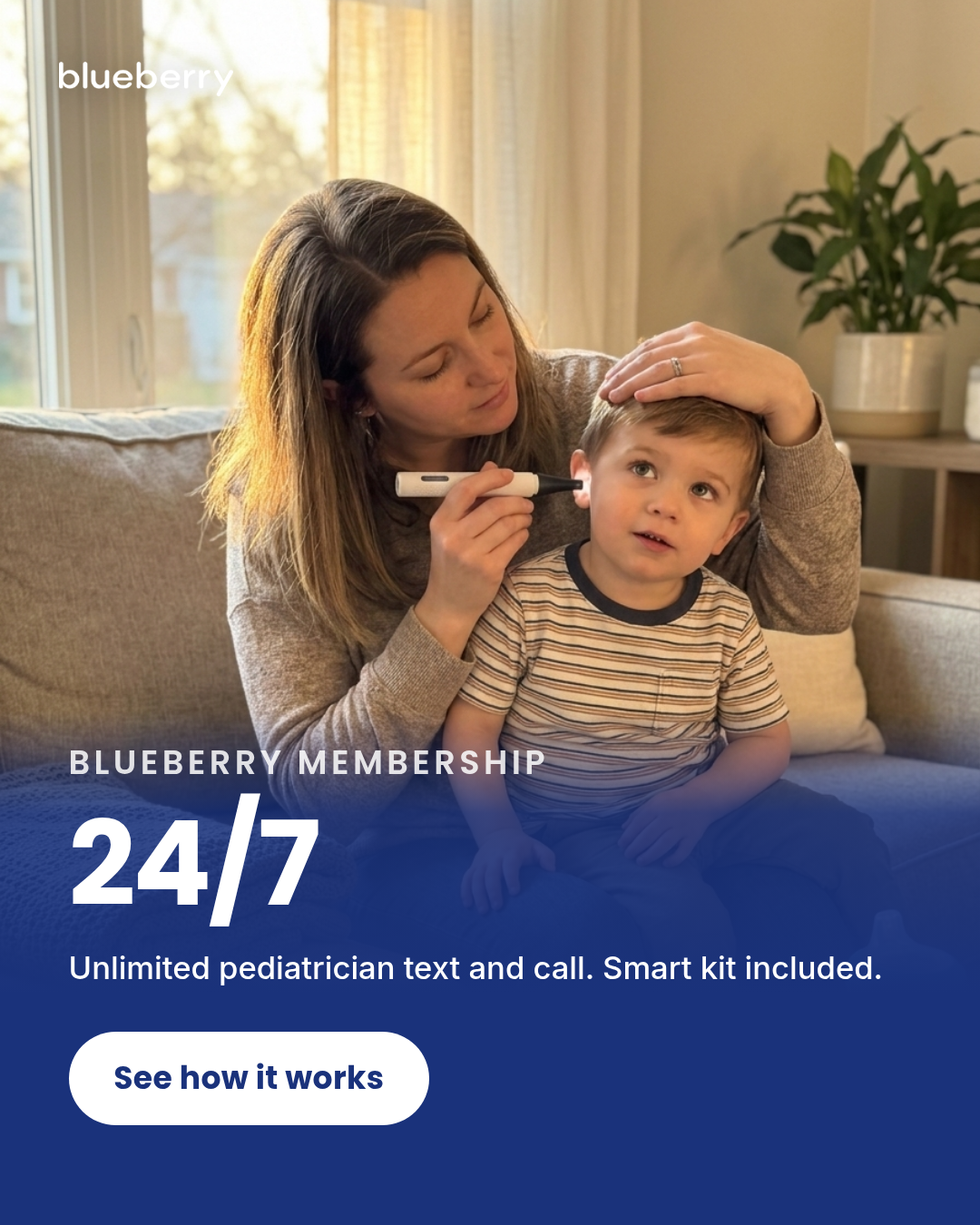
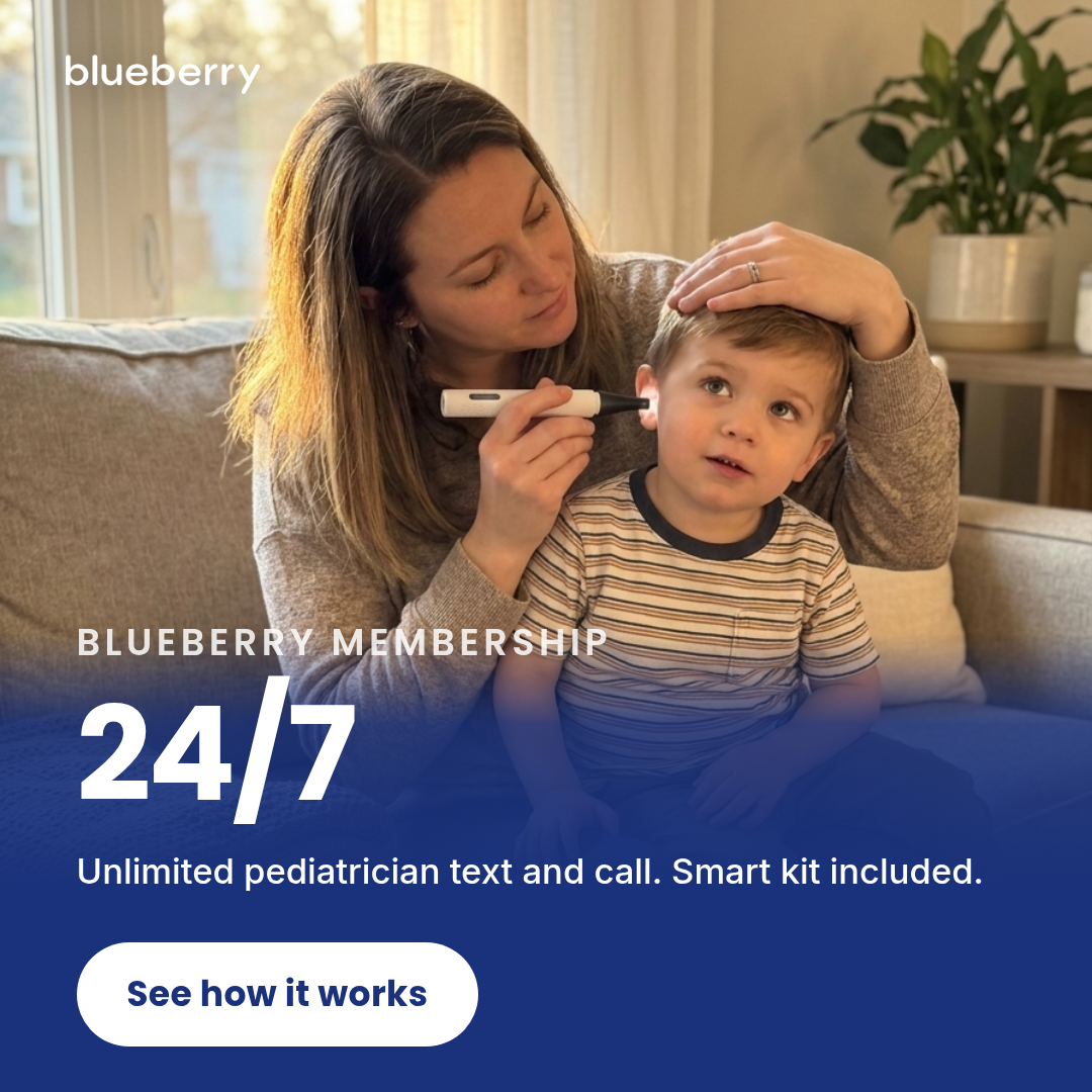
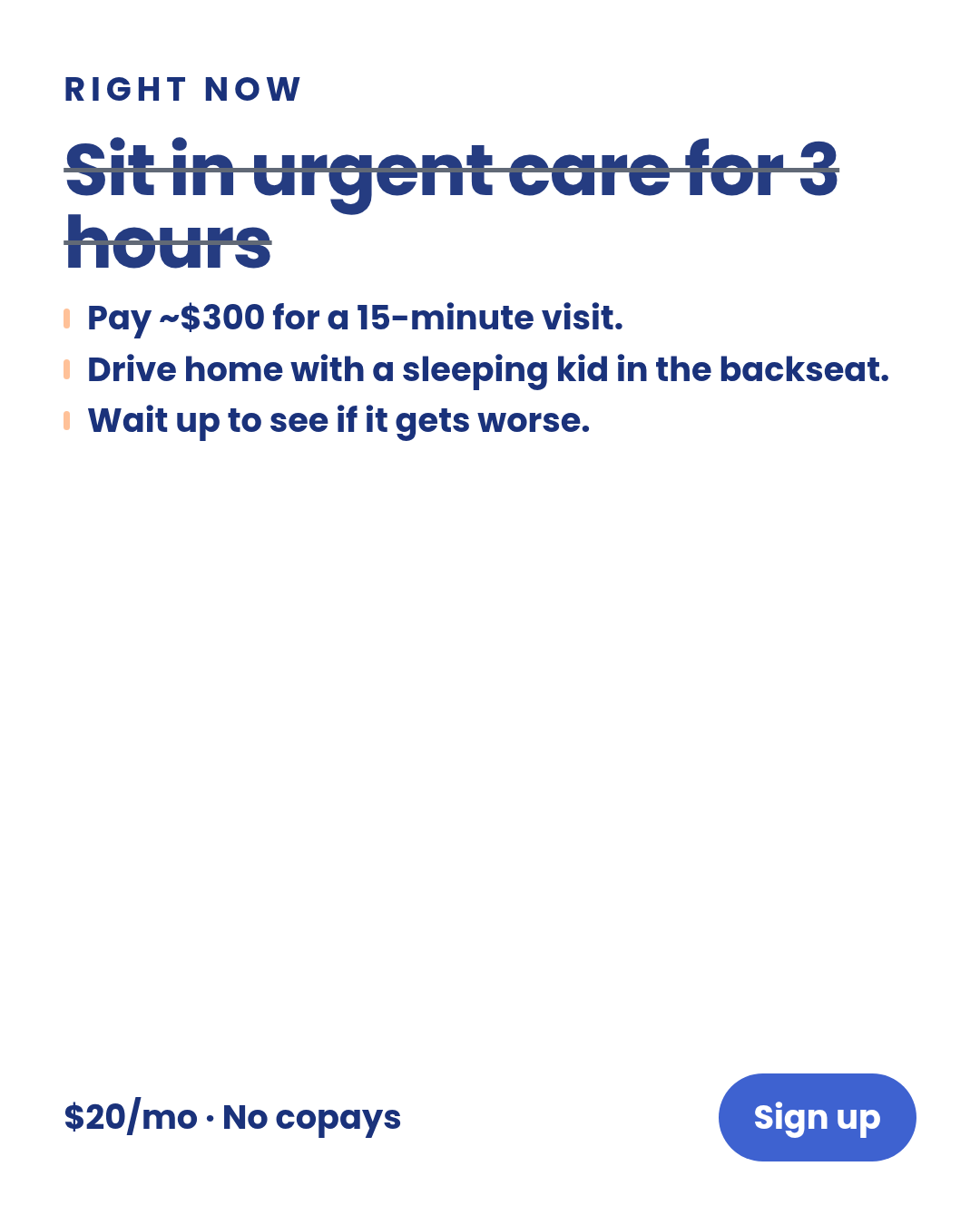
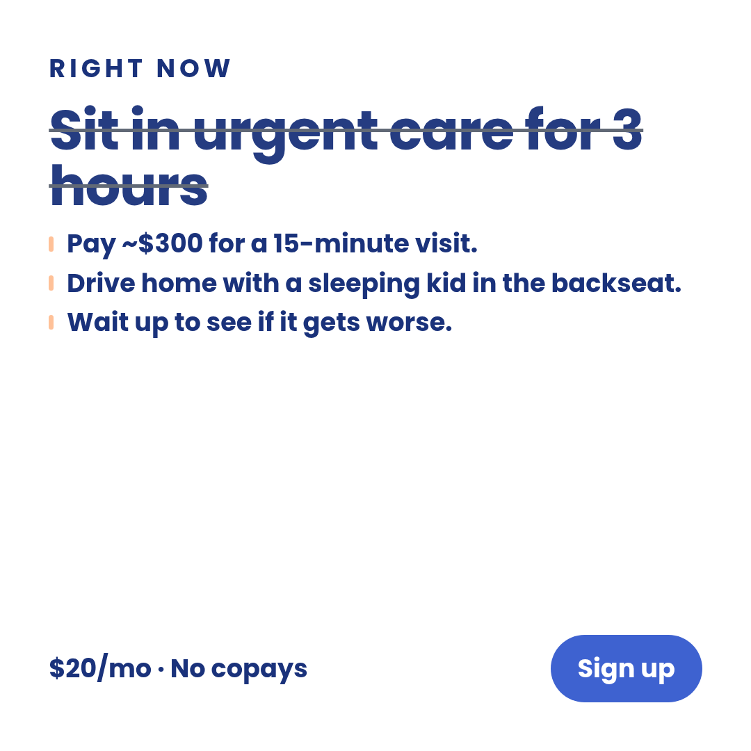
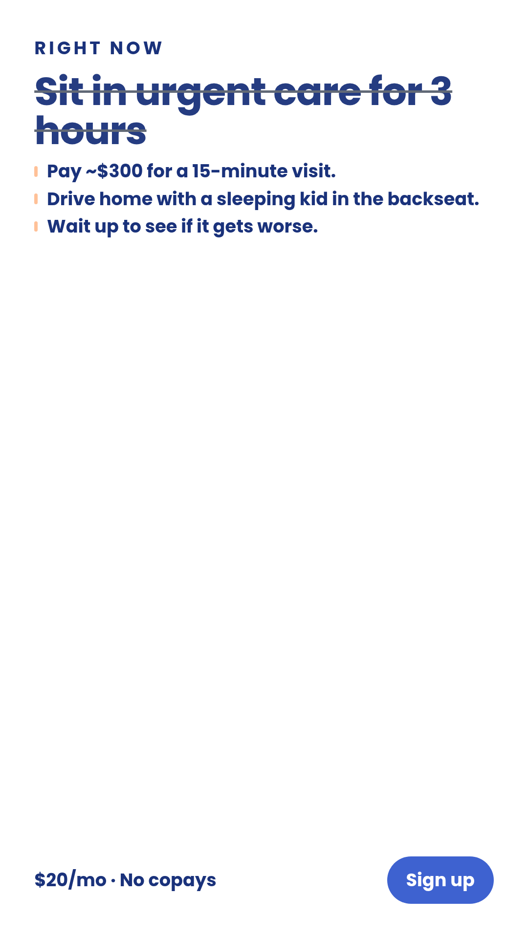
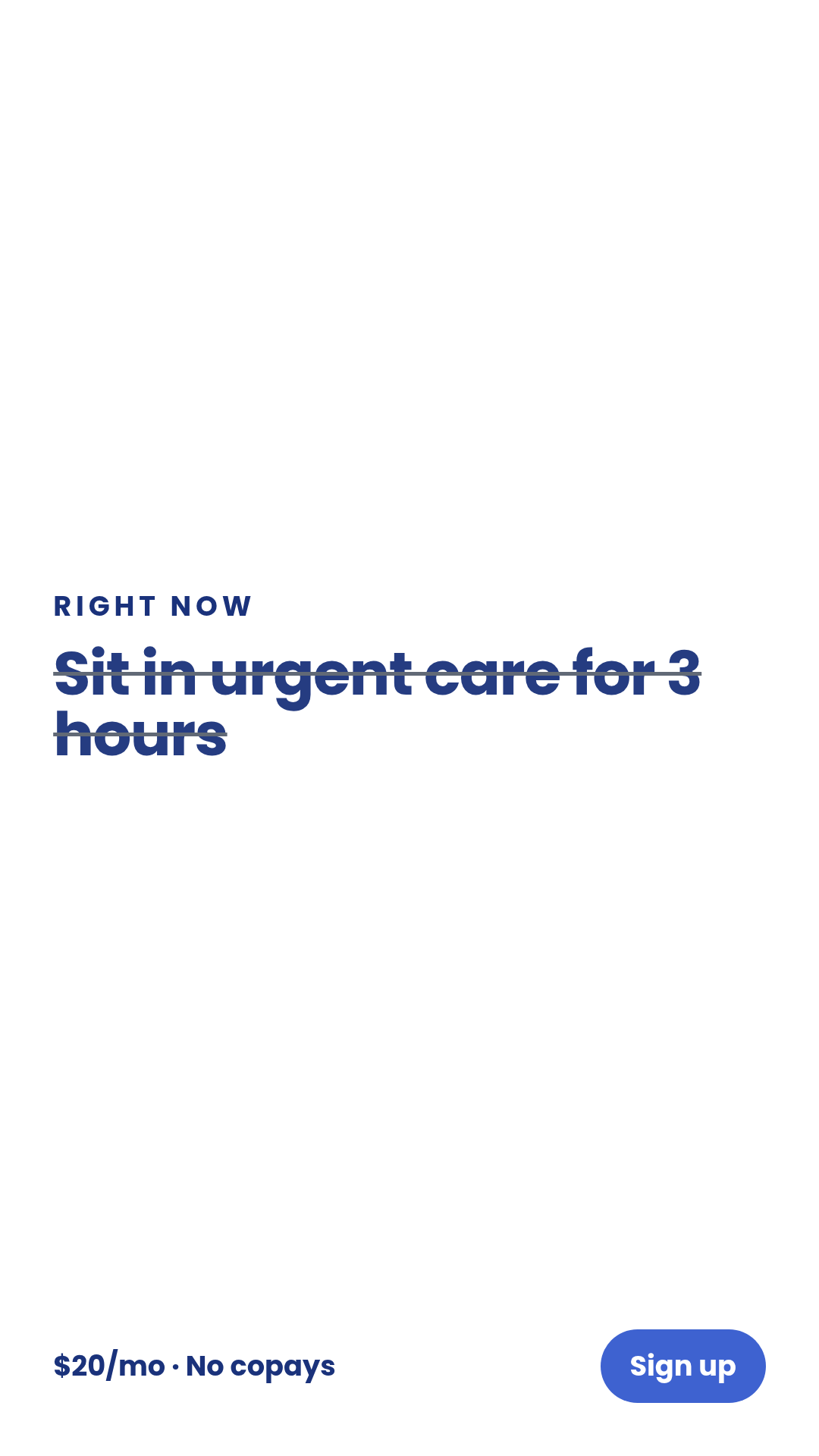
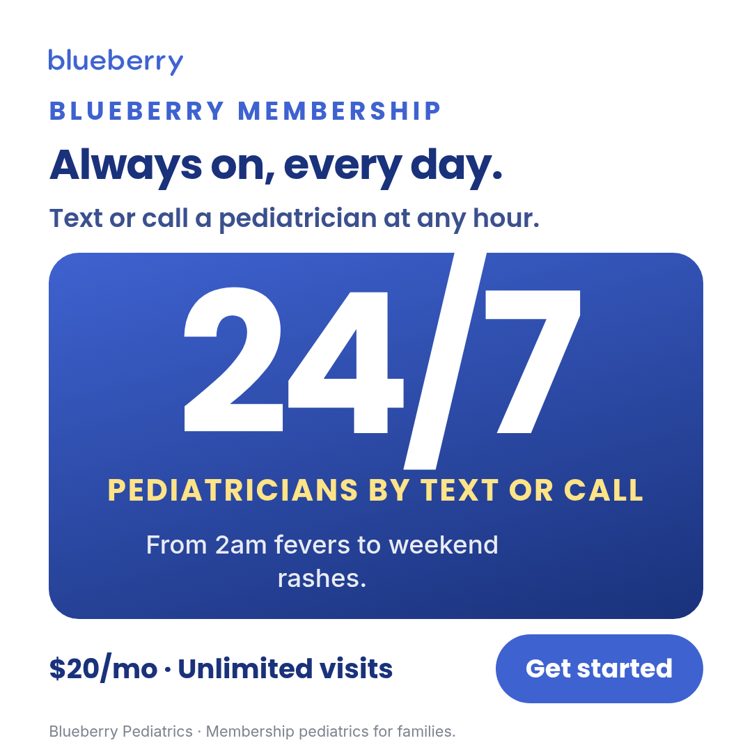
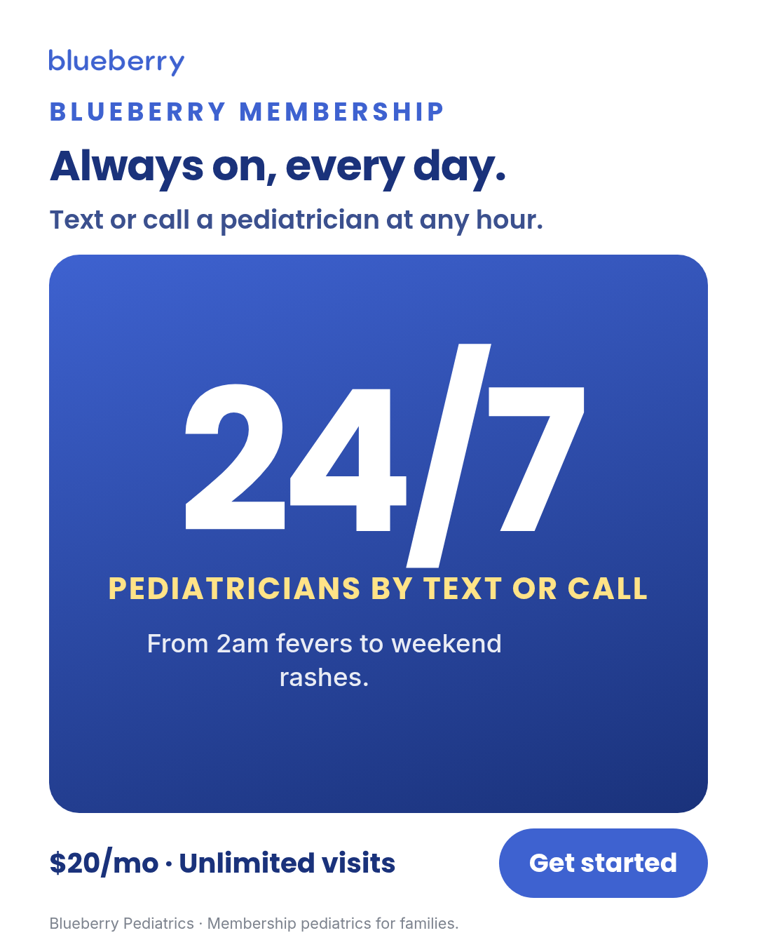
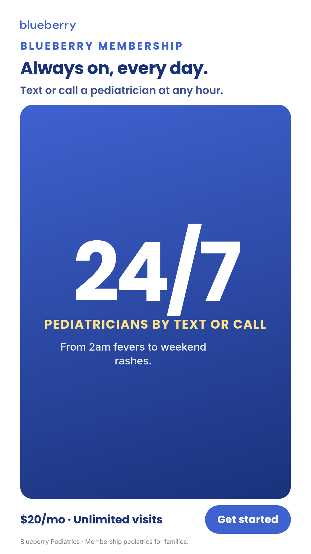
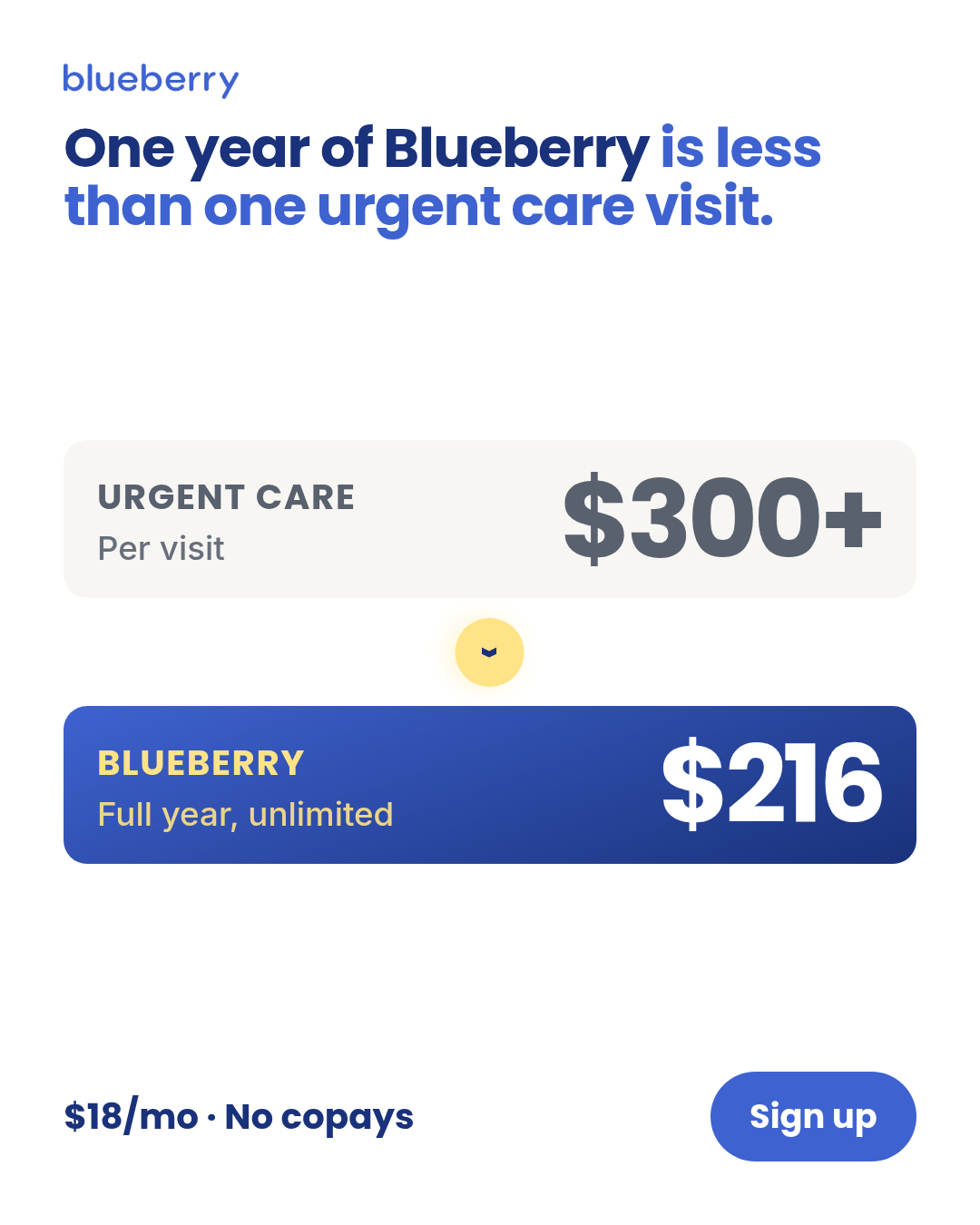
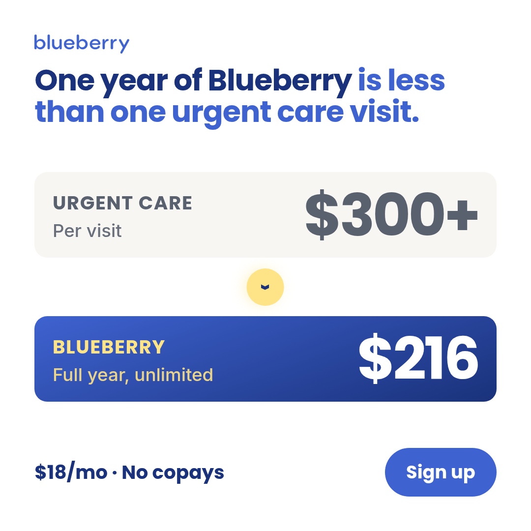
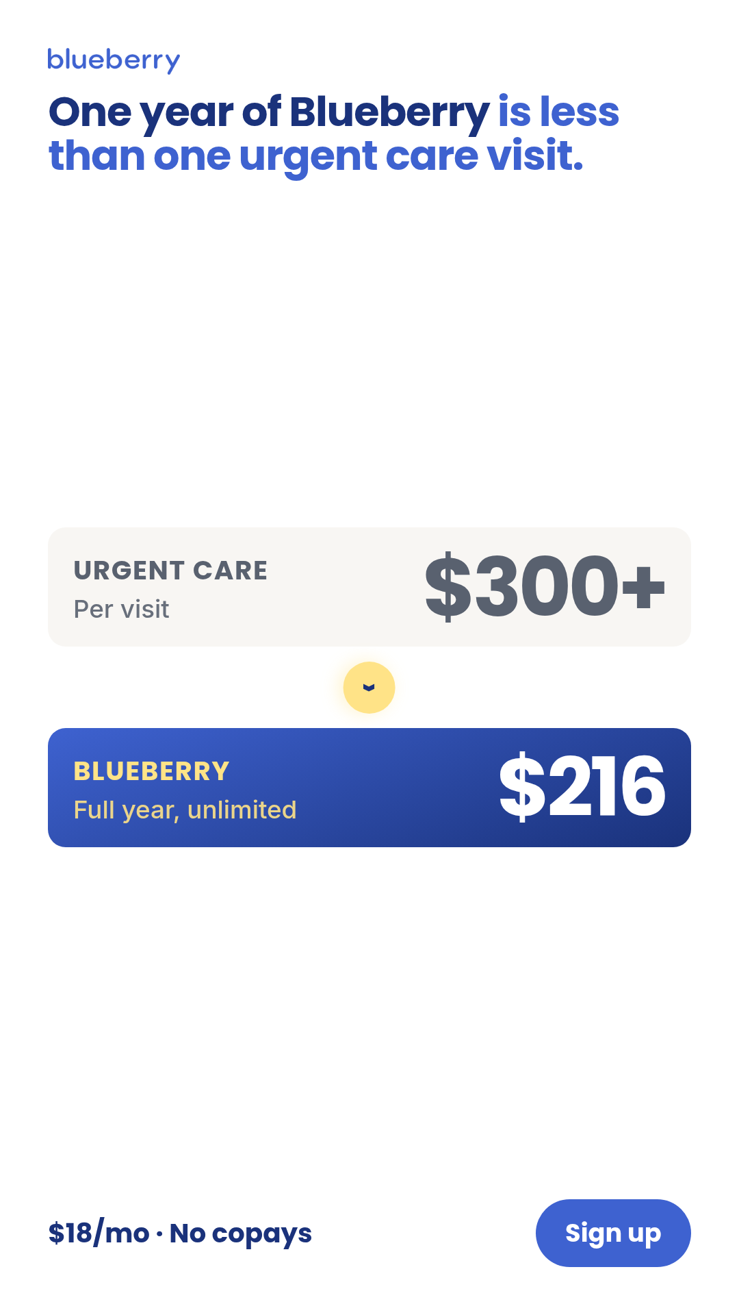
Video chassis
Motion-native ad chassis at 9:16, 1:1, and 4:5. Each chassis ships HTML + GSAP compositions with parameter slots for copy and brand assets. Renders below auto-play muted; click an aspect link to open the full-resolution MP4.
Quick jump · 11 chassis
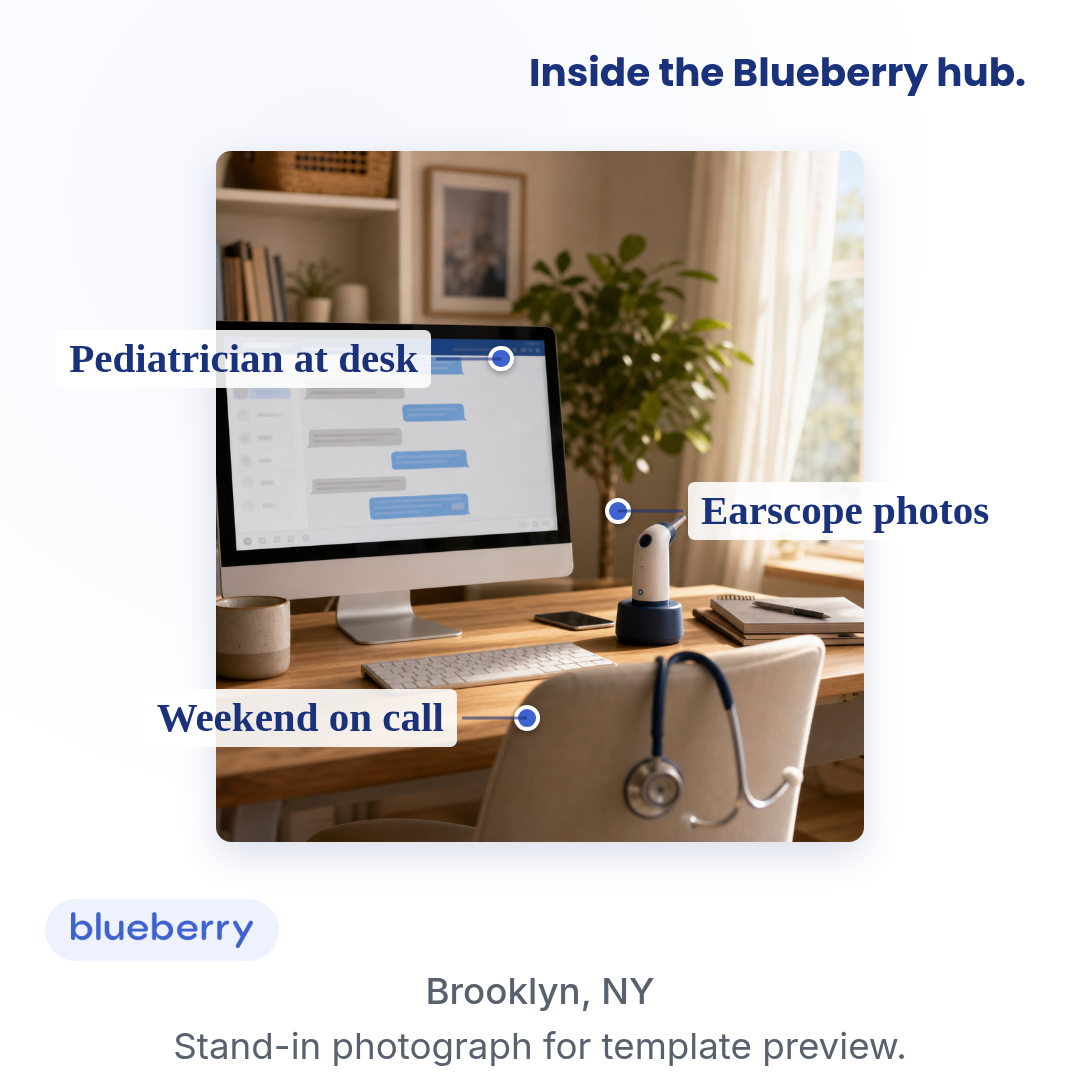
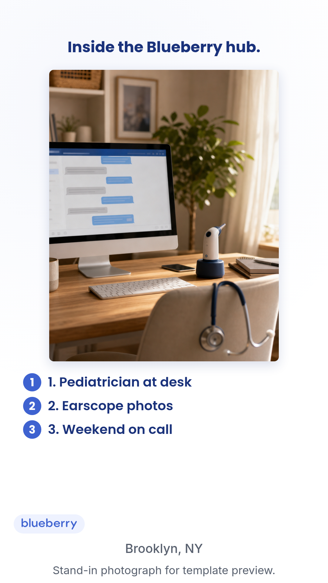
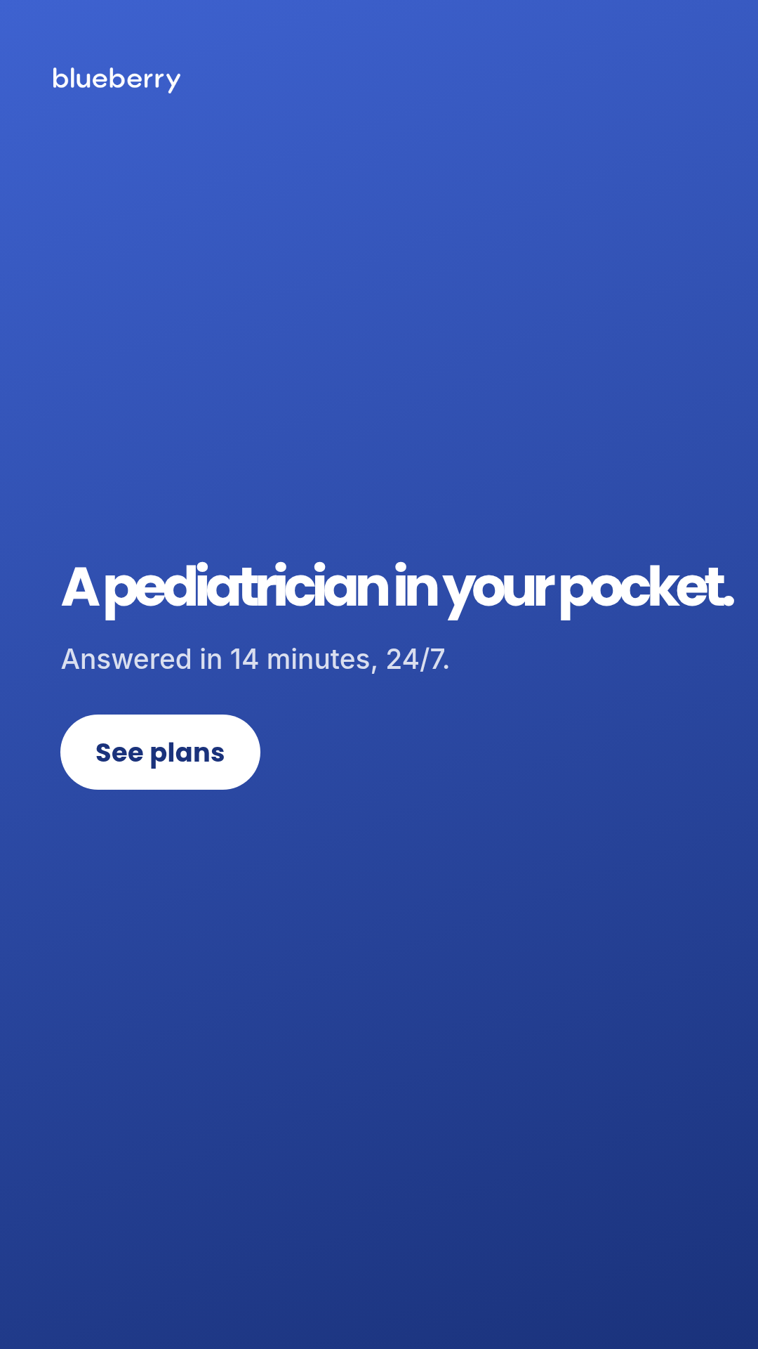
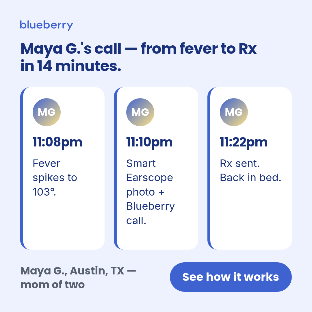
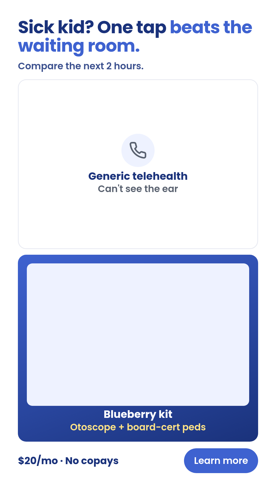
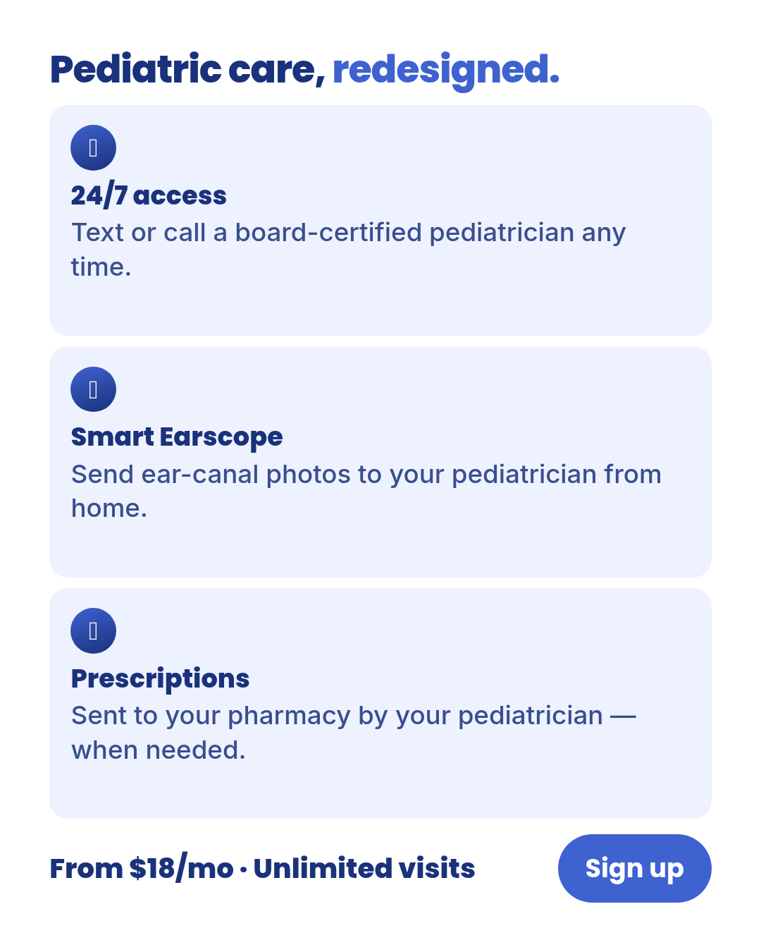
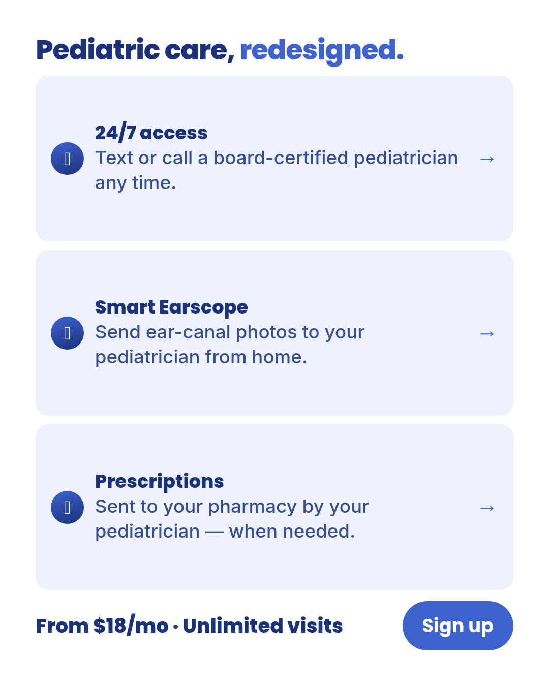
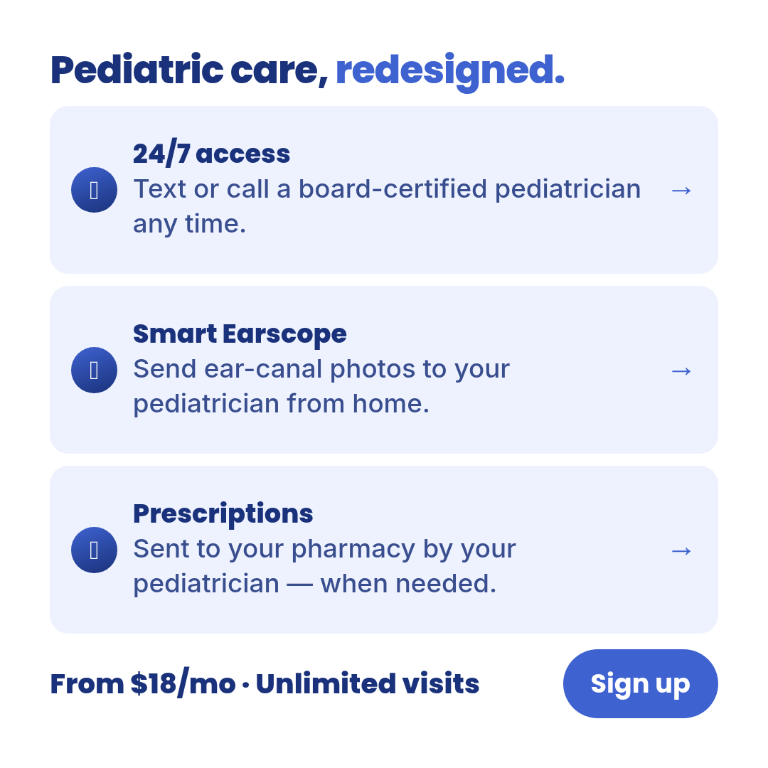
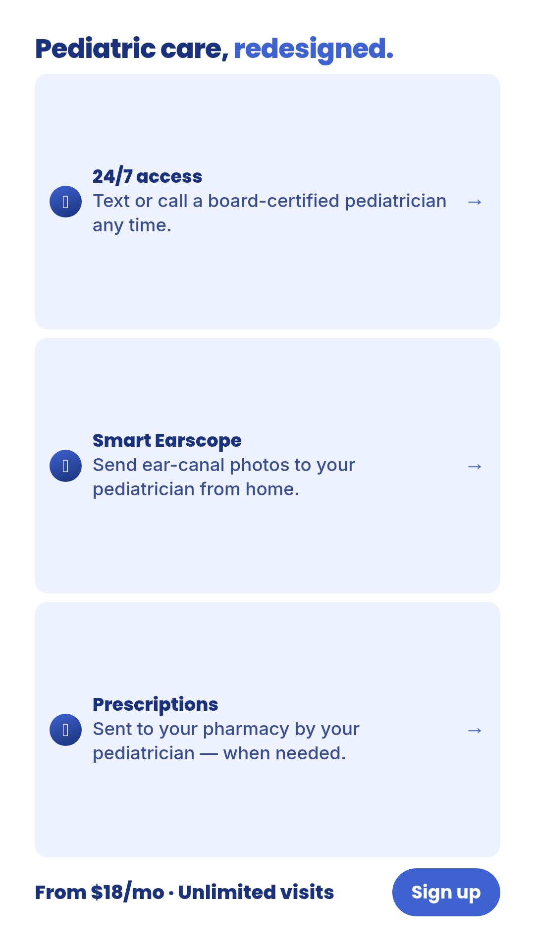
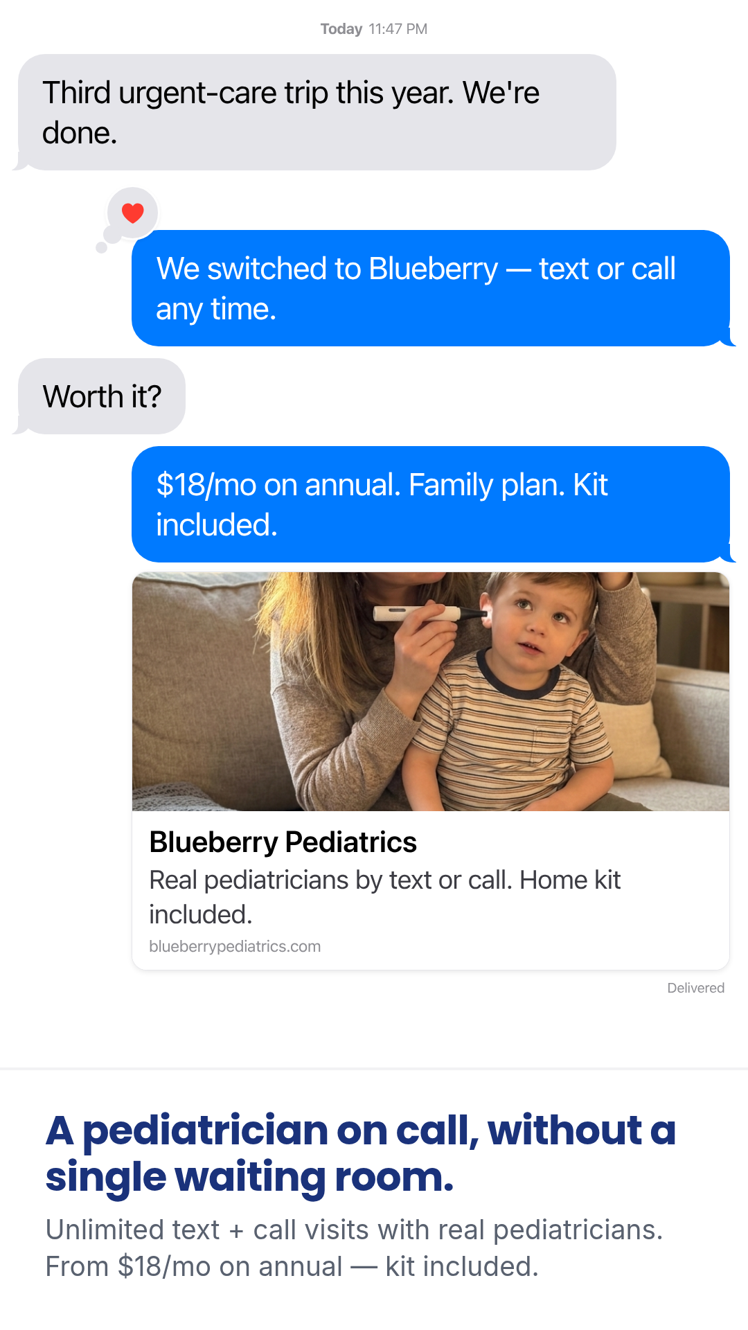
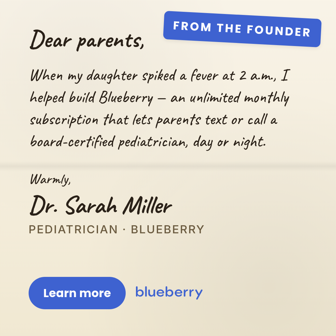
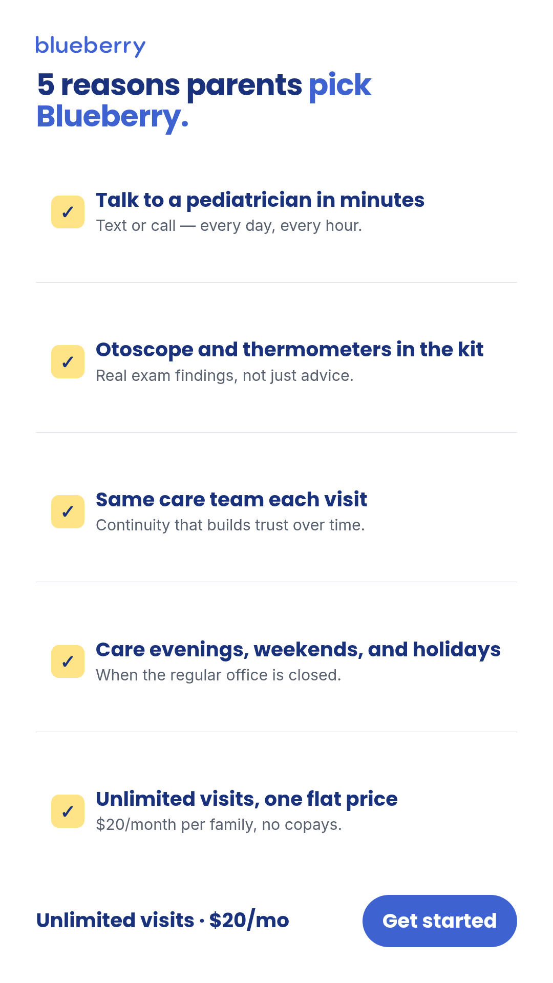
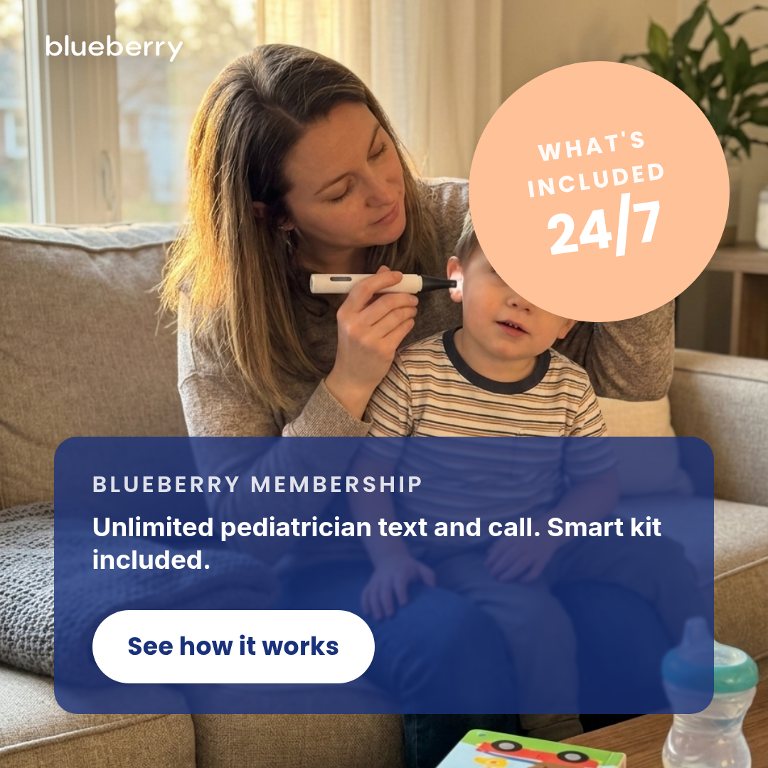
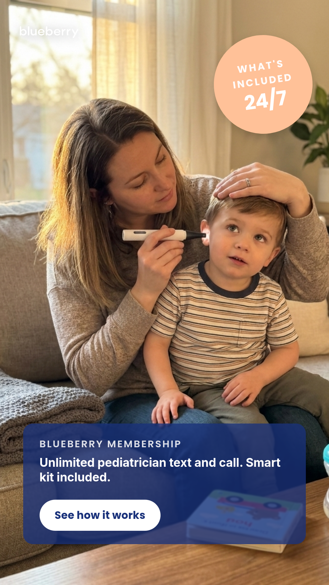
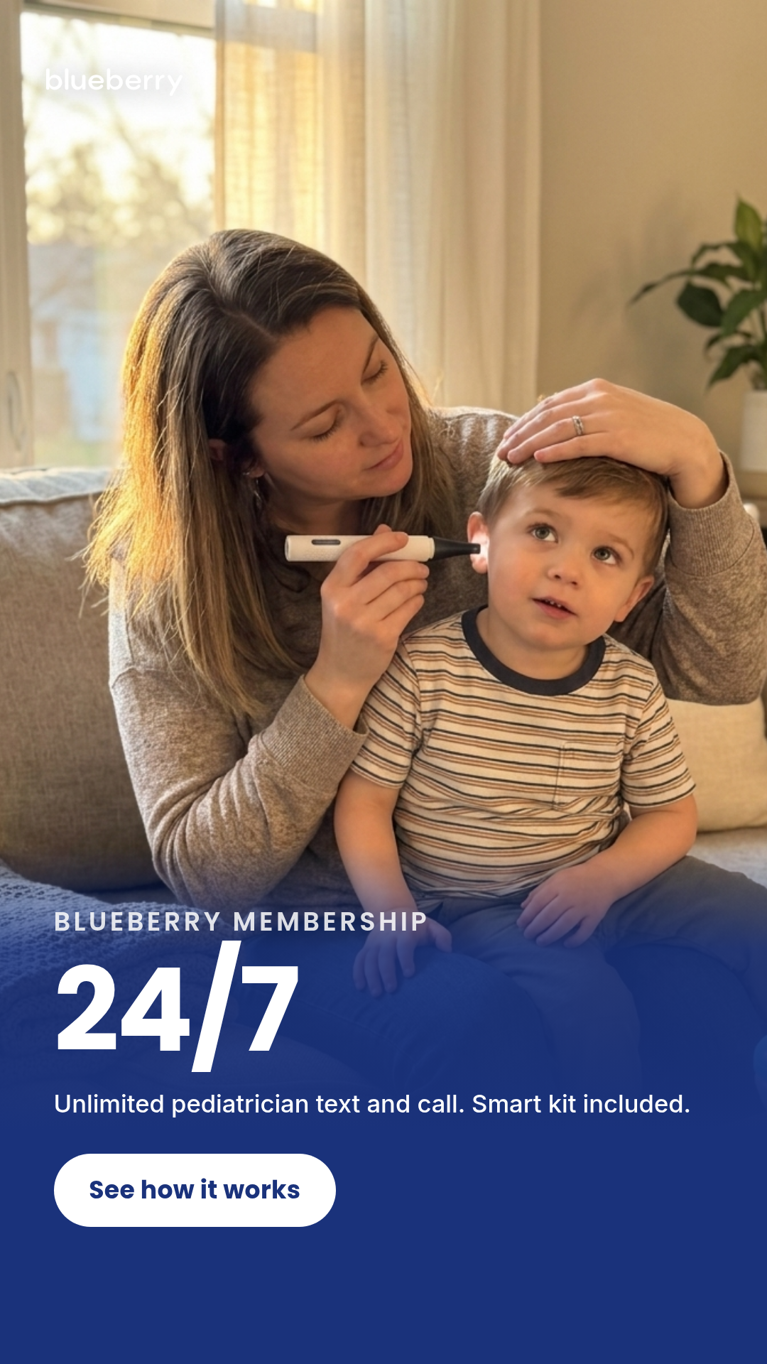
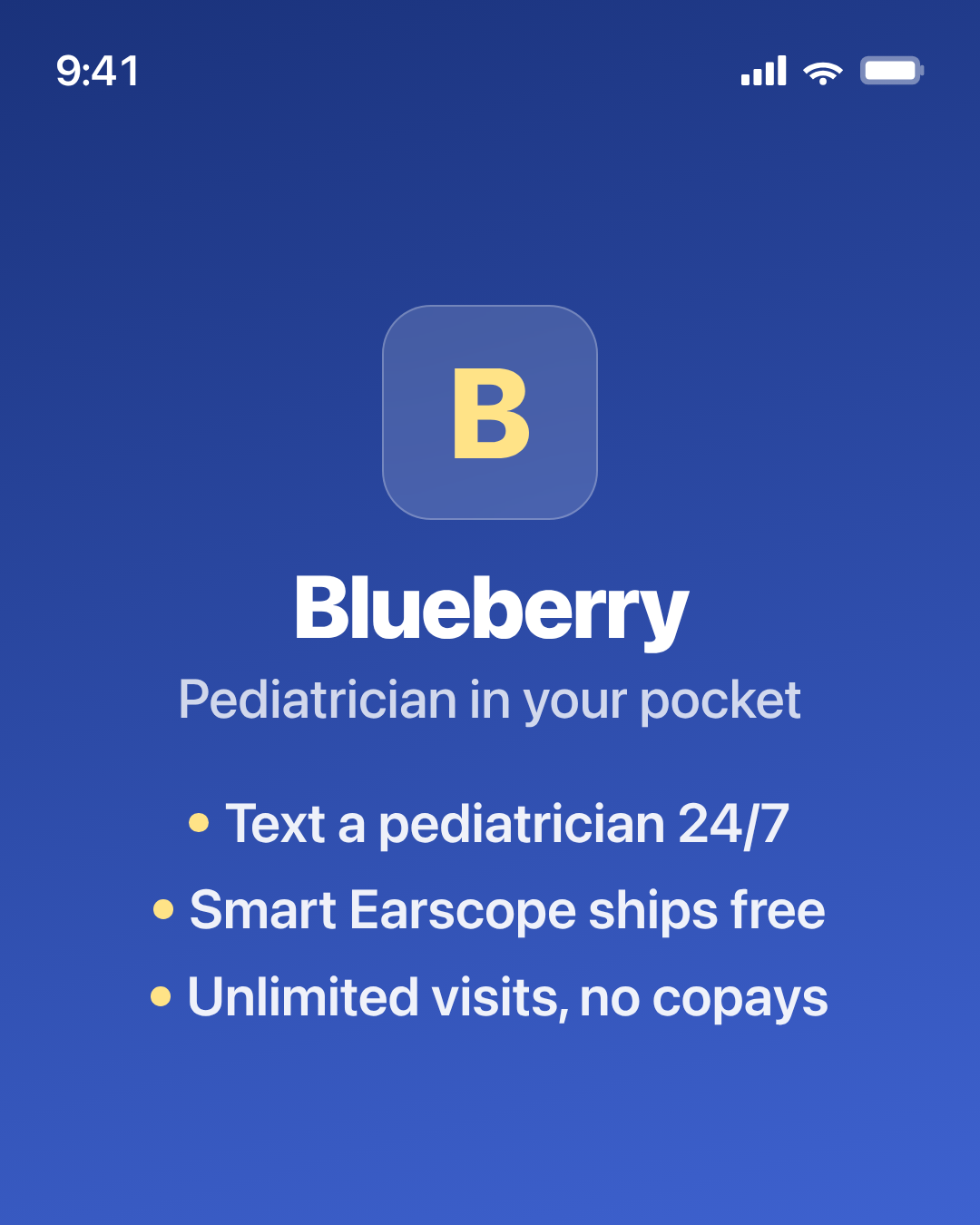
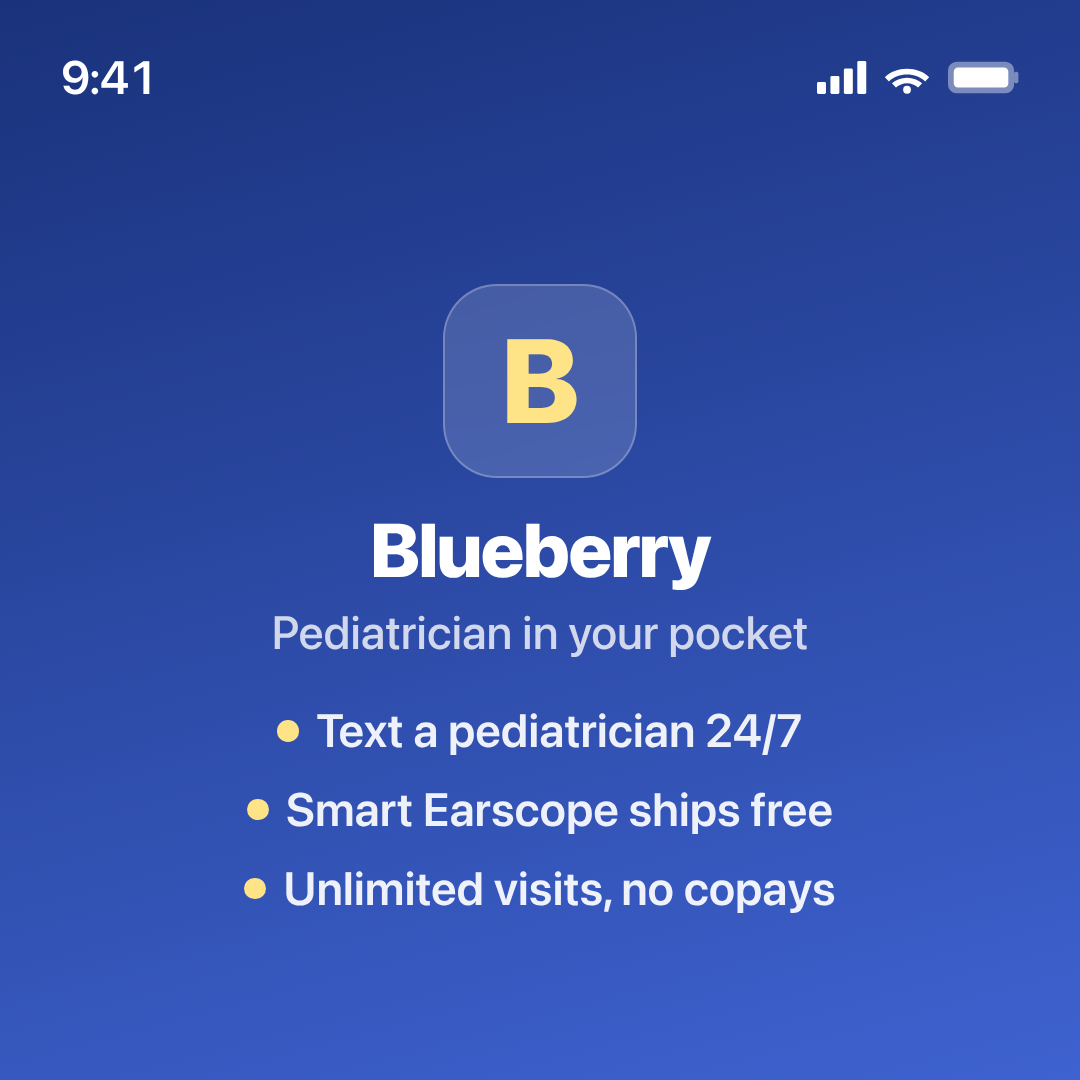
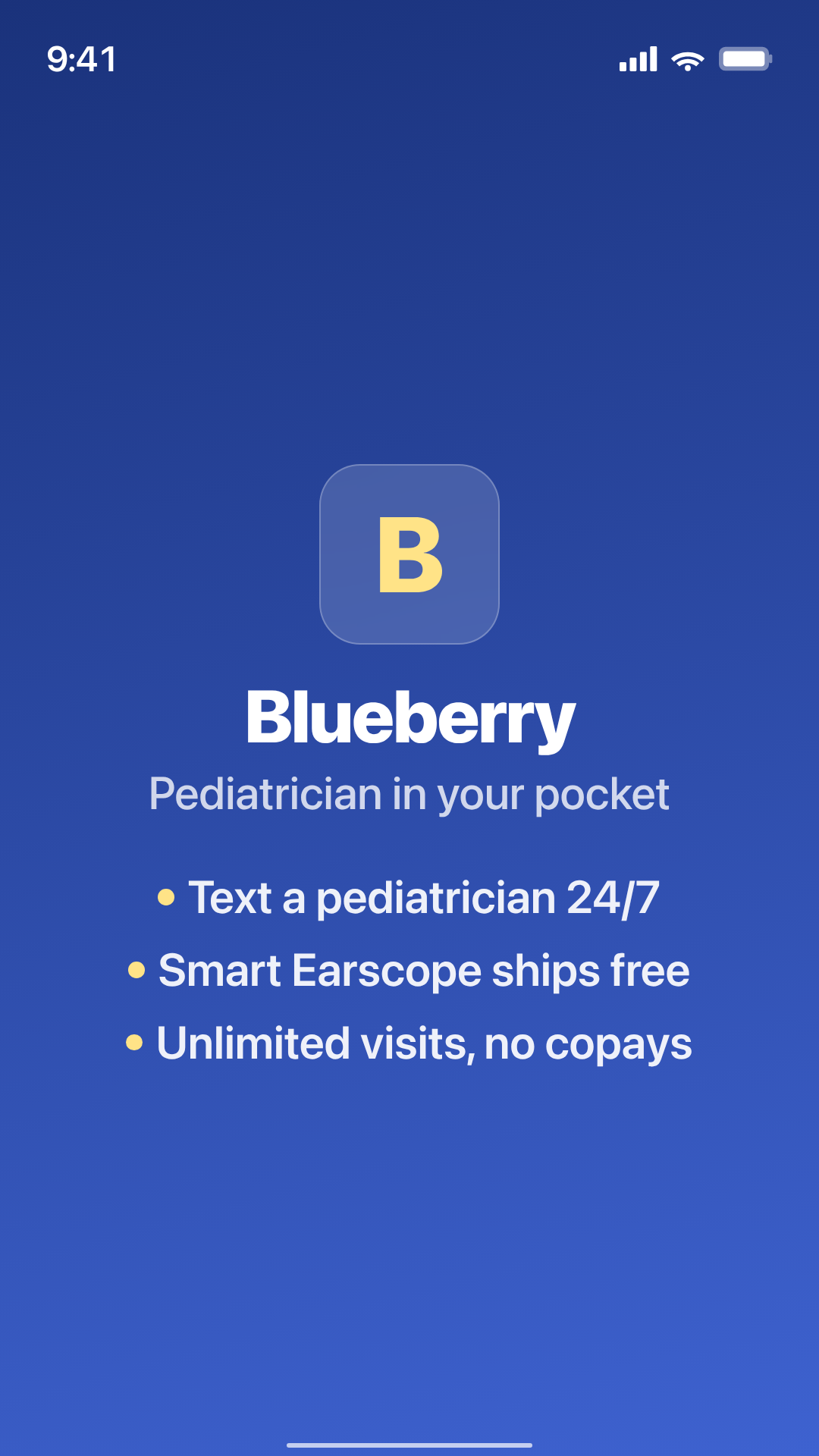
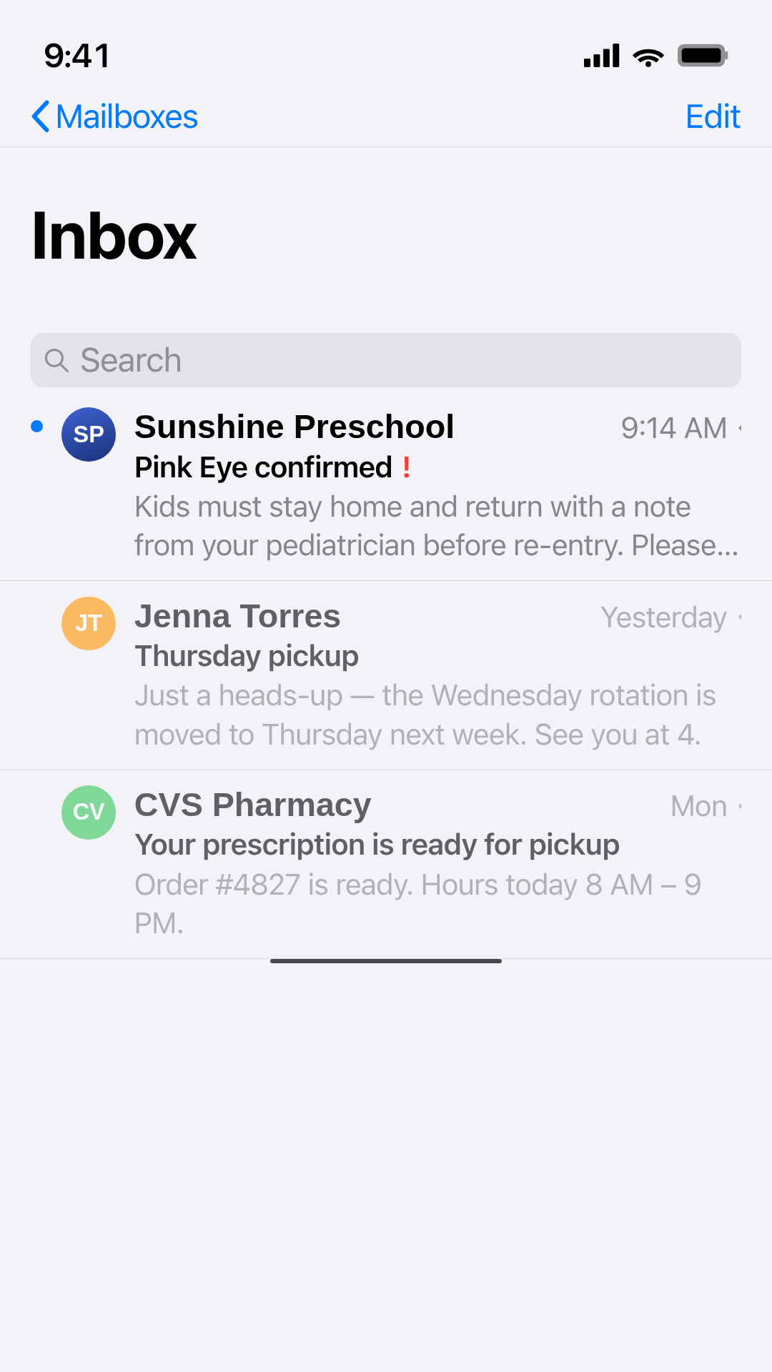
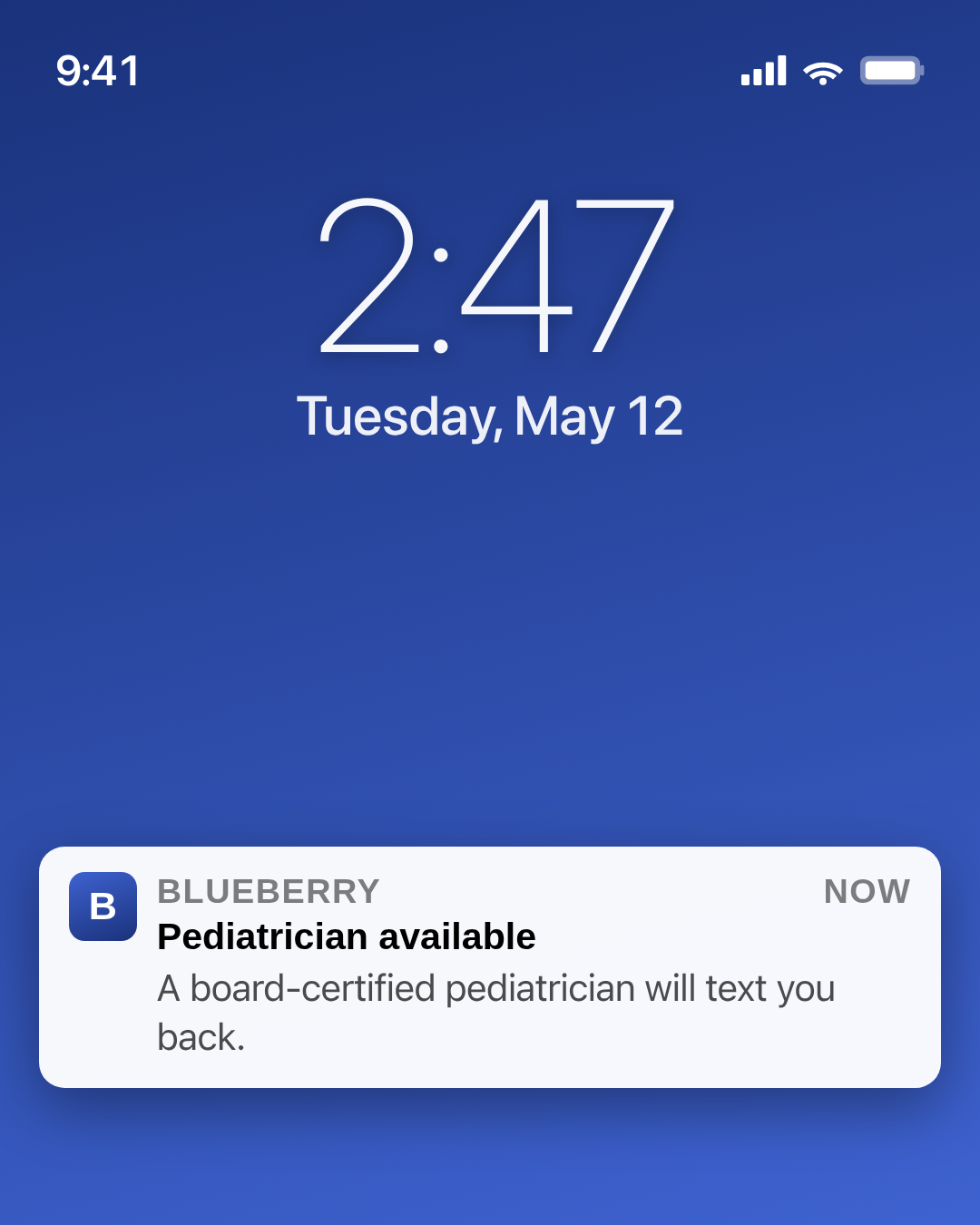
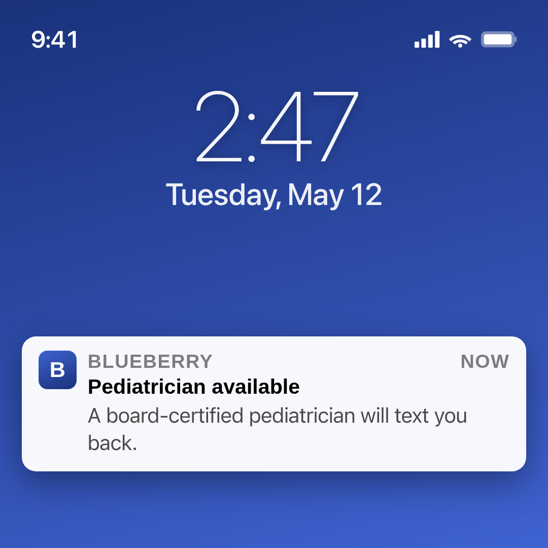
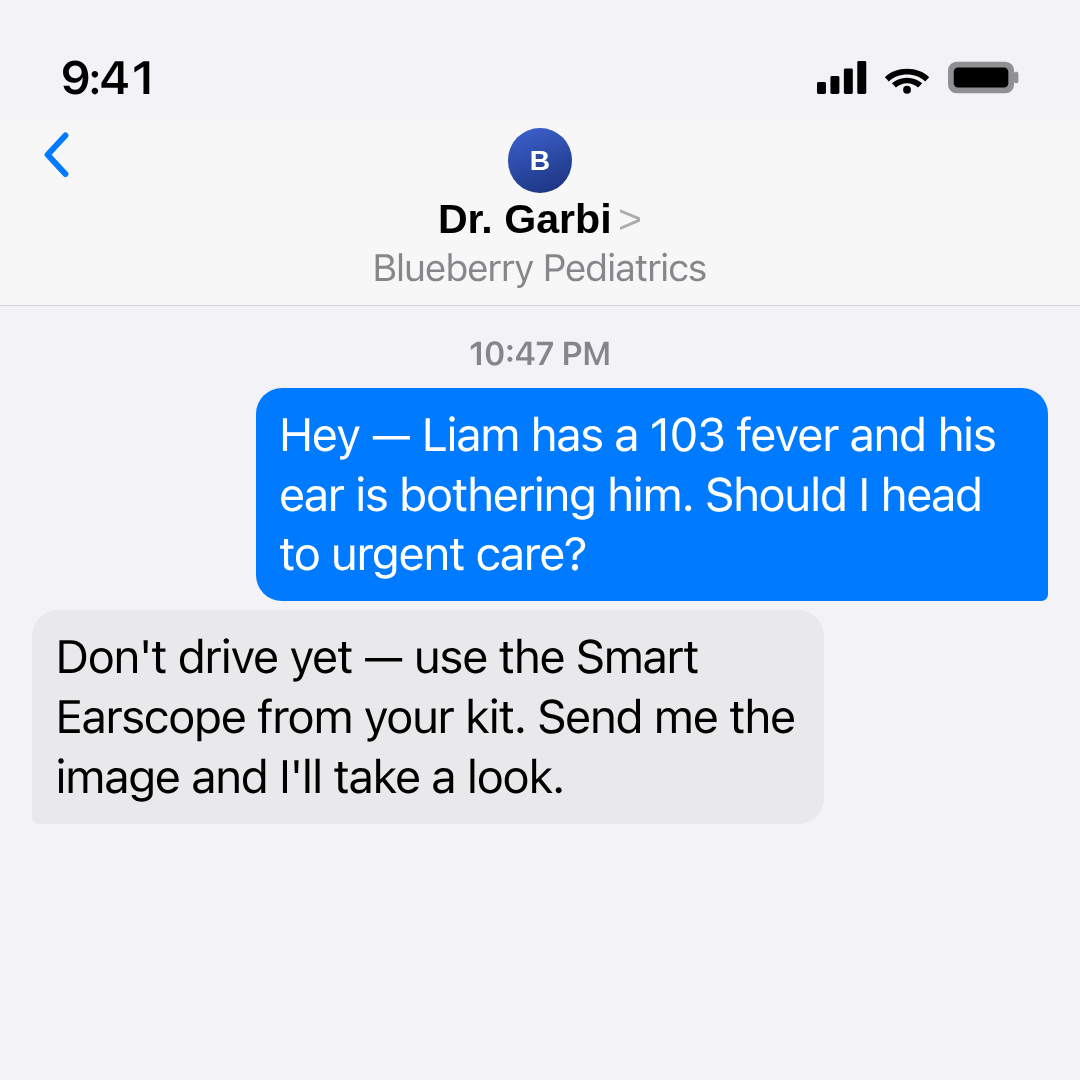
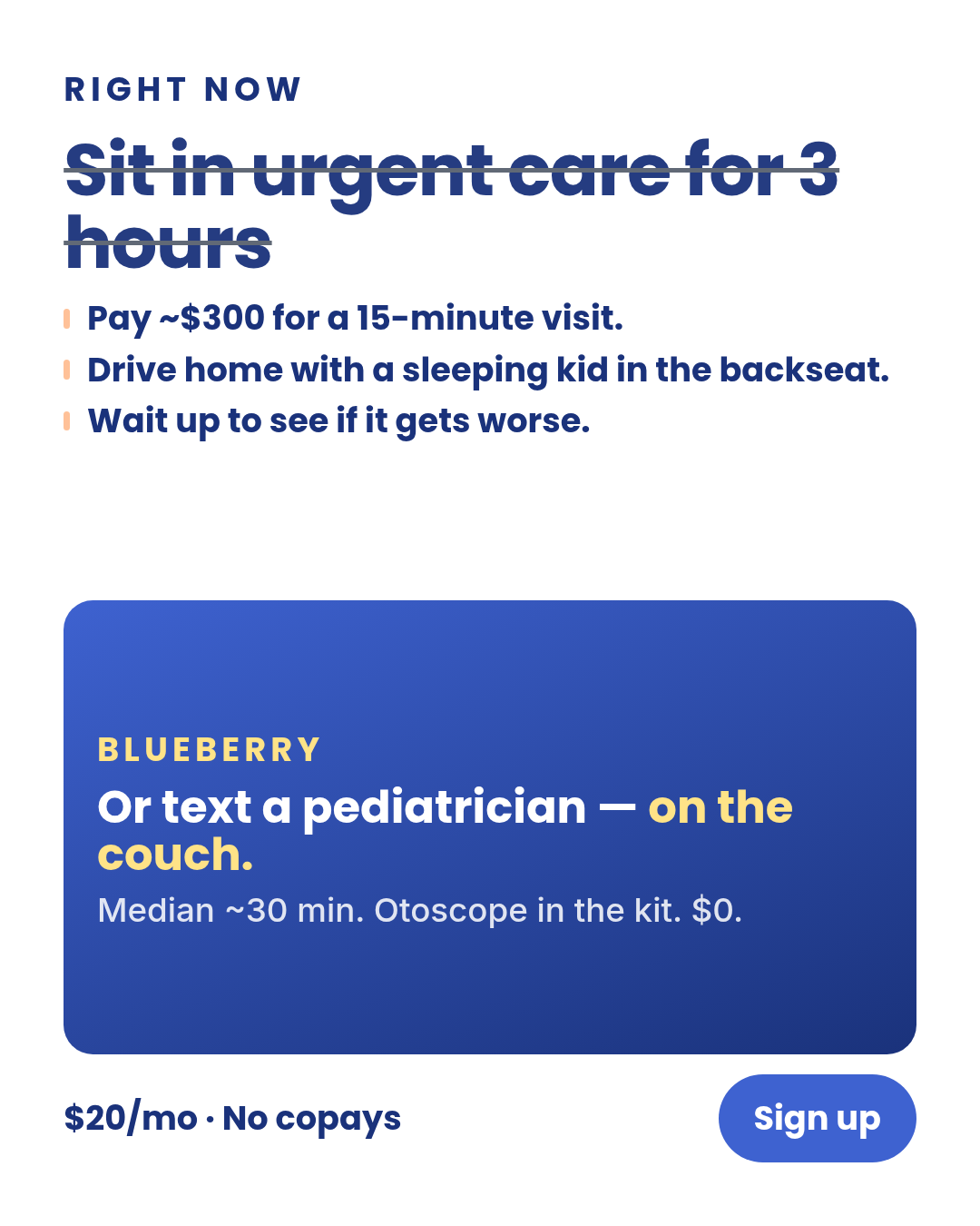
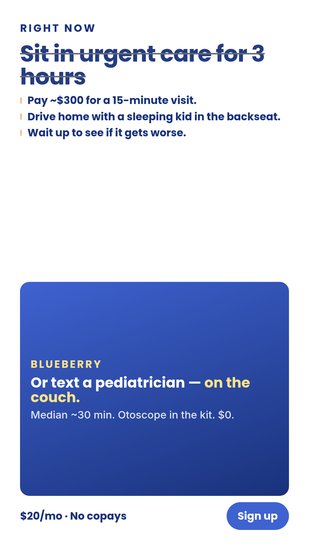
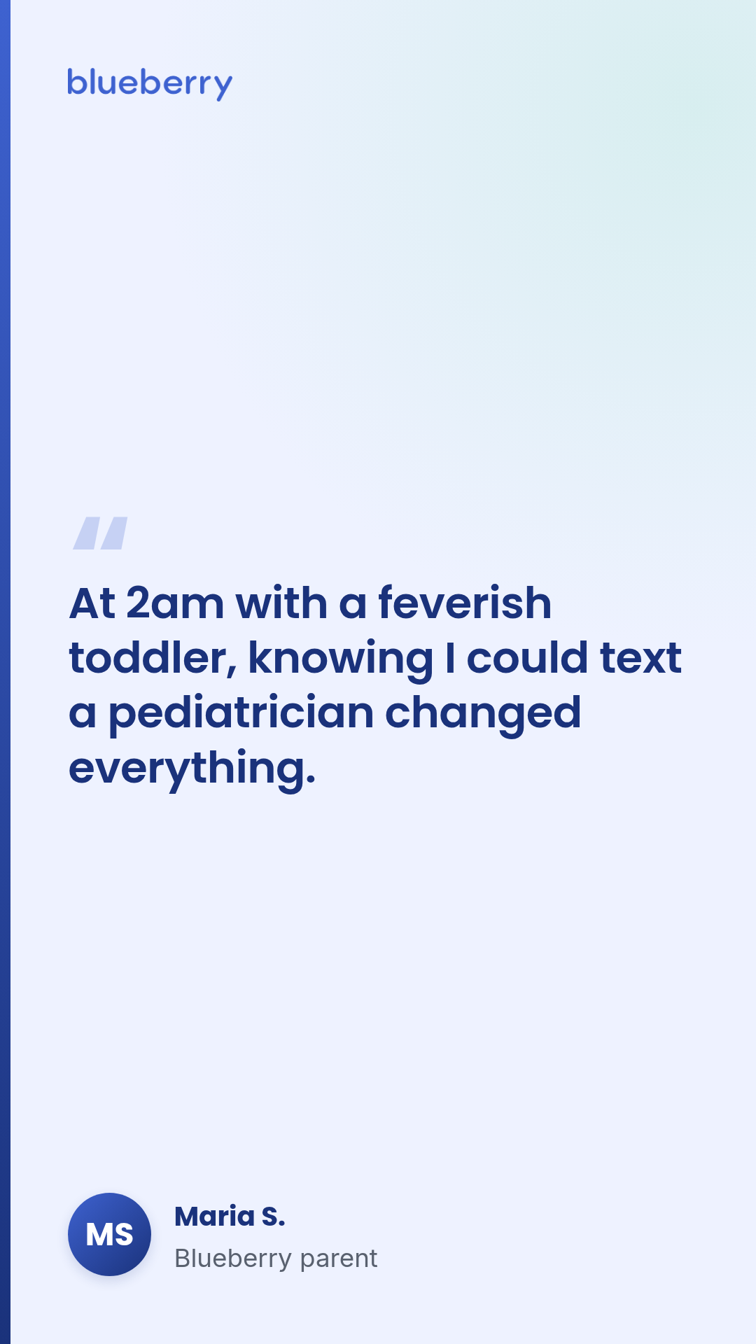
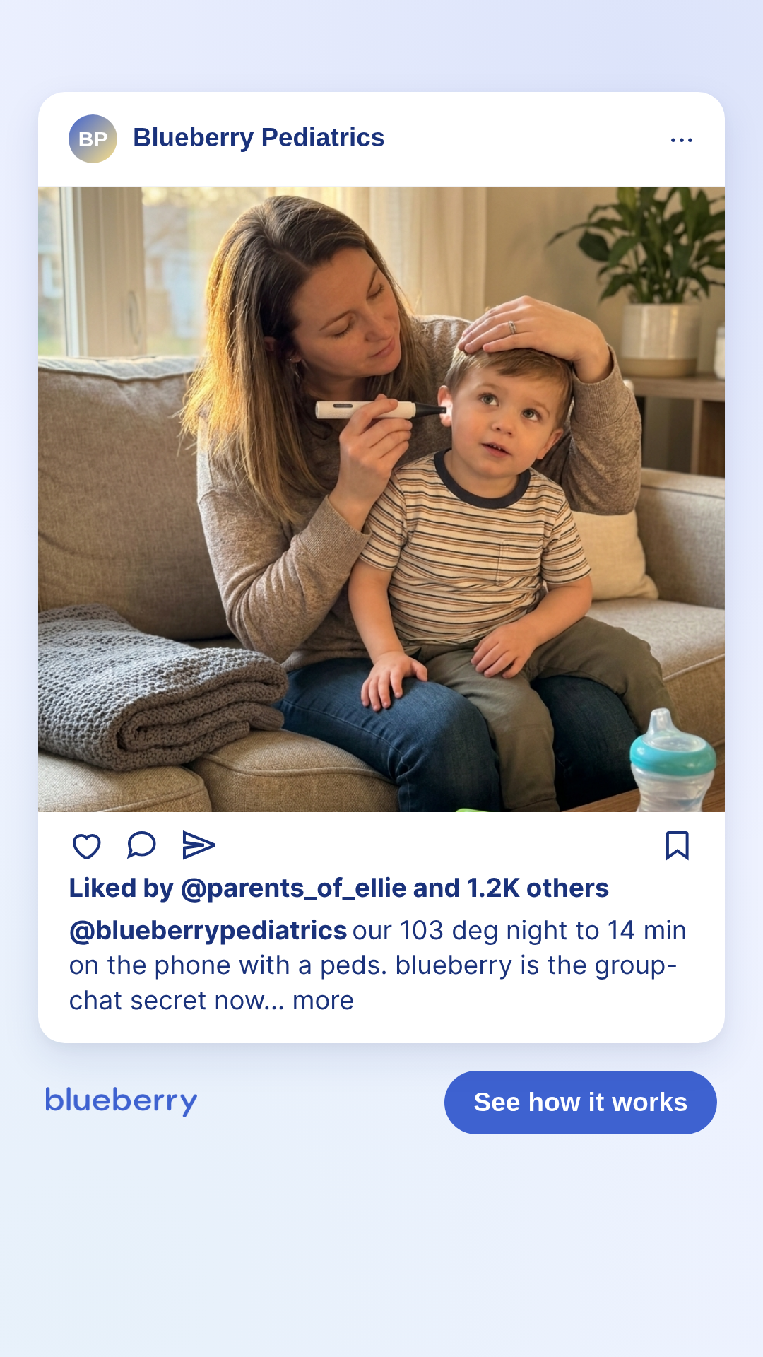
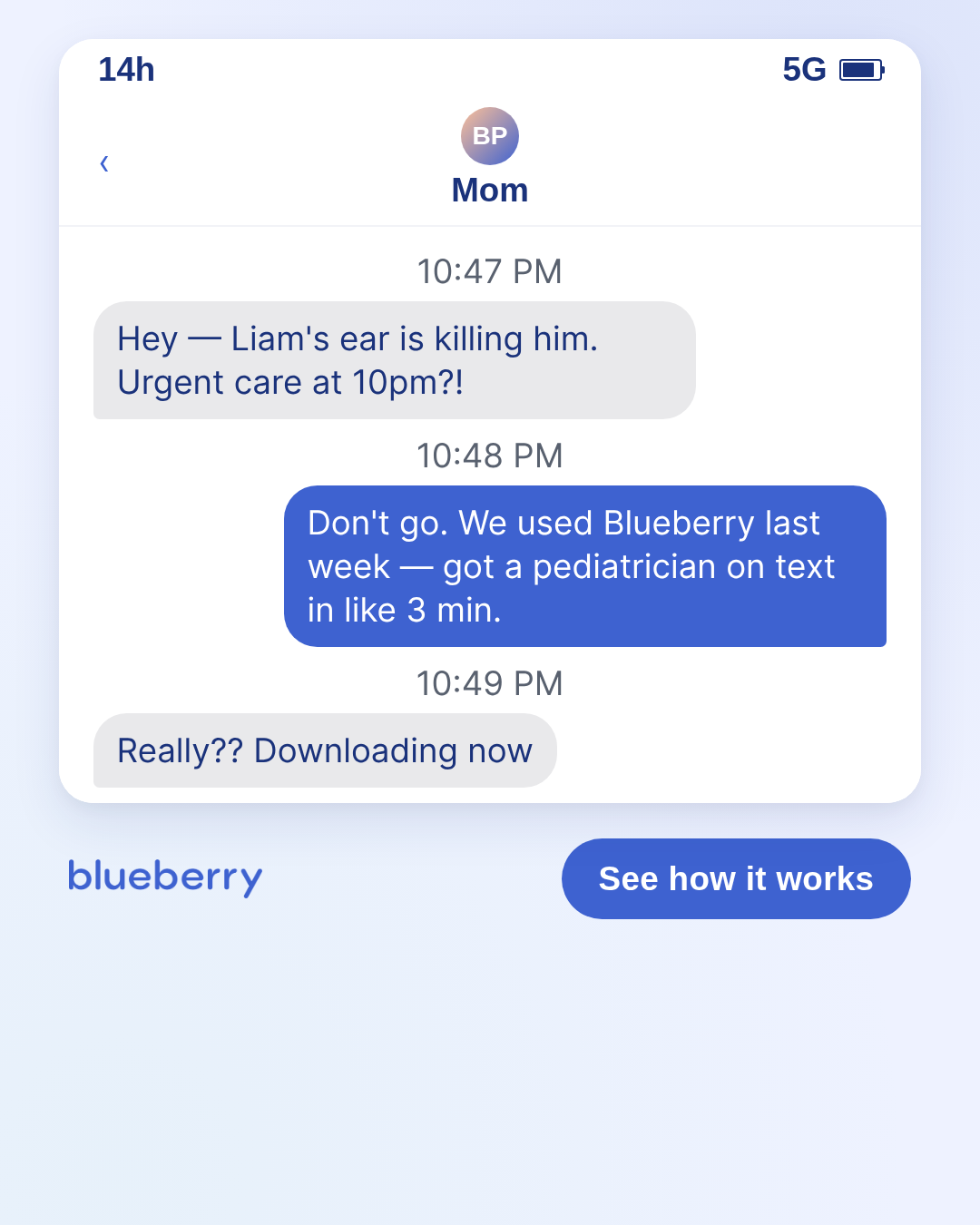
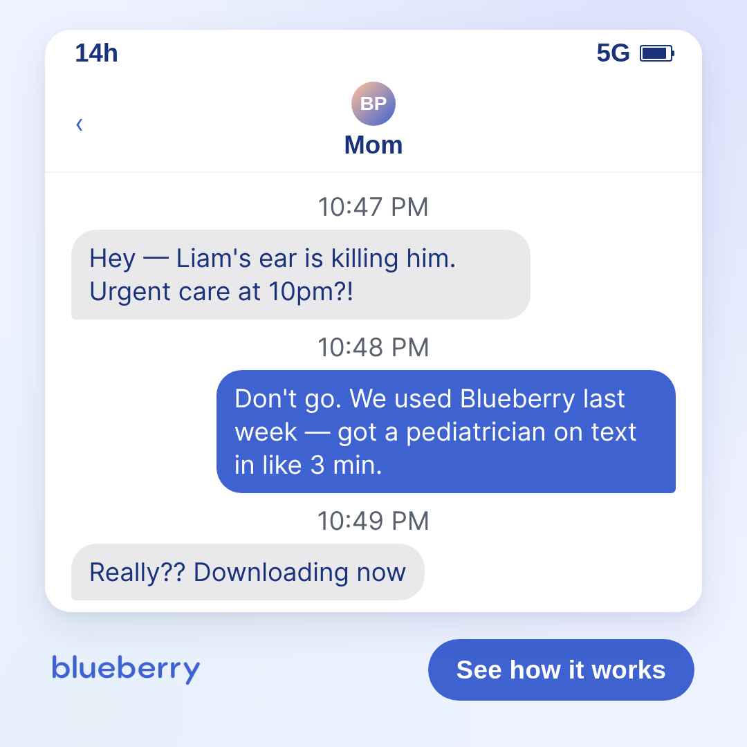
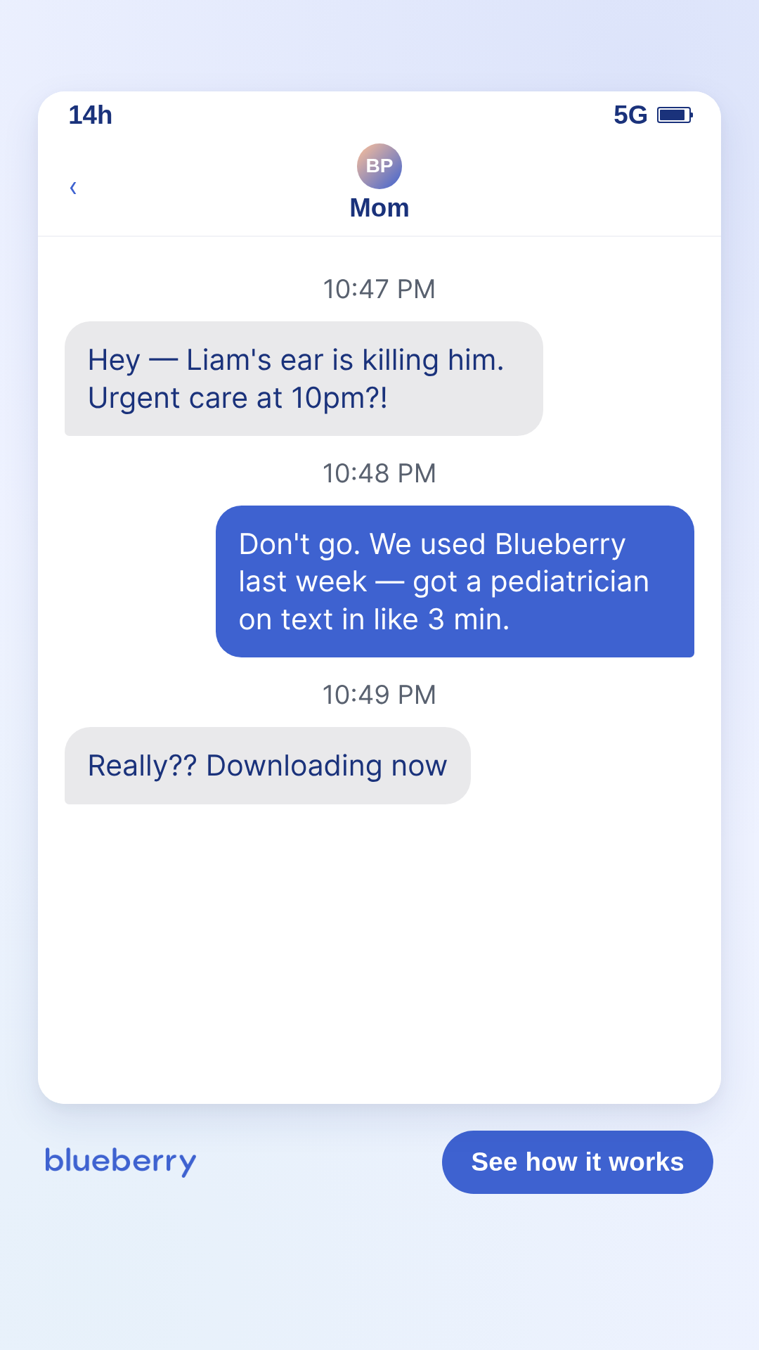
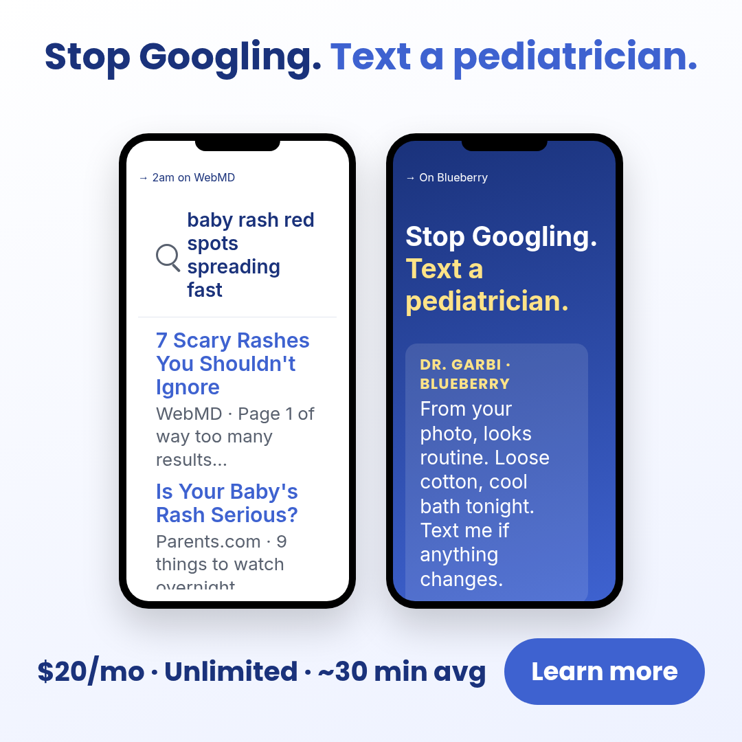
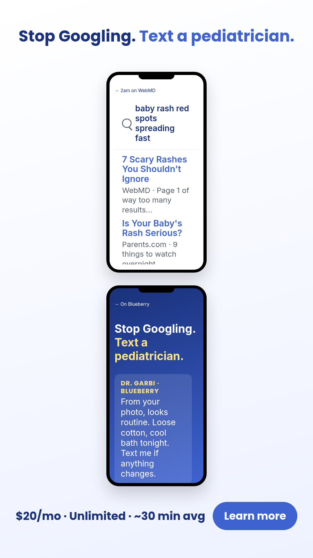
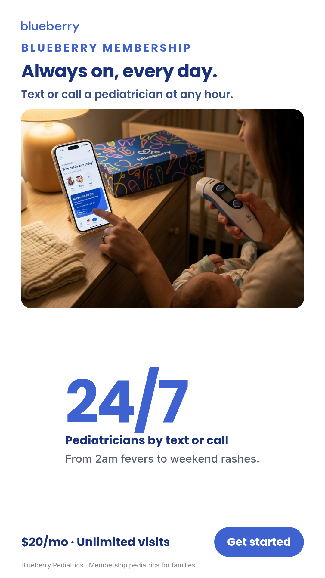
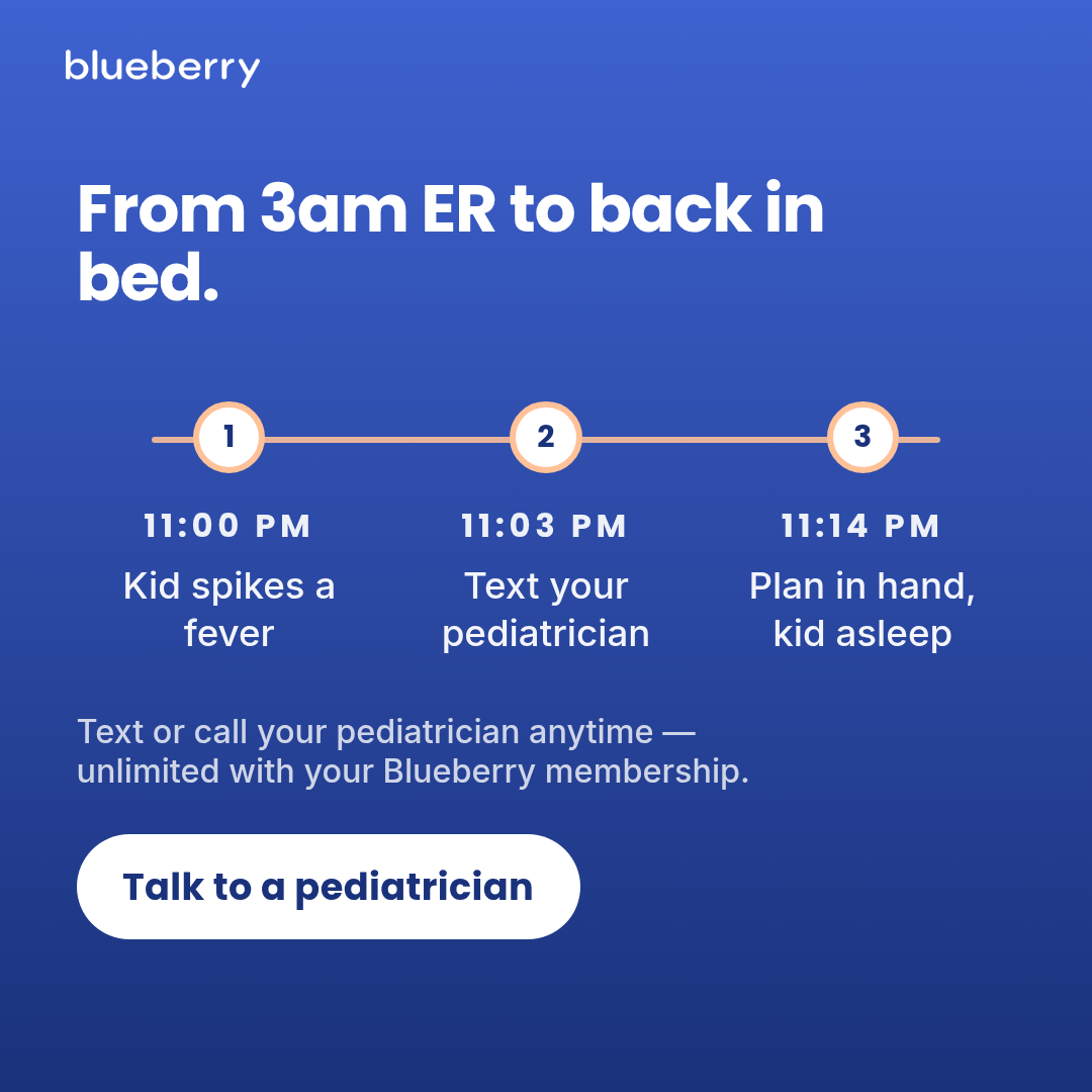
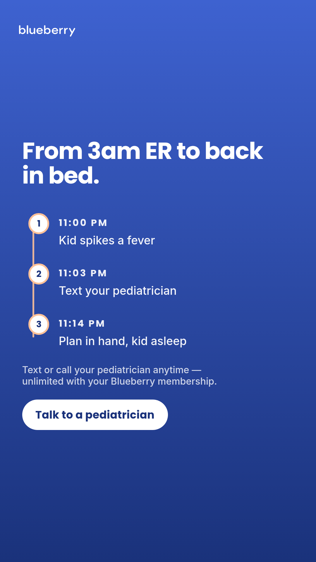
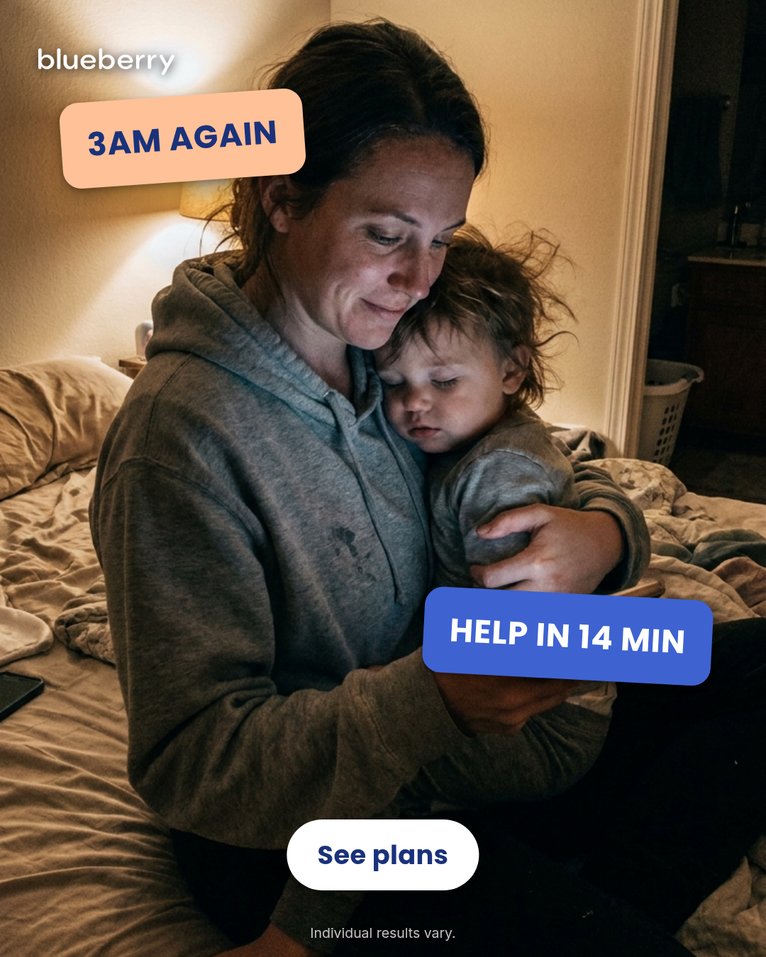
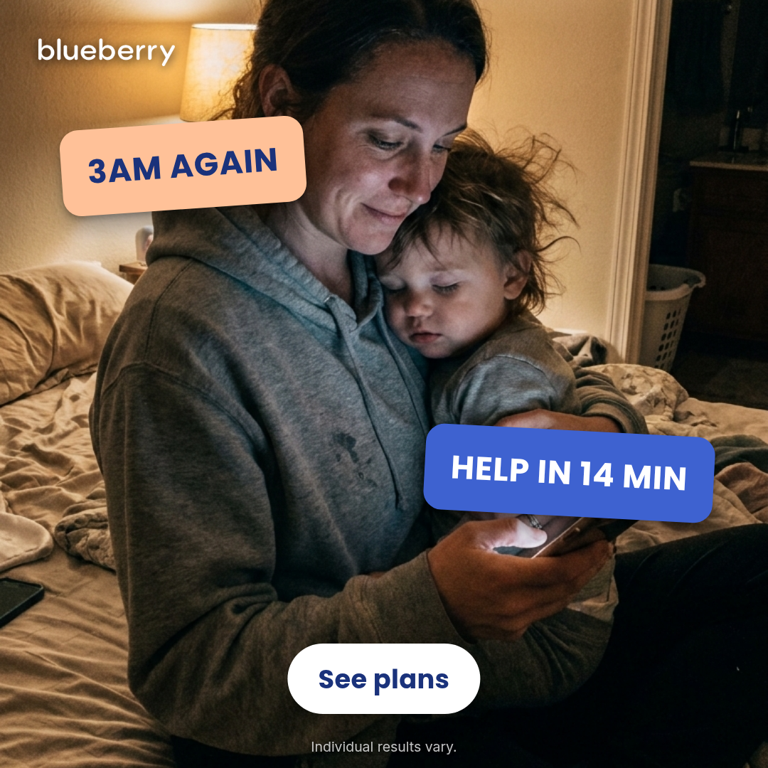
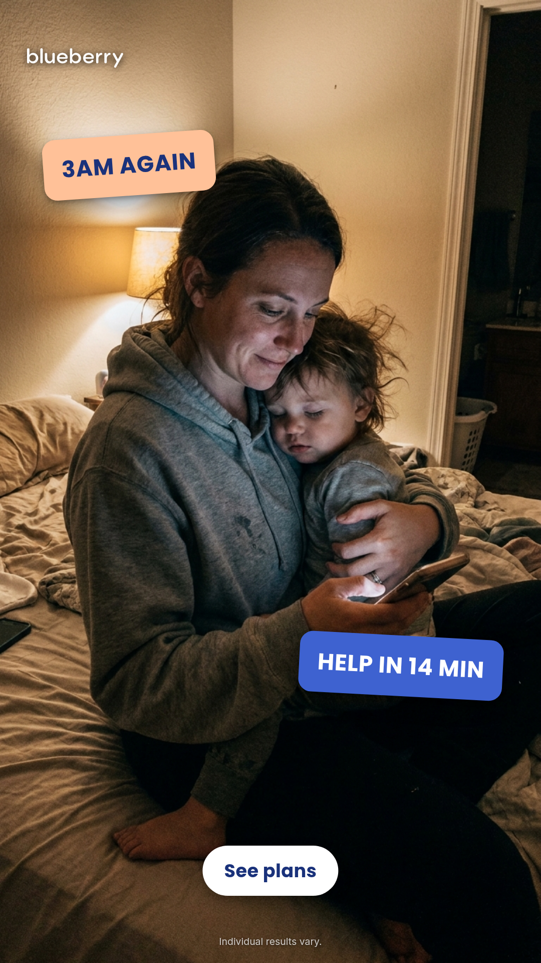
iMessage Thread Reveal
main chassisUse when: Overheard parent-friend dialogue. Worry → reassurance peer-to-peer recommendation framed as an iMessage thread; pure-iOS chrome with configurable per-bubble tapback reactions.
Structure: gray Q-bubble + exclamation tapback → blue A-bubble + heart tapback → brand end-card
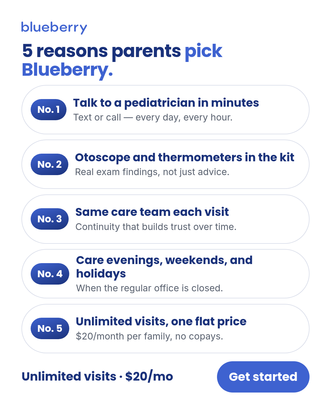
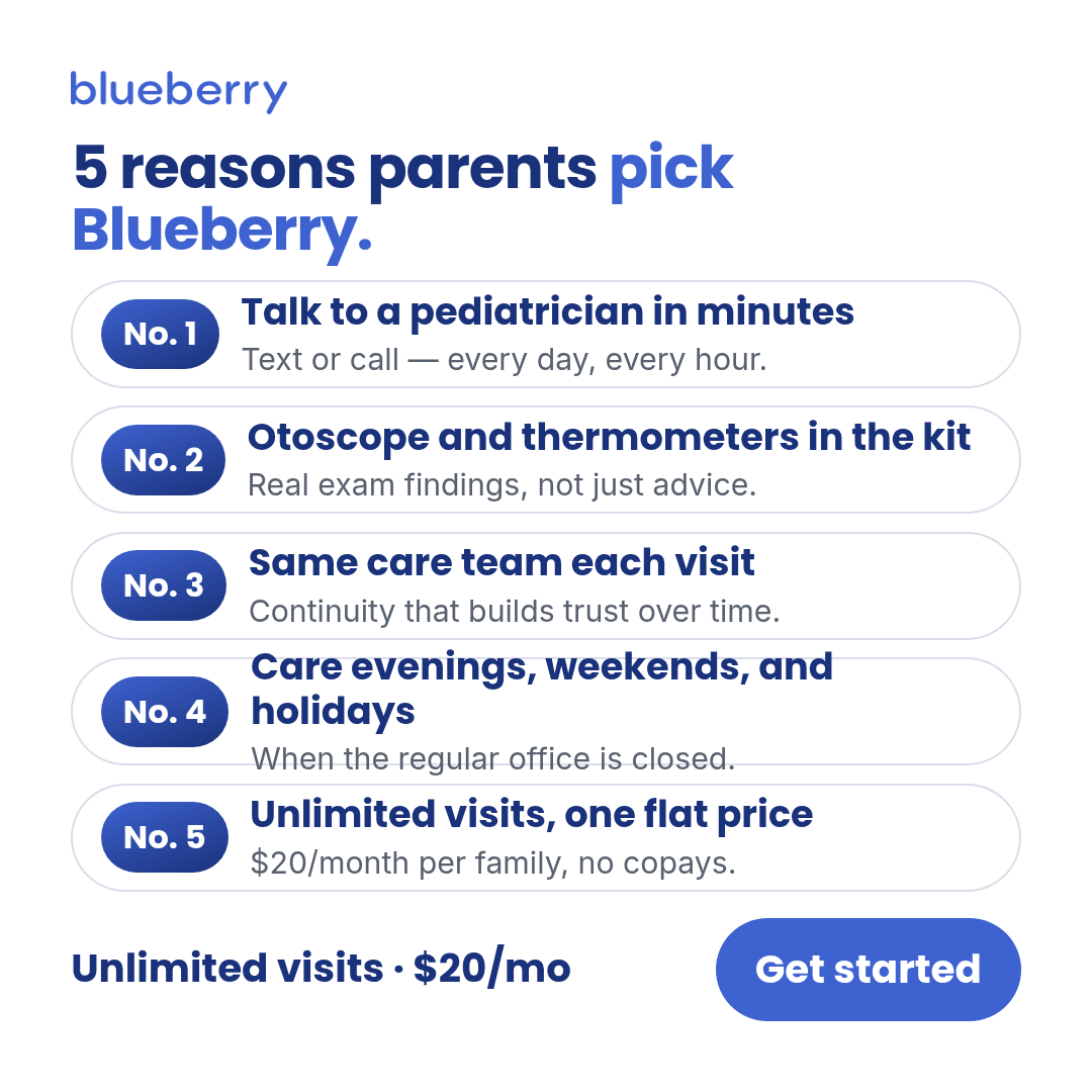
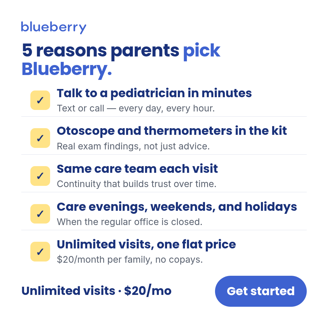
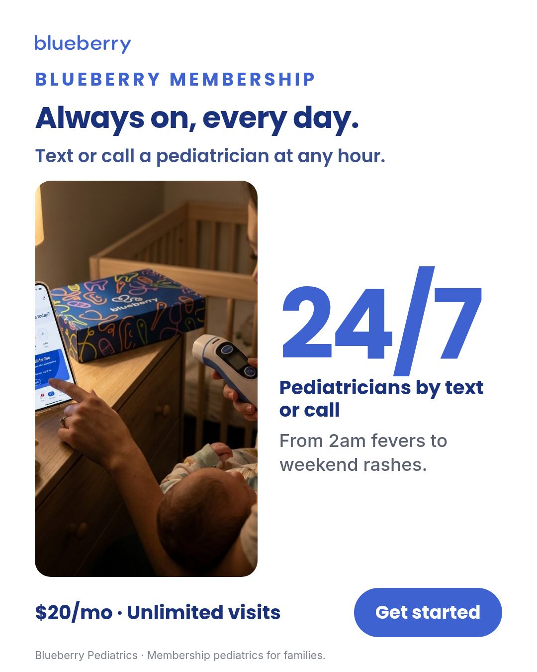
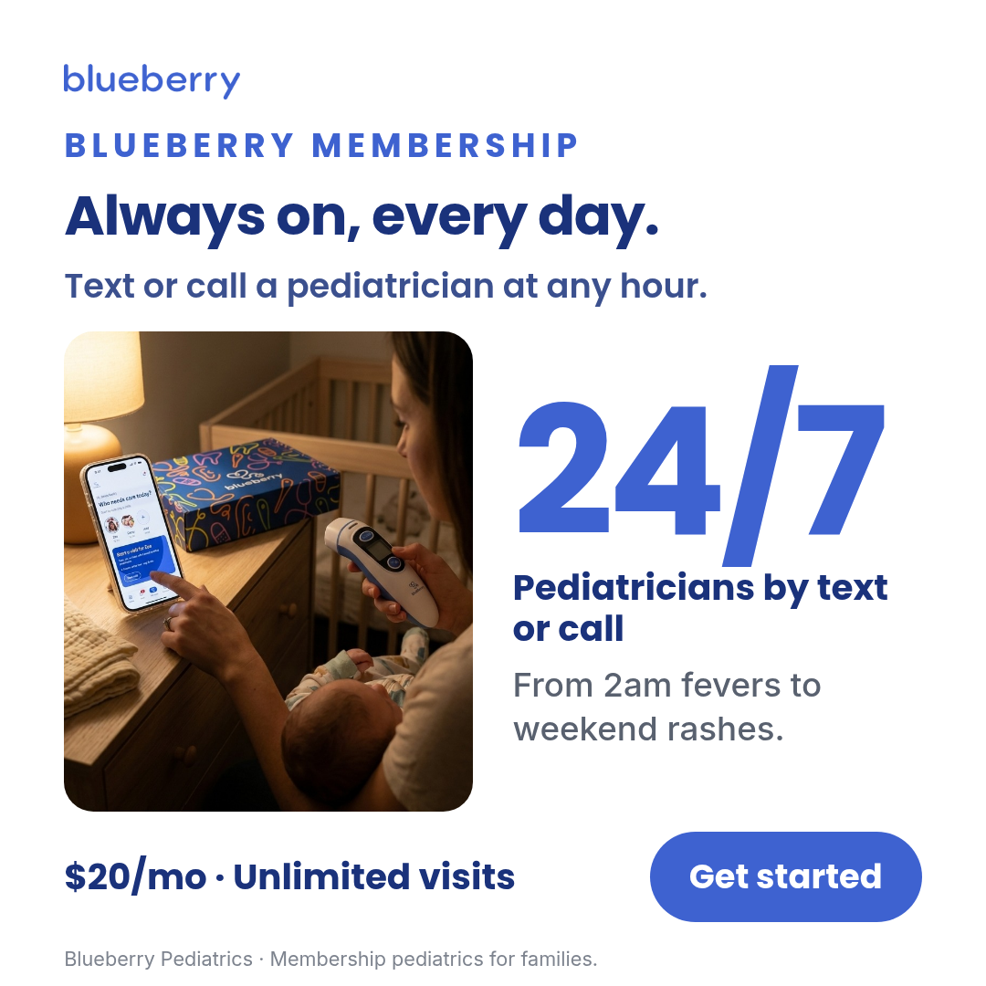
Image templates
Static creative templates rendered via headless Chromium. Each template has 1+
layouts × 3 aspect ratios (1:1, 4:5, 9:16). The thumbnail shows the canonical
default layout at 1:1 — expand "Show all renders" for the full layout × aspect grid.
The matcher in email-screenshot-to-template uses these renders for
competitor-ad triage.
Quick jump · 32 templates
ad-creative
1 layoutMeta-ready ad creative with headline, subhead, and CTA over a branded gradient.
Layouts: default
Show all 3 renders
Full description
Meta-ready ad creative with headline, subhead, and CTA over a branded gradient. Supports 1:1, 4:5, and 9:16.
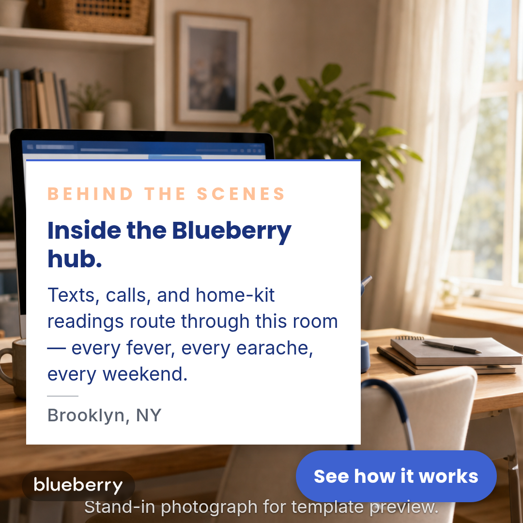
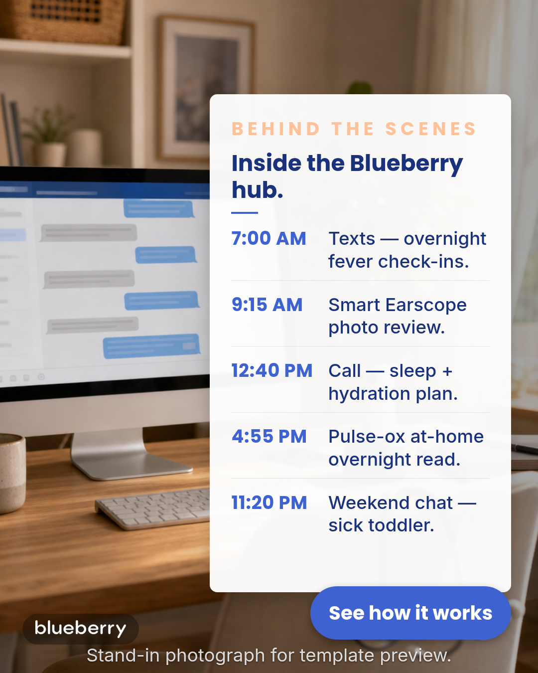
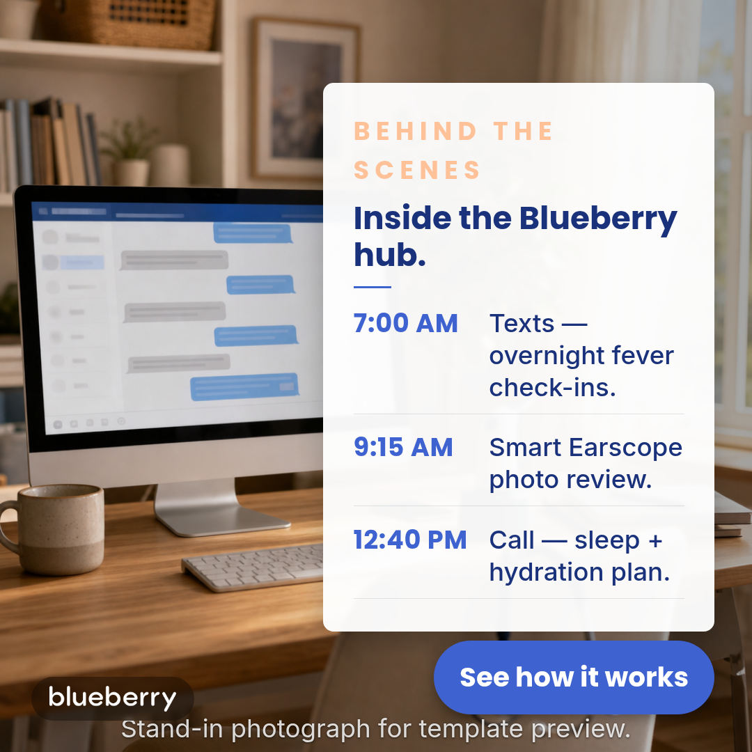
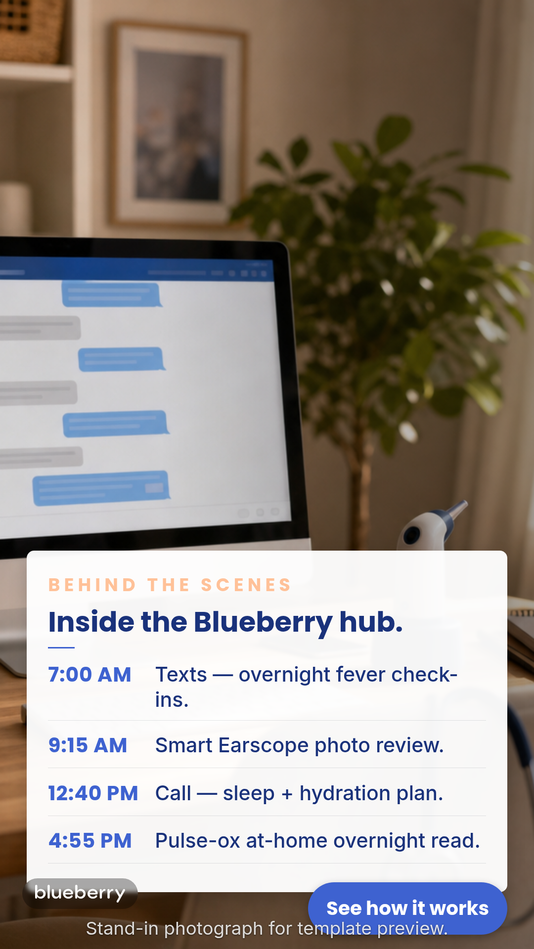
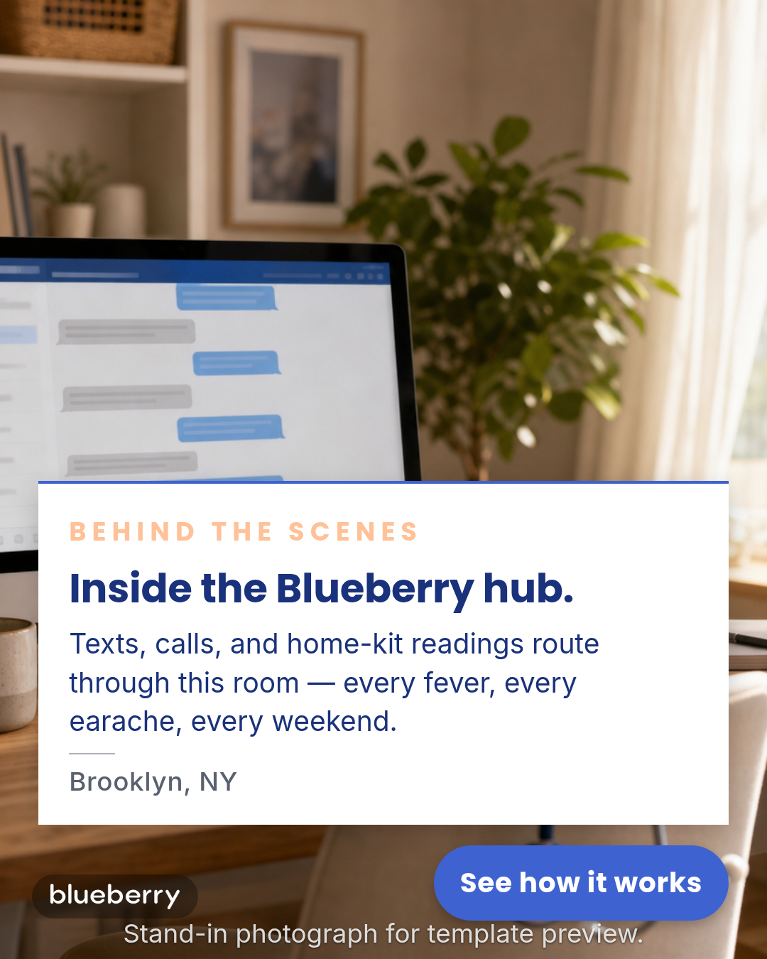
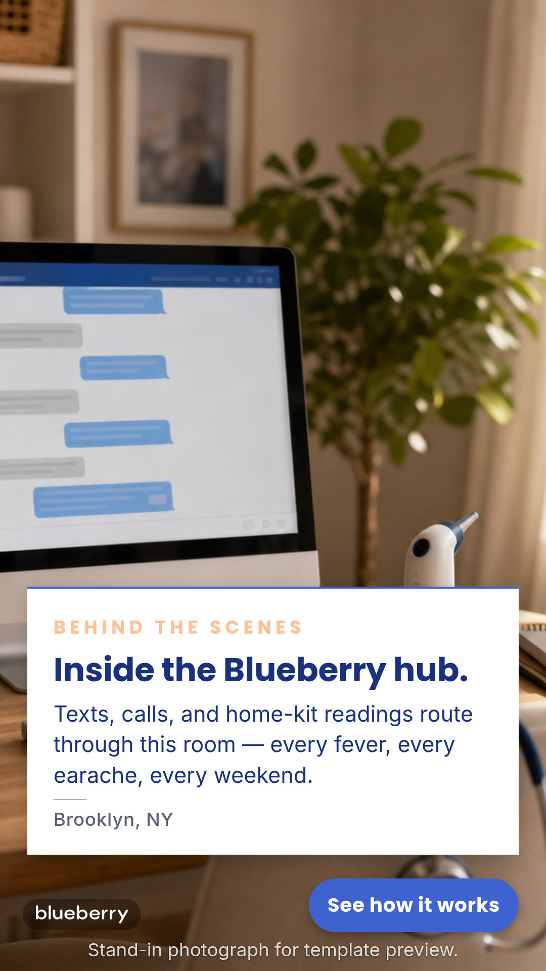
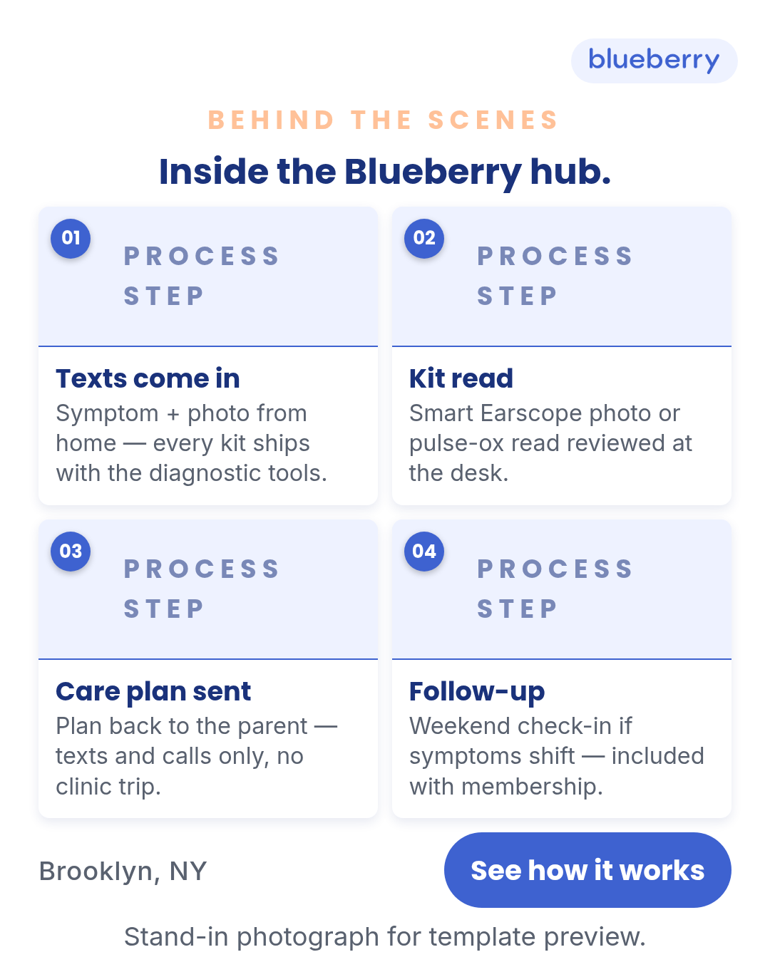
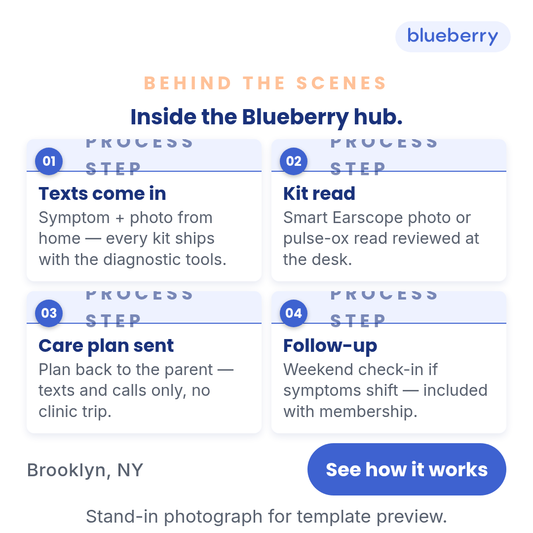
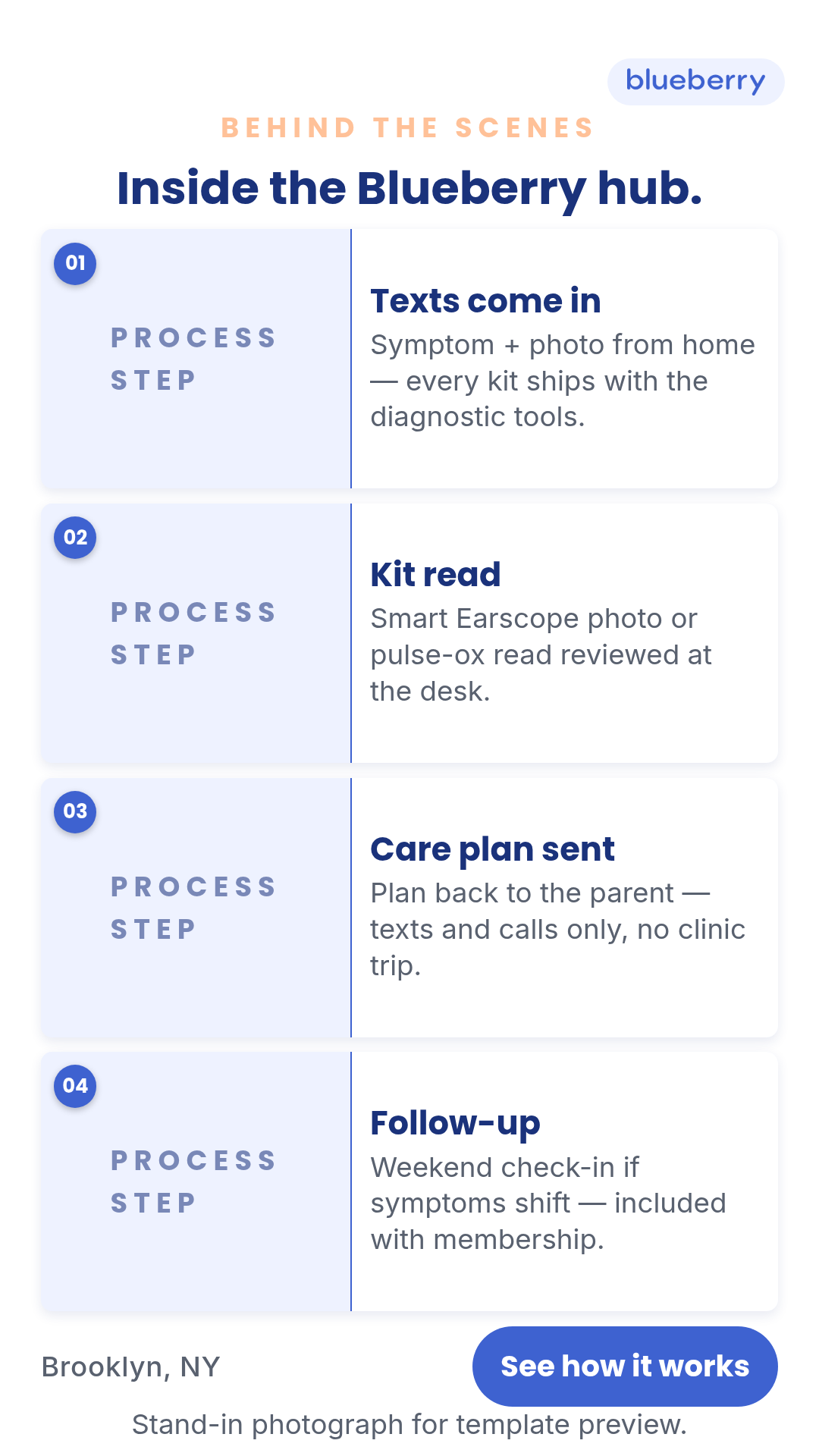
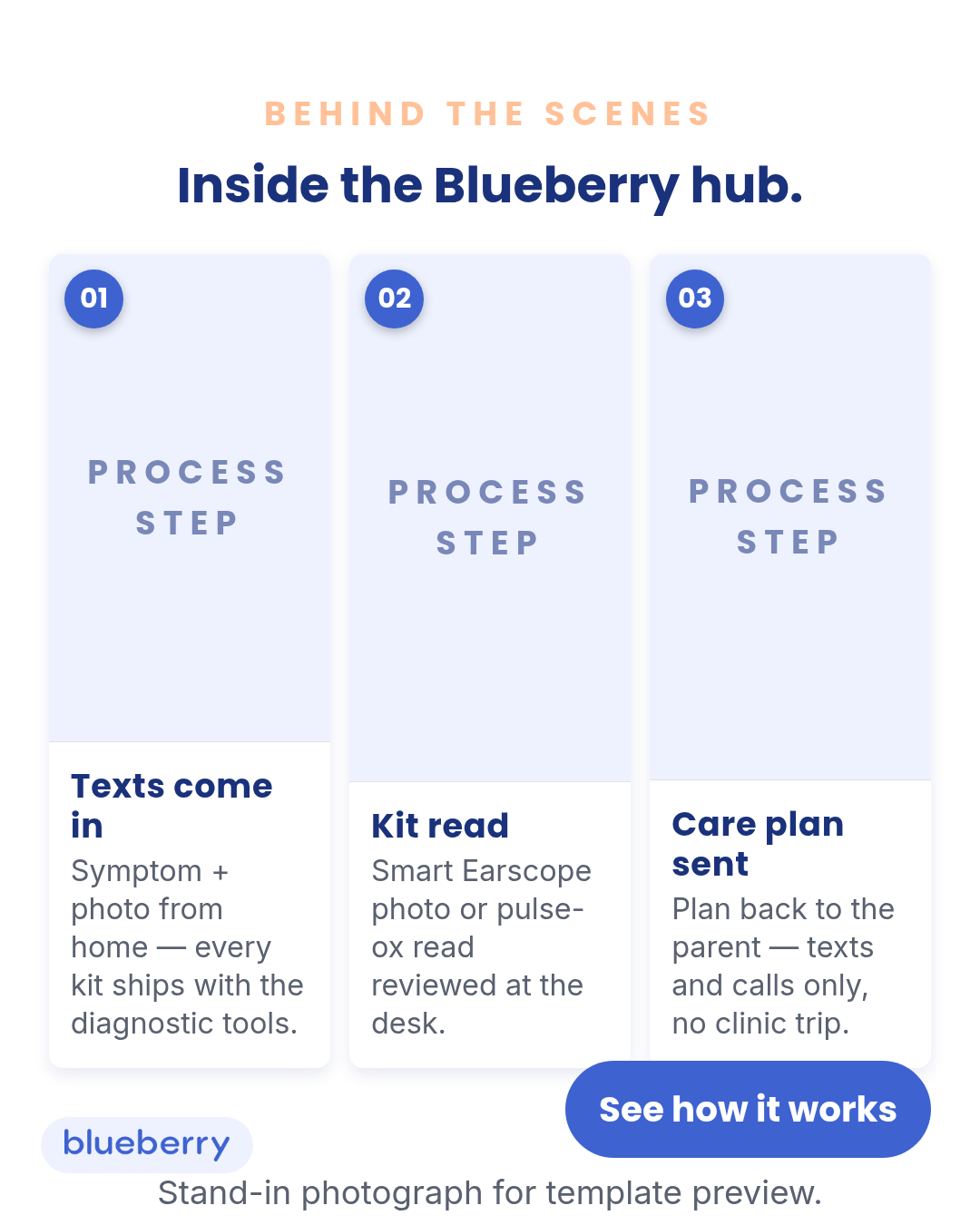
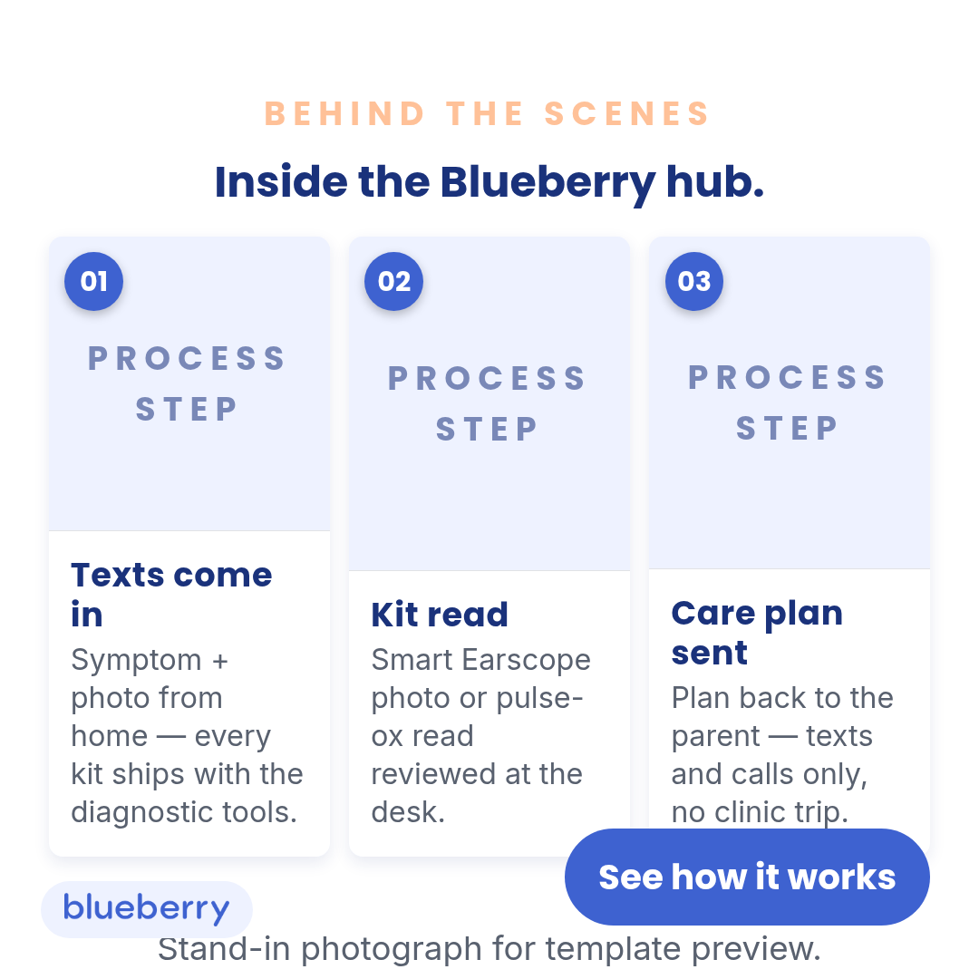
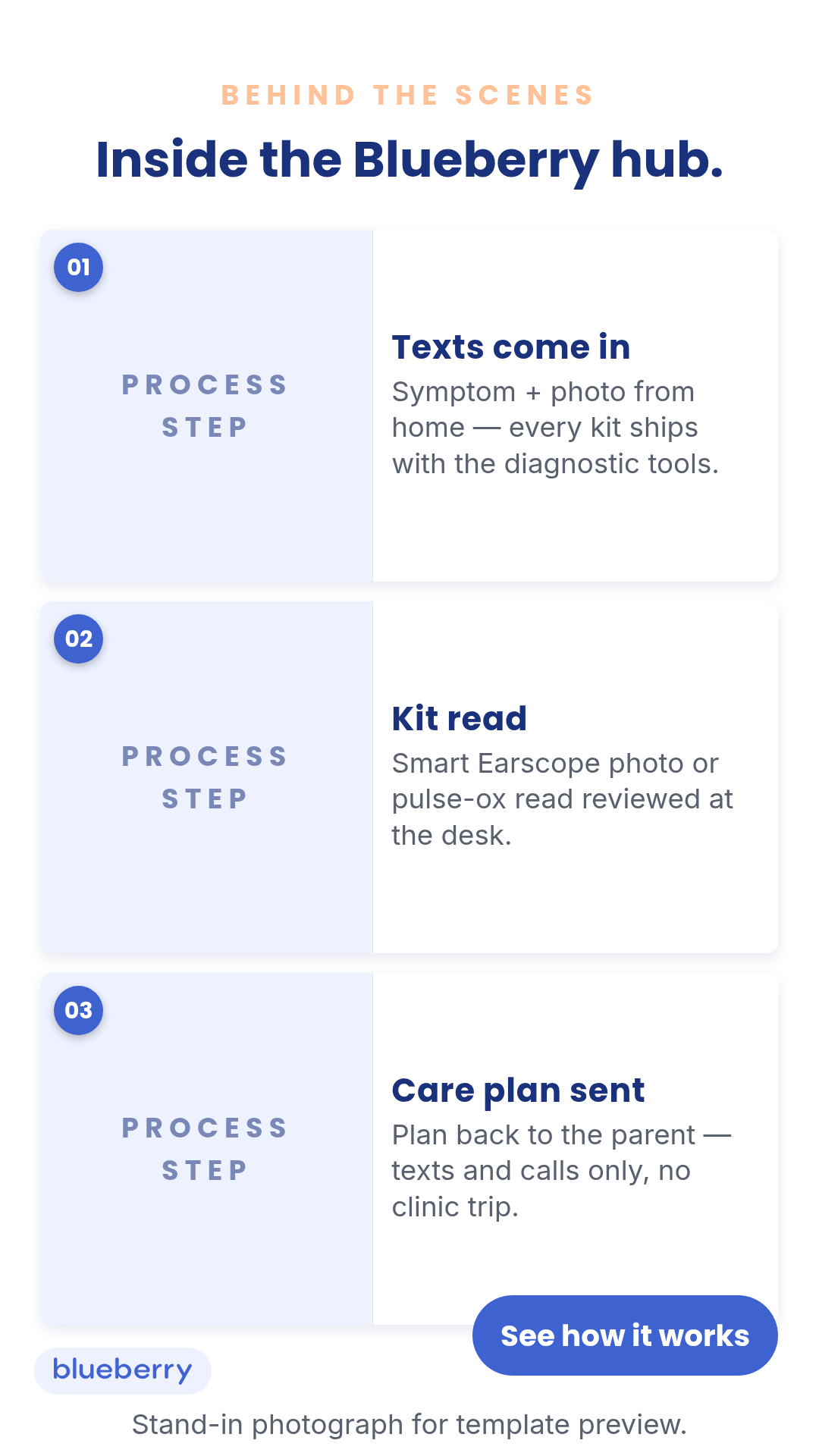
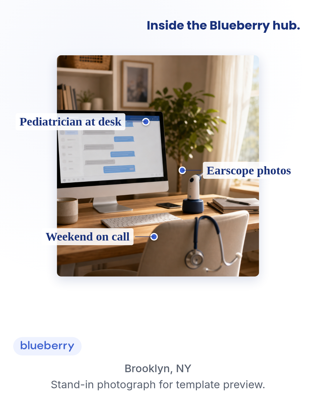
behind-the-scene
5 layoutsBehind-the-scene — operator/workplace/process glimpse.
Layouts: caption-cardprocess-striptag-calloutagenda-overlaycontact-sheet
Show all 15 renders
Full description
Behind-the-scene — operator/workplace/process glimpse. Motion H&W #6 spend-use scale format. Single template with 5 layouts (caption-card, process-strip, tag-callout, agenda-overlay, contact-sheet) × 3 aspect ratios. Differentiation guardrails: operator/workplace photo (NOT customer/peer photo — use `ugc-overlay`); unnamed process visibility (NOT named-customer outcome — use `case-study`); the operation, often anonymous (NOT a named individual — use `founder`); photographic, not diagrammatic (NOT data-density — use `infographic`); editorial caption chrome, not platform UI (NOT post-inside-platform — use `social-post-mockup`); never foreground 'Dr.' badges or medical-authority framing — that routes to `pediatrician-expert`. Compliance: no PHI in frame; staff identifiability requires release; describe the process, never claim a clinical outcome. Multi-photo layouts (process-strip, contact-sheet) iterate ctx.photos[]; single-photo layouts read ctx.photo. Gate F (Naive-Scroller Read) on chassis defaults — the workplace chassis is process-visibility, not price-claim, so F1 (price anchor) typically does not apply. F2 (capability anchor) IS load-bearing: when the caption or agenda names a care capability (fever-handling, ear pain, weekend availability), the same screen must carry a mechanism anchor (home-kit reads, Smart Earscope, pulse-ox, texts-and-calls channel). Chassis defaults thread the mechanism into the caption + agendaItems + photos[] step descs so every layout renders anchored. Default copy is Pass-A-thru-F clean: no video / video-call language (Gate A — pediatric care is text/call only), no MCO/employer-benefit framing (Gate B — DTC consumer ask, CTA is 'See how it works' not 'Check my benefit'), no trial language (Gate C), no specific diagnoses or outcomes in agenda labels (Gate D — symptoms only, never diagnoses), no FB-flagging language and no in-creative 'Sponsored' label (Gate E — platforms auto-render that), and mechanism anchors present on every screen (Gate F).
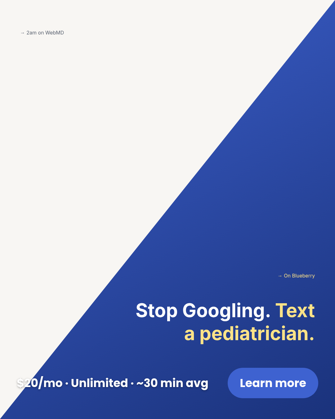
billboard
5 layoutsBillboard — Motion H&W spend-use scale format (#10 in H&W, #3 in Fashion & Apparel).
Layouts: giant-headlineword-stacksingle-word-emphasistwo-line-contrastheadline-with-inset
Show all 15 renders
Full description
Billboard — Motion H&W spend-use scale format (#10 in H&W, #3 in Fashion & Apparel). One bold claim dominates the frame; OOH billboard rhetoric translated to paid-social statics. Single template with 5 layouts (giant-headline, word-stack, single-word-emphasis, two-line-contrast, headline-with-inset) x 3 aspect ratios (1:1, 4:5, 9:16). Pick the composition with the `layout` prop. Differentiation guardrails: makes a bold CLAIM (not a bold number like offer-first-banner); declarative/public voice (not intimate/first-person like letter); no simulated platform chrome (vs social-post-mockup); no narrative arc (vs case-study). All five layouts share one prop schema so meta-ad-creative can bulk-fill across layouts without branching.
boundary-blocks
2 layoutsBoundary-blocks — defines the brand by what it ISN'T paired with what it IS.
Layouts: not-is-pairsx-vs-check-list
Show all 6 renders
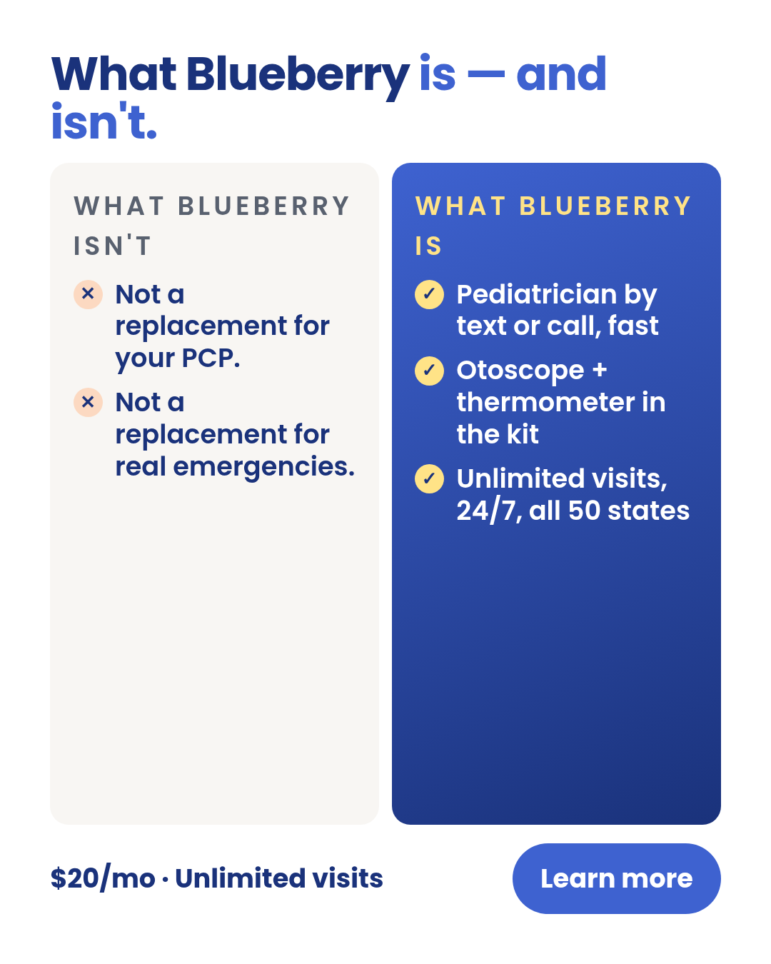
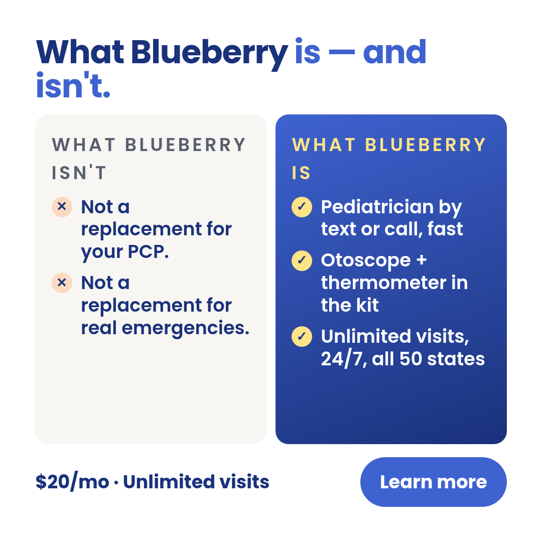
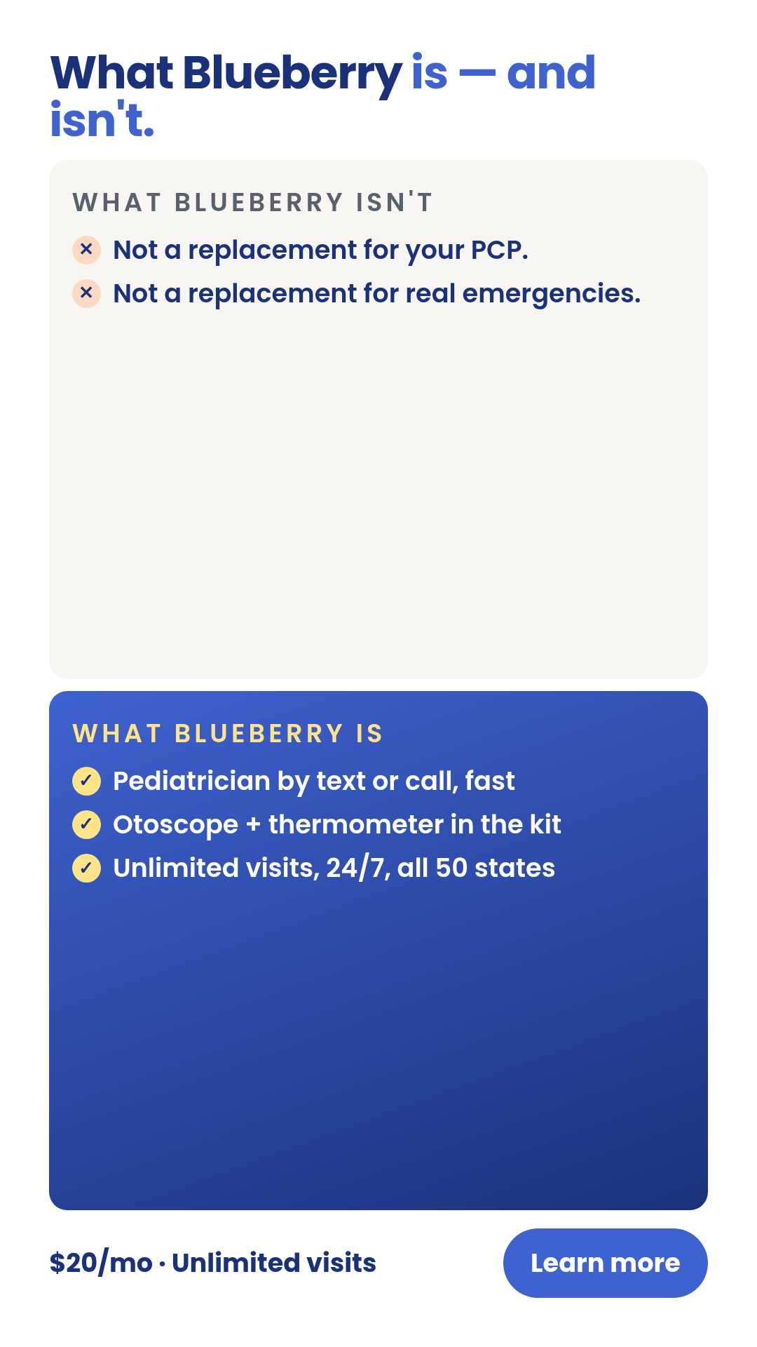
Full description
Boundary-blocks — defines the brand by what it ISN'T paired with what it IS. Single-entity scope (NOT cross-entity contrast — use `comparison-vs` for that). One template with 2 layouts (not-is-pairs, x-vs-check-list) × 3 aspect ratios. Differentiation guardrails: defines a SINGLE entity (the brand) by its boundaries; NO ranking among options (use `decision-stack`); NOT a pain-amplification ad (use `problem-agitation`); educational, teaching the audience what category fit looks like. Source: extracted from TR-PR-03 (boundary statement) — peace-of-mind-ads-v3 TRIAGE renders.
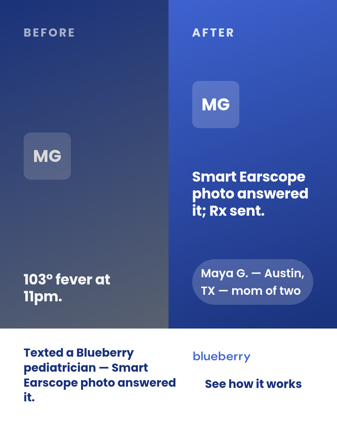
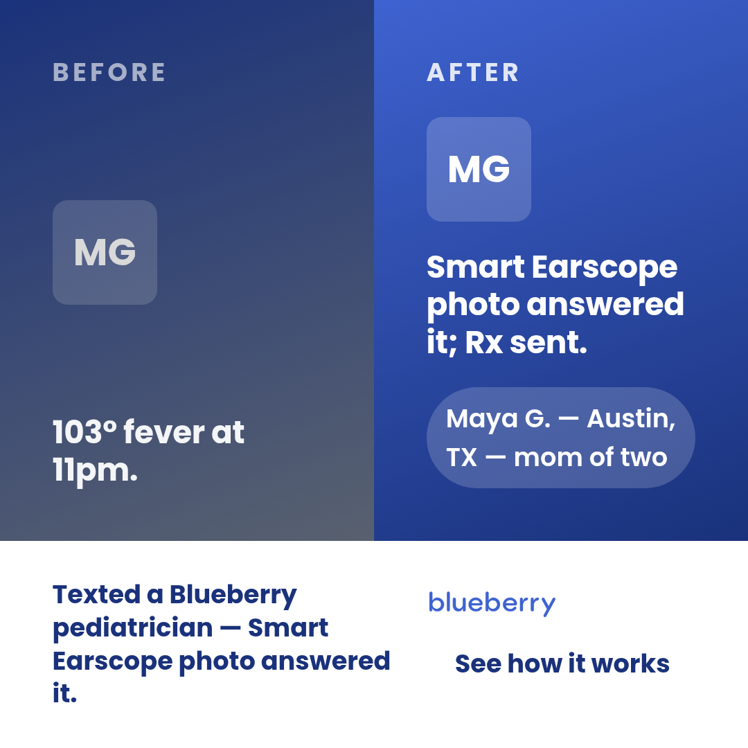
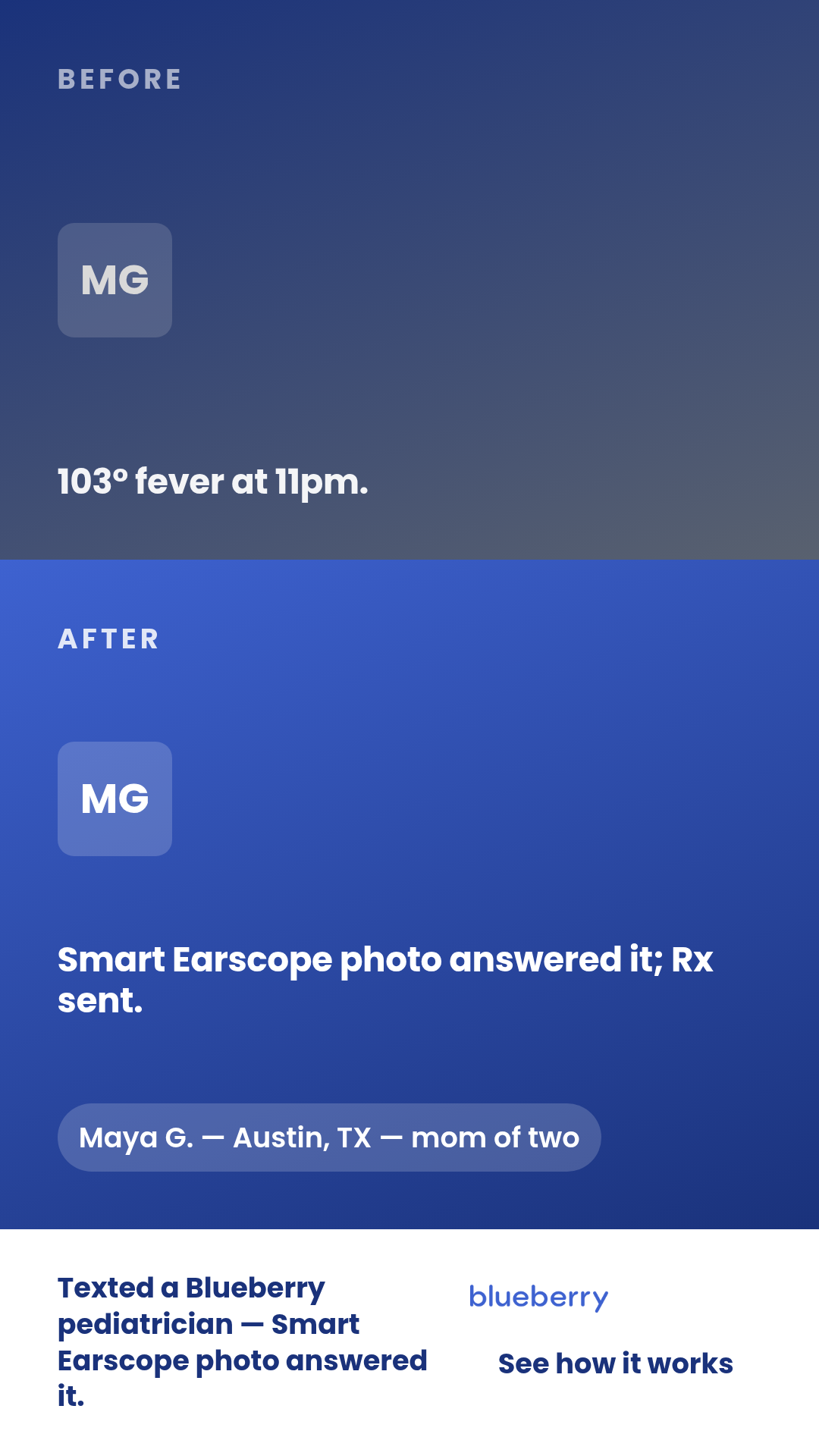
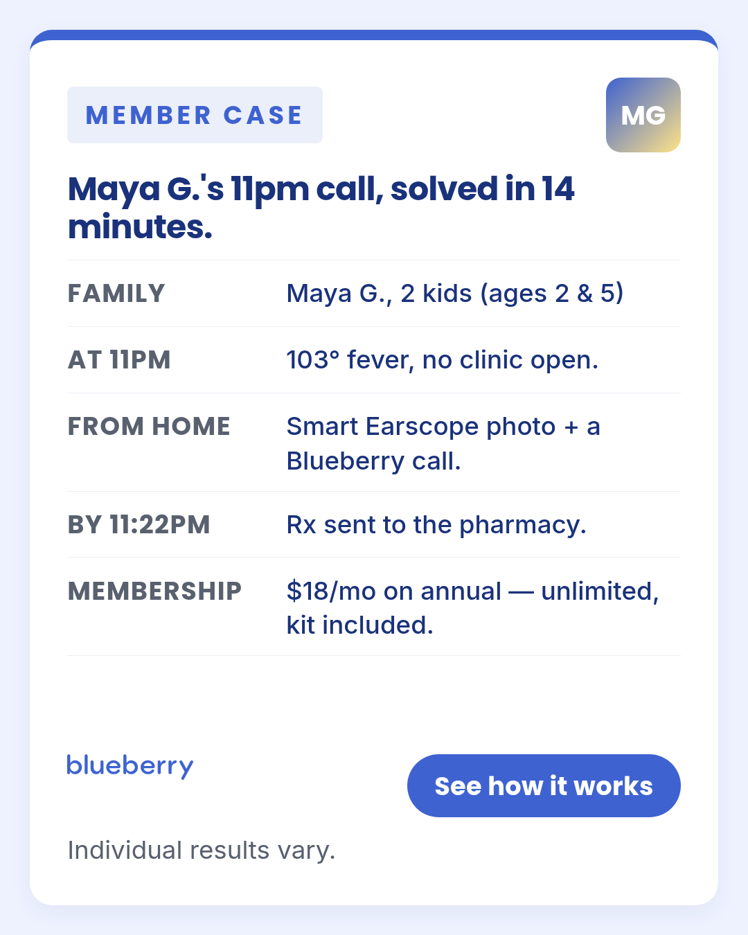
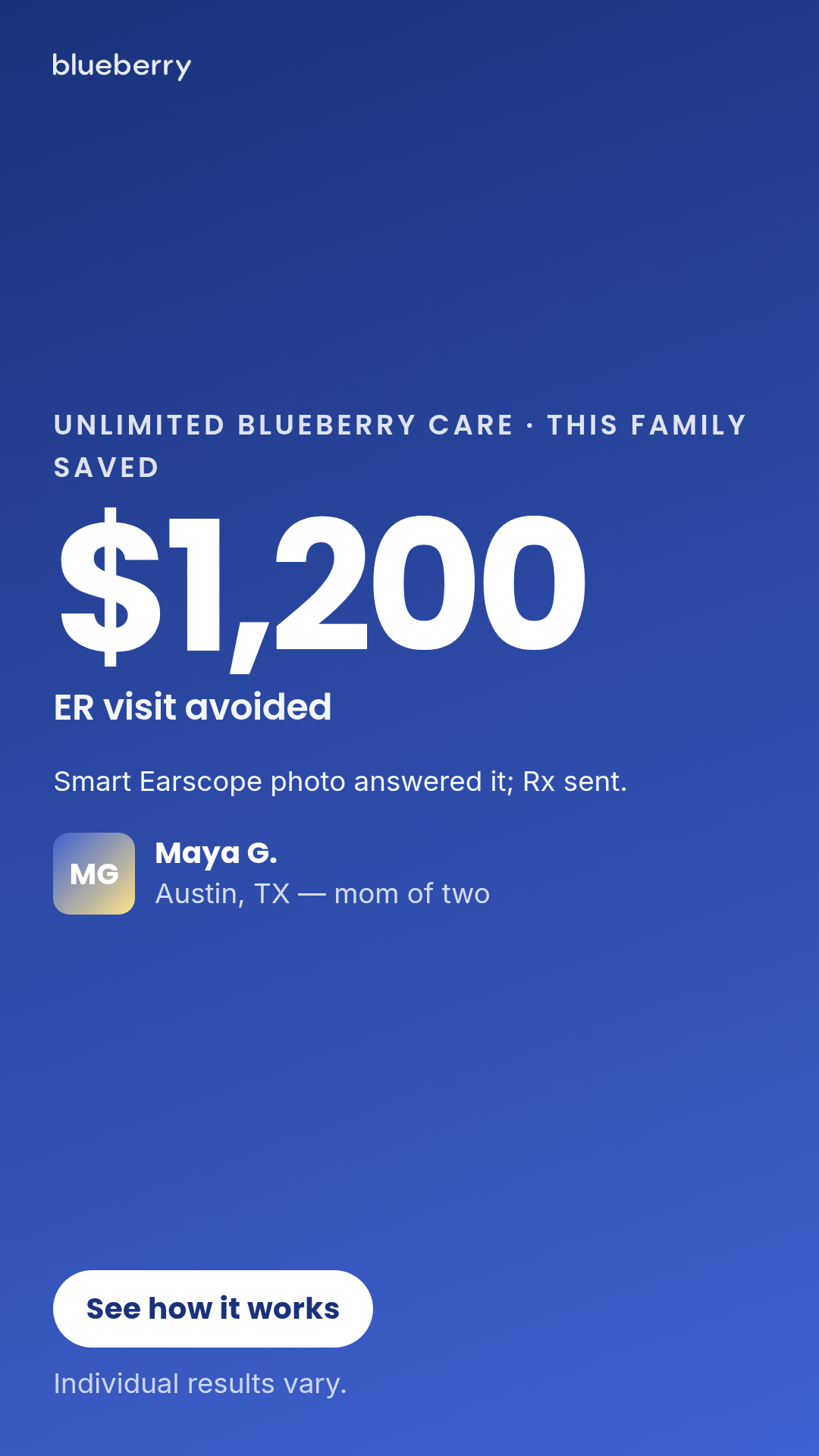
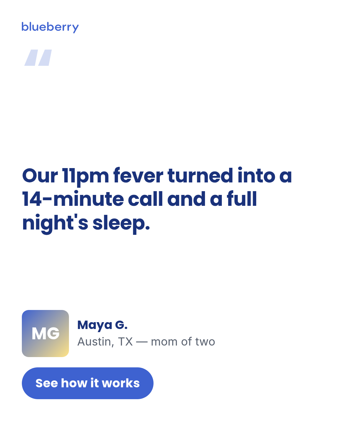
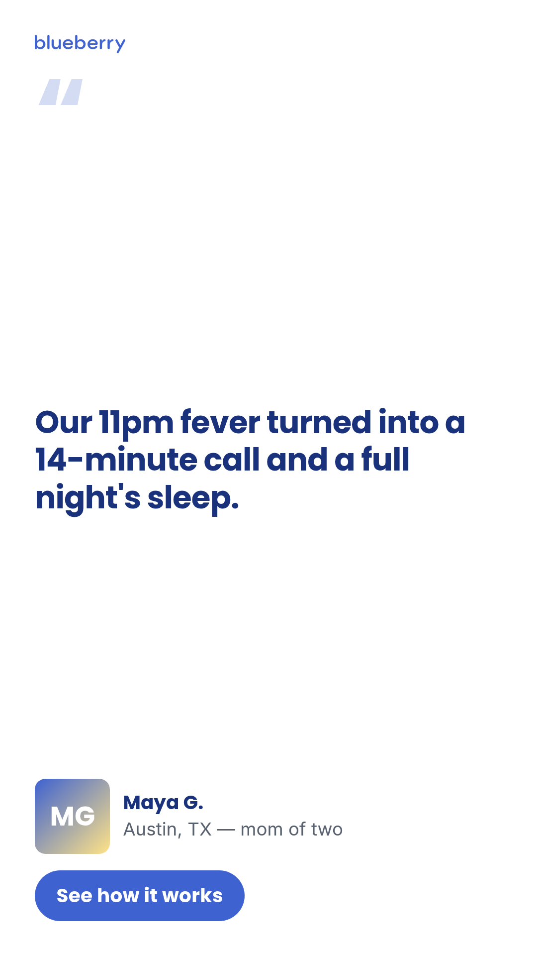
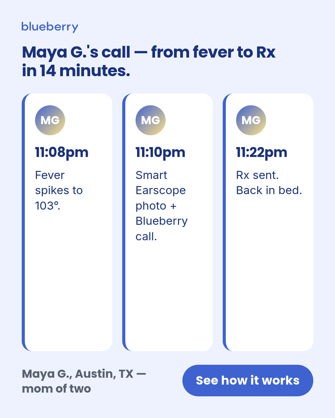
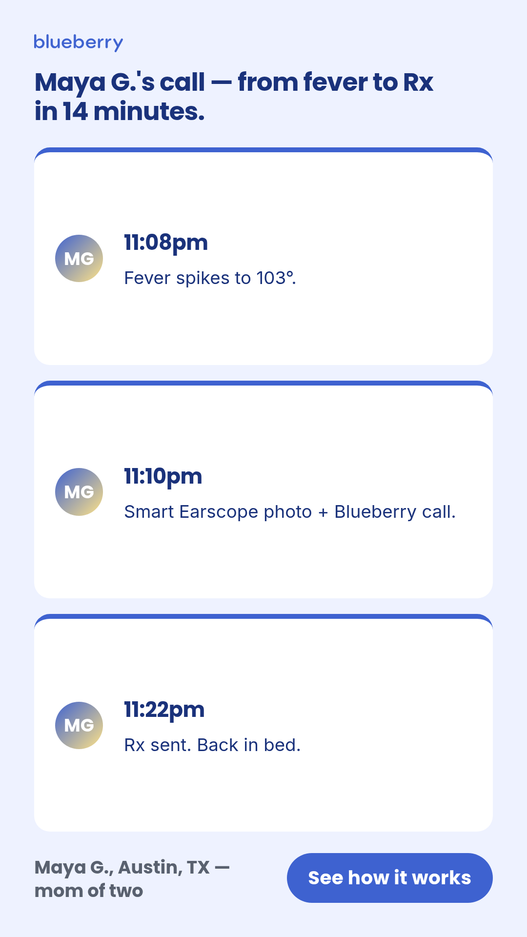
case-study
5 layoutsCase study (Motion H&W #4 spend-use) — named-protagonist proof ads.
Layouts: pull-quotemetric-ledbefore-aftertimeline-stripdata-card
Show all 15 renders
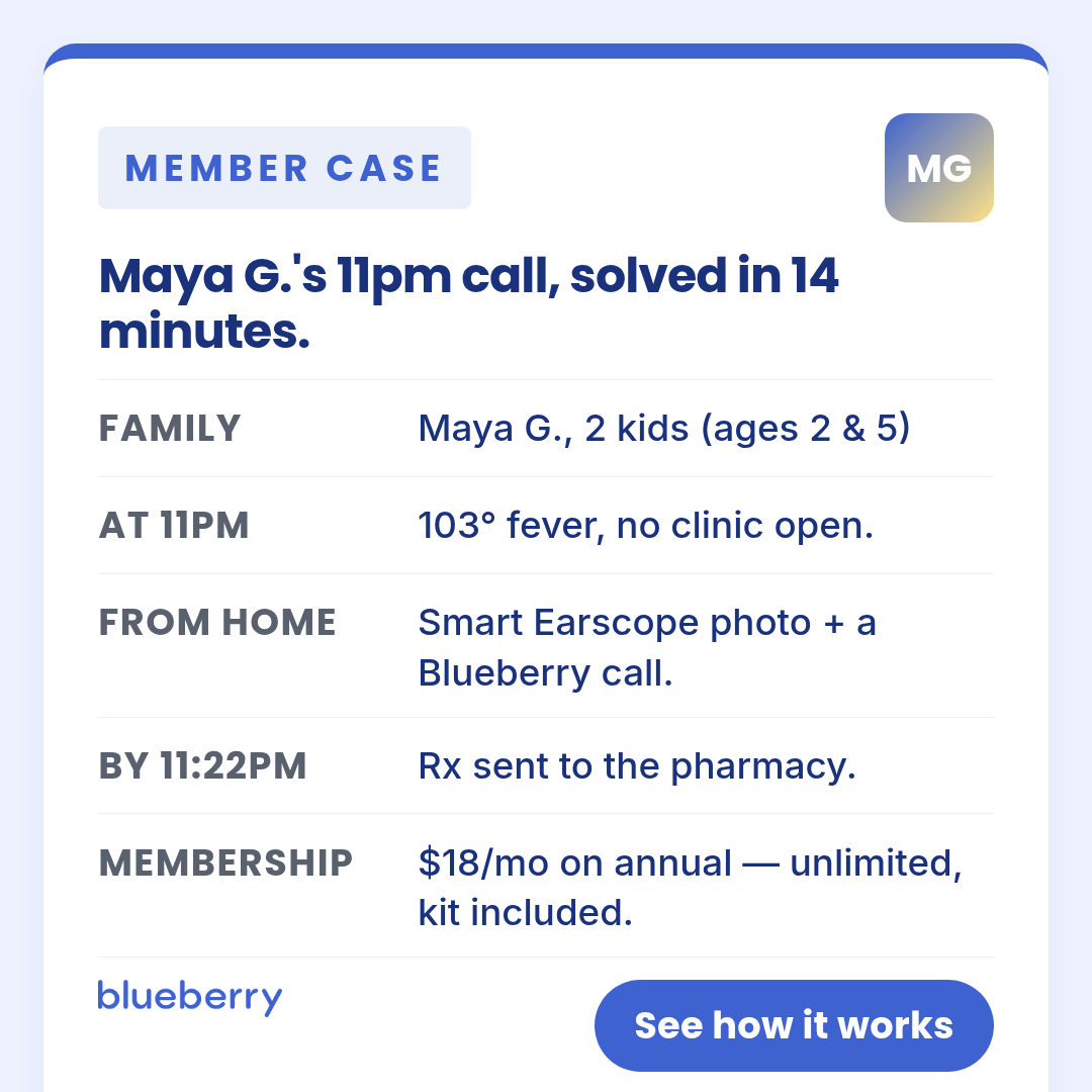
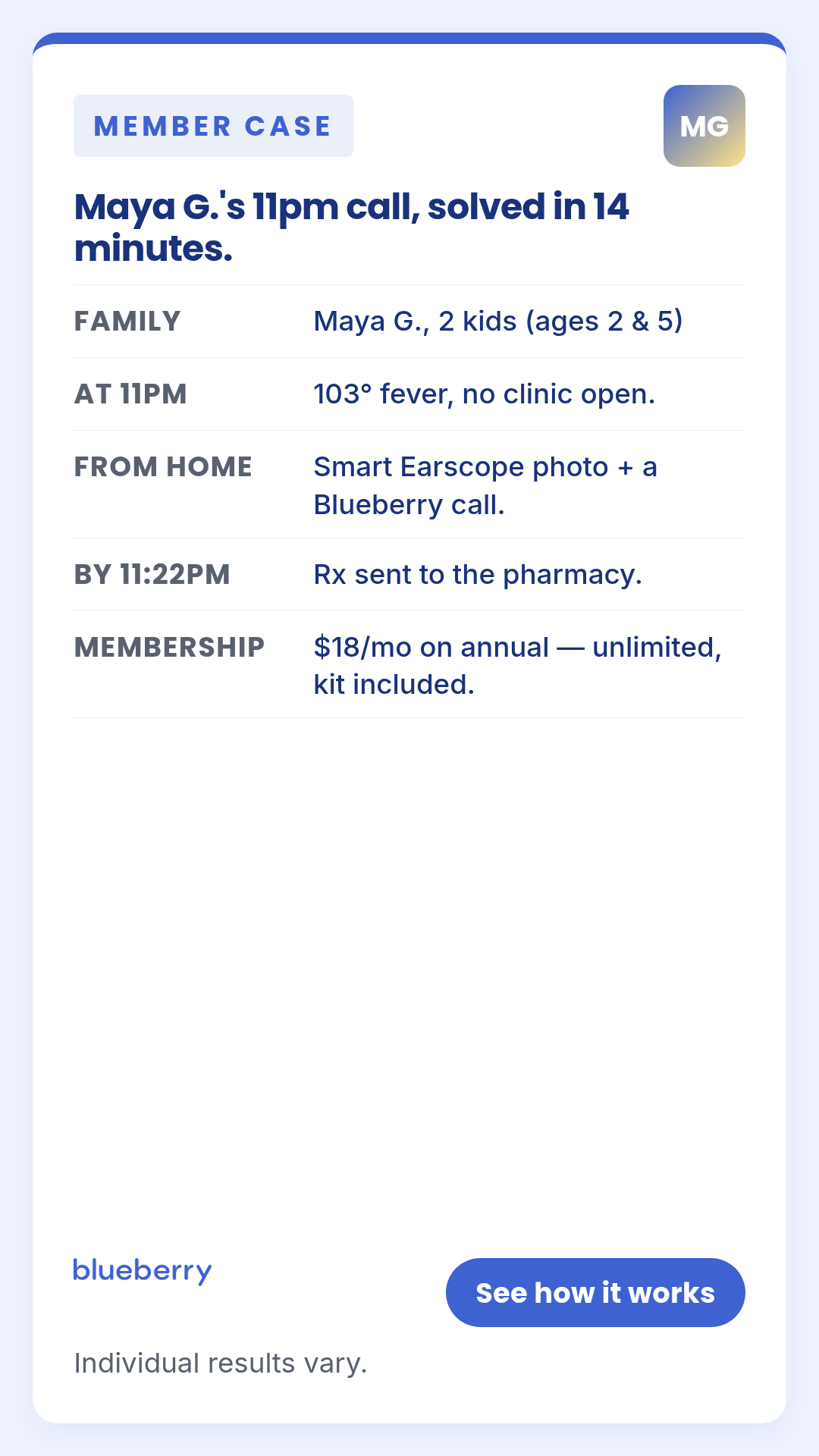
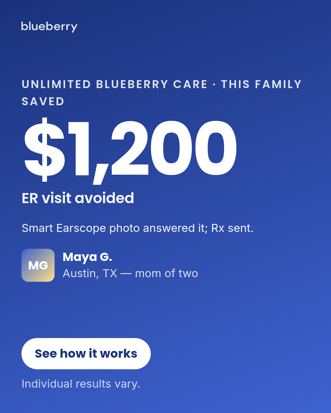
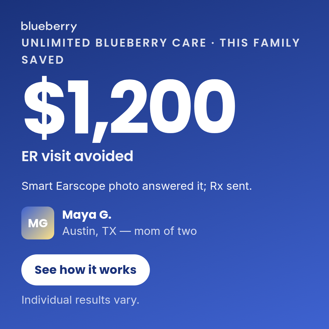
Full description
Case study (Motion H&W #4 spend-use) — named-protagonist proof ads. Single template with 5 layouts (pull-quote, metric-led, before-after, timeline-strip, data-card) × 3 aspect ratios (1:1, 4:5, 9:16). Layouts differ on structural dimension — use `layout` prop to select. Differentiation guardrails (see template.html header comment): no platform chrome (vs Social post mockup), third-person narrative only (vs Letter), requires protagonistName for before-after (vs Transformation), outcome-not-offer for metric-led (vs Offer-first banner). Ad-copy compliance contract — Gates A–F walked on every default copy string: Gate A (business model): text/call only — NEVER 'video'. The chassis describes 'texted a Blueberry pediatrician' and 'Smart Earscope photo' as the mechanism. Earlier defaults said 'Video'd with Dr. Chen' and 'On video with Dr. Chen' — REMOVED. Gate B (DTC, not MCO/payer): the only price line is '$18/mo on annual' (DTC consumer price). No 'covered by your plan' framing. Gate C (no trial language): clean — the ask is membership. Gate D (specific claims): diagnosis language ('ear infection diagnosed') REMOVED per imessage-thread-card precedent (would otherwise need Sage sign-off). Retained: '$1,200 ER visit avoided' as a retrospective outcome (defensible — pediatric ER averages $1,389 per AHRQ 2017) paired with finePrint 'Individual results vary.' Specific times ('14 minutes', '11:08pm → 11:22pm') are protagonist-specific case detail, not category claims. Gate E (FB policy / no Sponsored language): clean. Gate F (Naive-Scroller Read — composition-level anchors): every layout carries both load-bearing anchors on the same screen: - F1 price anchor: metric-led uses `metricLabel` 'Unlimited Blueberry care · This family saved' as the eyebrow right above the $1,200 price — subscription-scope anchor sits visually adjacent. data-card uses the Membership row '$18/mo on annual — unlimited, kit included' for both F1 (price) and its subscription-scope anchor. Other layouts (pull-quote, before-after, timeline-strip) carry no explicit price line, so F1 does not trigger. - F2 mechanism anchor: every layout names 'Smart Earscope' so the capability claim is grounded — metric-led narrative ('Smart Earscope photo answered it'), before-after narrative-band + after-panel-body, timeline-strip step 2 ('Smart Earscope photo + Blueberry call'), data-card 'From home' row. pull-quote relies on the 'call' modality reference in the quote + brand mark. `metricLabel` is an optional override on the metric-led layout — defaults to 'This family saved' but ships customized as 'Unlimited Blueberry care · This family saved' so the F1 subscription anchor lives in the most-visible slot. Briefs can override per-render. Default imagery (Pass 4): the chassis has a `protagonistPhoto` slot but ships with `null` so the gradient + initials fallback renders. AI-generating a default face for a named protagonist ('Maya G.') would imply a specific real person — chassis defaults intentionally use the initials fallback so briefs that have a real parent photo override `protagonistPhoto` explicitly. Briefs without a real photo render with the initials gradient, which reads as 'this represents a real parent' rather than as a fabricated identity.
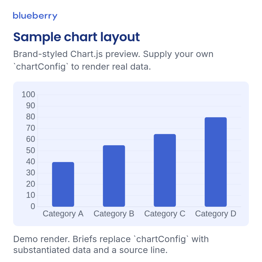
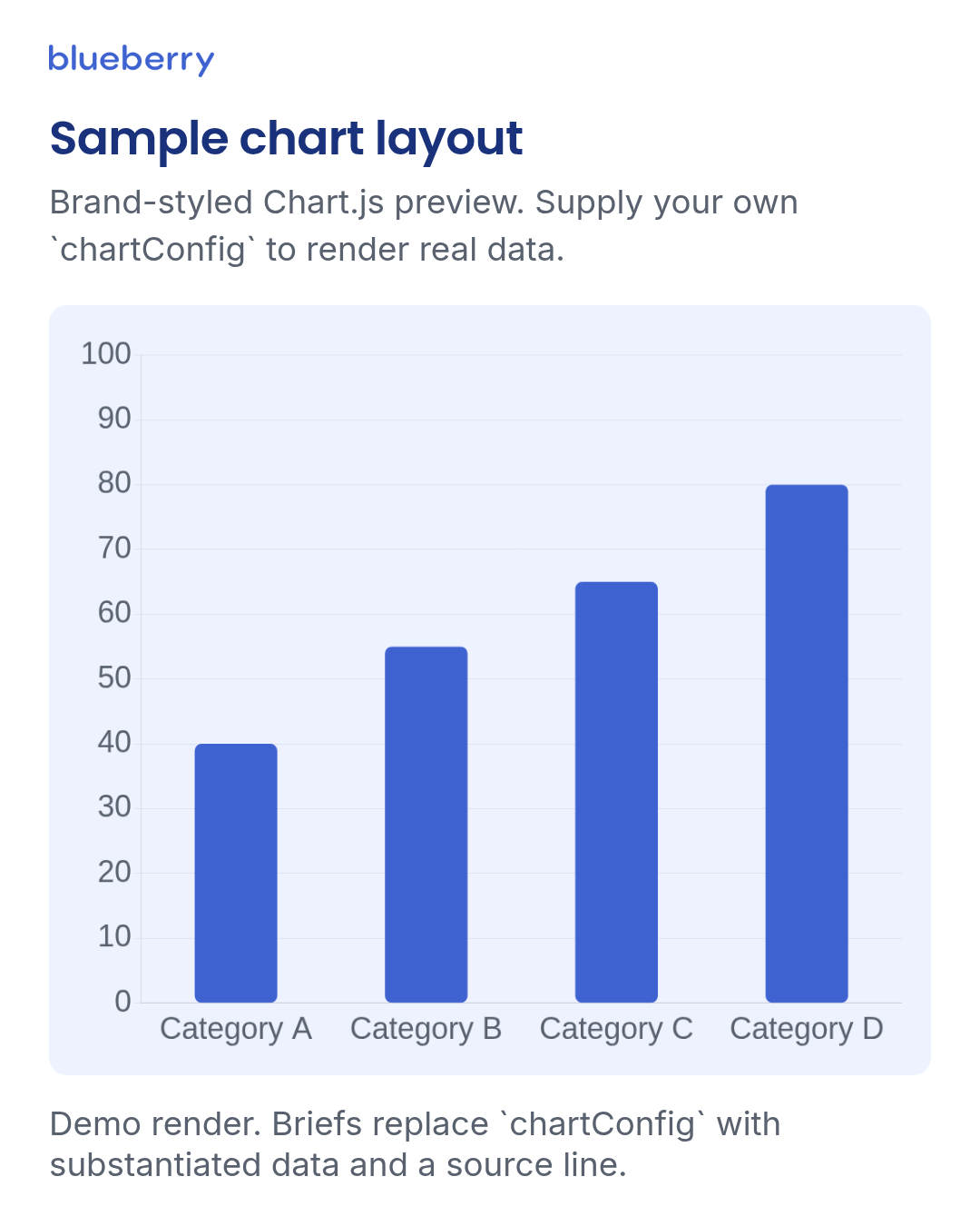
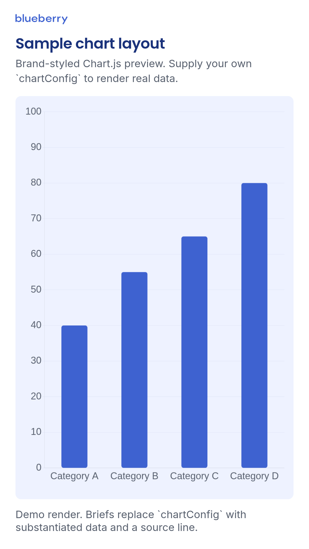
chart
1 layoutServer-side Chart.js chart exported as PNG.
Layouts: default
Show all 4 renders
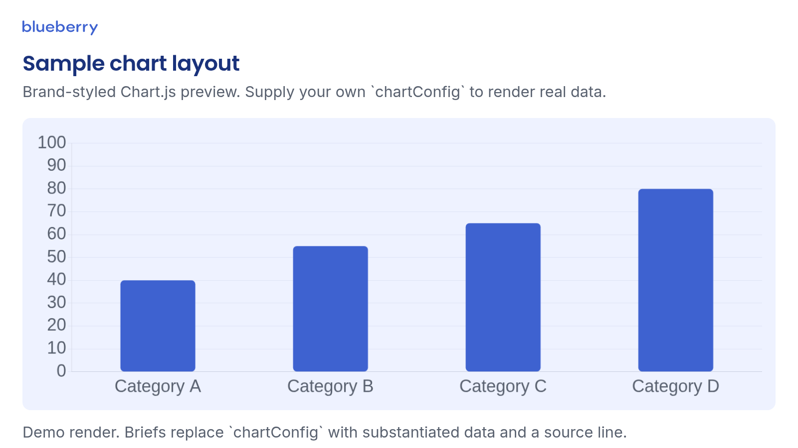
Full description
Server-side Chart.js chart exported as PNG. Pass a standard Chart.js config under `chartConfig`. Brand-default Chart.js typography + axis grids are injected at render time so callers don't need to restyle every chart. The defaults below render an obviously-illustrative sample chart — they are NOT a Blueberry outcome claim. Callers must pass a substantiated `chartConfig` (with source-line citation in the footnote slot) before rendering as a deliverable ad.
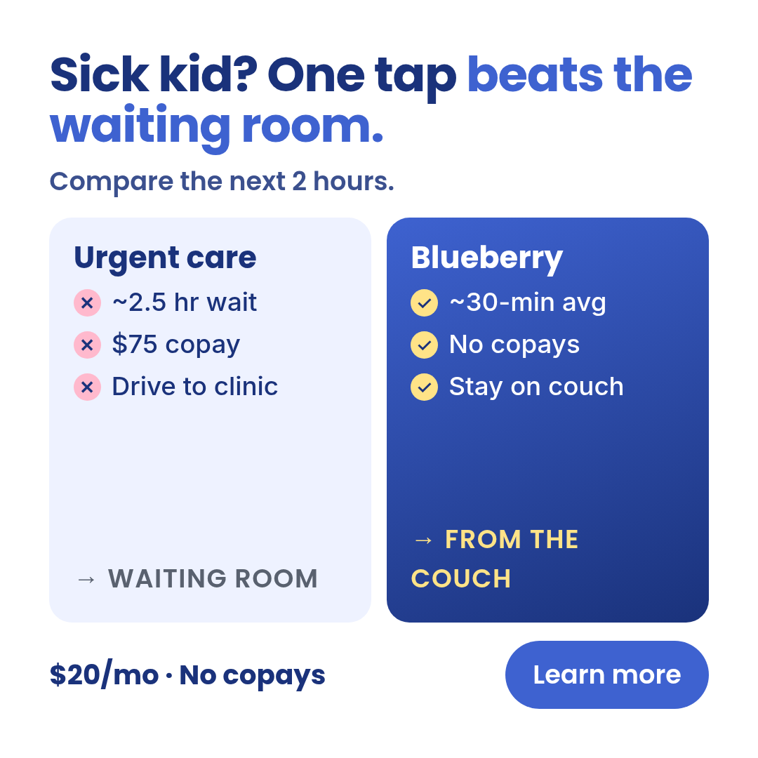
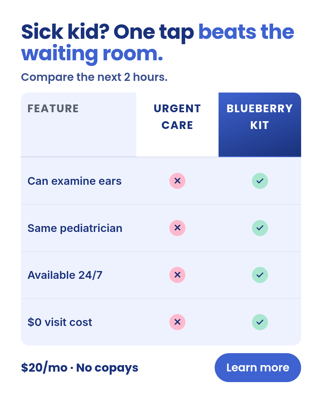
comparison-vs
4 layoutsComparison-vs — TWO OR MORE NAMED ENTITIES placed adjacent for direct contrast (Blueberry vs urgent care, vs nurse line, vs generic telehealth).
Layouts: two-column-vsn-by-n-gridhero-product-vscheckmark-x-table
Show all 12 renders
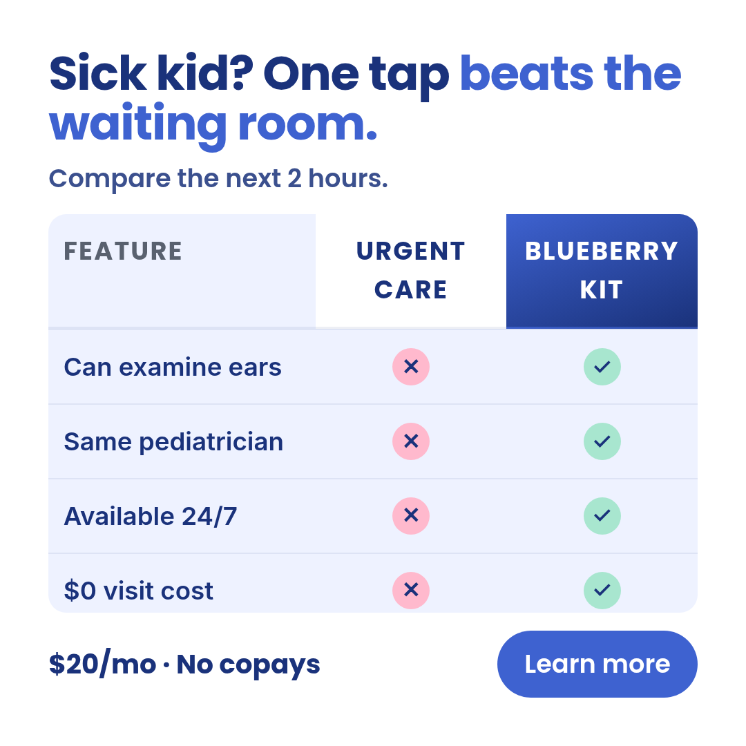
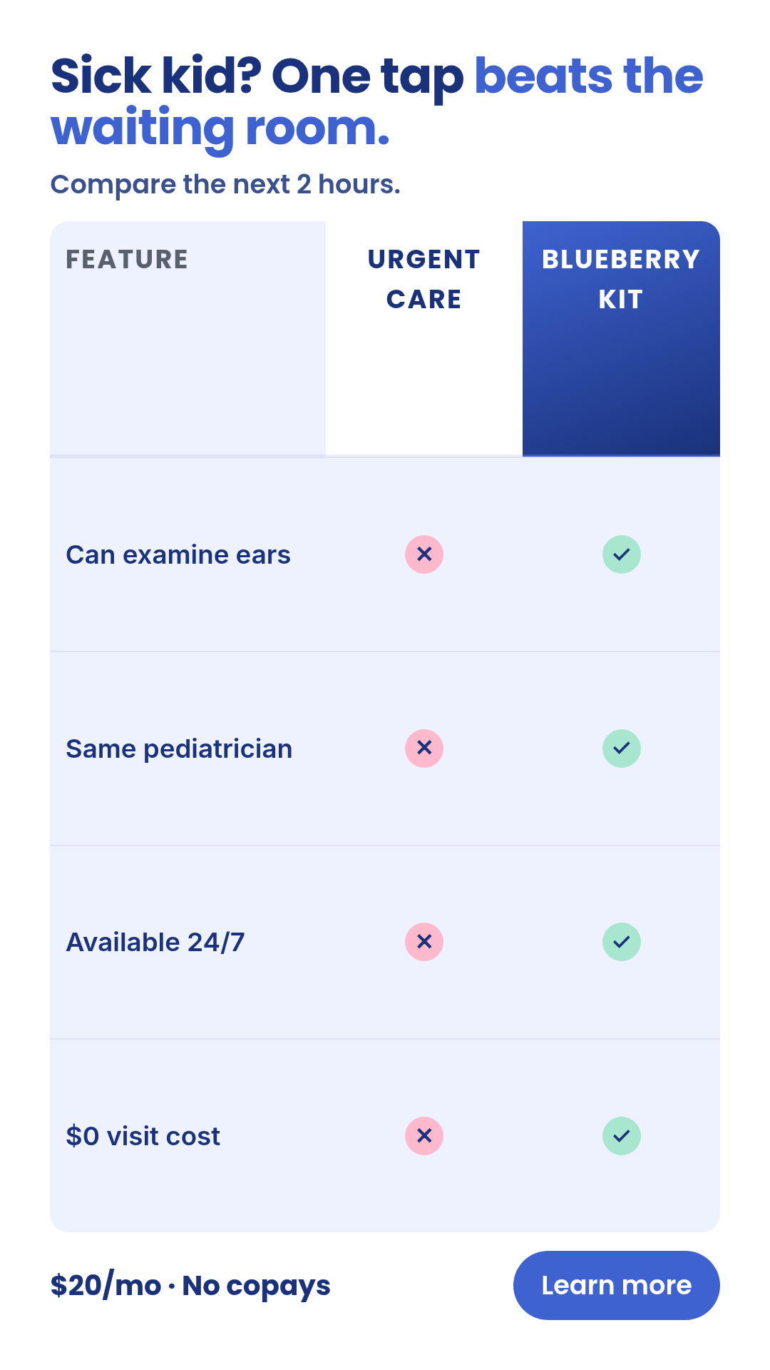
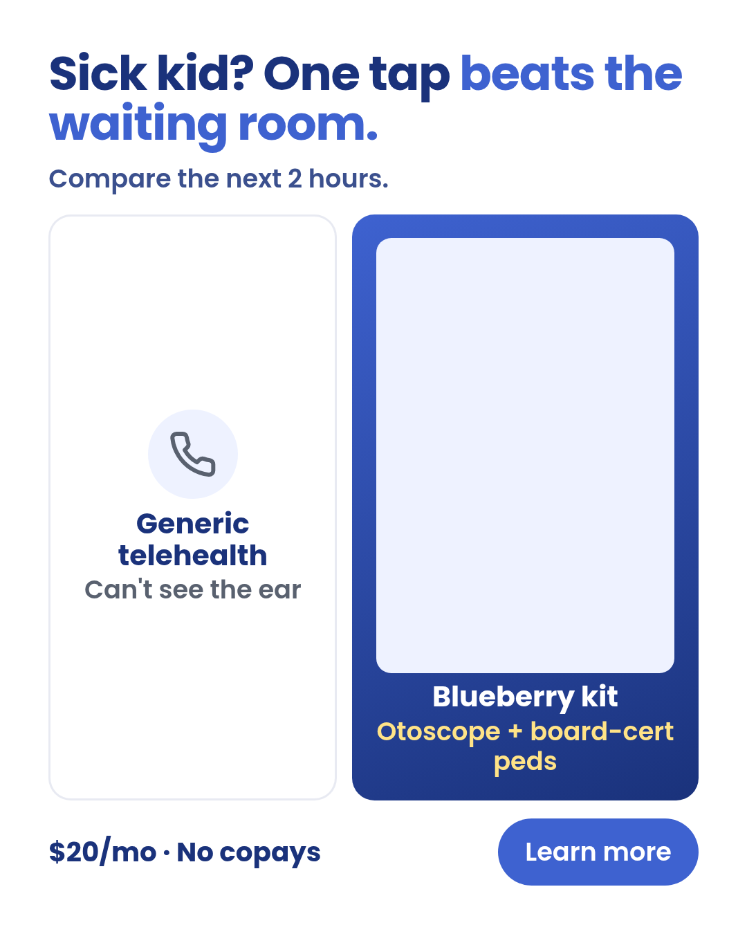
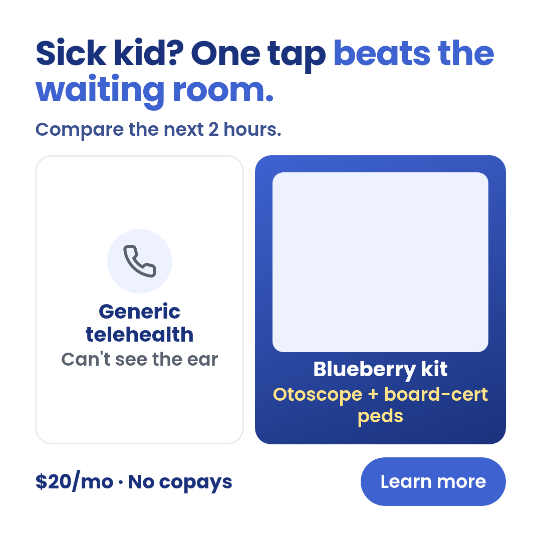
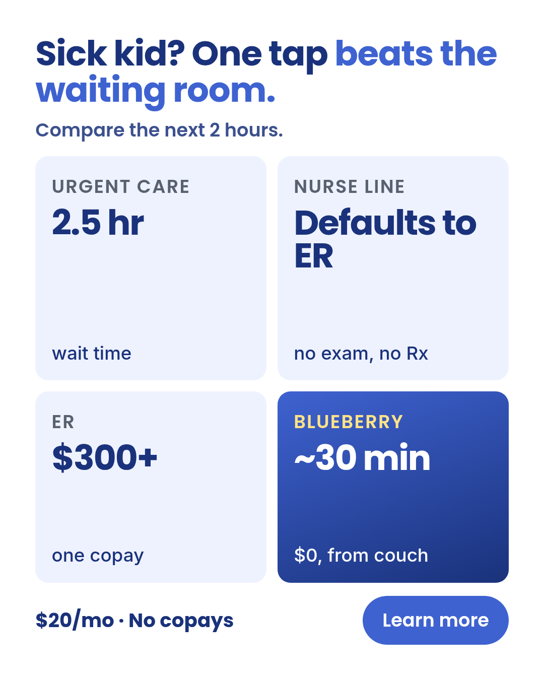
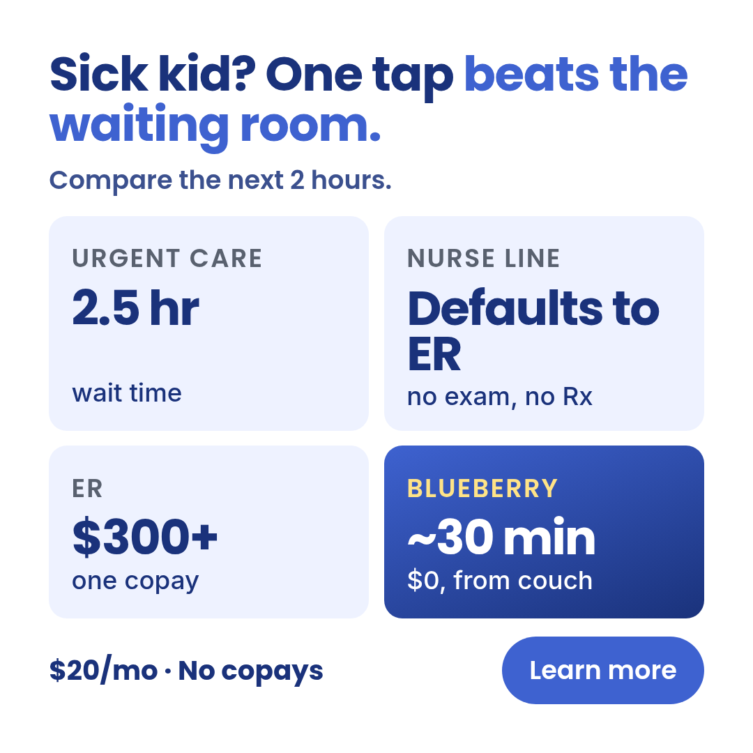
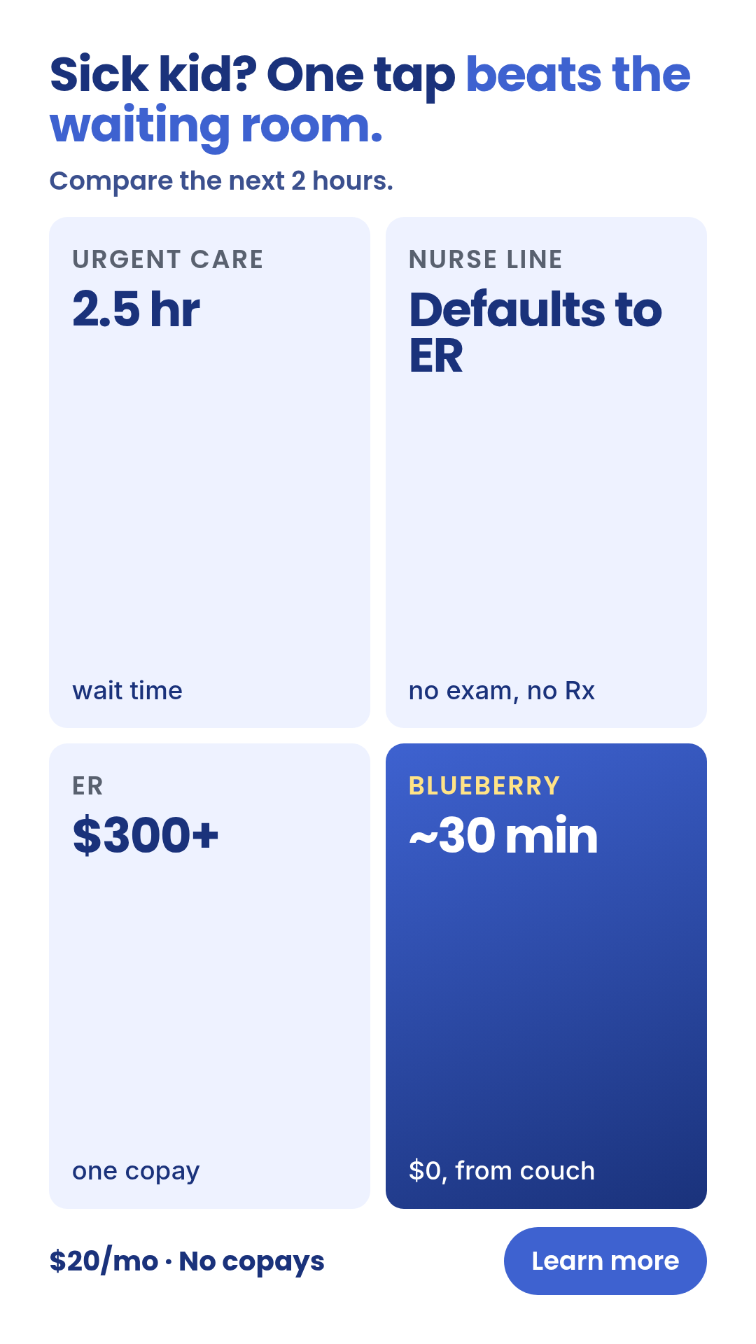
Full description
Comparison-vs — TWO OR MORE NAMED ENTITIES placed adjacent for direct contrast (Blueberry vs urgent care, vs nurse line, vs generic telehealth). One template with 4 layouts (two-column-vs, n-by-n-grid, hero-product-vs, checkmark-x-table) × 3 aspect ratios (1:1, 4:5, 9:16). Pick layout with the `layout` prop. Differentiation guardrails: cross-entity contrast (NOT one entity in two states — use `transformation` for that); NOT chaos vs calm on the same device (use `split-screen`); NOT a single hero claim (use `billboard`); NOT narrative proof (use `case-study`). All four layouts share a single prop schema so meta-ad-creative can bulk-fill across layouts without branching. Source: extracted from TR-SA-01 (waiting-room math), TR-SA-02 (nurse-line gap), TR-SA-03 (telehealth-without-otoscope) — peace-of-mind-ads-v3 TRIAGE renders.
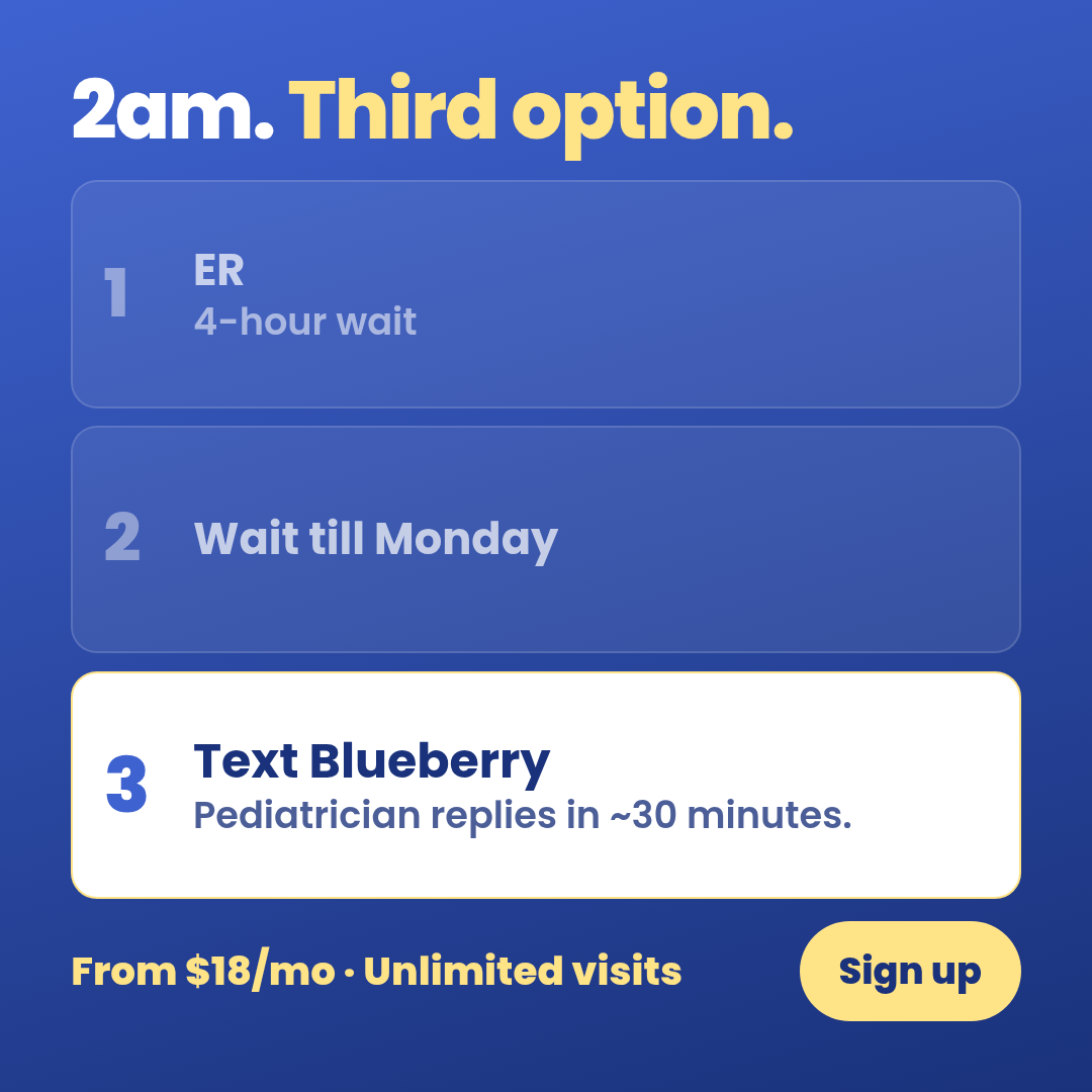
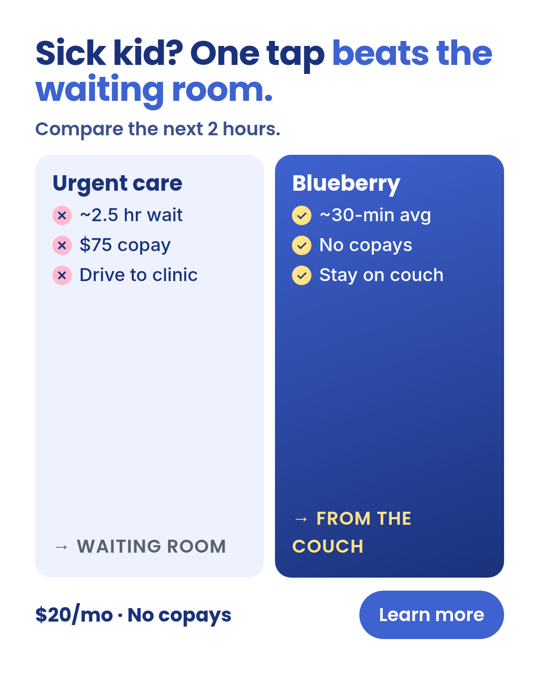
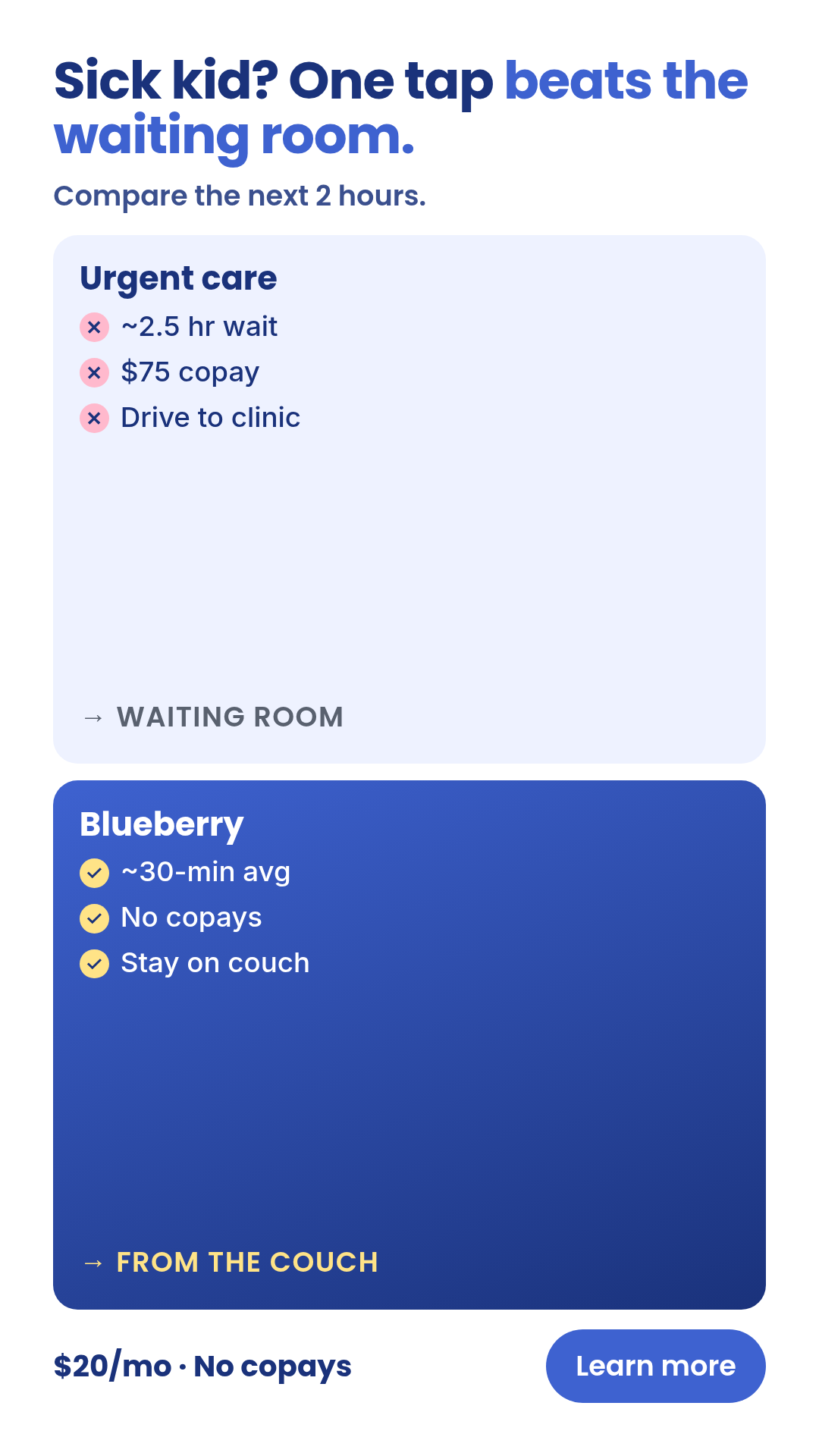
decision-stack
3 layoutsDecision-stack — 2-4 options where ONE is highlighted as the right answer.
Layouts: 3-bar-vertical3-card-horizontalranked-list
Show all 9 renders
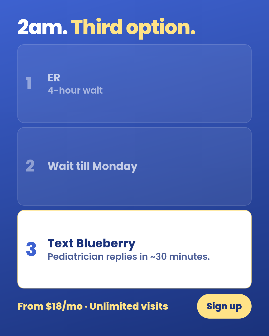
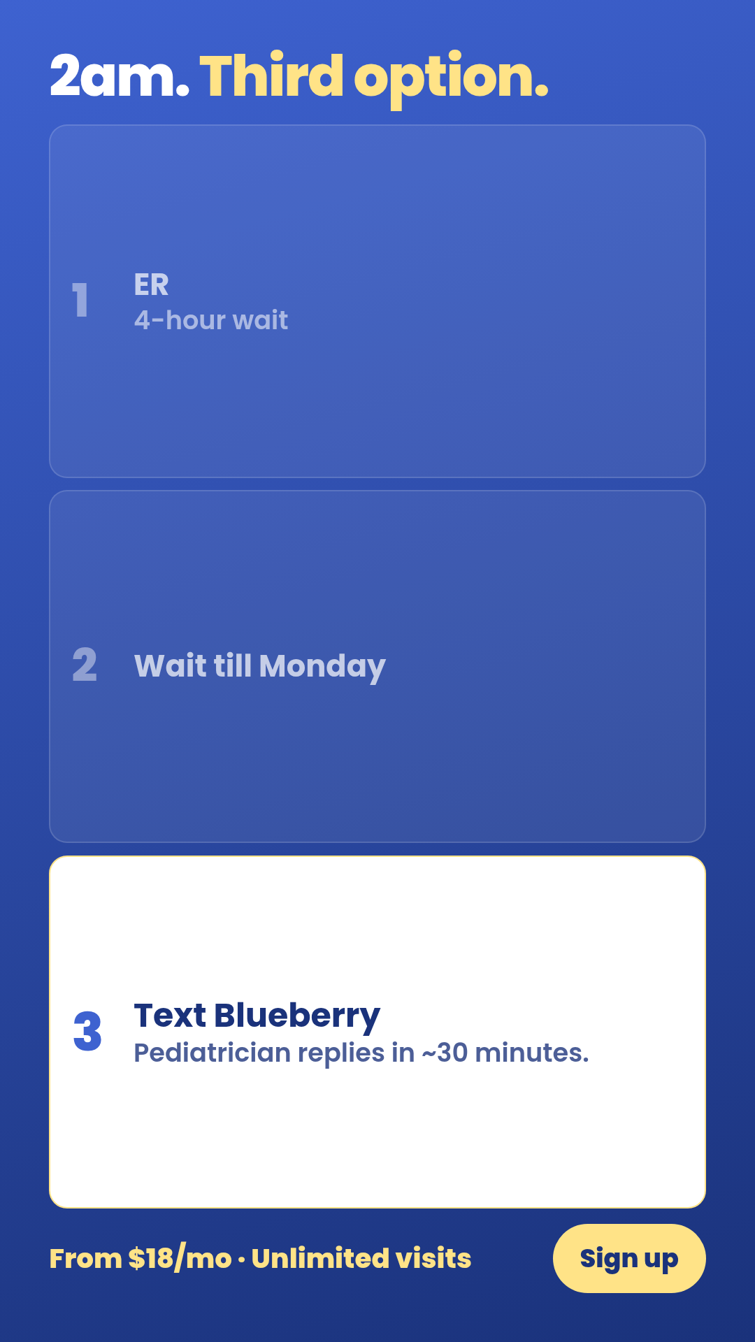
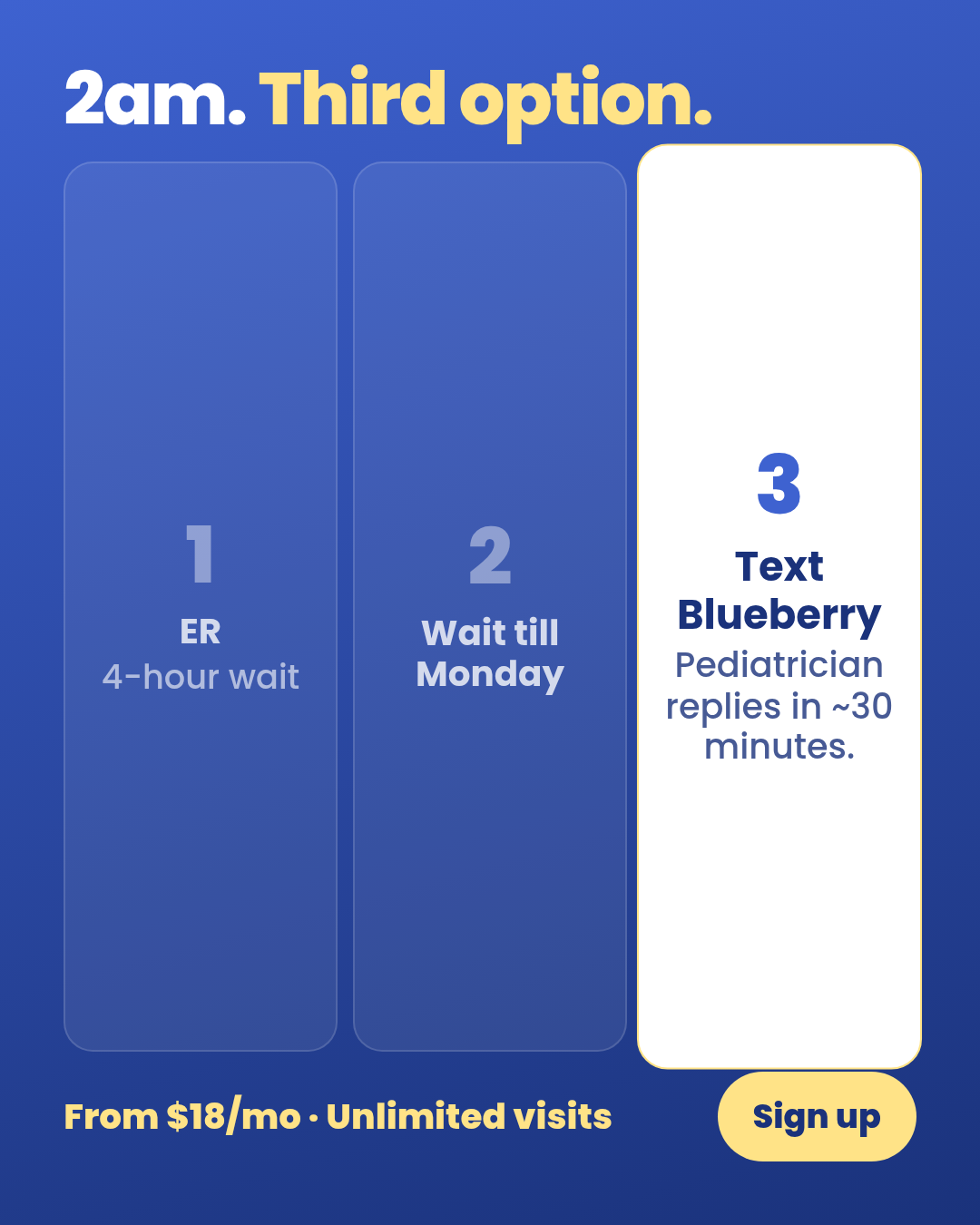
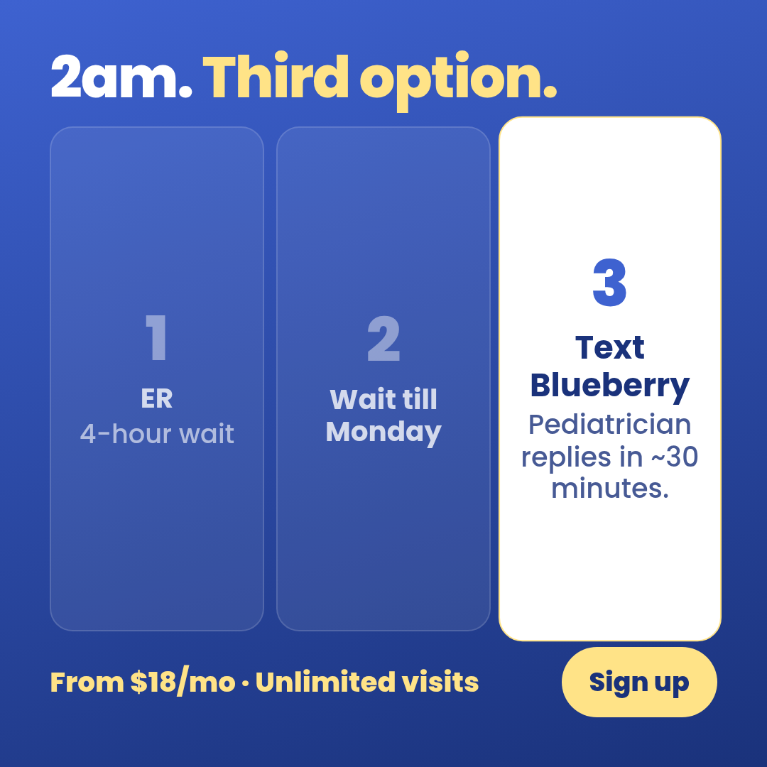
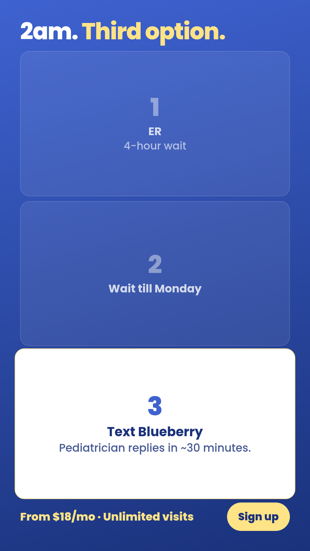
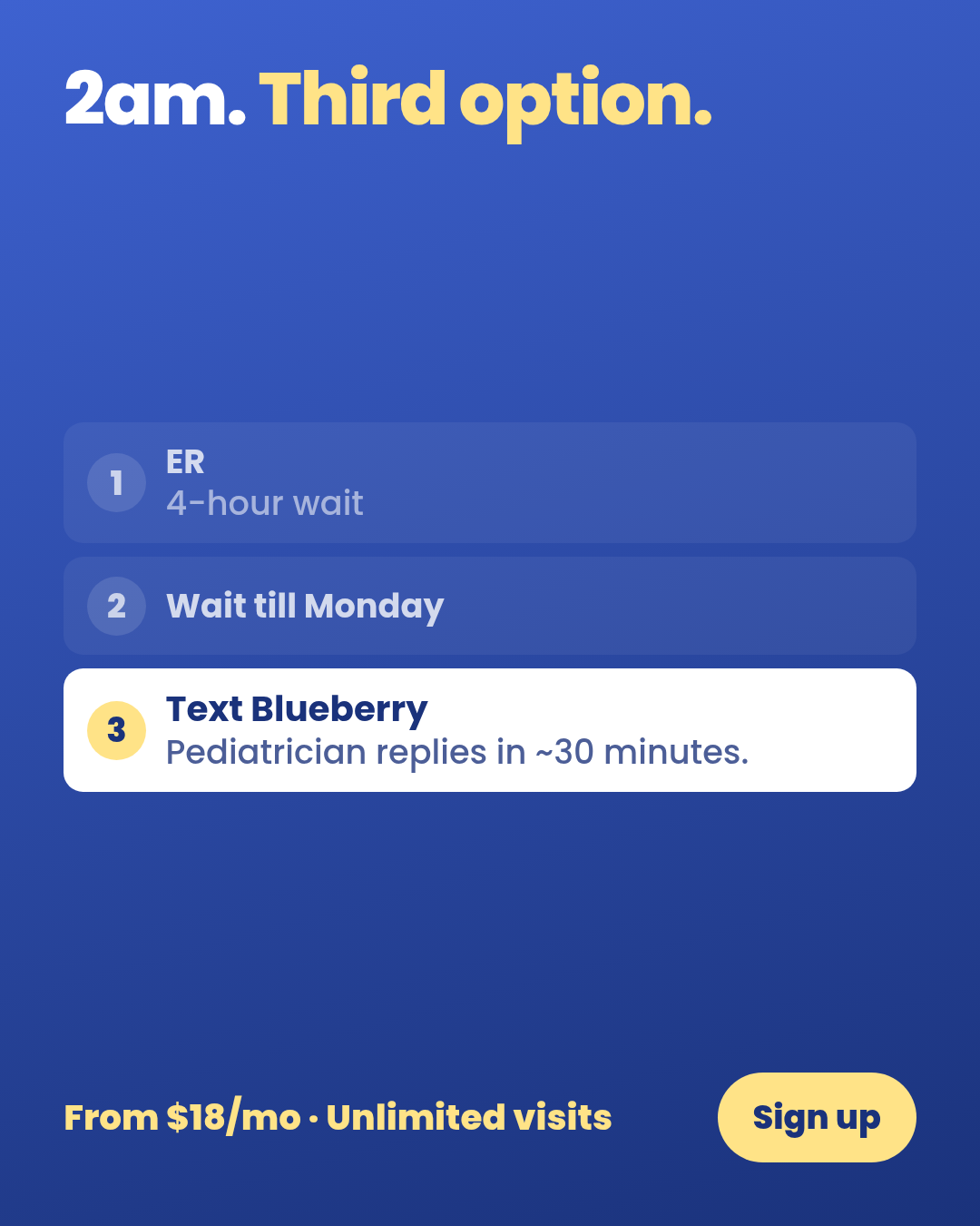
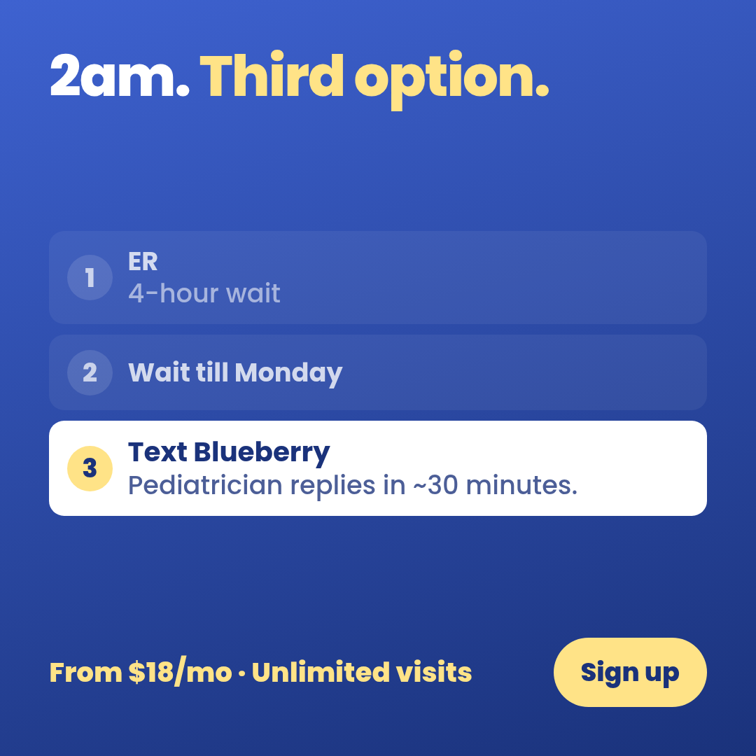
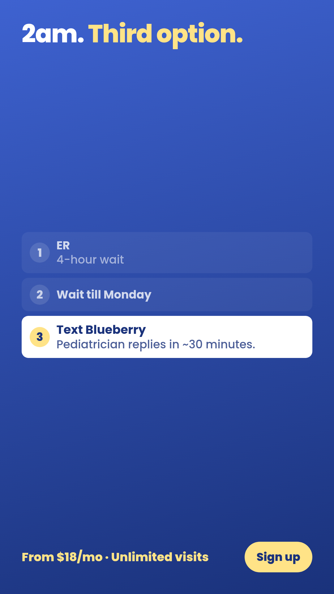
Full description
Decision-stack — 2-4 options where ONE is highlighted as the right answer. Reduces a fork-in-the-road to a tier list with the brand visually elevated. One template with 3 layouts (3-bar-vertical, 3-card-horizontal, ranked-list) × 3 aspect ratios. Differentiation guardrails: IMPLIED ranking with one winner (NOT cross-entity contrast — use `comparison-vs`); 2-4 items only (NOT 5+ unranked items — use `listicle`); decision-fatigue framing where the user is choosing between paths, NOT defining what something IS or ISN'T (use `boundary-blocks` for that). Source: extracted from TR-PA-03 (2am ER debate) — peace-of-mind-ads-v3 TRIAGE renders.
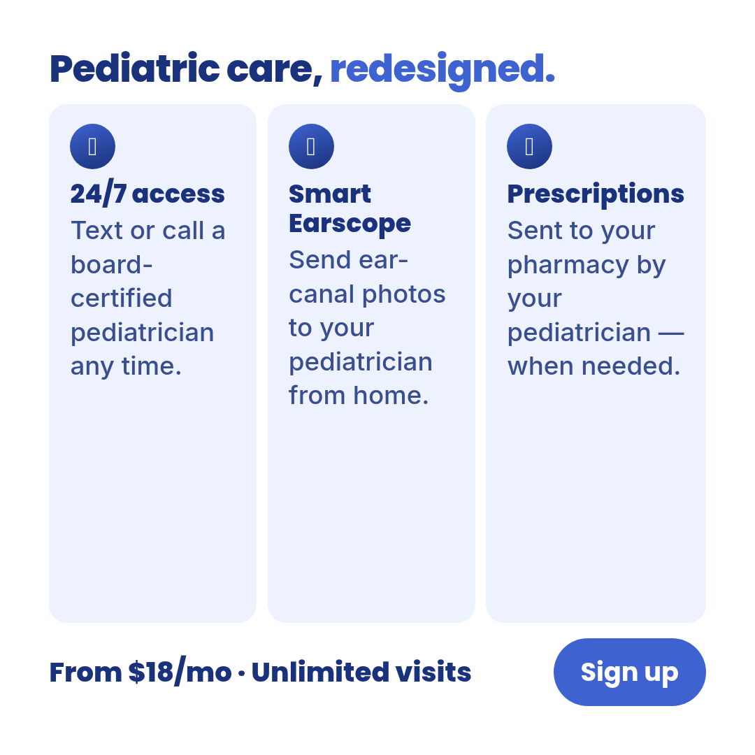
feature-benefit
4 layoutsFeature-benefit — N feature × benefit pairs.
Layouts: 3-feature4-featureicon-gridpaired-feature
Show all 12 renders
Full description
Feature-benefit — N feature × benefit pairs. Cross-vertical 5-9% hit rate. Highest-density format for parameterized bulk-fill (audience × offer × benefit grid). One template with 4 layouts (3-feature, 4-feature, icon-grid, paired-feature) × 3 aspect ratios. Differentiation guardrails: each row pairs a FEATURE with its BENEFIT (NOT a single claim per row — use `listicle`; NOT ranked-with-winner — use `decision-stack`; NOT stat-driven — use `infographic`); features are capabilities, benefits are outcomes; supports bulk variant generation. Source: data/templates/batch2/feature-benefit-research.md.
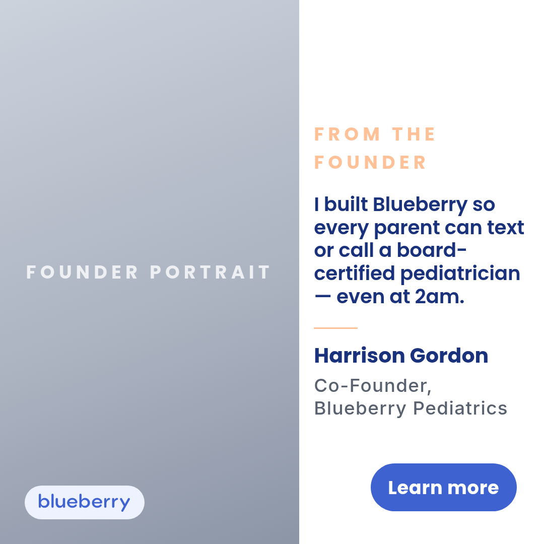
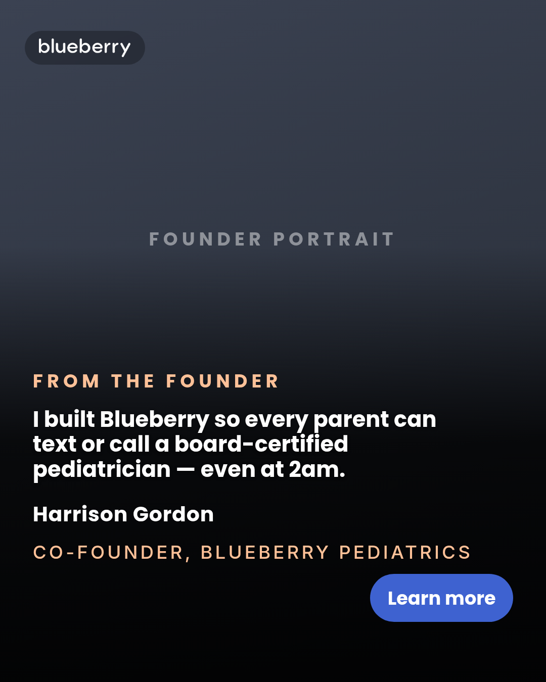
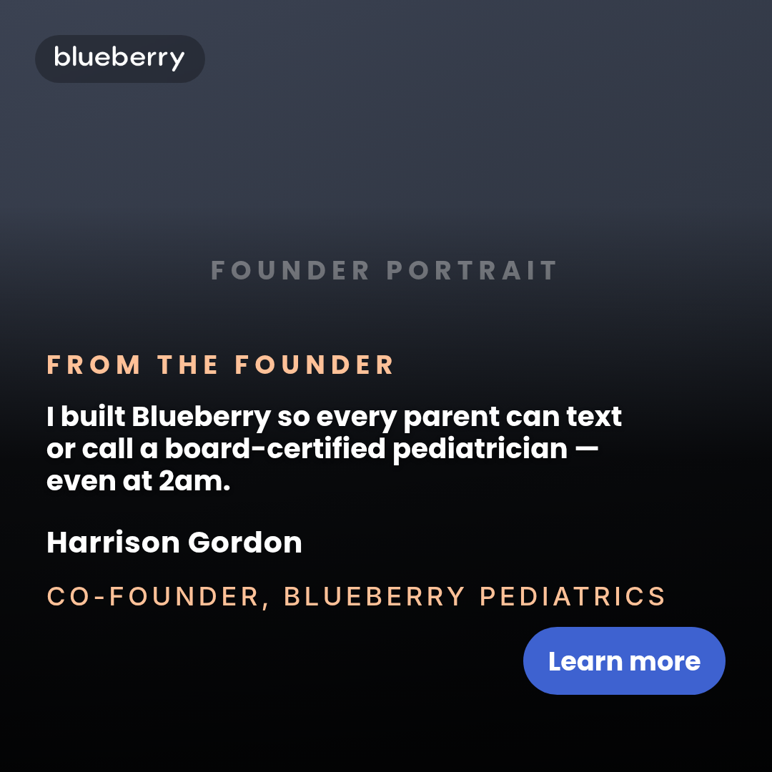
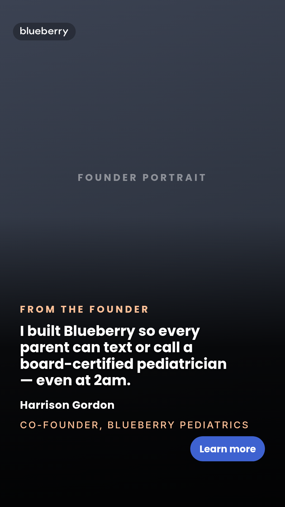
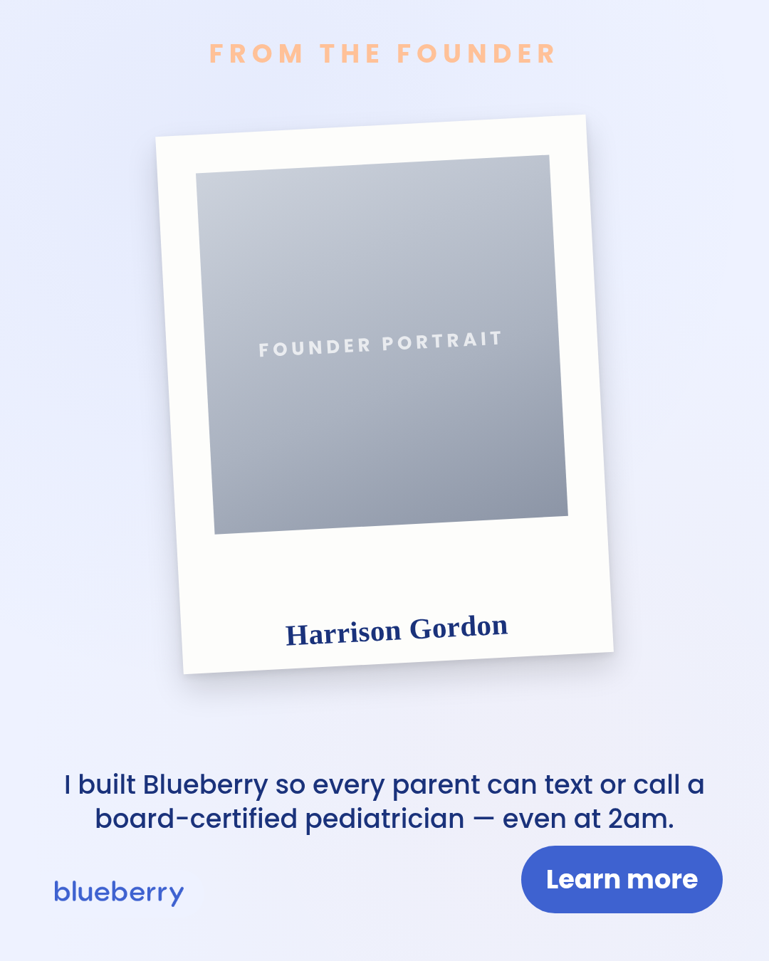
founder
5 layoutsFounder — photo-led static ad.
Layouts: portrait-leftfull-bleedpolaroidsignaturesplit-letter
Show all 15 renders
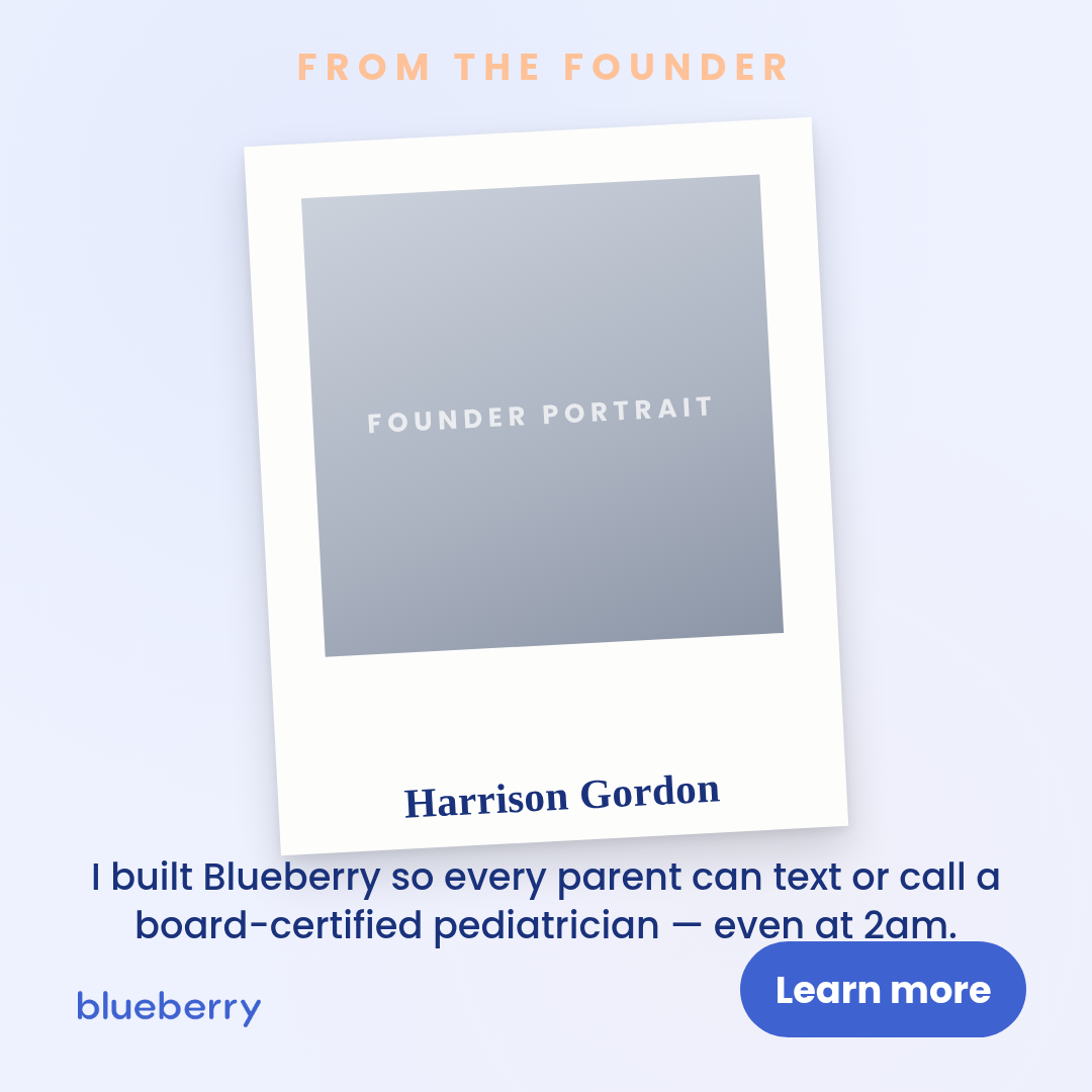
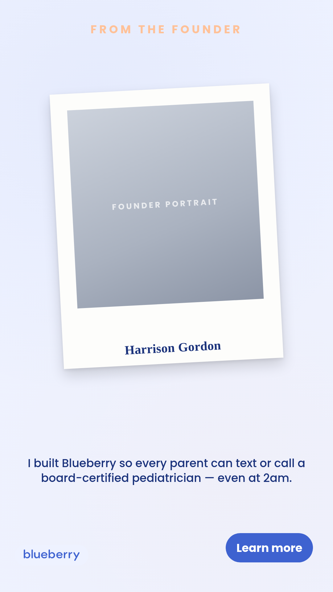
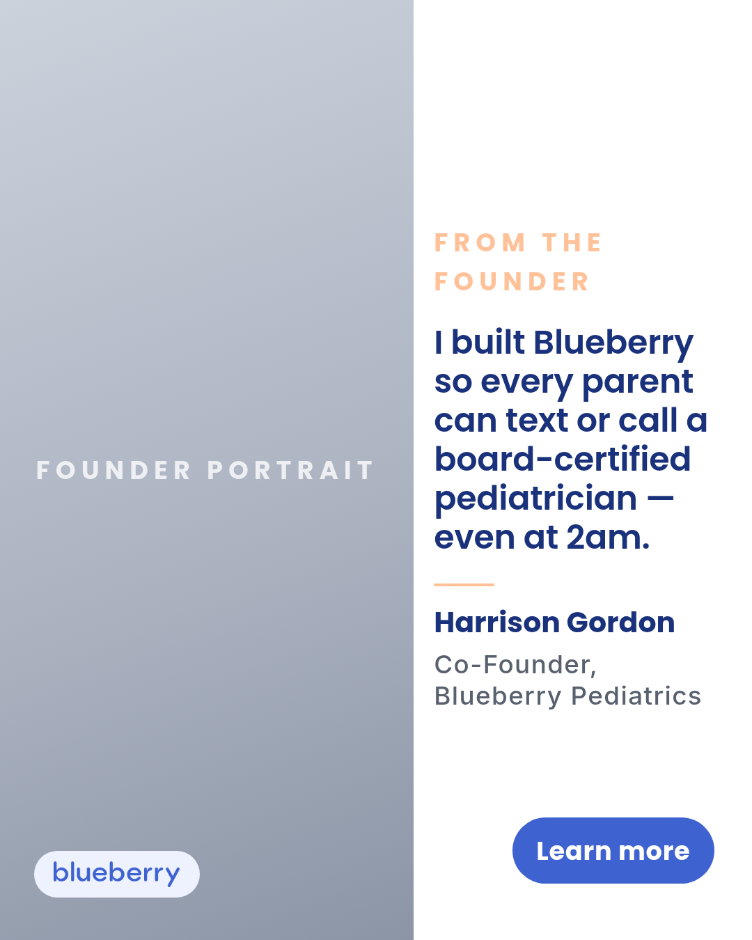
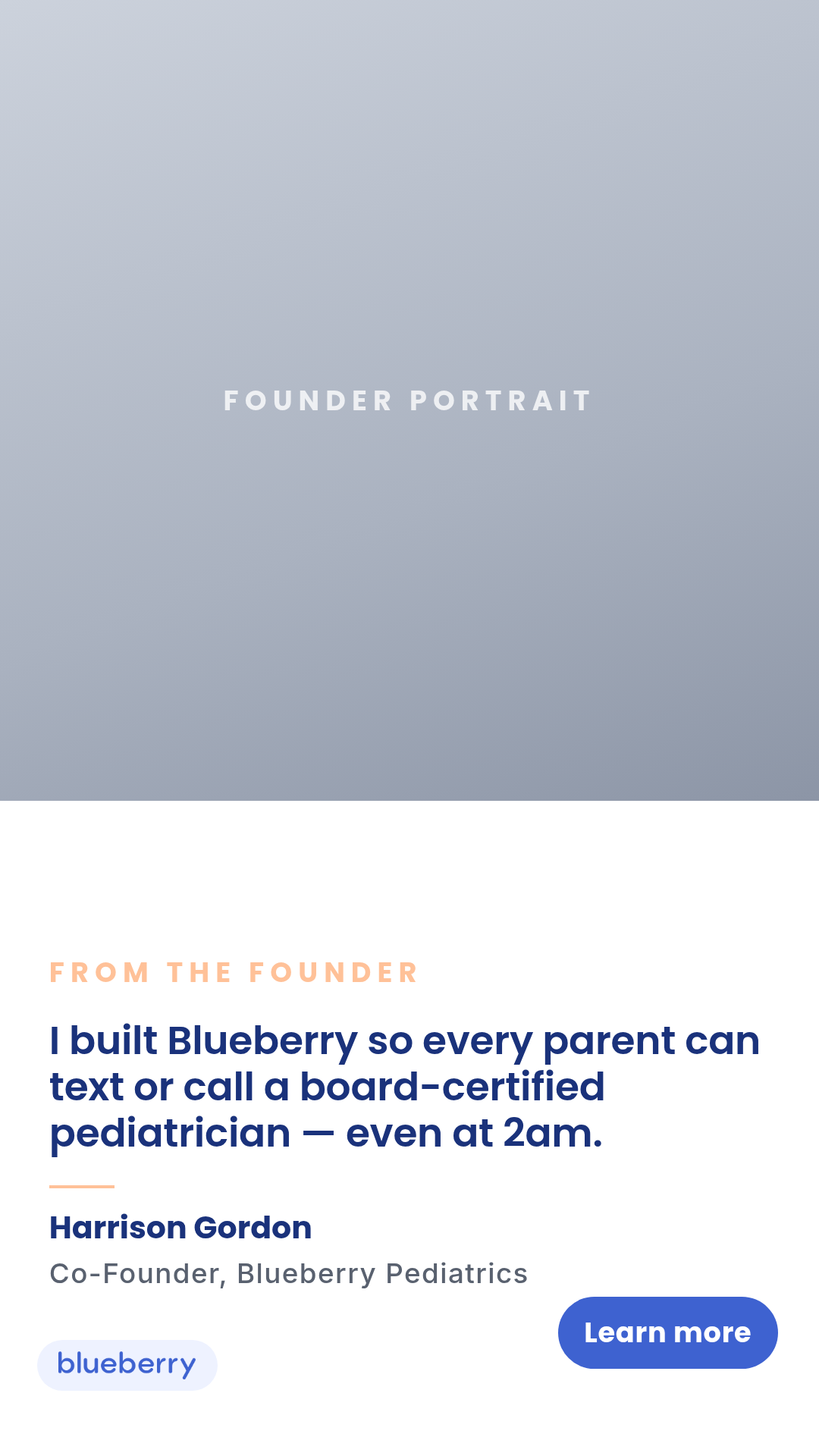
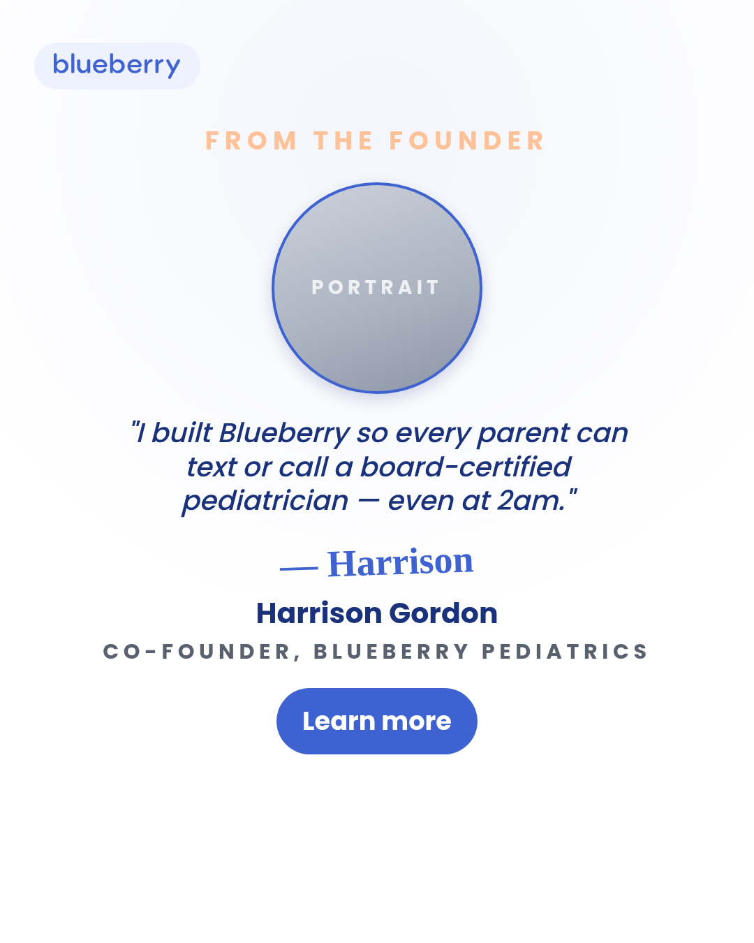
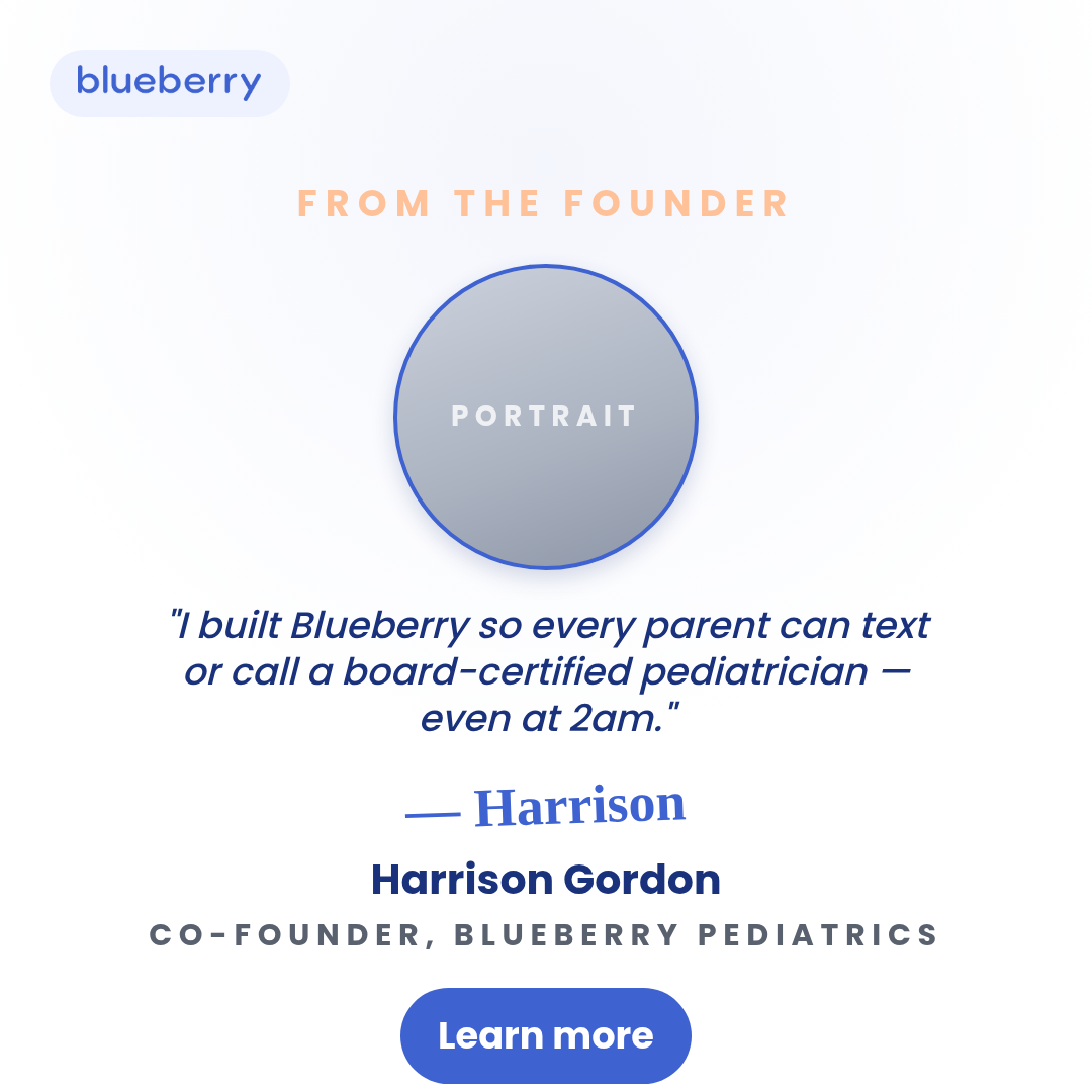
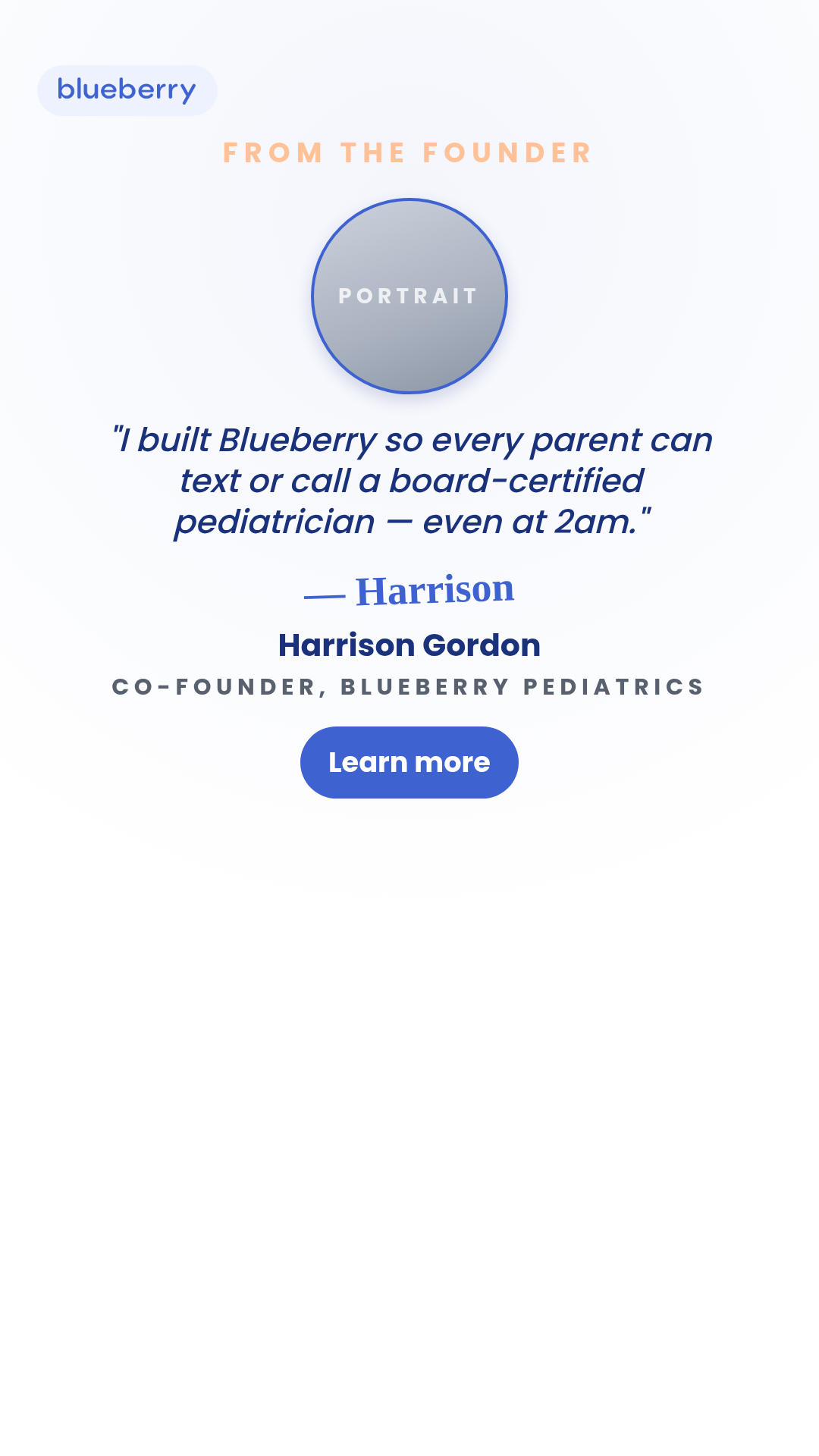
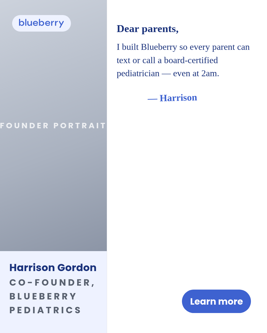
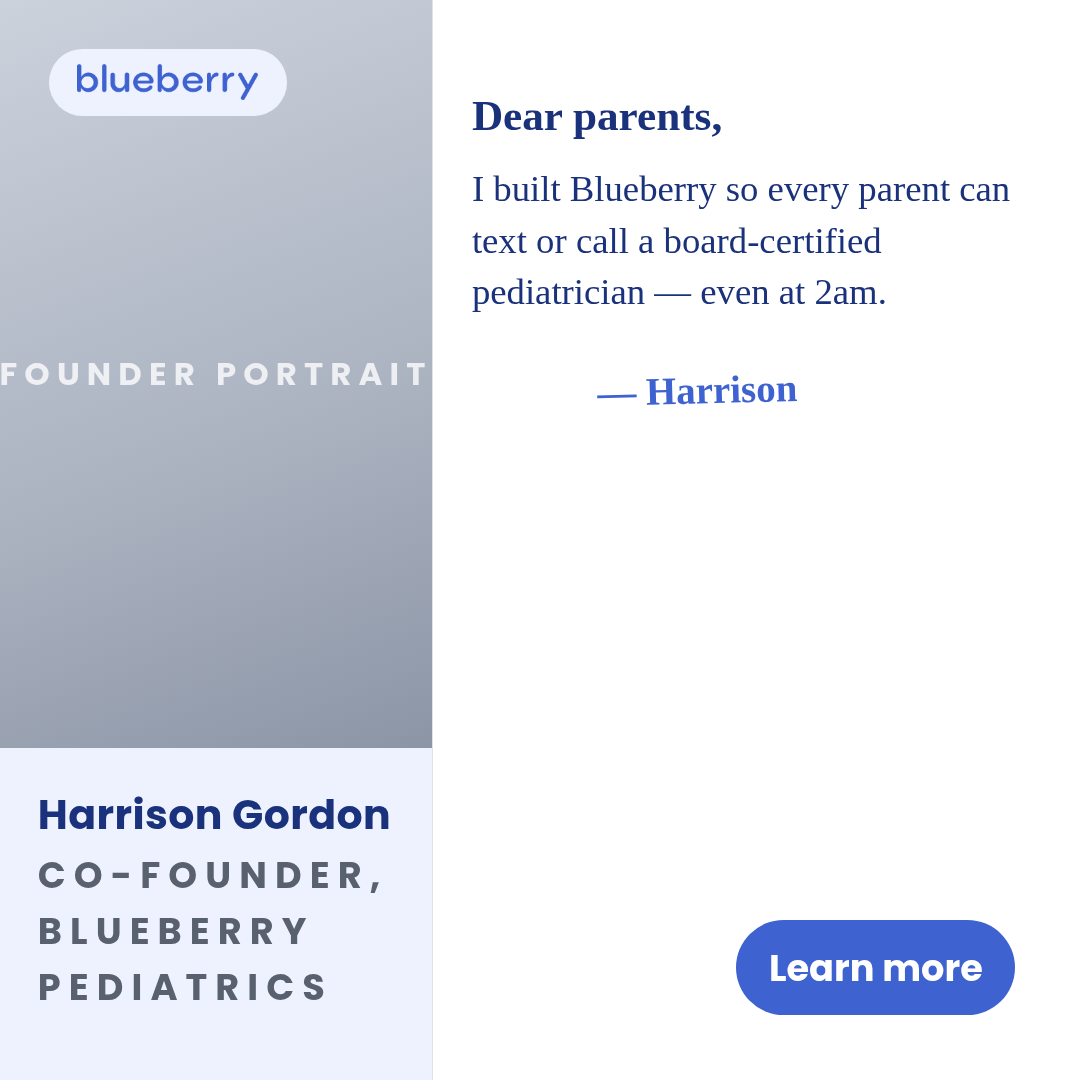
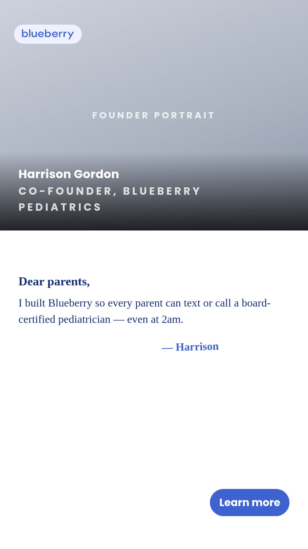
Full description
Founder — photo-led static ad. Motion H&W hit-rate AND spend-use leaderboard format (CH-010). Named founder portrait + short first-person message or quote, framed to read as personally authored. Five layouts (portrait-left, full-bleed, polaroid, signature, split-letter) x three aspect ratios (1:1, 4:5, 9:16). Differentiation rules vs siblings: vs `letter` — photo-led not text-led; vs `case-study` — internal operator not customer; vs `quote-card` — requires photograph; vs `ugc-overlay` — editorial/portrait aesthetic not UGC-selfie; vs `review-quote` — no star rating; vs `feature-benefit` — one promise not feature list. Compliance: photo release assumed upstream (Blueberry-owned Drive assets); Sage / meta-ad-compliance must clear founder quote text before production; prefer parent-founder framing over physician-authority framing (physician-authority routes to pediatrician-expert template).
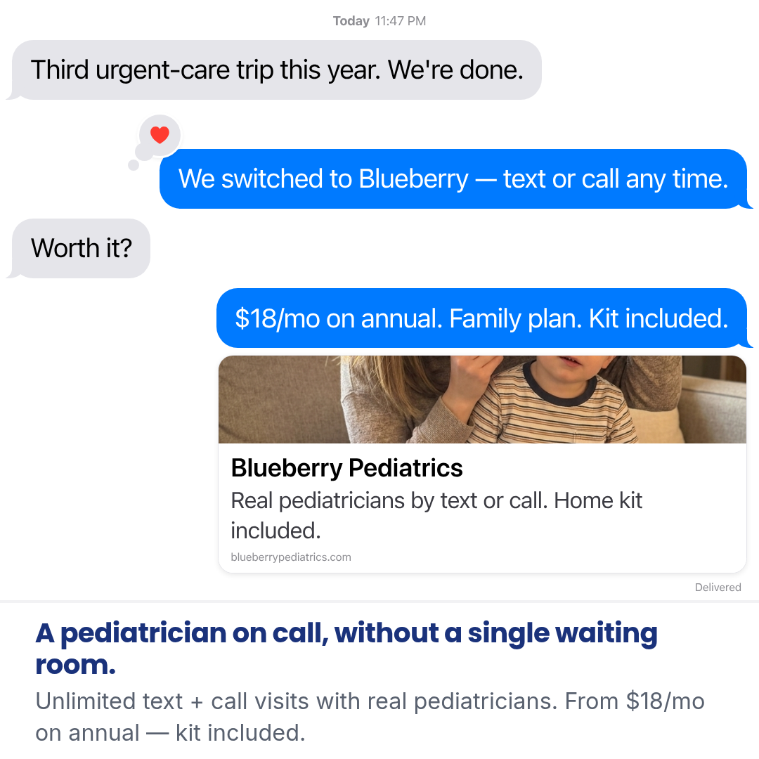
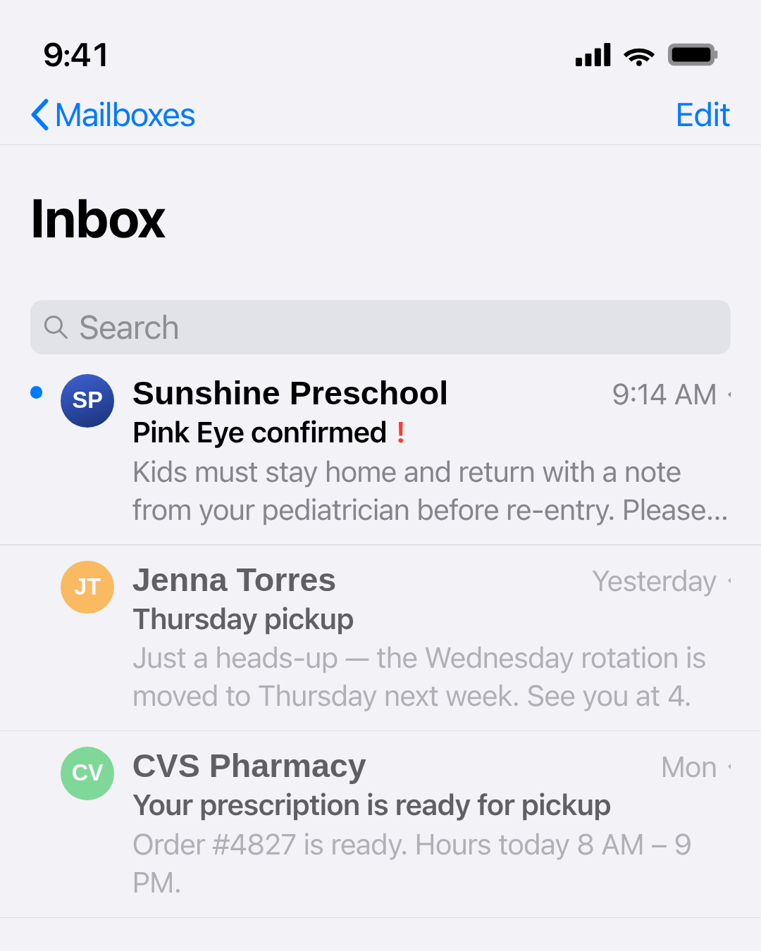
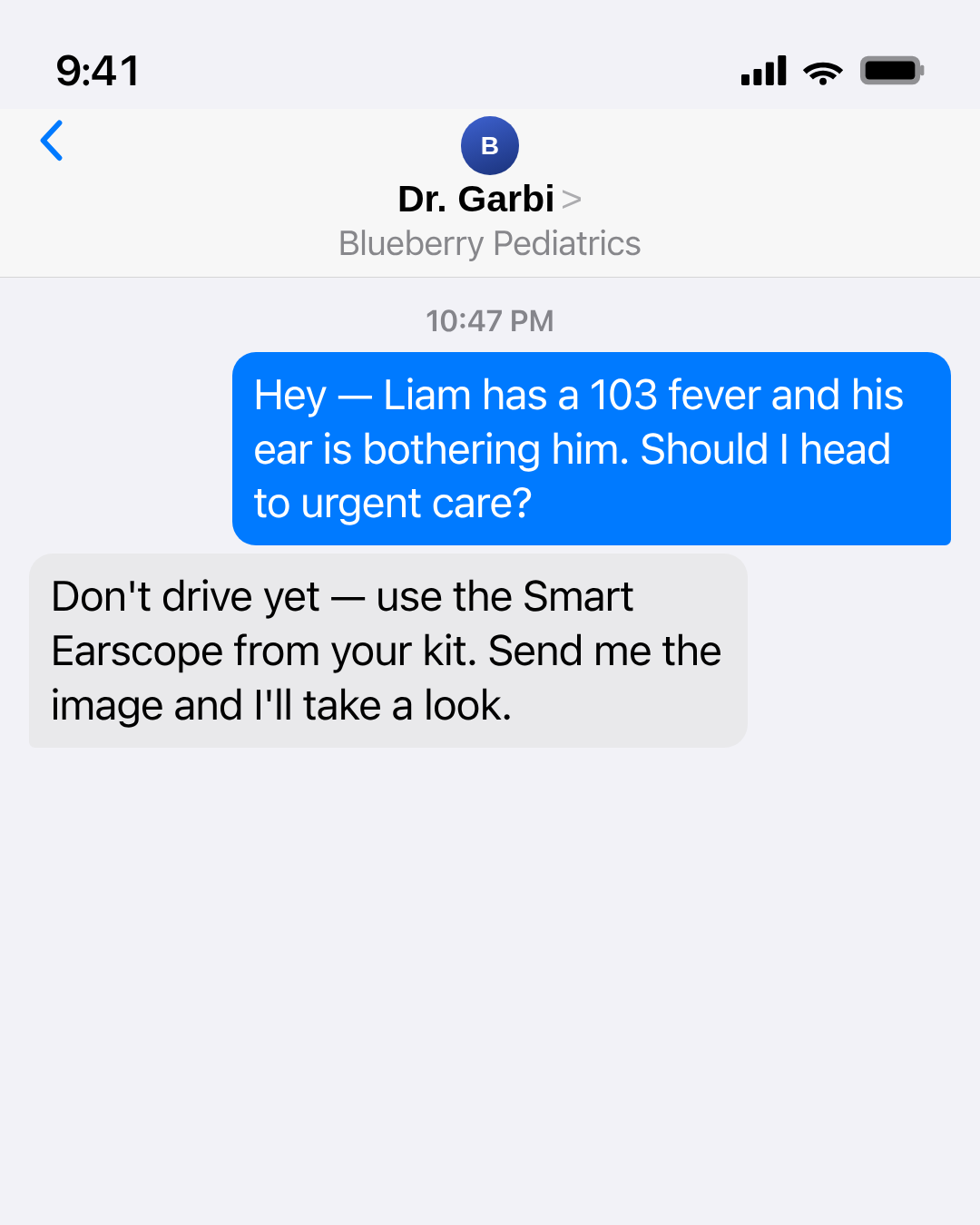
imessage-thread-card
1 layoutiMessage-style private text thread between two parents, rendered as a pixel-faithful iOS Messages screenshot — full chrome (status bar, nav header with peer avatar + name + back chevron + FaceTime…
Layouts: default
Show all 3 renders
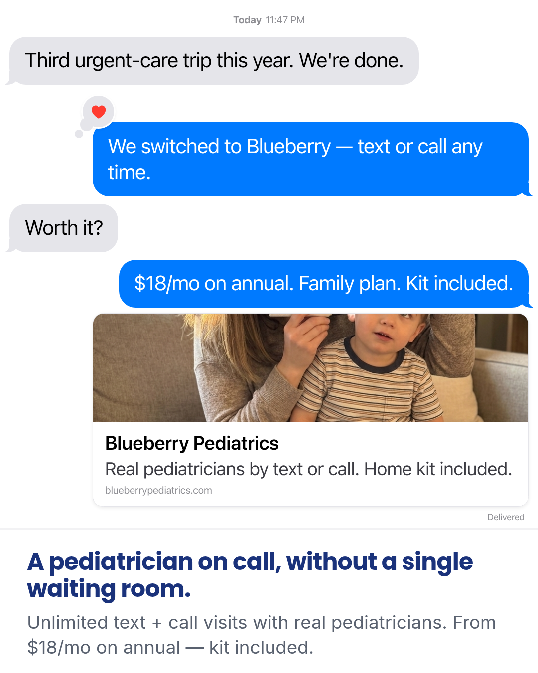
Full description
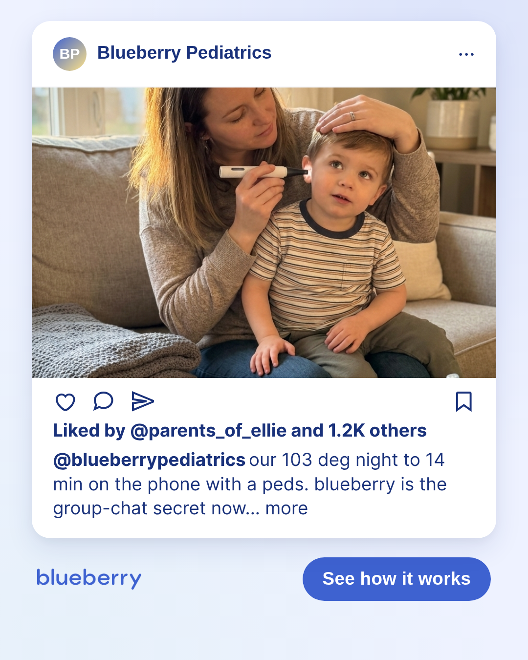
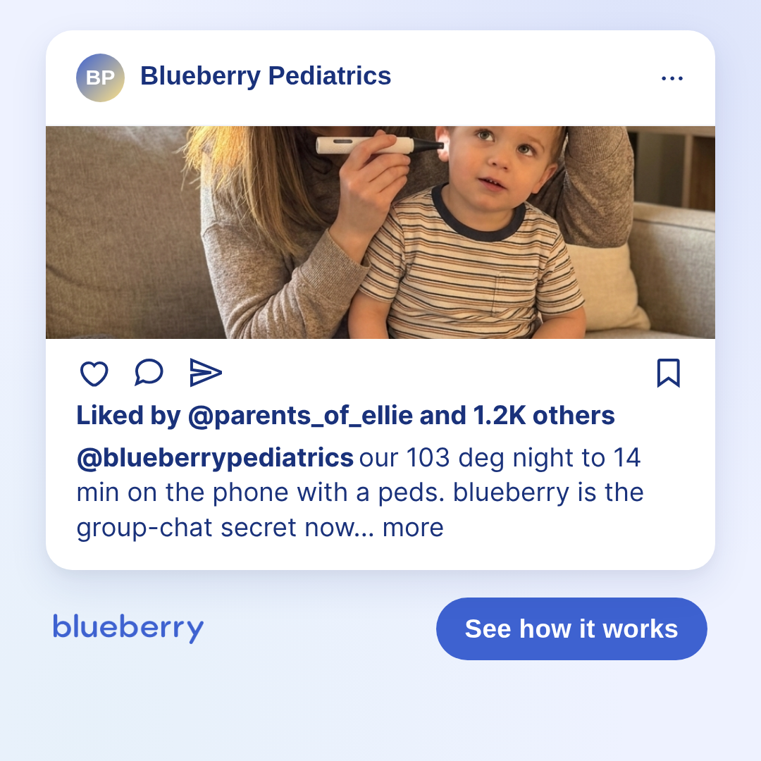
iMessage-style private text thread between two parents, rendered as a pixel-faithful iOS Messages screenshot — full chrome (status bar, nav header with peer avatar + name + back chevron + FaceTime icon, date-stamp divider, gray/blue bubbles with iOS bubble tail on last-of-stack, Open-Graph-style link-preview card on the sent side, Delivered/Read indicator, and the iMessage input bar with camera + iMessage pill + mic) — and a benefit-headline + subhead block on the white canvas beneath. Inspired by the Epidemic Sound iMessage ad — a peer-voice sales-letter chassis where the thread answers a skeptical question, the link card visually anchors the brand, and the headline-below carries the price/capability anchor (Gate F1). Visual chrome breaks brand conventions deliberately to match a real iOS Messages screenshot — system blue (#007AFF) for sent bubbles, iOS gray (#E5E5EA) for received, white chat background, system font stack (-apple-system / SF Pro / Inter fallback). The Blueberry brand colors return in the link-card header and the headline band below — that's the bridge from 'authentic peer convo' to 'this is an ad for Blueberry Pediatrics'. Per Harrison 2026-05-08 (msg 19e0ae9b612659d6): 'This template only works if the image is identical to iMessage' — chrome-fidelity is the contract. Tapback reactions are a configurable per-bubble element. Set `reaction` on any bubble to one of: heart, thumbs_up, thumbs_down, haha, exclaim, question. The reaction renders as a floating circle bubble at the corner of the parent bubble (upper-left for sent / upper-right for received), with the two trailing dots that point back into the bubble — matching the iOS tapback geometry. Default sample shows a heart-tapback on the friend's reassurance line to prove the element renders. Differentiation: - vs `social-post-mockup.sms-thread`: that layout is a phone-chrome thread only (no status bar, no link-preview card, no headline-below, no tapbacks). This template is the standalone iOS-faithful composition with the full chrome and tapback support. - vs `parent-reddit-thread` / `parent-forum-thread`: those are public-forum mockups (handles + votes + multiple commenters). This is a 1:1 private SMS conversation — quieter, more intimate. - vs `letter` / `notes-screenshot`: those are single-author monologues. This template is dialogue — skeptic asks, friend answers — which makes it pair best with high-friction objections (price, modality, 'is it actually any good?'). Realism + compliance contract — apply BEFORE rendering, every time: 1. Per-bubble business-model pass. Every claim in every bubble must map to an in-scope feature. For Blueberry Pediatrics: text/call only — NEVER 'video'; no ADHD-meds, psychiatry, or emergency framing. A bubble that says 'video visit' or 'video pediatrician' is a launch-blocker. 2. Per-bubble medical-claim pass. If a bubble names a diagnosis, treatment verb, or specific outcome ('strep', 'diagnosed', 'treated', 'ear infection cured'), hold the chassis until Sage signs off. Don't ship as flagged-but-unresolved. 3. DTC pricing only. Use $18/mo (annual) or $29/mo (monthly) — the DTC consumer prices. Never use 'often covered' / '$0 with your plan' / 'insurance covers it' framing — those are B2B/MCO language. 4. No trial language. No 'free trial', '30-day', 'risk-free', 'money-back guarantee'. The ask is membership. 5. Answer-the-question / named-grounding. The skeptical bubble must ask something specific ('Worth it?', 'How much?', 'Wait, no video?'). The answering bubble must NAME the brand and the in-scope mechanism. Vague endorsements ('honestly worth it', 'we love it') without naming what the thing actually does fail this gate — they read as fake because real friends answering a friend's specific question always name the thing. 6. Internal consistency. The link card's title/subtitle and the headline-below must agree with what the bubbles claim. Don't have a bubble say 'text or call' and the link card say 'video visits'. Gate F (Naive-Scroller Read) on chassis defaults: - F1 price anchor: '$18/mo on annual' (bubble + subhead). Subscription-scope qualifier: 'Unlimited text + call visits', 'Family plan', 'kit included'. ANCHORED. - F2 capability anchor: 'real pediatricians by text or call' (link card subtitle), 'kit included' (bubble + subhead). ANCHORED. Link-card cover image variants (Harrison 2026-05-09 pick): - DEFAULT — `assets/cover-kit-otoscope.jpg` (couch ear-check). Lifestyle parent-child shot: mom on a living-room couch in late-afternoon light, doing a calm ear-check on her 3-year-old with the otoscope. Real-home anchors (folded knit blanket, sippy cup + board book on coffee table). This is the most direct read of the parent-child / using-the-otoscope brief — what the kit looks like in the moment a parent would actually use it. Use for the canonical "what real moms do with this" cover. - VARIANT — `assets/cover-kit-otoscope-counter.jpg` (counter product hero). The closed kit box on a warm wood counter with kid's drawing on the cabinet behind, otoscope at correct relative scale (~½ box length). People-free product hero. Use when you want a quieter, more product-forward cover (e.g., paired with a louder bubble thread, or a cleaner OG-card aesthetic). Swap by setting `linkCard.coverImageUrl` to the counter variant in the `_coverImageVariants` map.
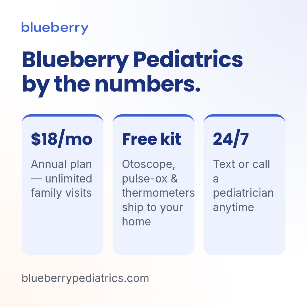
infographic
1 layoutBranded stat infographic with a title, 3 key stats, and an optional footnote.
Layouts: default
Show all 3 renders
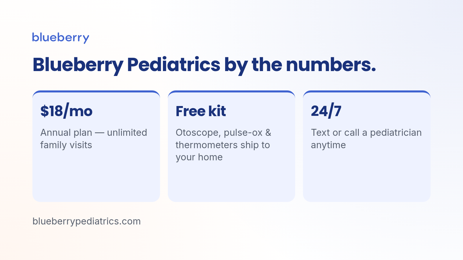
Full description
Branded stat infographic with a title, 3 key stats, and an optional footnote.
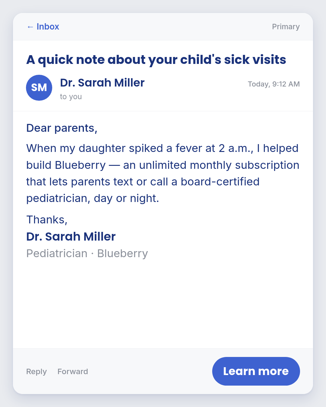
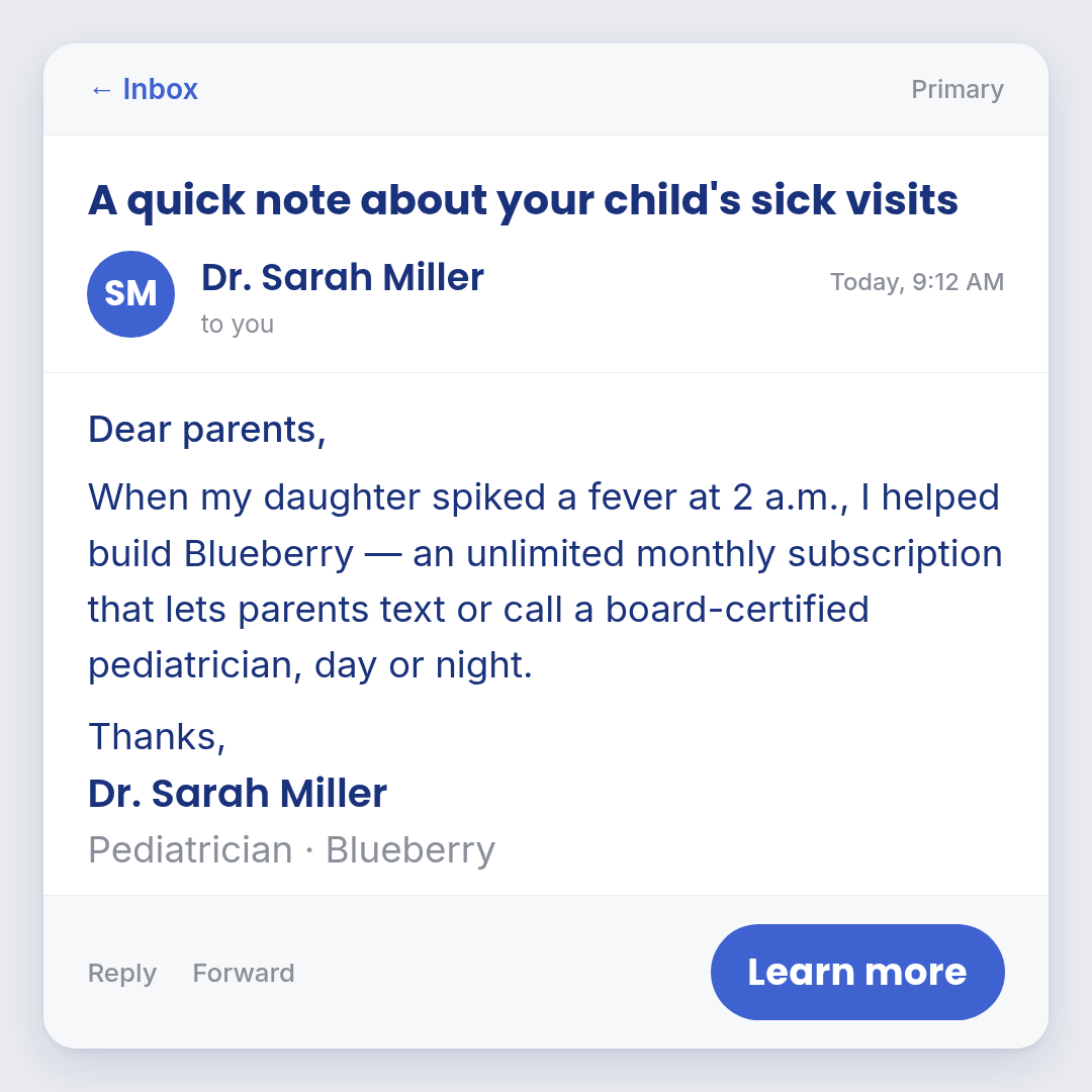
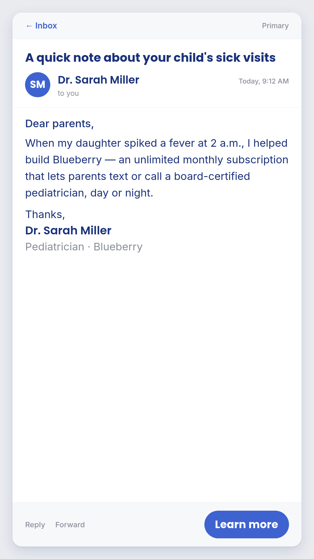
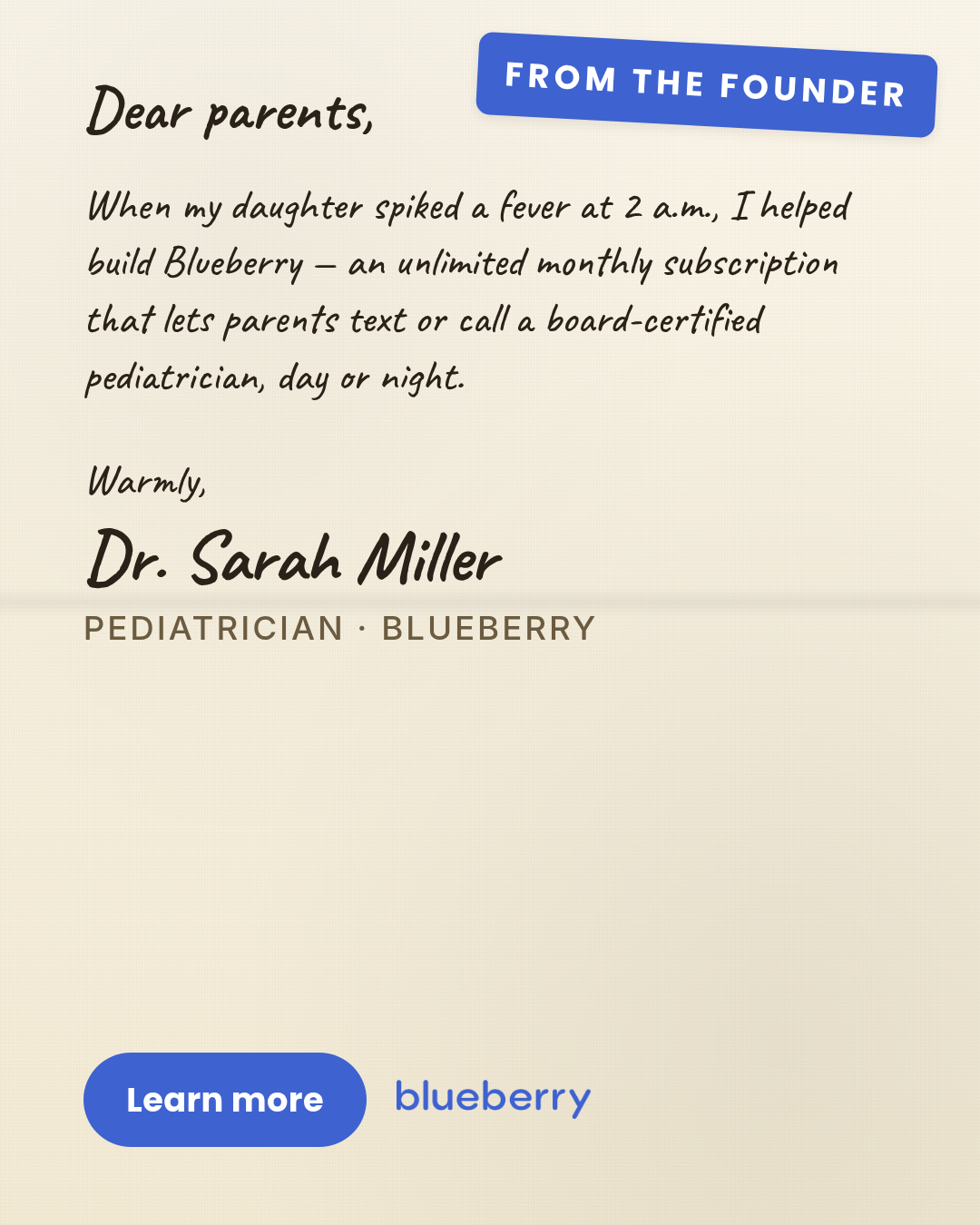
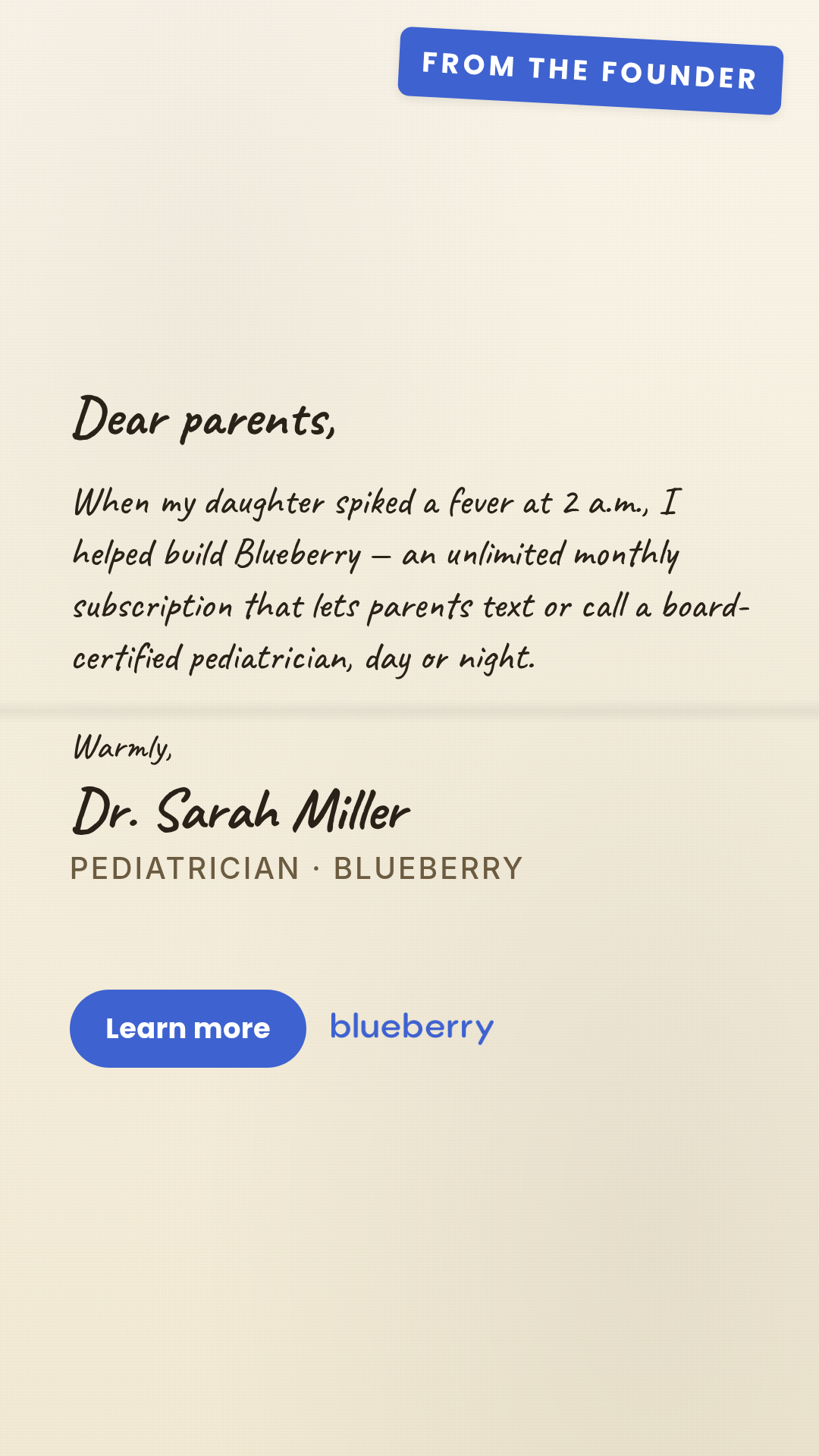
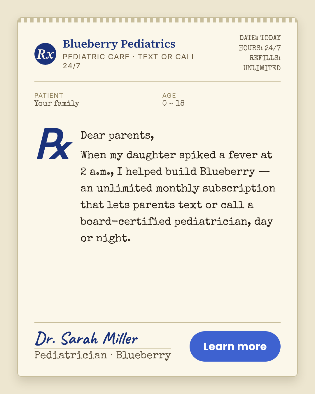
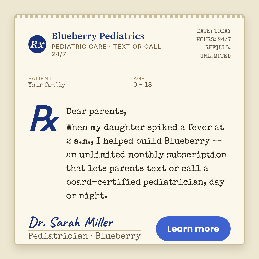
letter
4 layoutsLetter — Motion H&W punch-above format.
Layouts: handwritten-notetyped-letteremail-screenshotrx-pad
Show all 12 renders
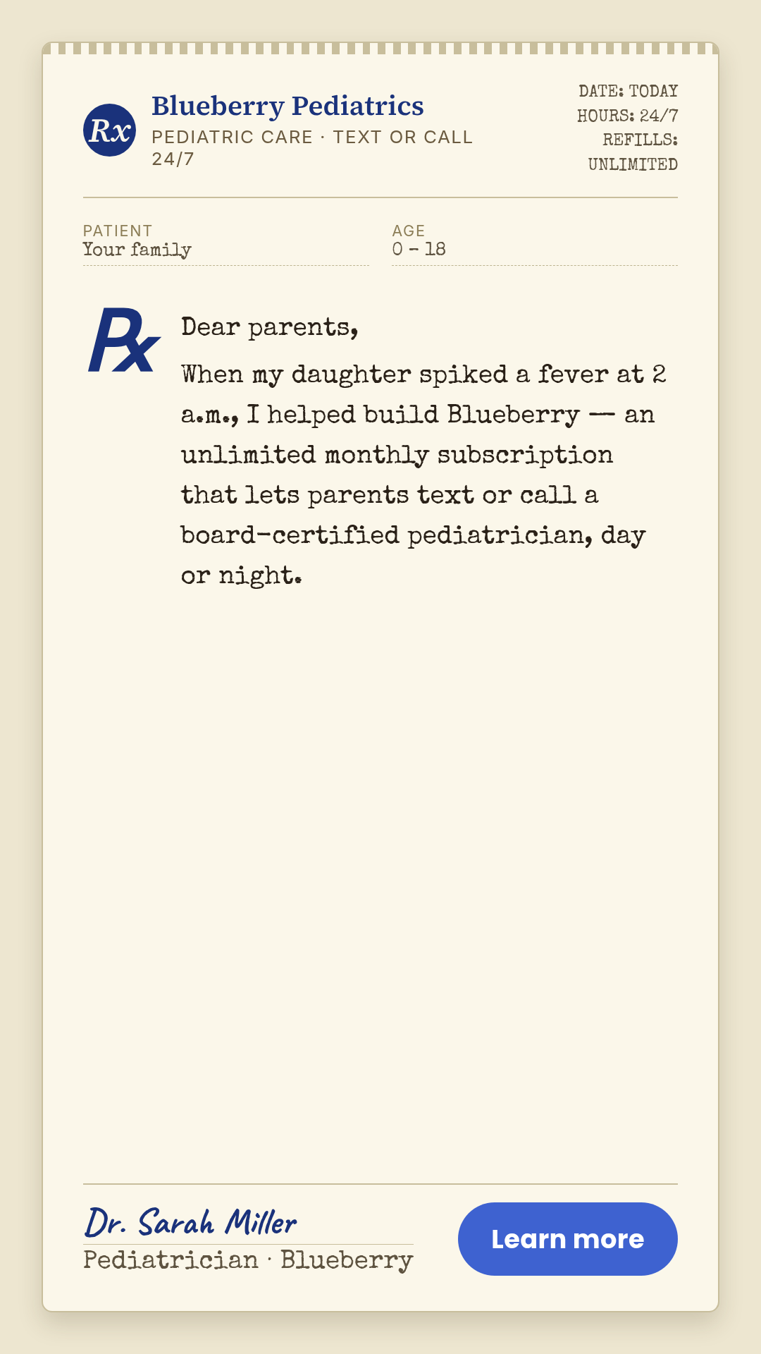
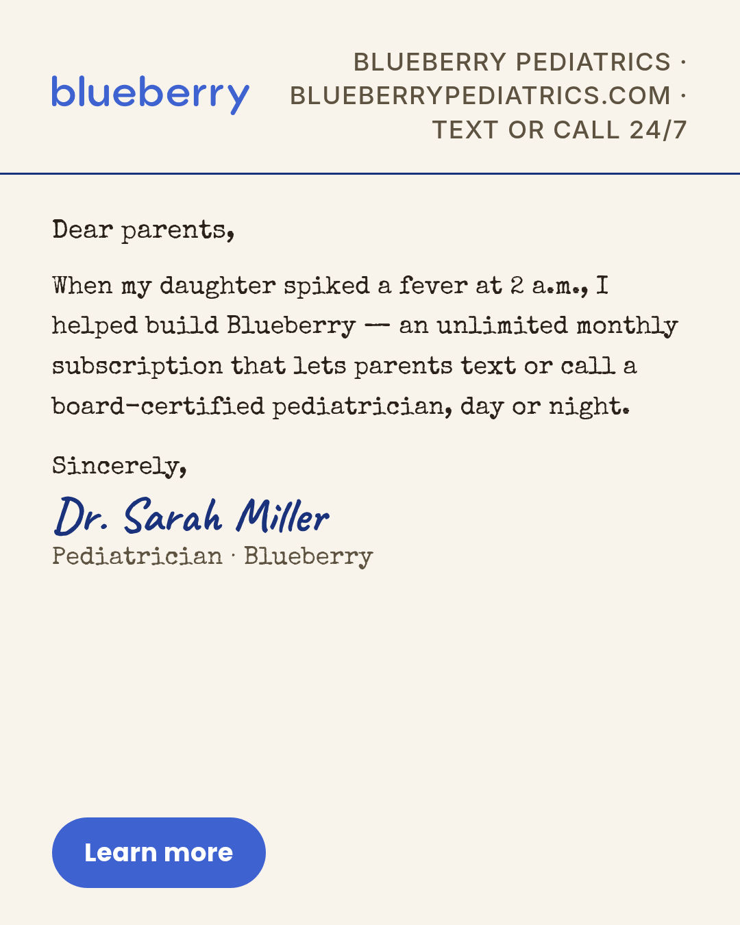
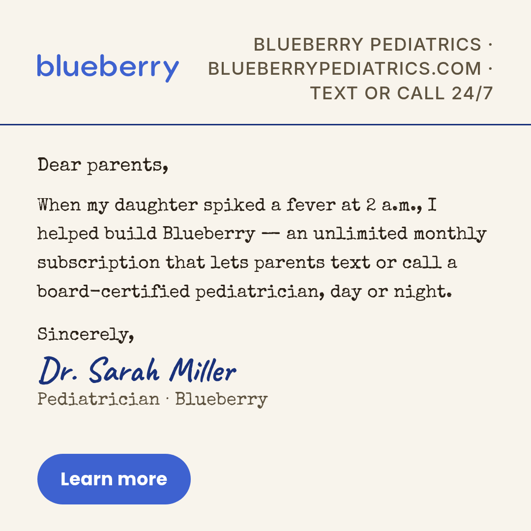
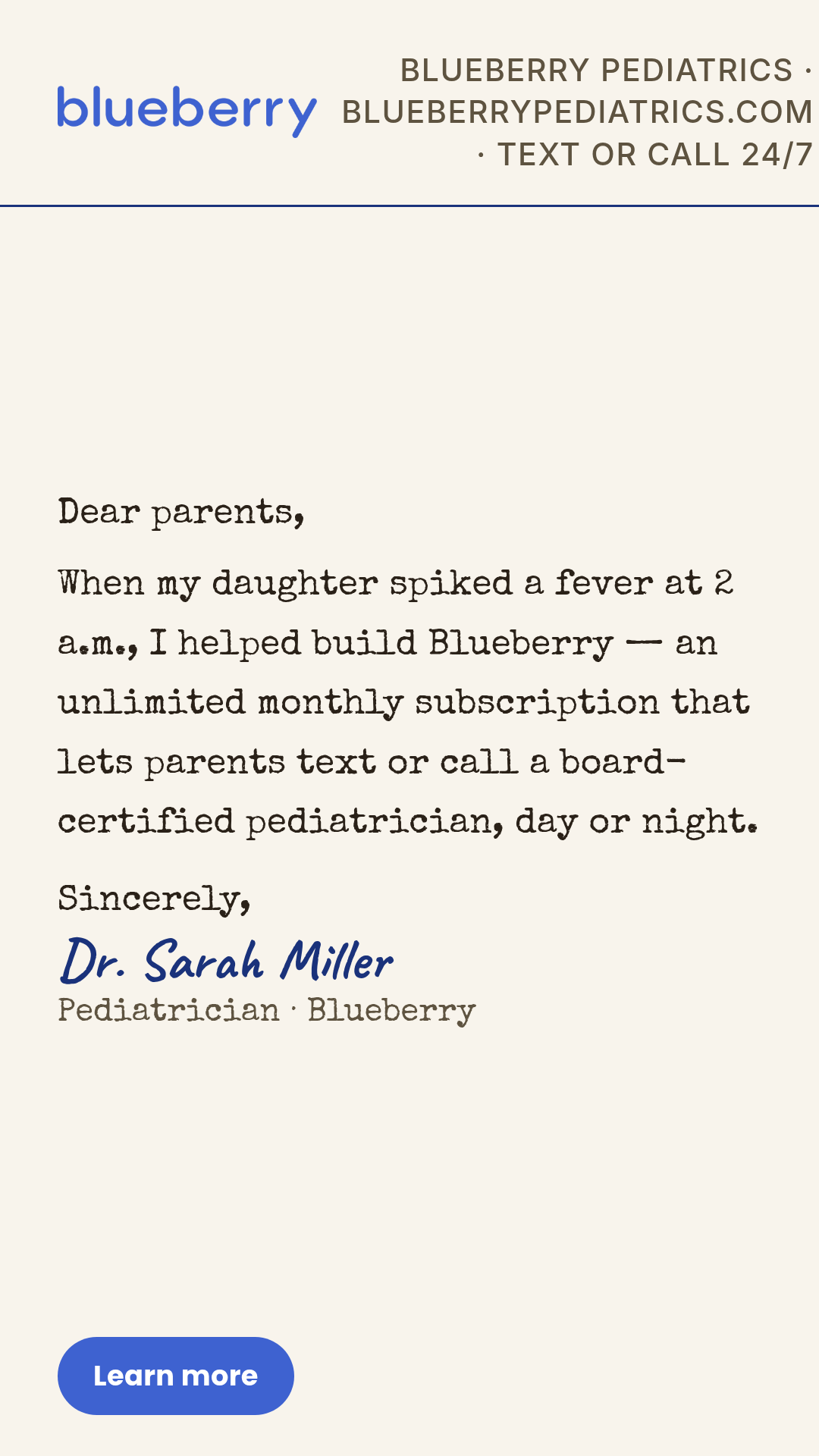
Full description
Letter — Motion H&W punch-above format. Static creative that visually mimics personal correspondence: handwritten note, typed letter on letterhead, email screenshot, or Rx-pad directive. Body copy in first person is the hero. Four layouts (handwritten-note, typed-letter, email-screenshot, rx-pad) x three aspect ratios. Pass `layout` in data to pick composition.
listicle
3 layoutsListicle — 3-7 numbered list items as the hero.
Layouts: numbered-rowsicon-rowsbadge-list
Show all 9 renders
Full description
Listicle — 3-7 numbered list items as the hero. Cross-vertical 5-9% hit rate; H&W under-uses, opportunity to test before crowding. One template with 3 layouts (numbered-rows, icon-rows, badge-list) × 3 aspect ratios. Differentiation guardrails: 3-7 items with NO ranked winner (NOT 2-4 items WITH a winner — use `decision-stack`); items are claims/stats/benefits not features-with-benefits (NOT N feature × benefit pairs — use `feature-benefit`); items are top-level claims not bordered/handwritten reminders (NOT yellow sticky reminder — use `post-it`). Source: data/templates/batch2/listicle-research.md.
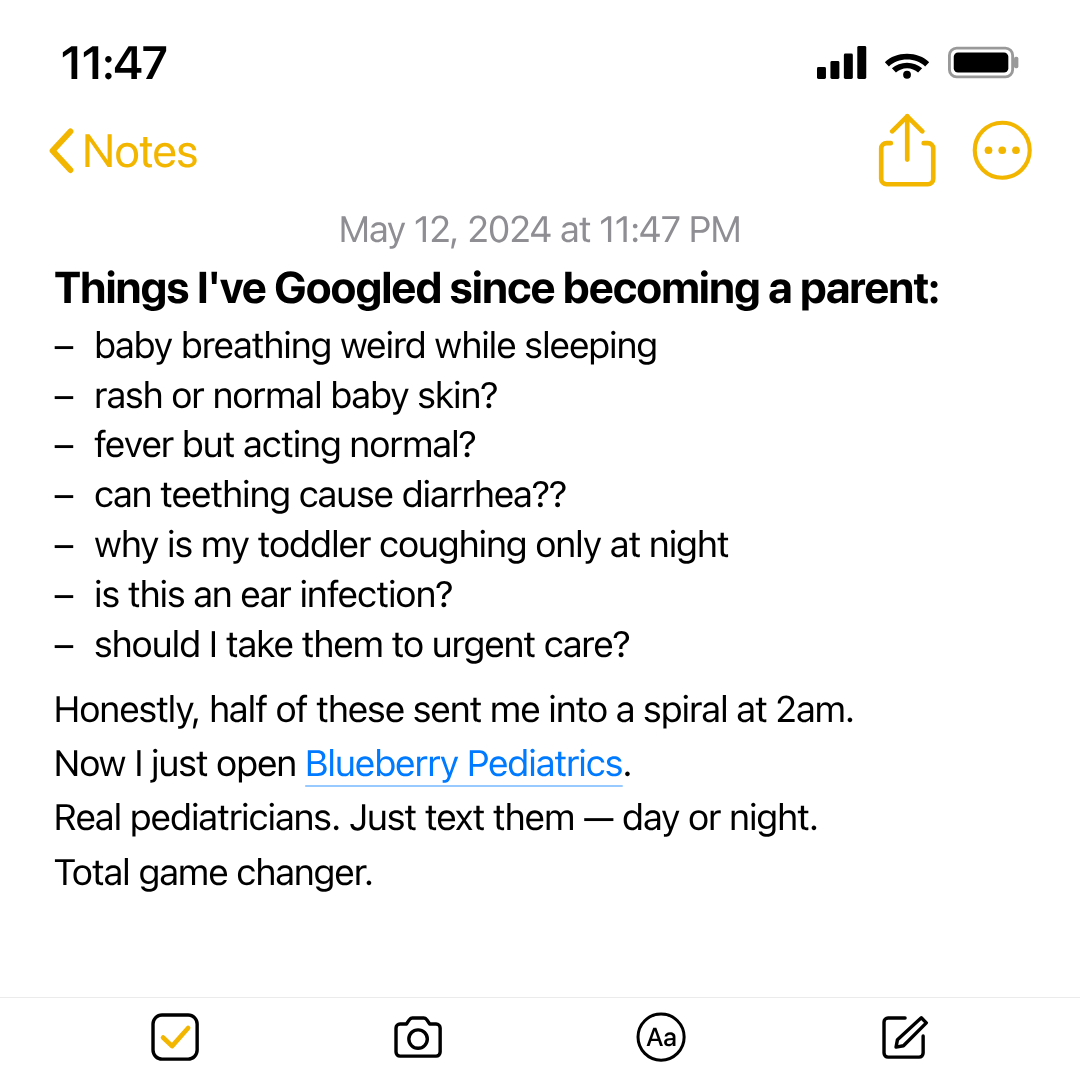
notes-screenshot
1 layoutNotes-screenshot — UGC ad creative styled as a full-bleed iPhone Notes app screenshot.
Layouts: default
Show all 3 renders
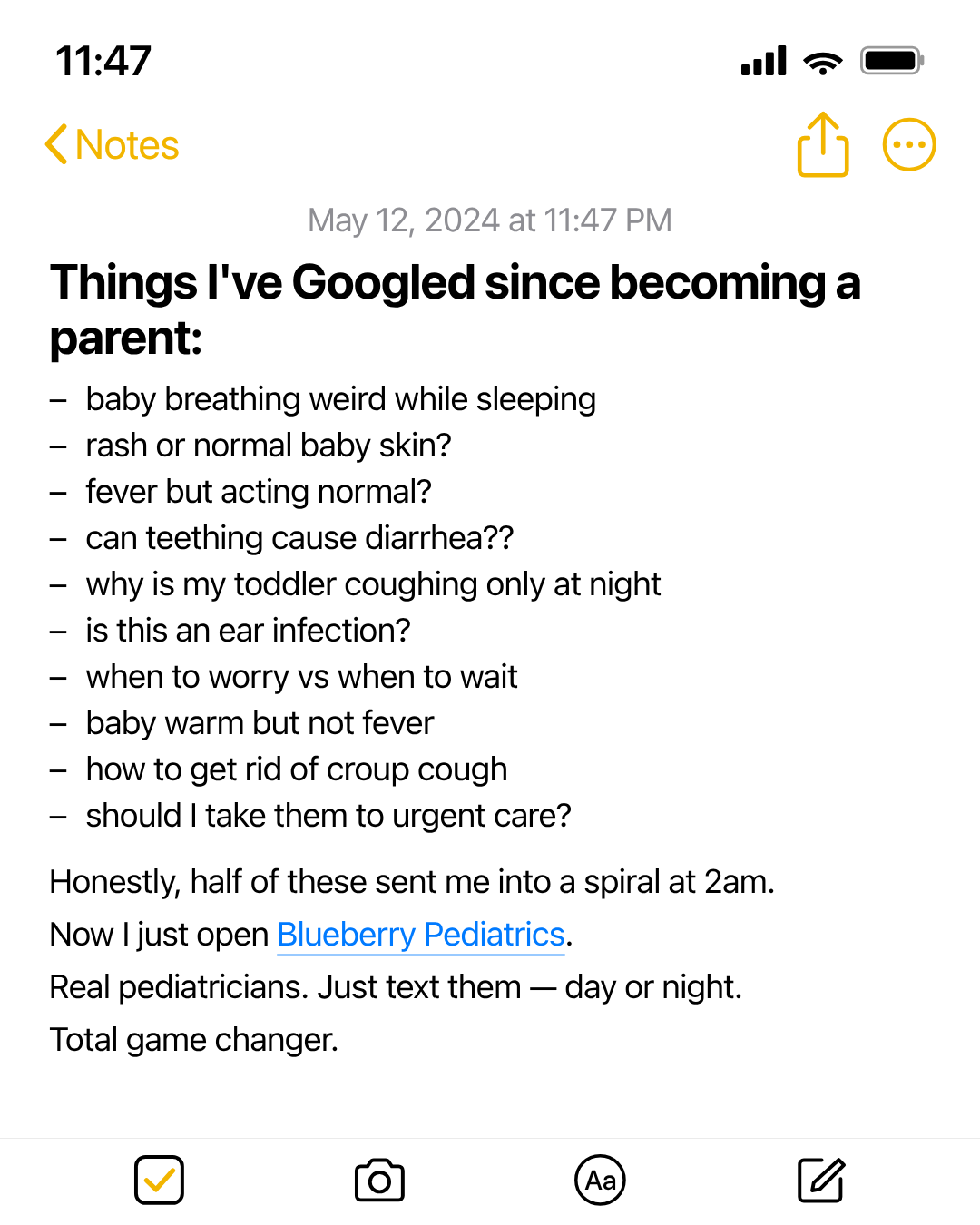
Full description
Notes-screenshot — UGC ad creative styled as a full-bleed iPhone Notes app screenshot. The render IS the iPhone screen, edge-to-edge: status bar, Notes nav, date stamp, note body, and bottom toolbar — no surrounding canvas, no brand band, no CTA, no Sponsored fine-print. Meta overlays its own Sponsored label when the asset is uploaded as an ad. Brand placement happens *inside* the note body via an inline auto-link (e.g. paragraph with linkText: 'Blueberry Pediatrics'). Stylized chrome (CSS-drawn, no Apple SF Symbols / iOS assets). Differentiation: vs social-post-mockup it's single-author note-taking (no platform handle / engagement / verified badge); vs letter it has no opener/signature; vs ugc-overlay it's typography-only on a white note canvas with no photograph.
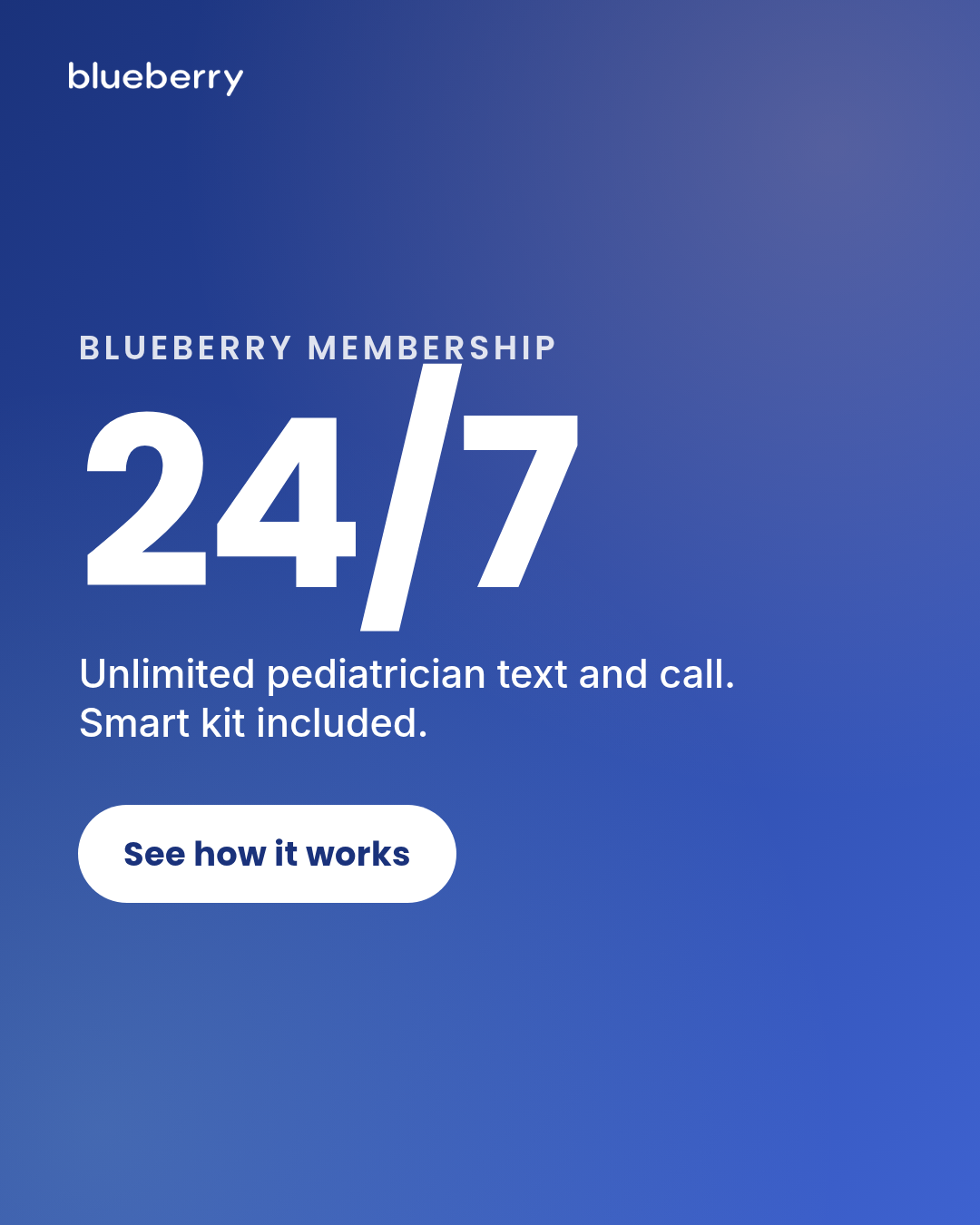
offer-first-banner
5 layoutsOffer-first banner — capability hero + supporting visual.
Layouts: offer-leftoffer-stackedbadge-cornerfull-bleed-offerbundle-band
Show all 15 renders
Full description
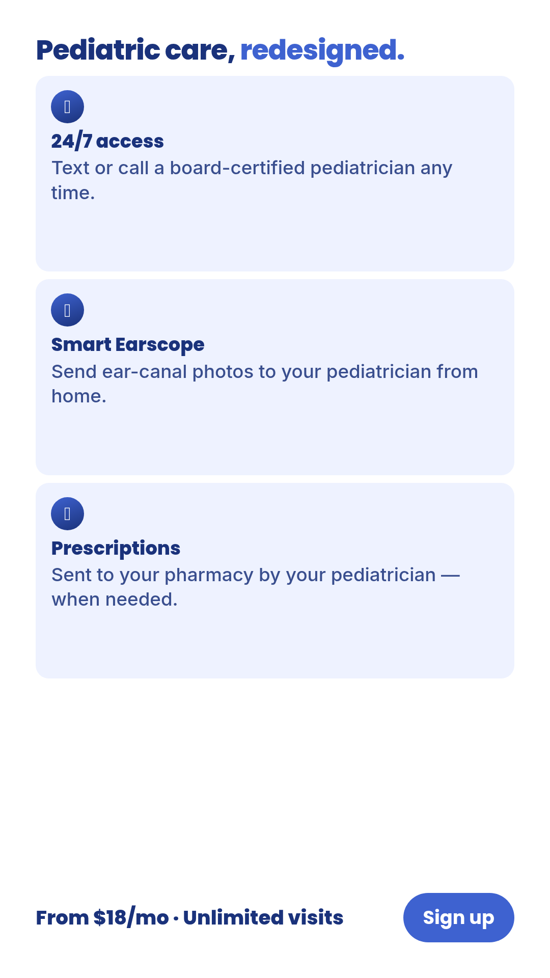
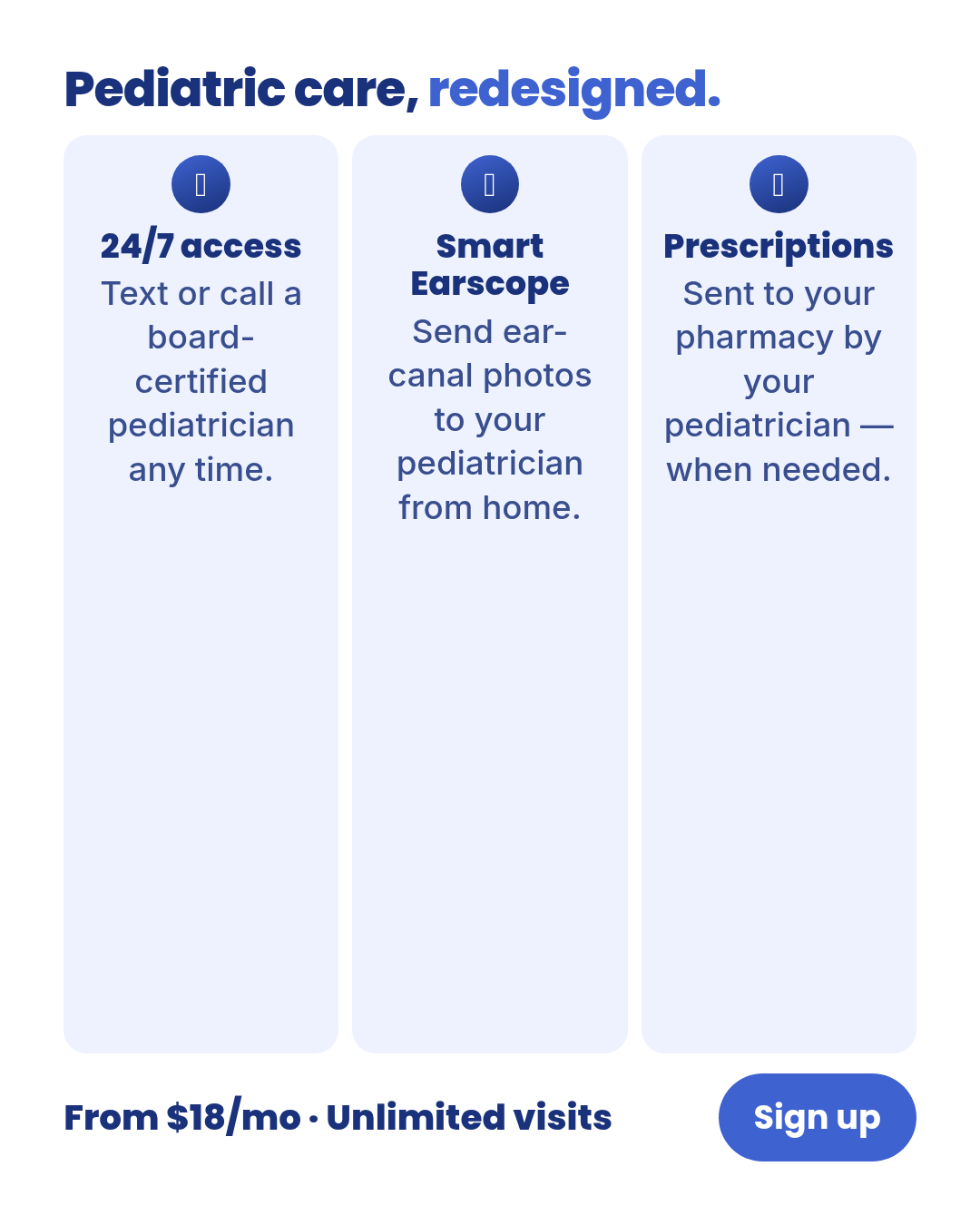
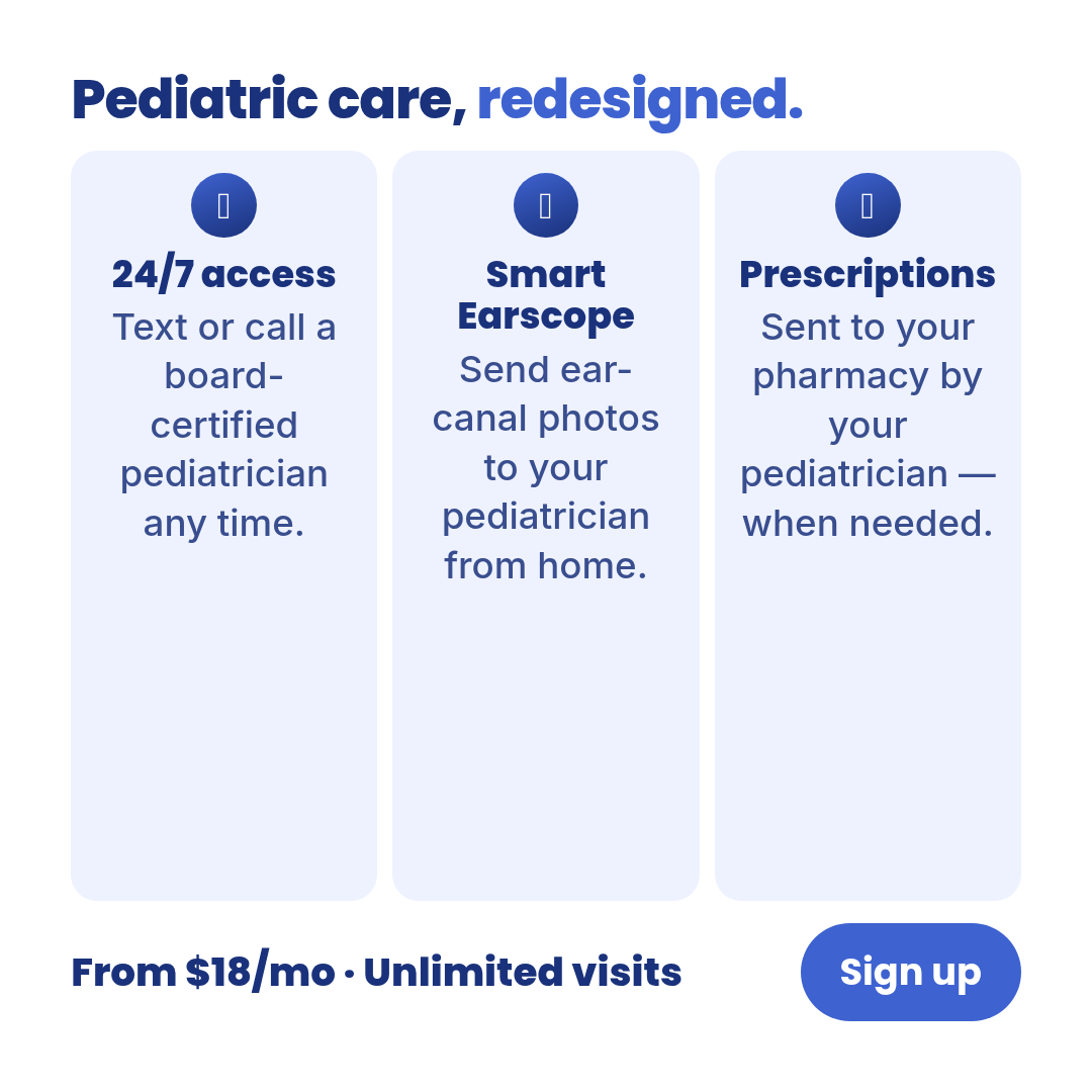
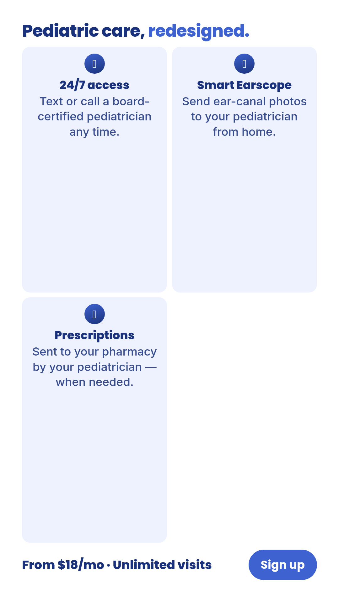
Offer-first banner — capability hero + supporting visual. Five composition layouts (offer-left, offer-stacked, badge-corner, full-bleed-offer, bundle-band) × three aspect ratios. Pass `layout` in data to pick composition. Defaults frame Blueberry as a DTC subscription (24/7 unlimited pediatrician text & call + smart kit) — never MCO/payer copay framing.
parent-forum-thread
1 layoutStylized parent-community discussion mockup — multiple persona-tagged comments stacked in a clean forum-card aesthetic.
Layouts: default
Show all 3 renders
Full description
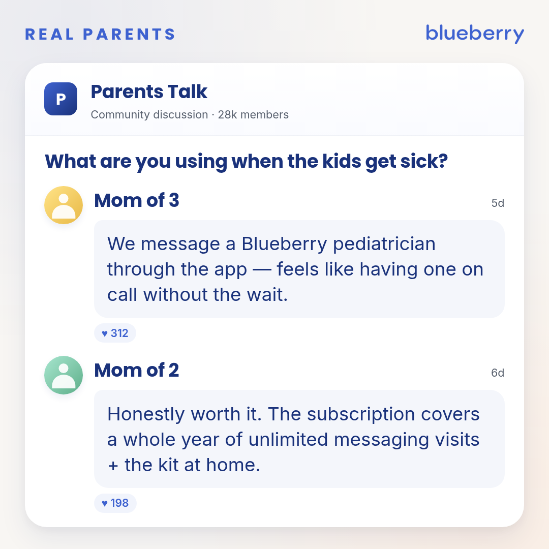
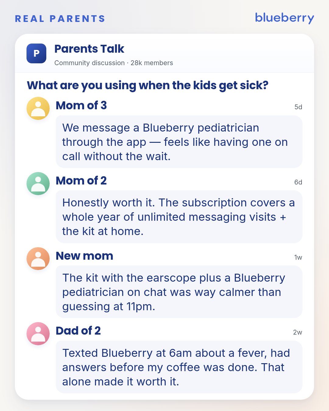
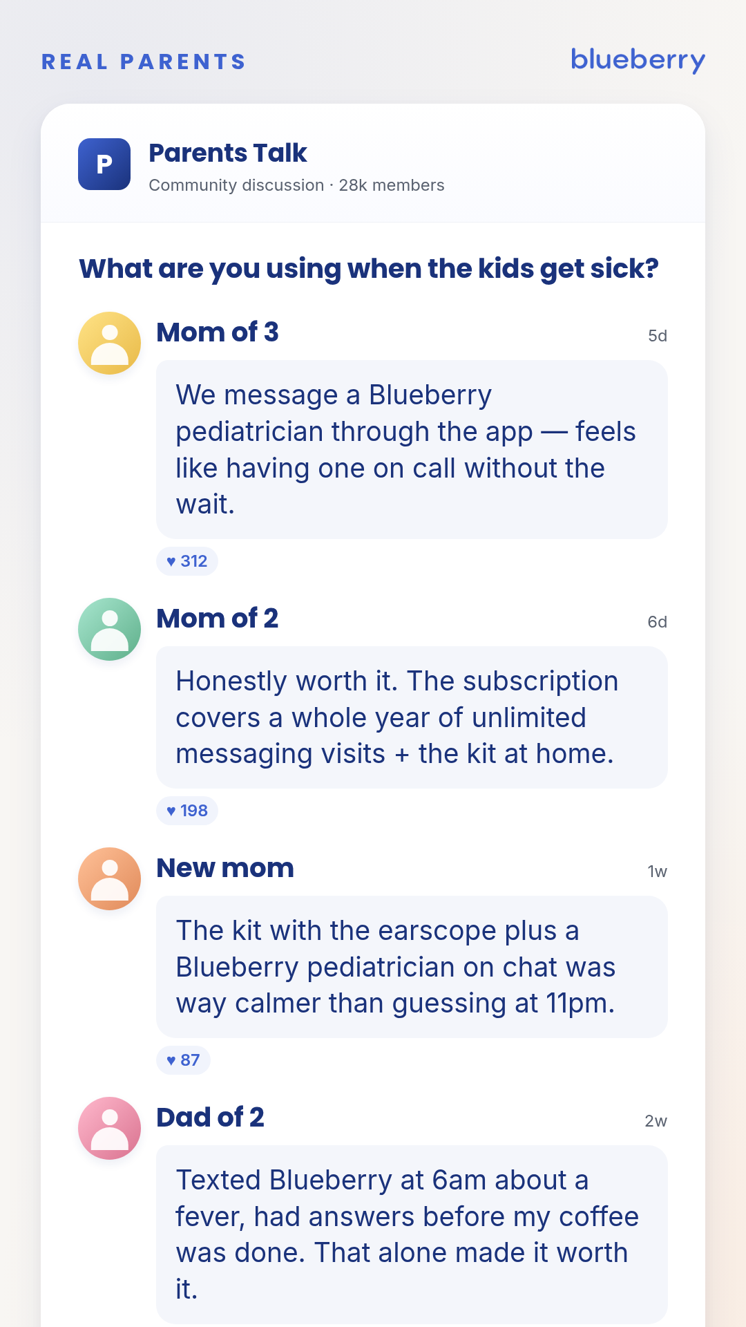
Stylized parent-community discussion mockup — multiple persona-tagged comments stacked in a clean forum-card aesthetic. Intentionally NOT Facebook chrome (no FB-blue, no FB Like/Reply rail, no FB profile rings). Generic 'parent group' look. Reusable for any social-proof comment-thread set. Variants: square_1_1 (≤2 comments fit) / portrait_4_5 (4 comments, no reactions) / story_9_16 (4 comments + reactions). Comments accept persona/timestamp/body/likes/accentToken; regions supported but only set when verified. Realism contract — apply BEFORE rendering, every time: 1. Per-comment business-model pass. Every claim in every comment must map to an in-scope feature of the product being mocked. For Blueberry Pediatrics: text/call only, never 'video'; no ADHD-meds prescribing; no psychiatry. A claim that violates this in the OP body OR in any comment is a launch-blocker. 2. Per-comment medical-claim pass. If a comment names a diagnosis, condition, treatment verb, or specific outcome ('strep,' 'diagnosed,' 'treated,' 'ear infection'), hold the chassis until Sage signs off. Don't ship as flagged-but-unresolved. 3. Internal-consistency pass. No two comments may describe a feature the other contradicts. Walk the comments as a set. 4. Sort by likes/reactions DESC. Real forum threads default to top-engaged-first. Comments must be ordered DESC by the engagement metric shown. 5. Vocabulary establishment. The OP must name (or strongly imply) any term the comments use ('the kit,' 'the chat'). No orphan references. 6. Answer-the-question / named-grounding. If the OP asks 'what are you using' or similar, every comment must explicitly NAME the product/brand/feature it's recommending. Vague endorsements ('honestly worth it,' 'love it') without naming the thing fail this gate — they read as fake because real parents answering a 'what are you using' question always name what they use.
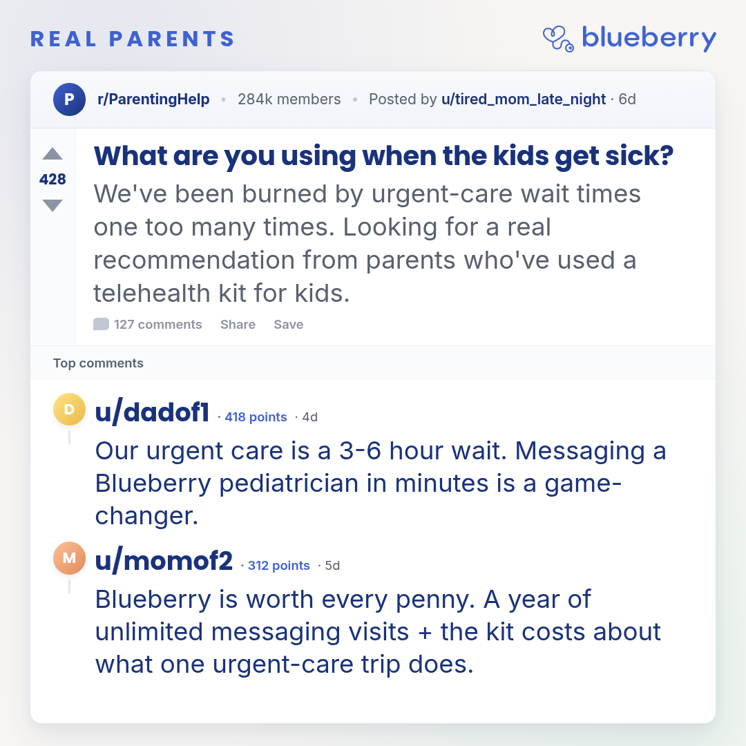
parent-reddit-thread
1 layoutReddit-style discussion mockup — fictional subreddit + post + threaded comments.
Layouts: default
Show all 3 renders
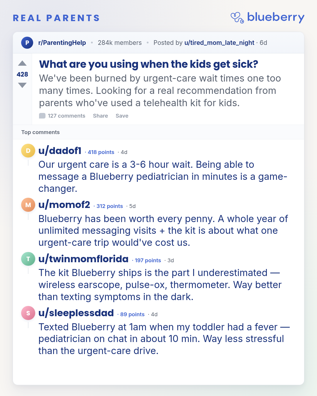
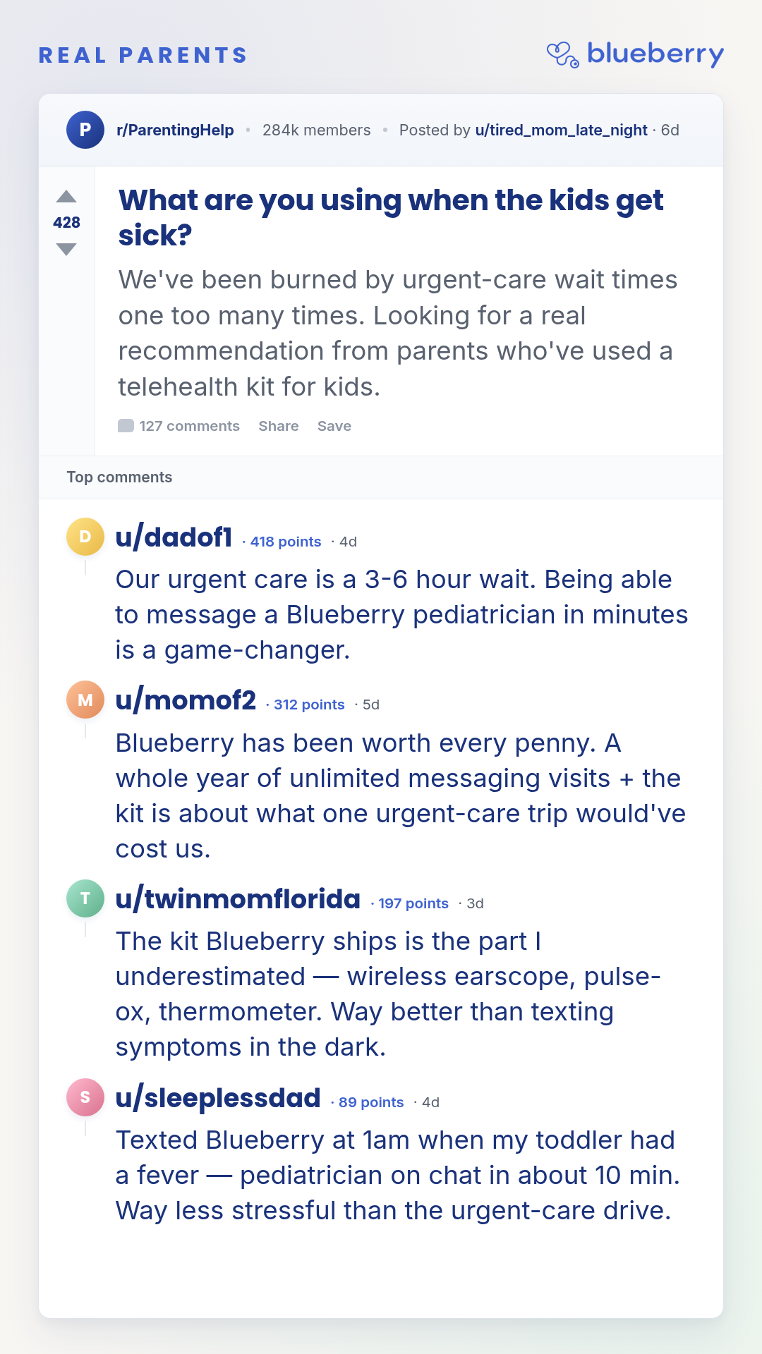
Full description
Reddit-style discussion mockup — fictional subreddit + post + threaded comments. Defensive against Reddit-brand confusion: no Reddit orange, no Reddit logo, made-up subreddit + made-up u/handles. Vote rail + u/handle + 'points' + subreddit header give the Reddit feel; muted-blue chrome and brand lockup keep it visibly an ad. Reusable for any persona-tagged comment-thread set. Variants: square_1_1 (≤2 comments fit) / portrait_4_5 (3-4 comments) / story_9_16 (4 comments + vote rail visible). Comments accept handle/timestamp/body/points/accentToken; OP fields drive the post header. Realism contract — apply BEFORE rendering, every time: 1. Per-comment business-model pass. Every claim in every comment must map to an in-scope feature of the product being mocked. For Blueberry Pediatrics: text/call only, never 'video'; no ADHD-meds prescribing; no psychiatry. A claim that violates this in the OP body OR in any comment is a launch-blocker. 2. Per-comment medical-claim pass. If a comment names a diagnosis, condition, treatment verb, or specific outcome ('strep,' 'diagnosed,' 'treated,' 'ear infection'), hold the chassis until Sage signs off. Don't ship as flagged-but-unresolved. 3. Internal-consistency pass. No two comments may describe a feature the other contradicts (e.g. 'chat feature' vs. 'video' in the same fictional thread). Walk the comments as a set. 4. Sort by points DESC. Real Reddit threads default to top-voted-first. Comments must be ordered points DESC. 5. Vocabulary establishment. The OP must name (or strongly imply) any term the comments use ('the kit,' 'the chat'). No orphan references. 6. Answer-the-question / named-grounding. If the OP asks 'what are you using' or similar, every comment must explicitly NAME the product/brand/feature it's recommending. Vague endorsements ('honestly worth it,' 'love it') without naming the thing fail this gate — they read as fake because real Redditors answering a 'what are you using' question always name what they use.
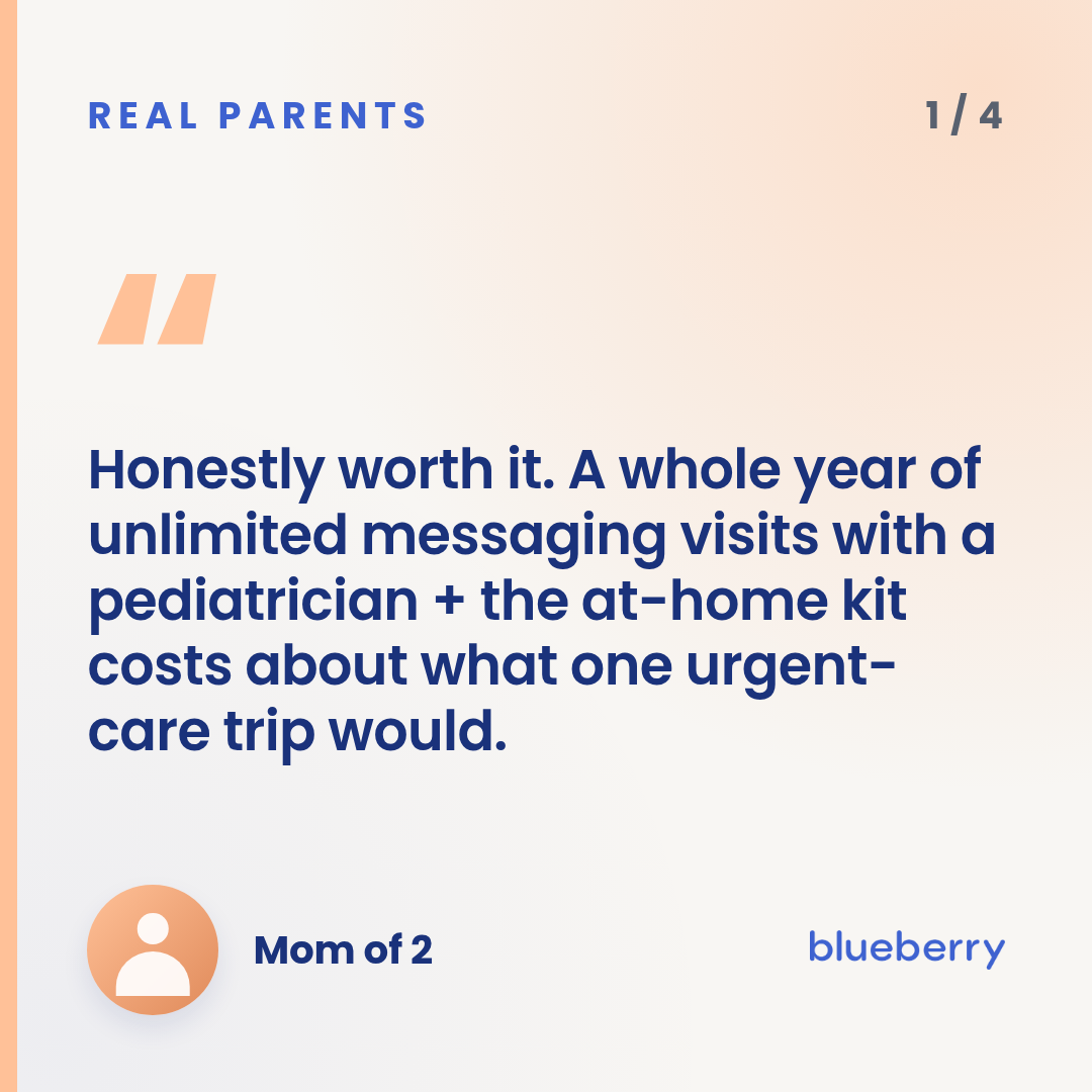
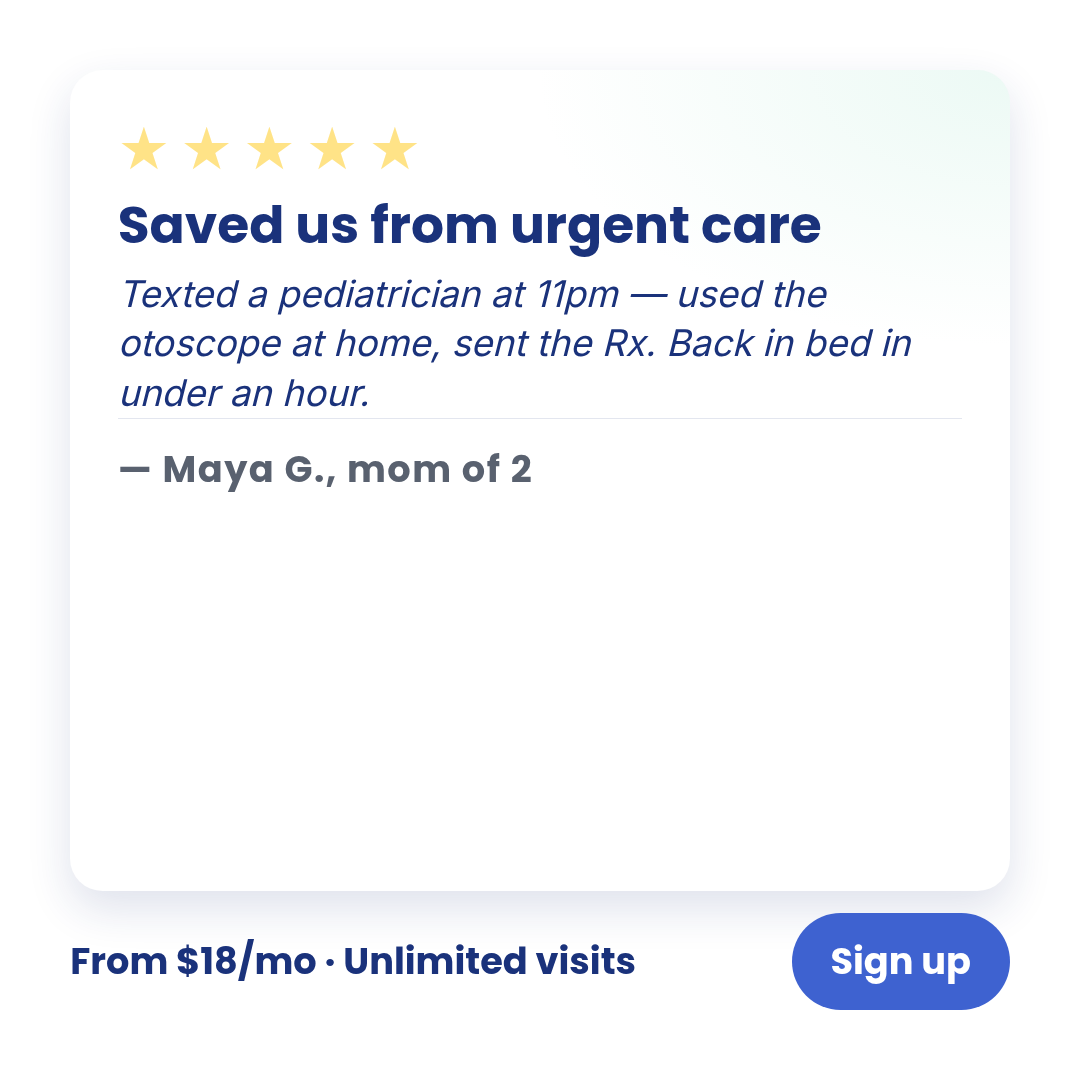
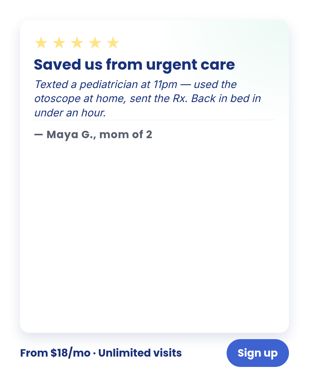
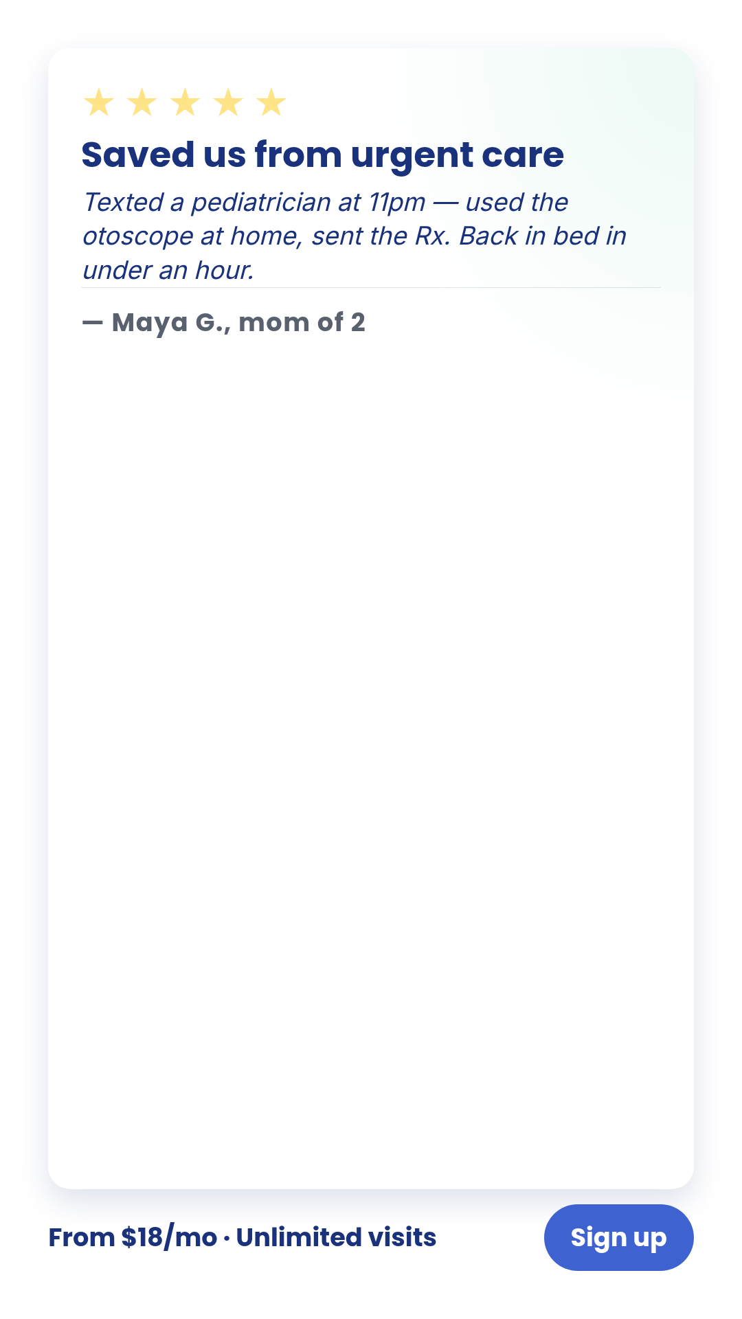
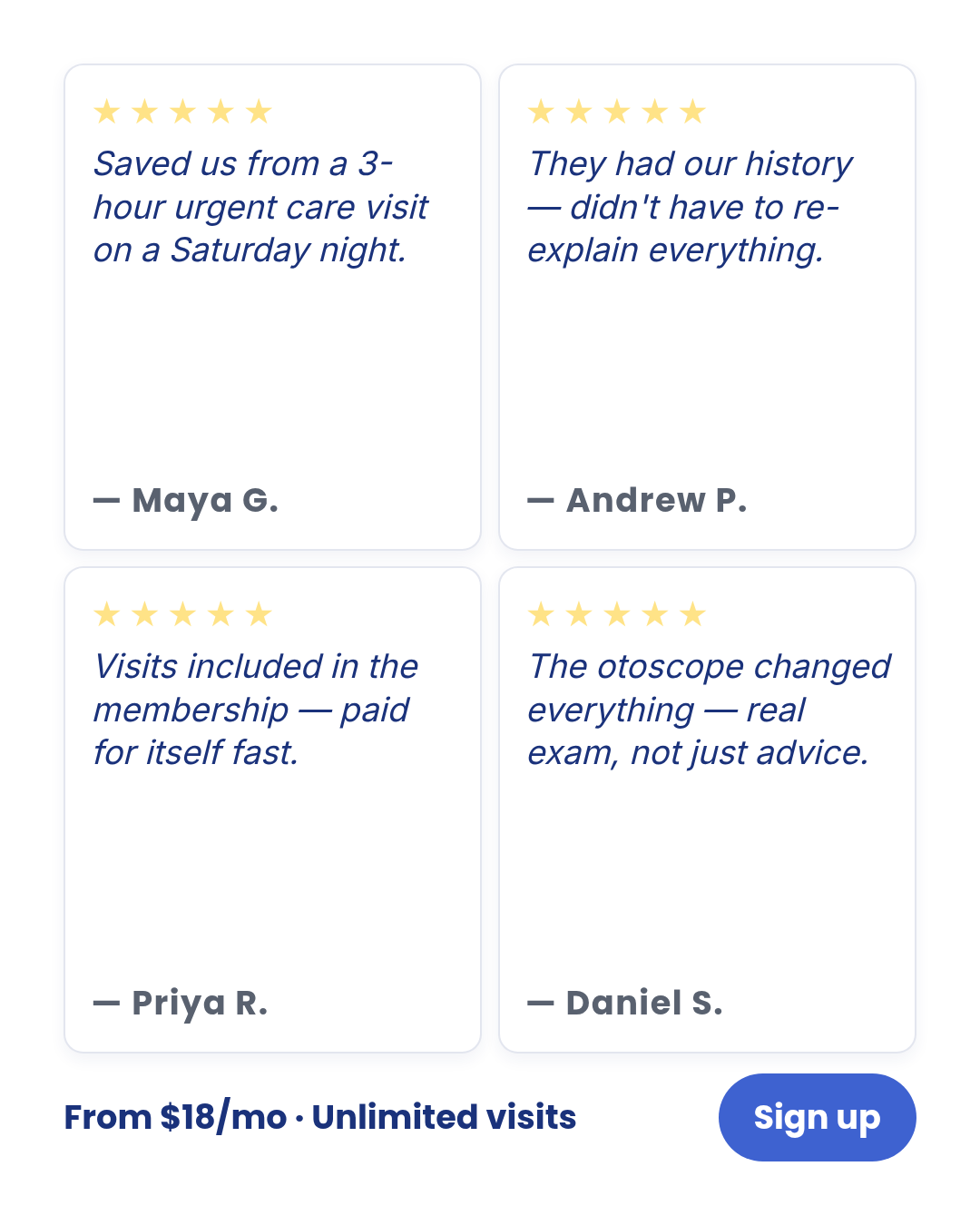
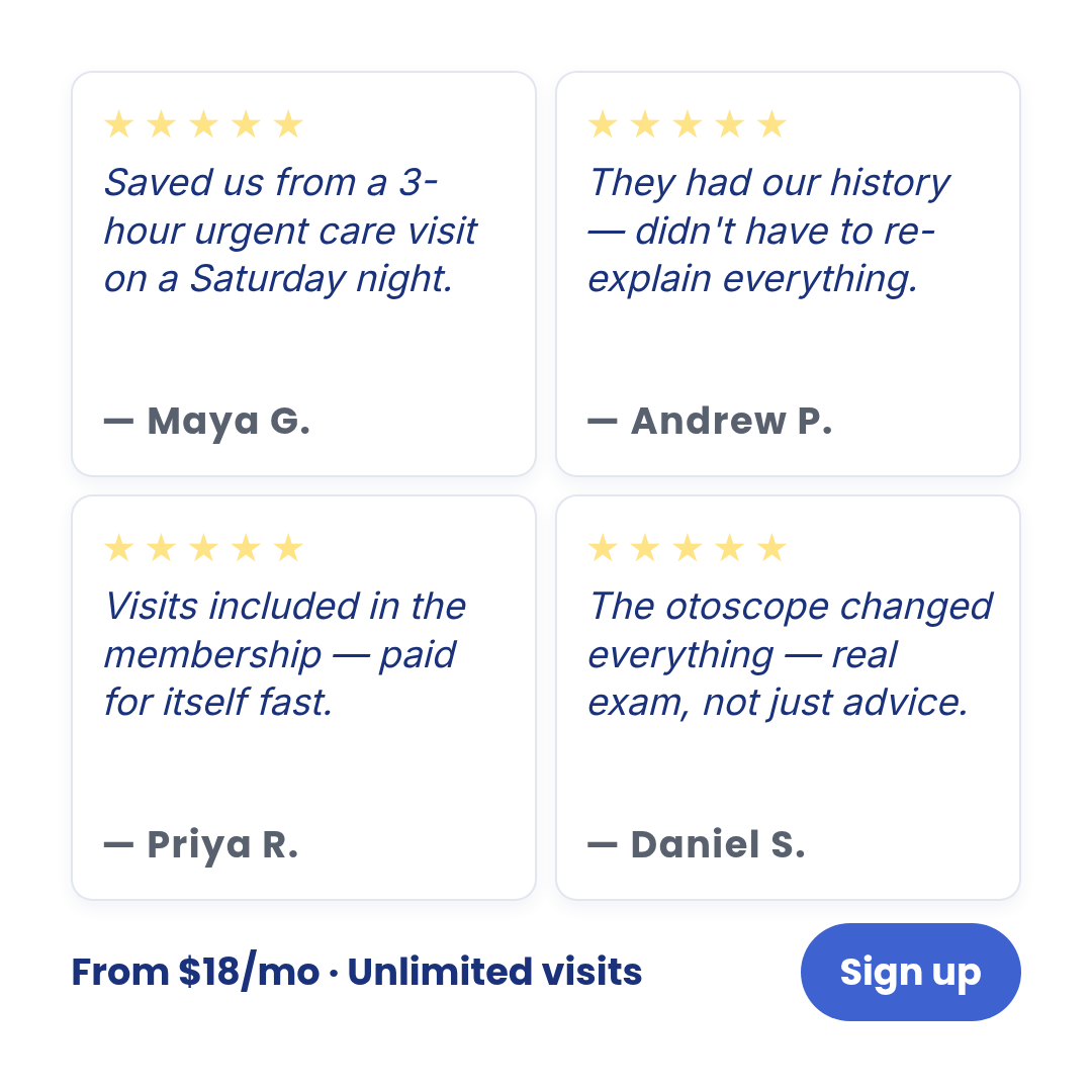
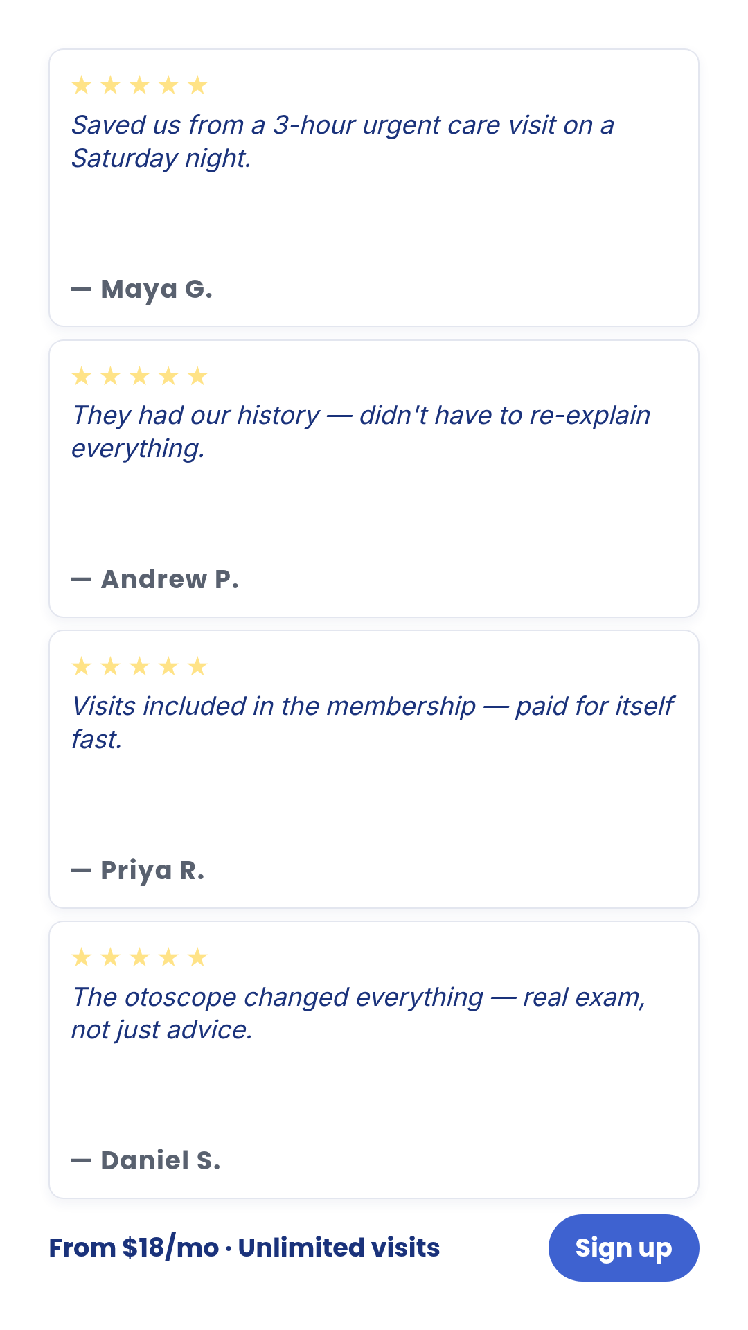
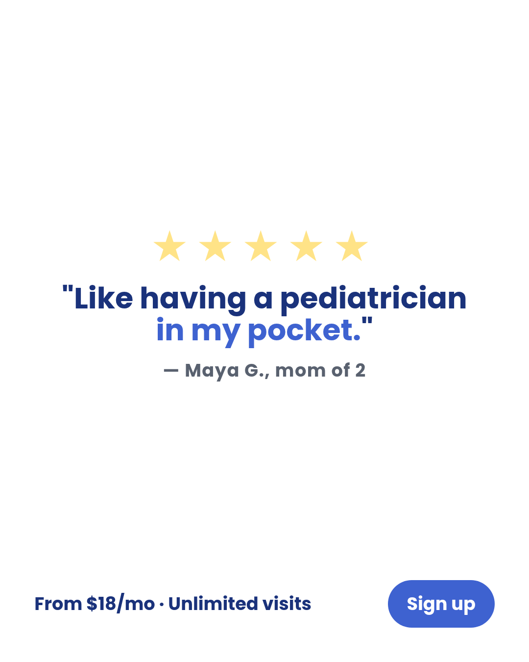
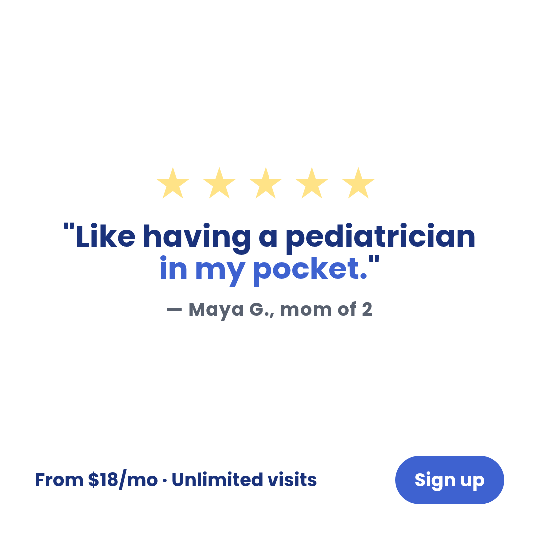
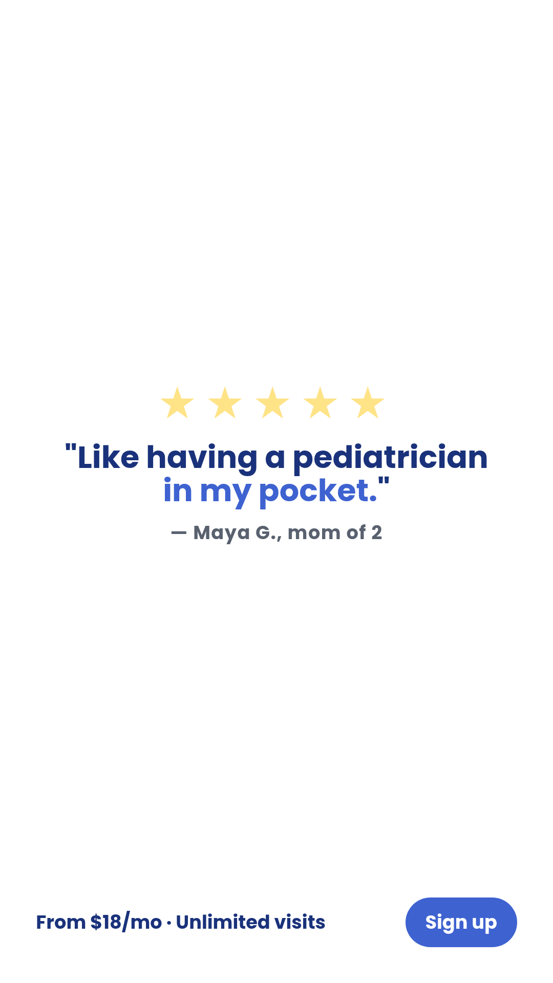
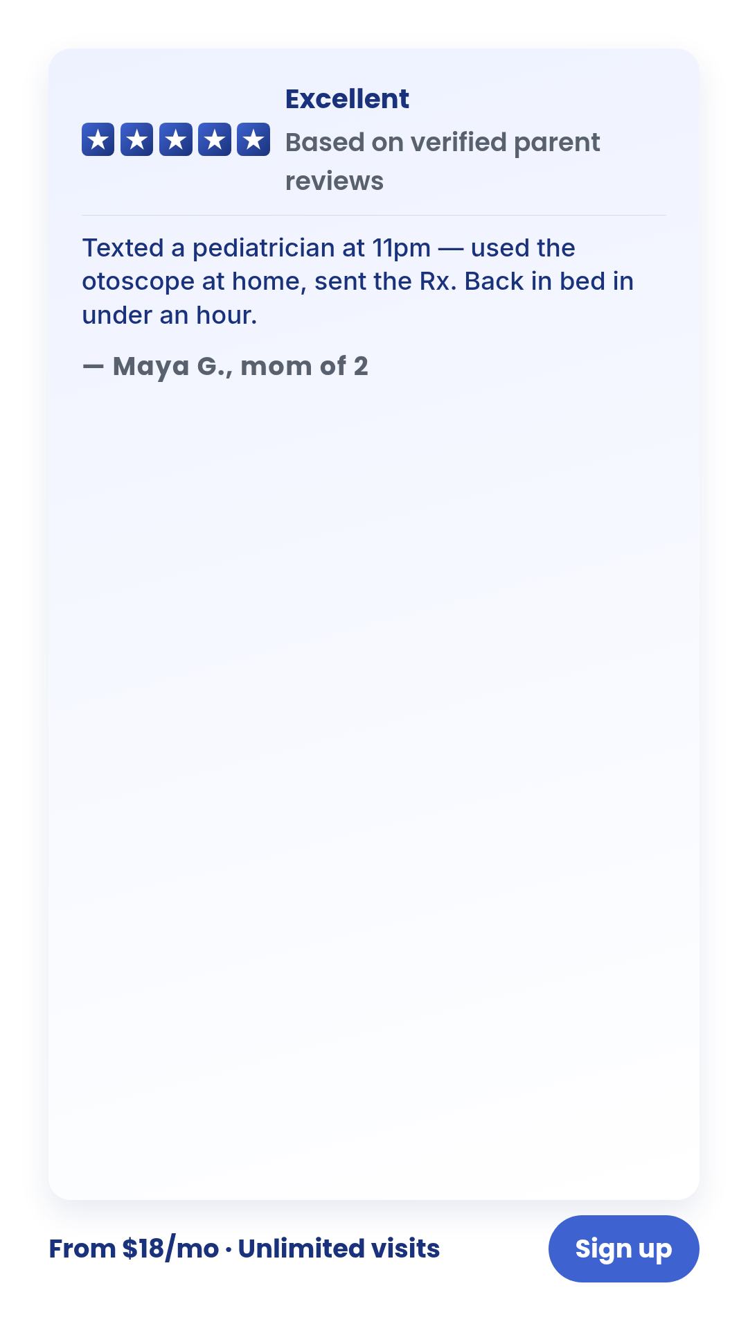
parent-testimonial-card
1 layoutParent-voice testimonial card with persona attribution (e.g., 'Mom of 2').
Layouts: default
Show all 3 renders
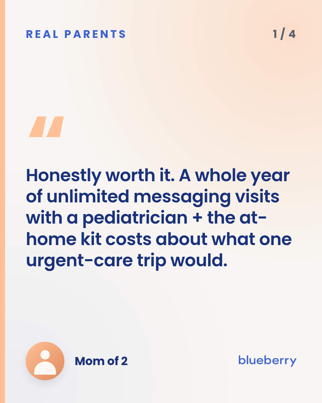
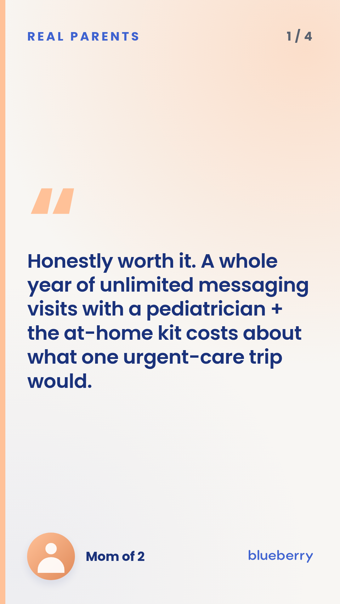
Full description
Parent-voice testimonial card with persona attribution (e.g., 'Mom of 2'). One quote per render. Reusable for any anonymized parent-quote carousel — feed (1:1, 4:5) or reels (9:16). Per-card accent color via `accentToken` (one of brand.secondaryYellow / Peach / Pink / Mint). Optional `region` field is supported but should ONLY be set when the source customer's location is verified — leaving it empty is the FTC-safer default. The default `quote` carries a Gate-F-compliant anchor pair (subscription-scope + kit) so the rendered canonical example is itself a valid ad; briefs override `quote` per card.
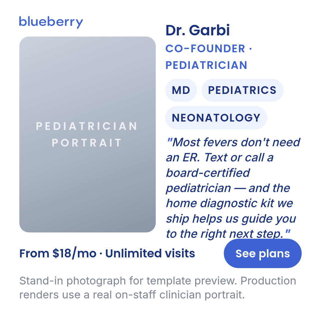
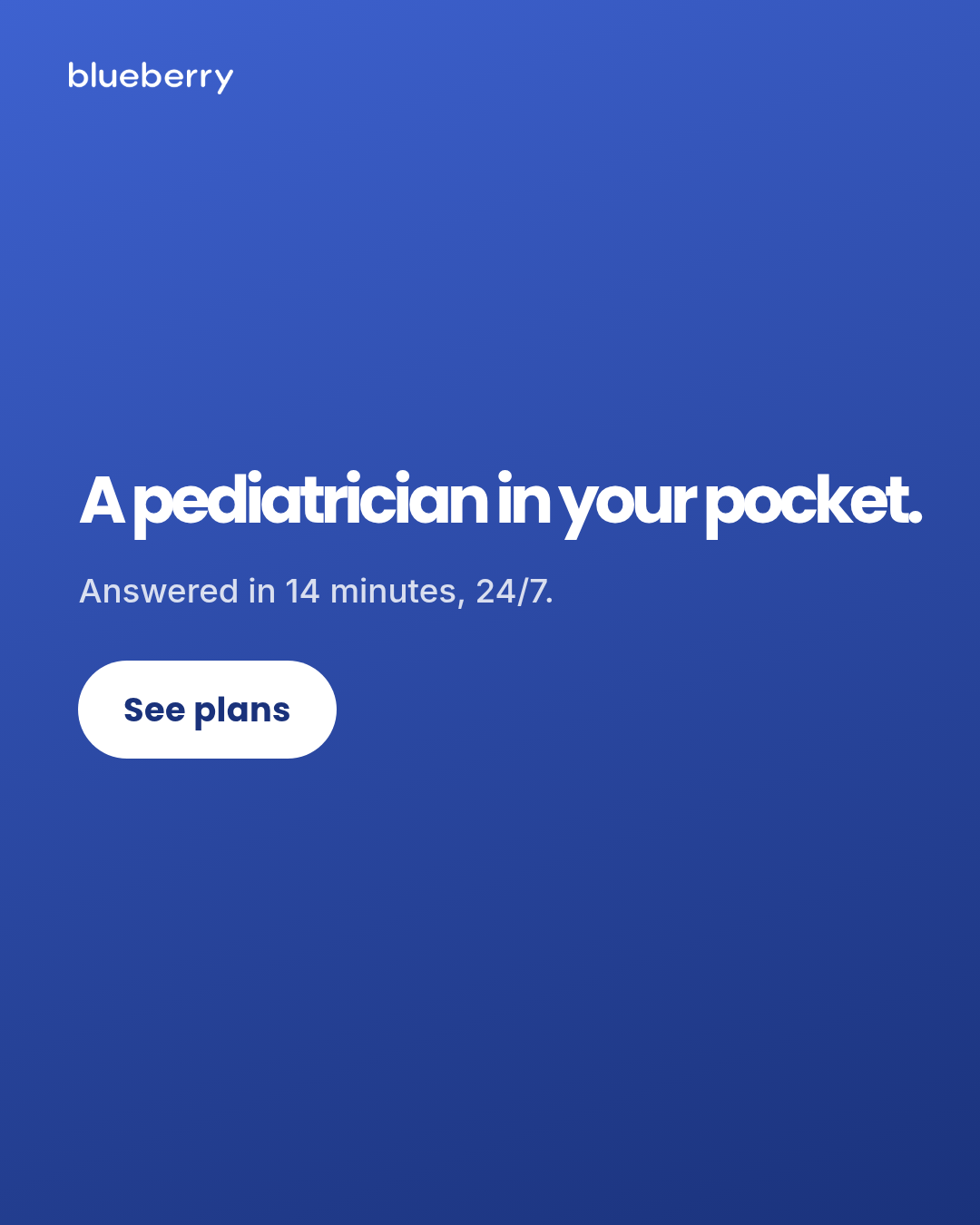
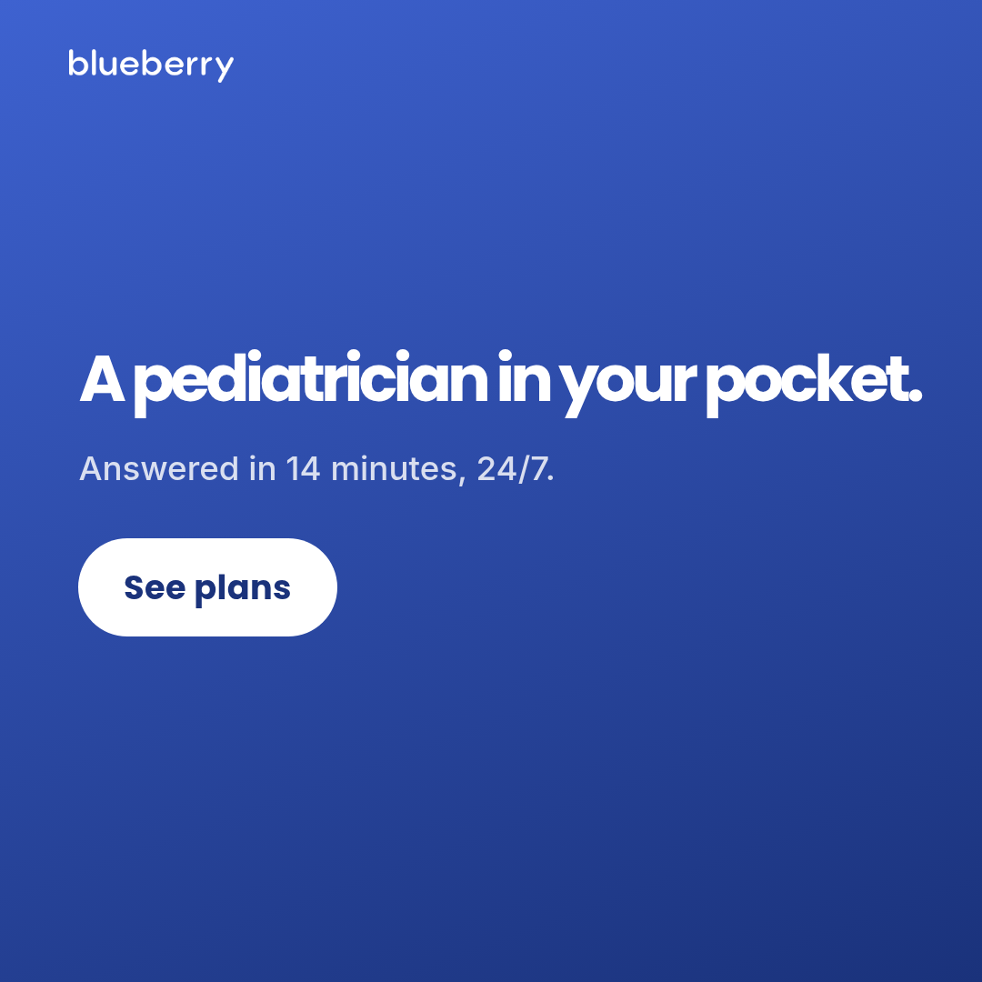
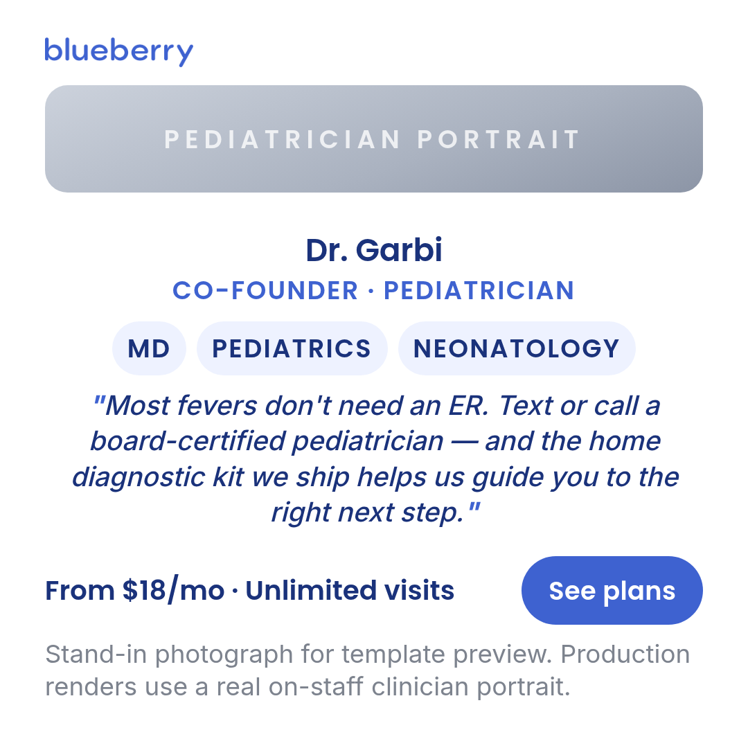
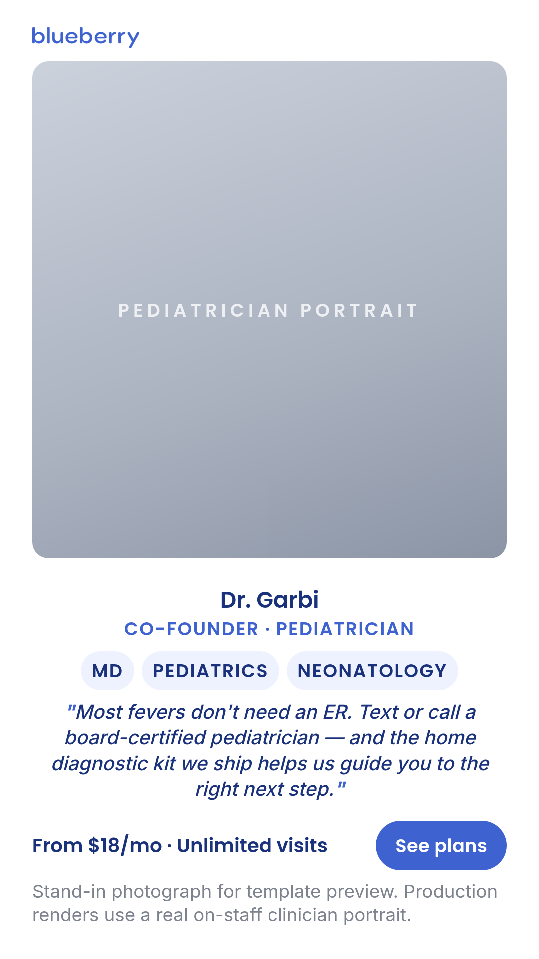
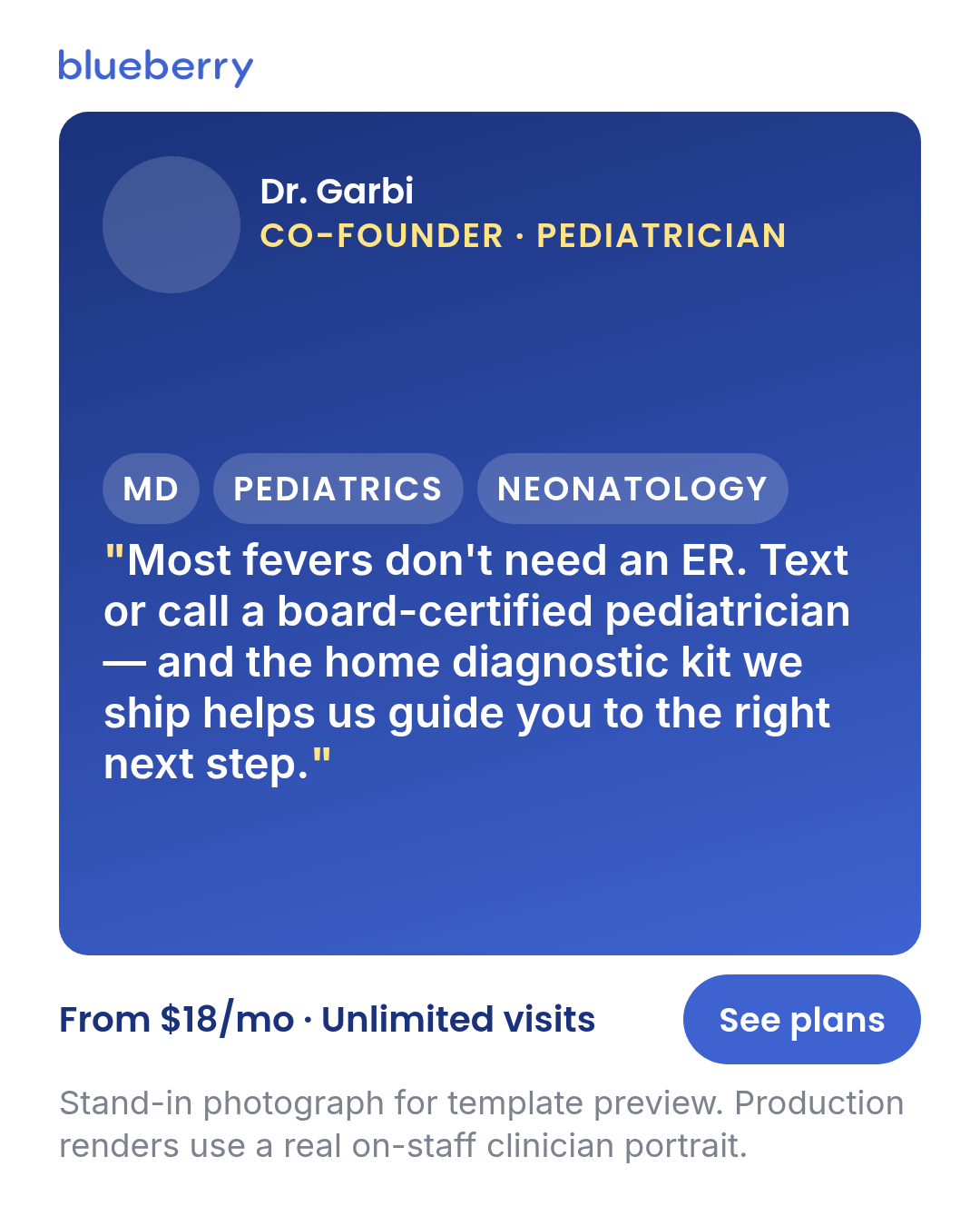
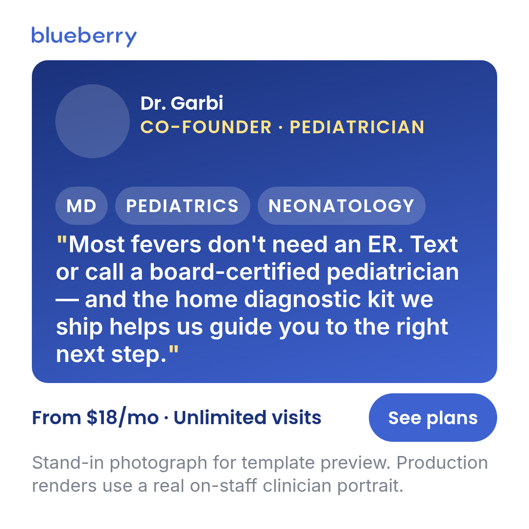
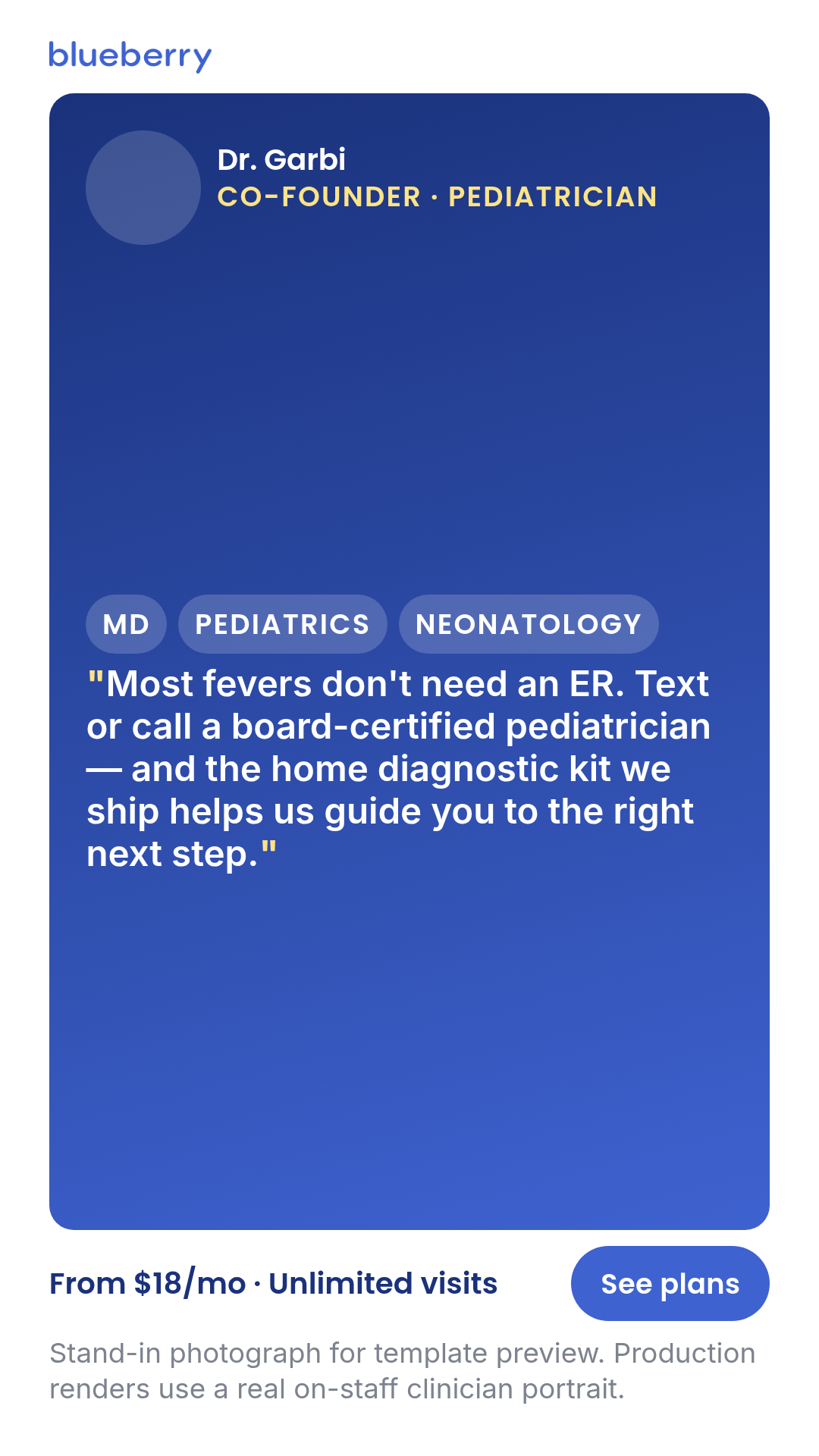
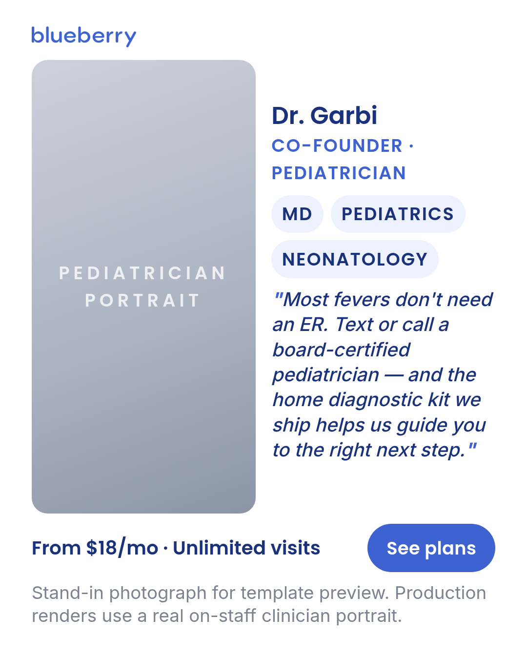
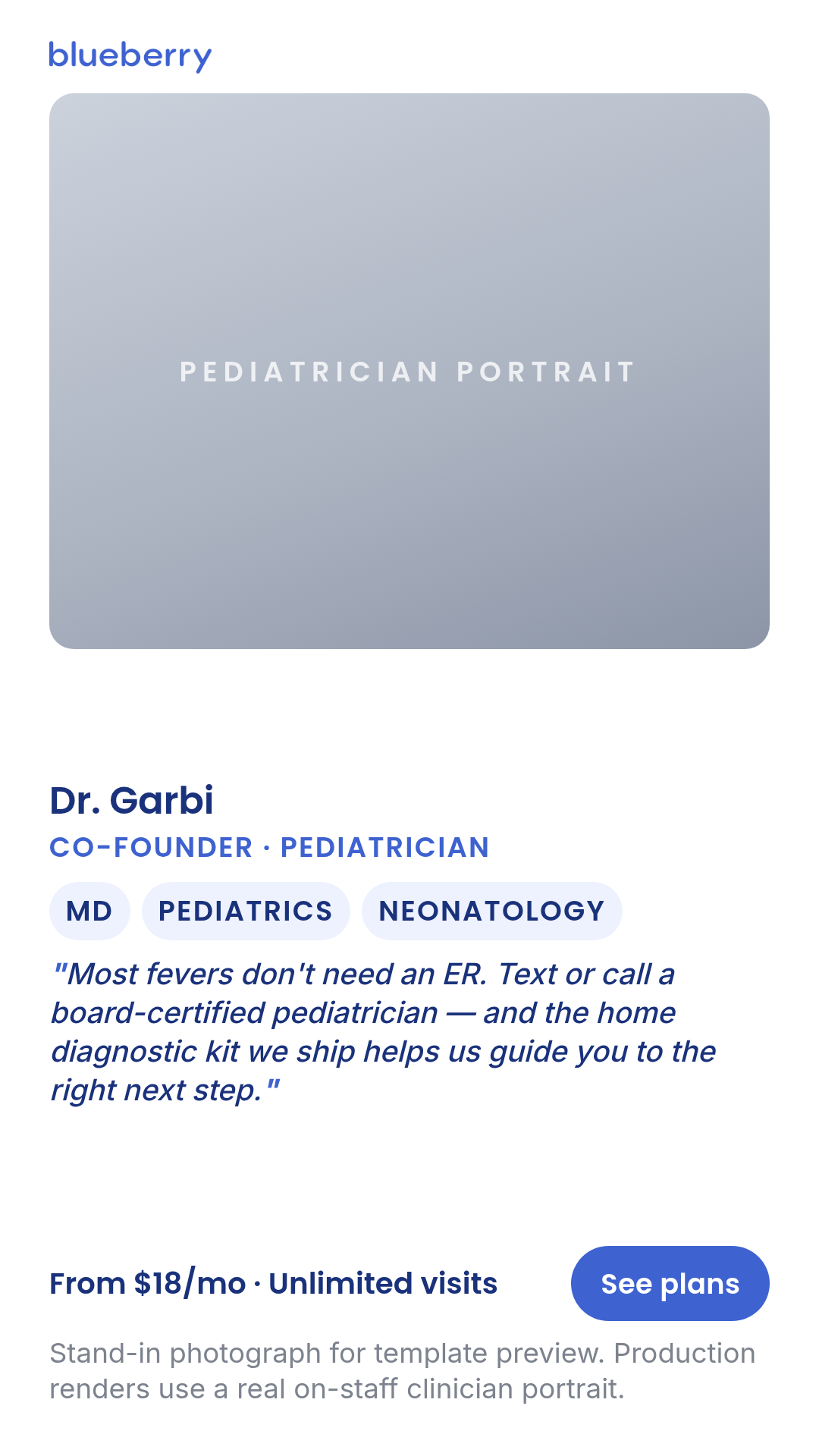
pediatrician-expert
3 layoutsPediatrician-expert — clinician-authority static.
Layouts: white-coat-portraitcredential-frameexpert-quote
Show all 9 renders
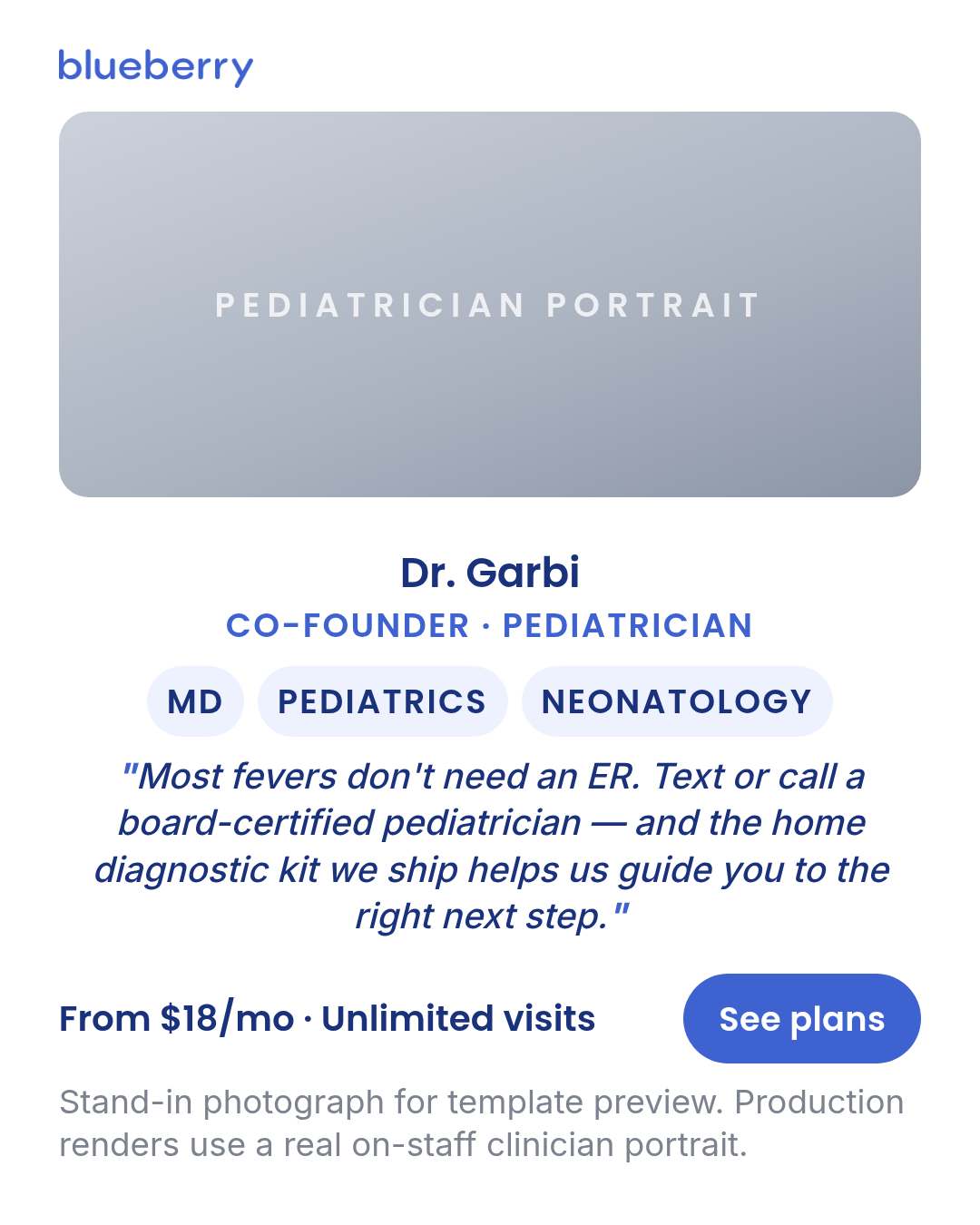
Full description
Pediatrician-expert — clinician-authority static. Named board-certified pediatrician with credentials visible. Distinct from `founder` (operator voice without credential framing) and `letter` (correspondence framing). One template with 3 layouts (white-coat-portrait, credential-frame, expert-quote) × 3 aspect ratios. Differentiation guardrails: clinical authority framing with credentials shown (NOT operator/co-founder voice — use `founder`; NOT a customer or peer-voice photo — use `ugc-overlay` / `case-study`; NOT a typed letterhead — use `letter`). Compliance posture is stricter than `founder`: every claim, dose, treatment outcome, and superlative MUST be cleared by Sage / meta-ad-compliance. Briefs MUST supply a real on-staff clinician photo + credentials — the chassis default photo is an intentional CSS placeholder (NOT an AI face) because an AI-generated pediatrician on an authority-frame ad is a misleading-endorsement risk. Source: data/templates/batch3/pediatrician-expert-research.md.
platform-mockup
5 layoutsPlatform-mockup — full-bleed iPhone screenshot (the render IS the phone screen, edge-to-edge).
Layouts: email-inboxpush-notificationapp-screen-darklock-screen-alertrx-chat
Show all 15 renders
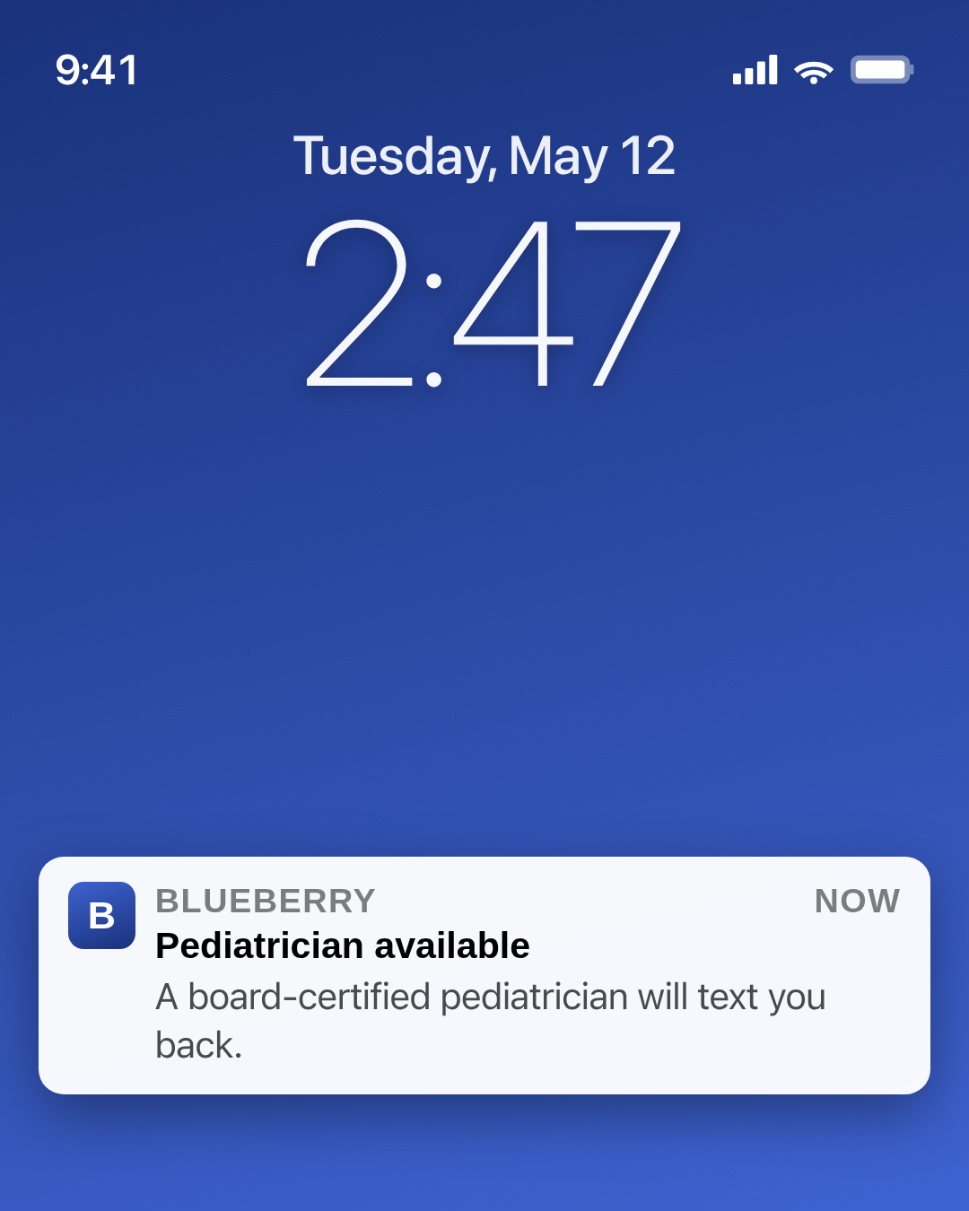
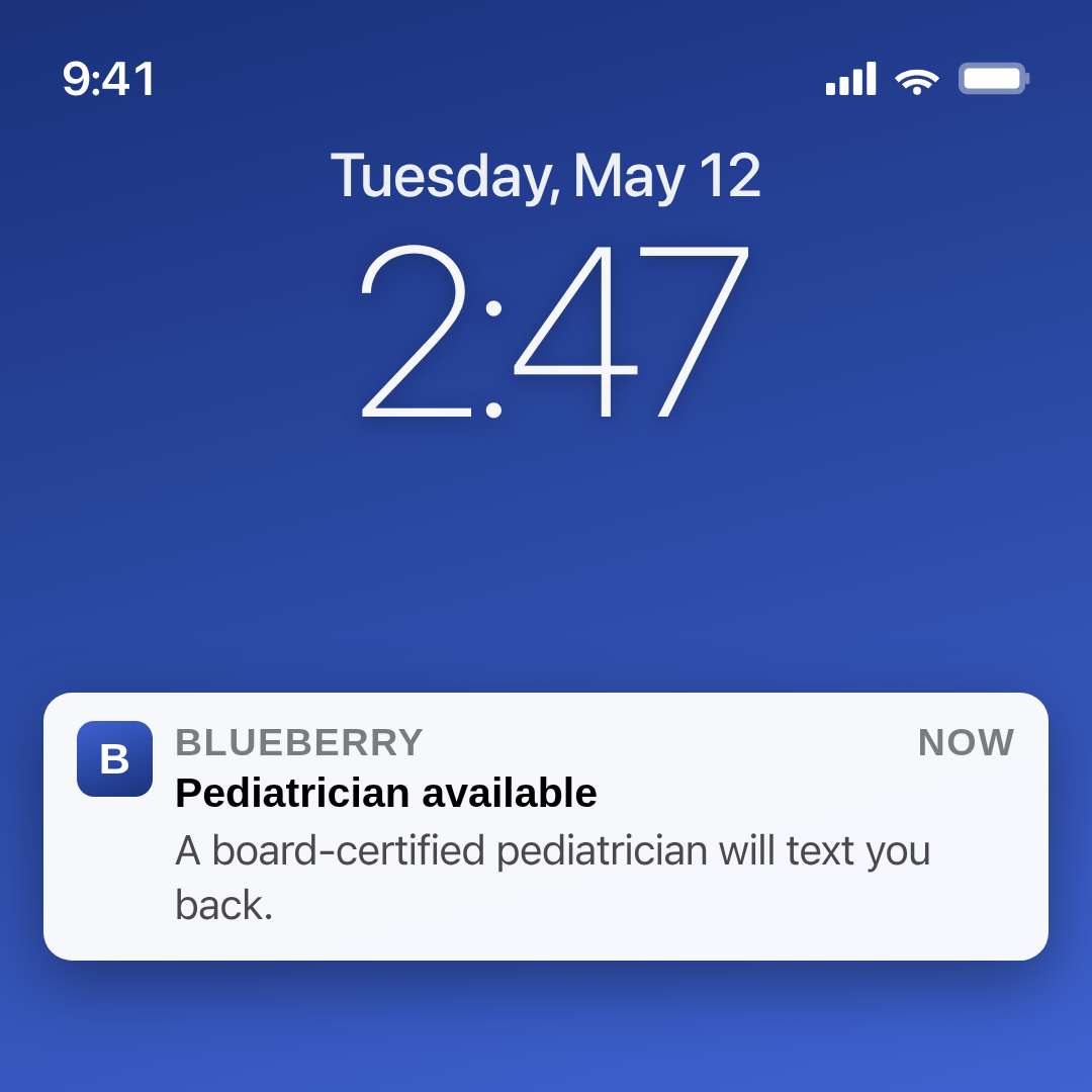
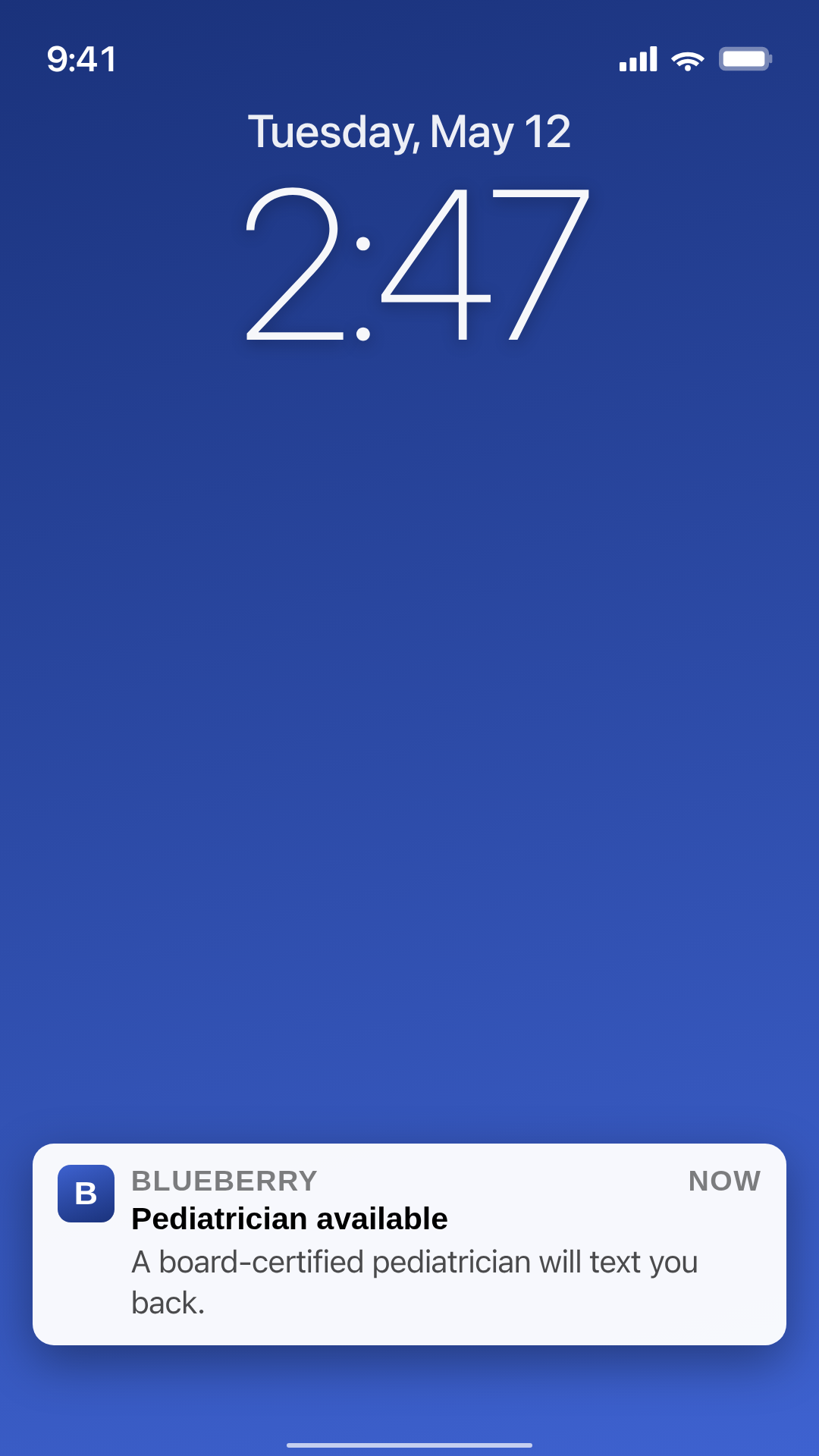
Full description
Platform-mockup — full-bleed iPhone screenshot (the render IS the phone screen, edge-to-edge). 5 layouts: email-inbox (Mail-app inbox card), push-notification (lock-screen-style notification on dark wallpaper), app-screen-dark (Blueberry brand splash as if launching the app), lock-screen-alert (giant clock + alert card), rx-chat (Messages-app conversation). Each carries an accurate iOS status bar pulled from `_partials/ios/`. NO surrounding canvas, brand band, headline, CTA pill, or 'Sponsored' fine-print — Meta overlays its own Sponsored label when uploaded. Brand placement happens *inside* the screenshot (sender name, app icon, doctor name in chat). Differentiation: post-inside-platform-chrome (X tweet, IG post, SMS thread, reddit comment) → `social-post-mockup`; typographic overlay on a UGC photo → `ugc-overlay`; ad with explicit headline + CTA → `ad-creative` / `offer-first-banner` / `billboard`.
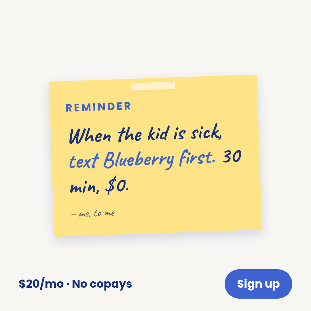
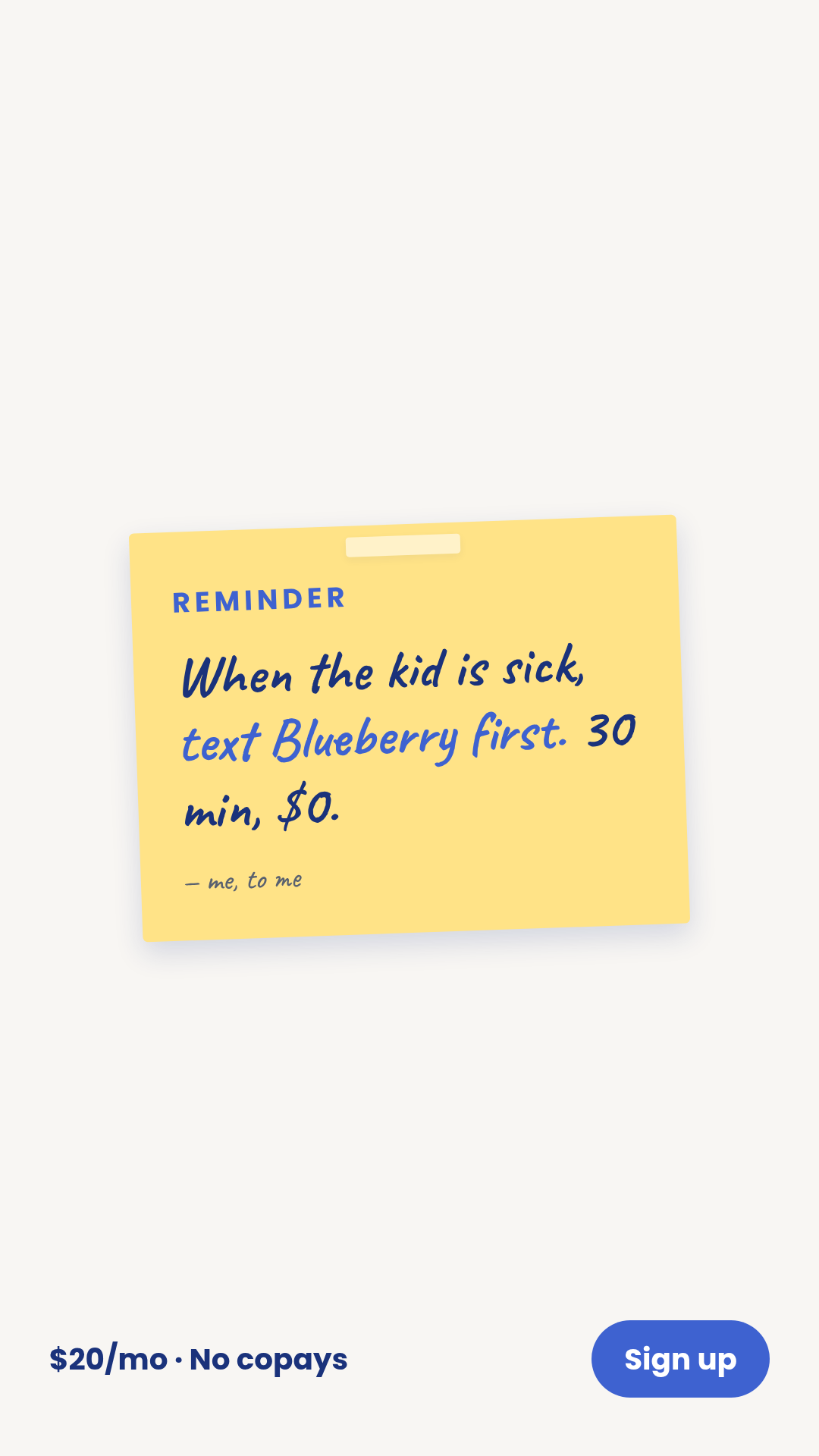
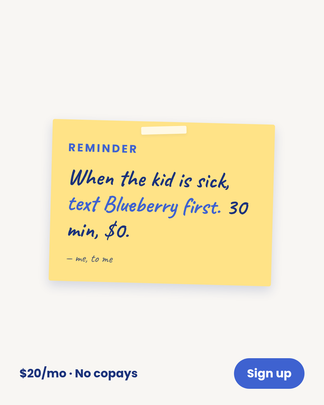
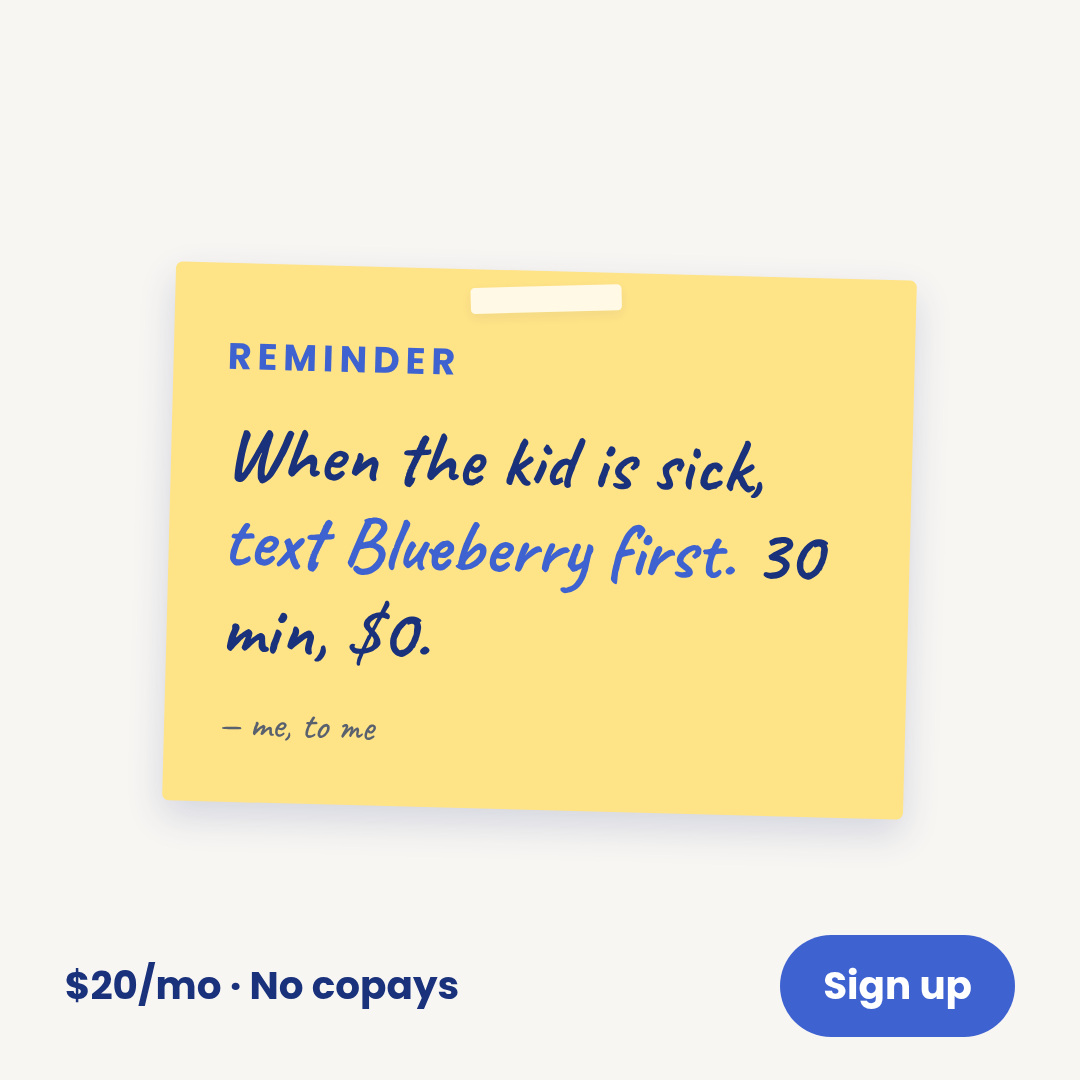
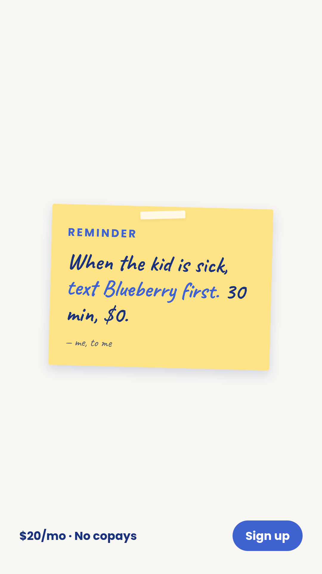
post-it
3 layoutsPost-it — handwritten reminder/note on a yellow square.
Layouts: single-notetaped-cornertwo-stickies
Show all 9 renders
Full description
Post-it — handwritten reminder/note on a yellow square. Punch-above format (F&A #1 hit-rate; H&W under-represented = test-before-crowding opportunity). One template with 3 layouts (single-note, taped-corner, two-stickies) × 3 aspect ratios. Differentiation guardrails: handwritten-on-yellow note rhetoric (NOT printed letterhead — use `letter`; NOT pure typography in a card frame — use `quote-card`; NOT photo + typography — use `ugc-overlay`); reads like a parent's reminder to themselves or a fridge note. Source: data/templates/batch2/post-it-research.md.
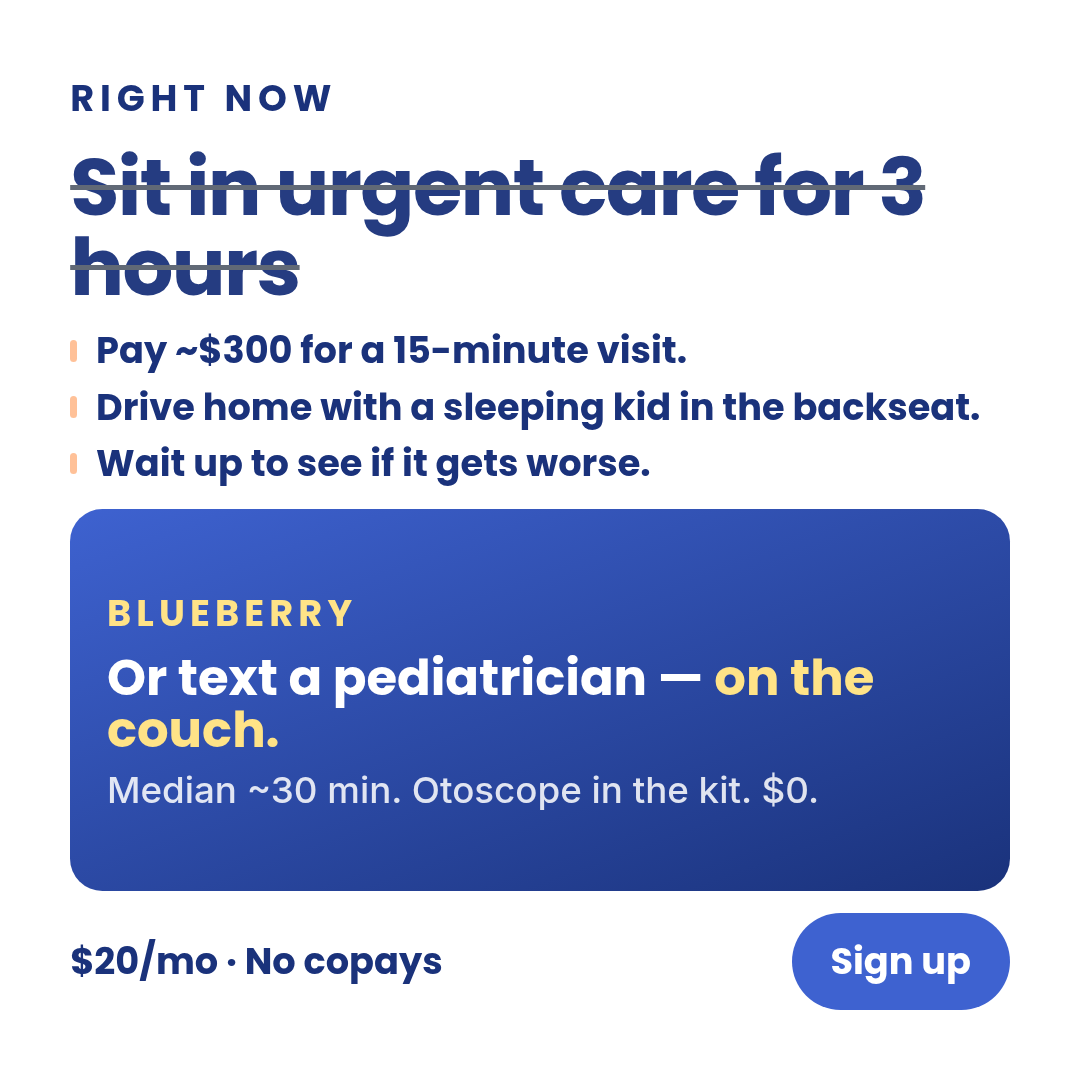
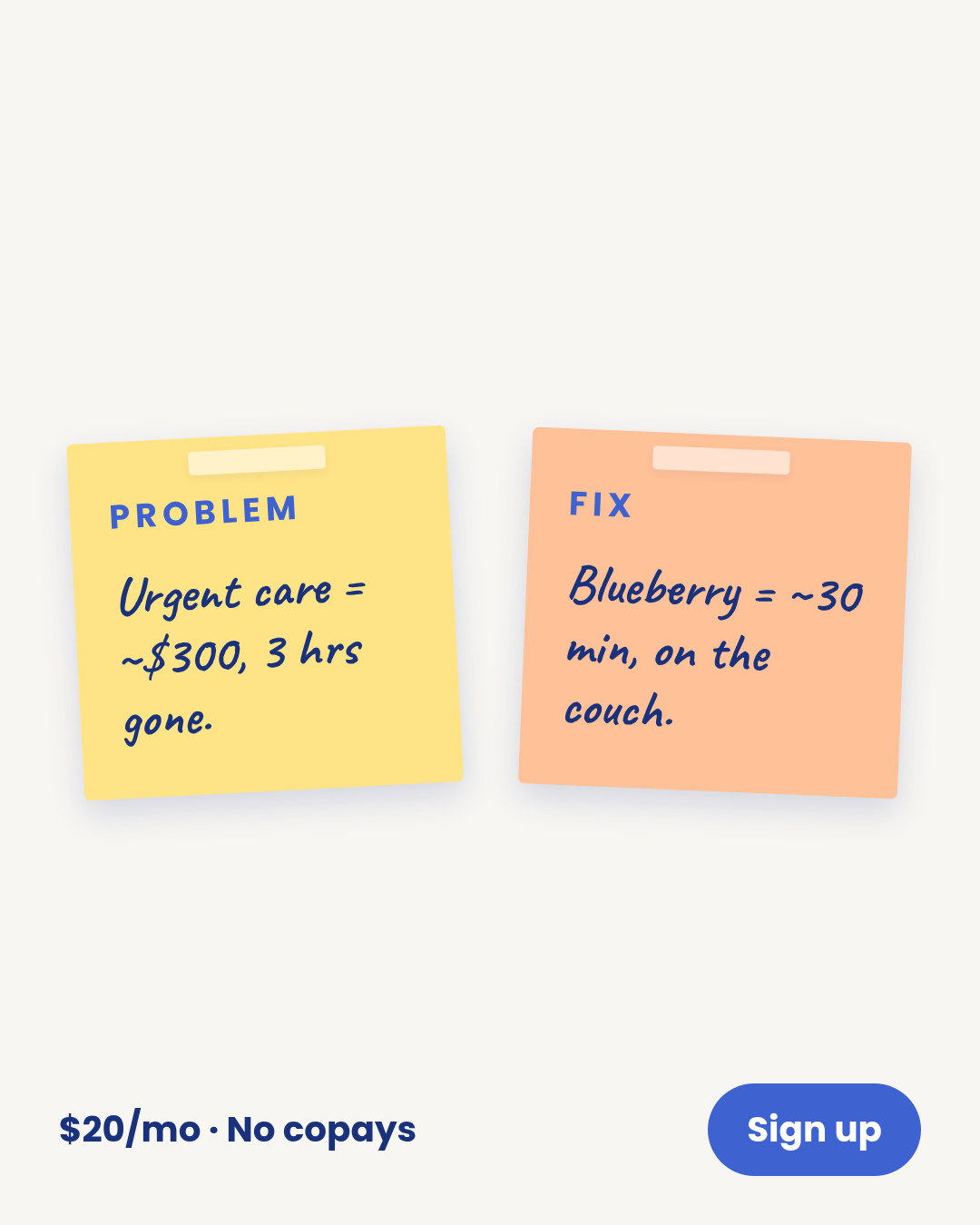
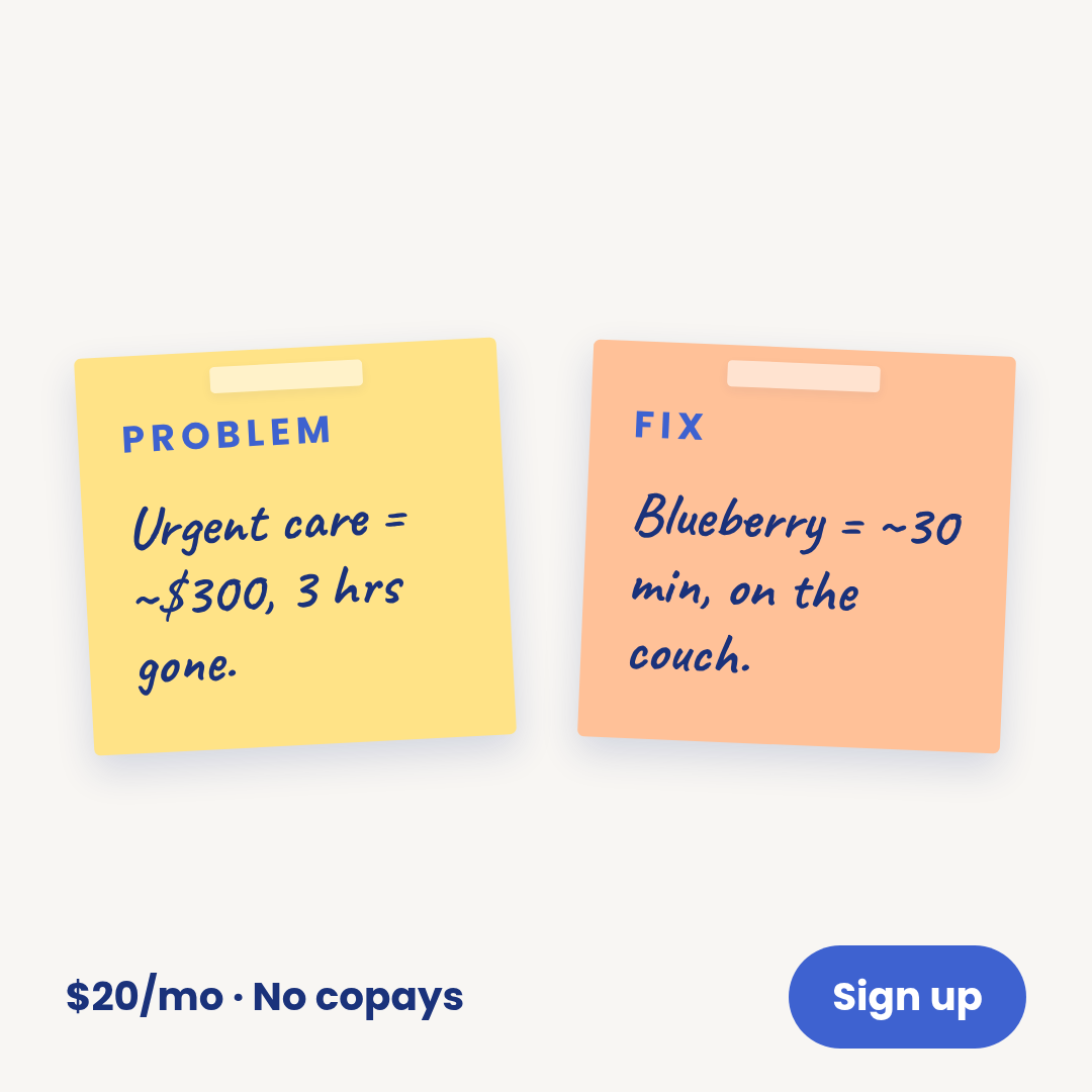
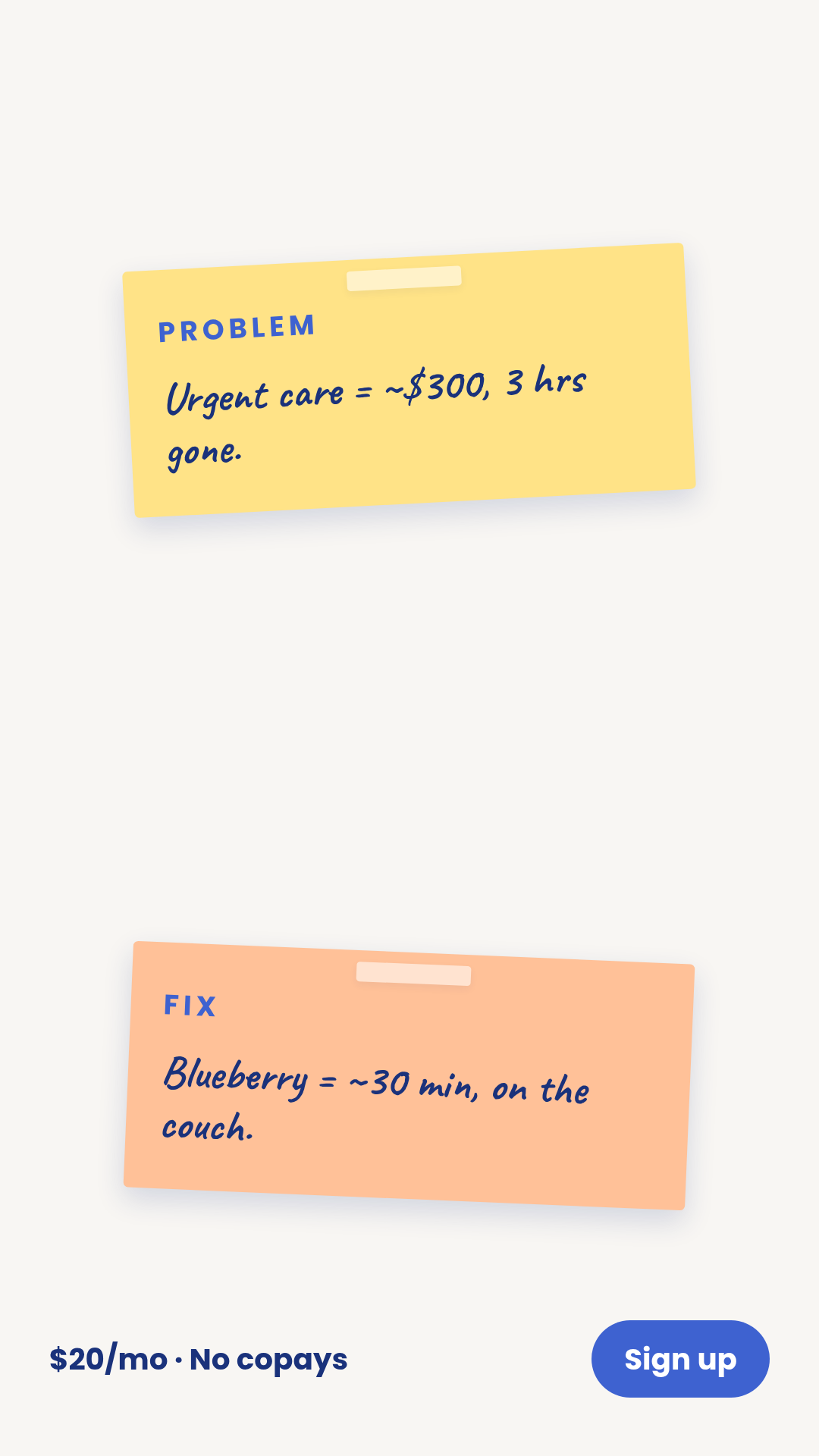
problem-agitation
3 layoutsProblem-agitation — pain-point named, amplified, then resolved.
Layouts: pain-onlypain-amplifiedpain-then-fix
Show all 9 renders


Full description
Problem-agitation — pain-point named, amplified, then resolved. Top-of-funnel pain framing. Mid-band hit rate but reliable. One template with 3 layouts (pain-only, pain-amplified, pain-then-fix) × 3 aspect ratios. pain-only states the pain on its own; pain-amplified adds 3 escalations; pain-then-fix is the full sequence with a brand resolution. Differentiation guardrails: pain-amplification rhetoric (NOT a boundary statement — use `boundary-blocks`; NOT a quote — use `quote-card`; NOT chronological before/after with explicit BEFORE/AFTER labels — use `transformation`); the rhetoric is 'this hurts, here's why, here's how it stops.' Compliance: pain text must not imply medical danger or unsubstantiated outcome — Sage / meta-ad-compliance must clear. Source: data/templates/batch2/problem-agitation-research.md.
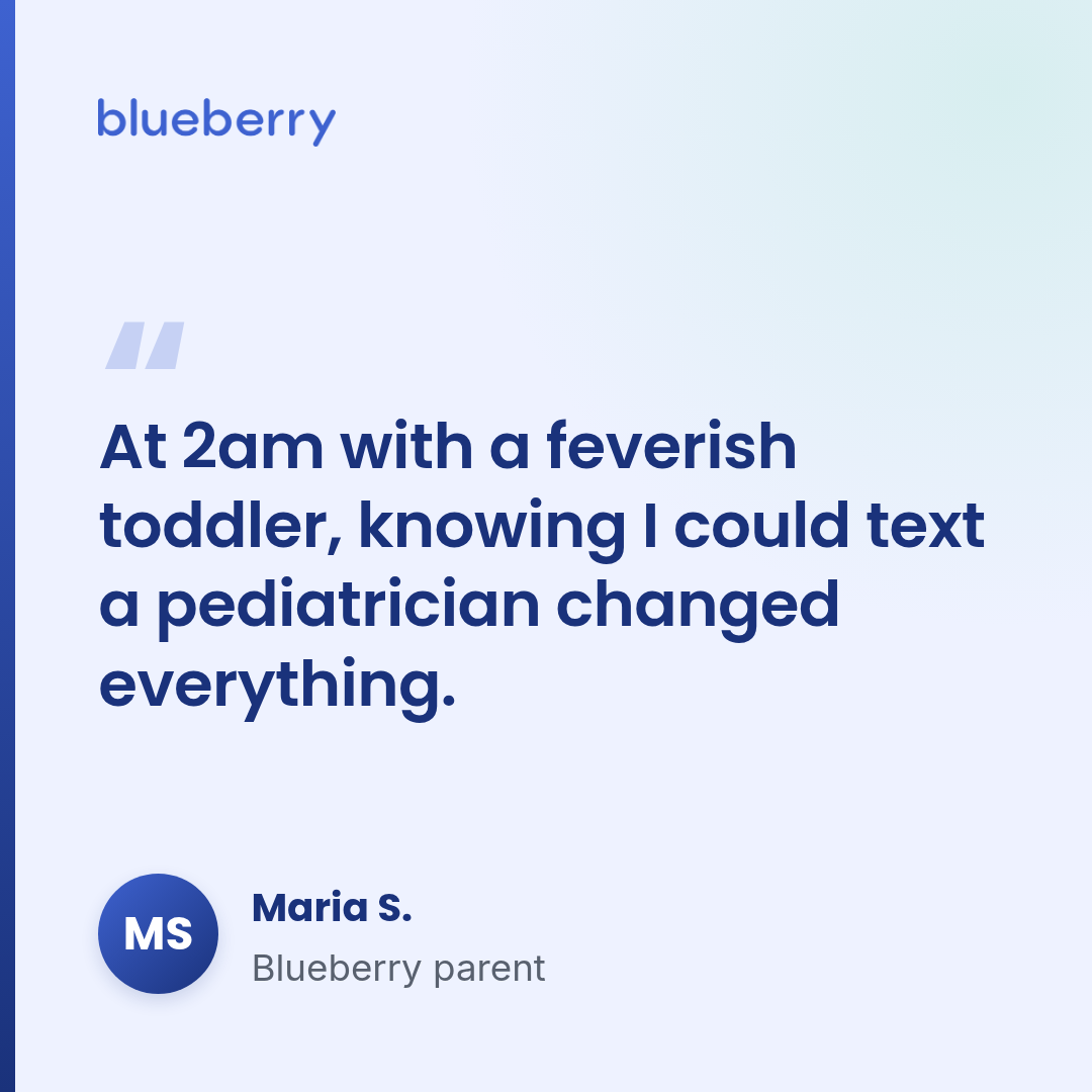
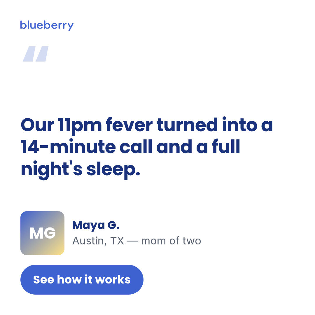
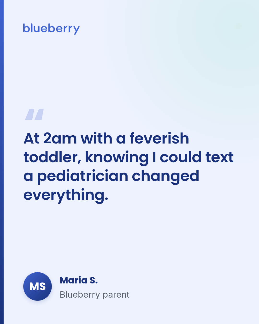
quote-card
1 layoutQuote-card — single big-quote testimonial chassis.
Layouts: default
Show all 3 renders
Full description
Quote-card — single big-quote testimonial chassis. Wordmark image at top, oversized open-quote glyph, quote, then attribution row with avatar (initials chip by default; supply avatarUrl for a photo). Single layout. Square + portrait suit LinkedIn / Feed; story_9_16 suits Reels / Stories.
review-quote
4 layoutsReview-quote — rated consumer verdict ad.
Layouts: app-store-cardrating-and-linecompact-rating-gridtrustpilot-style
Show all 12 renders
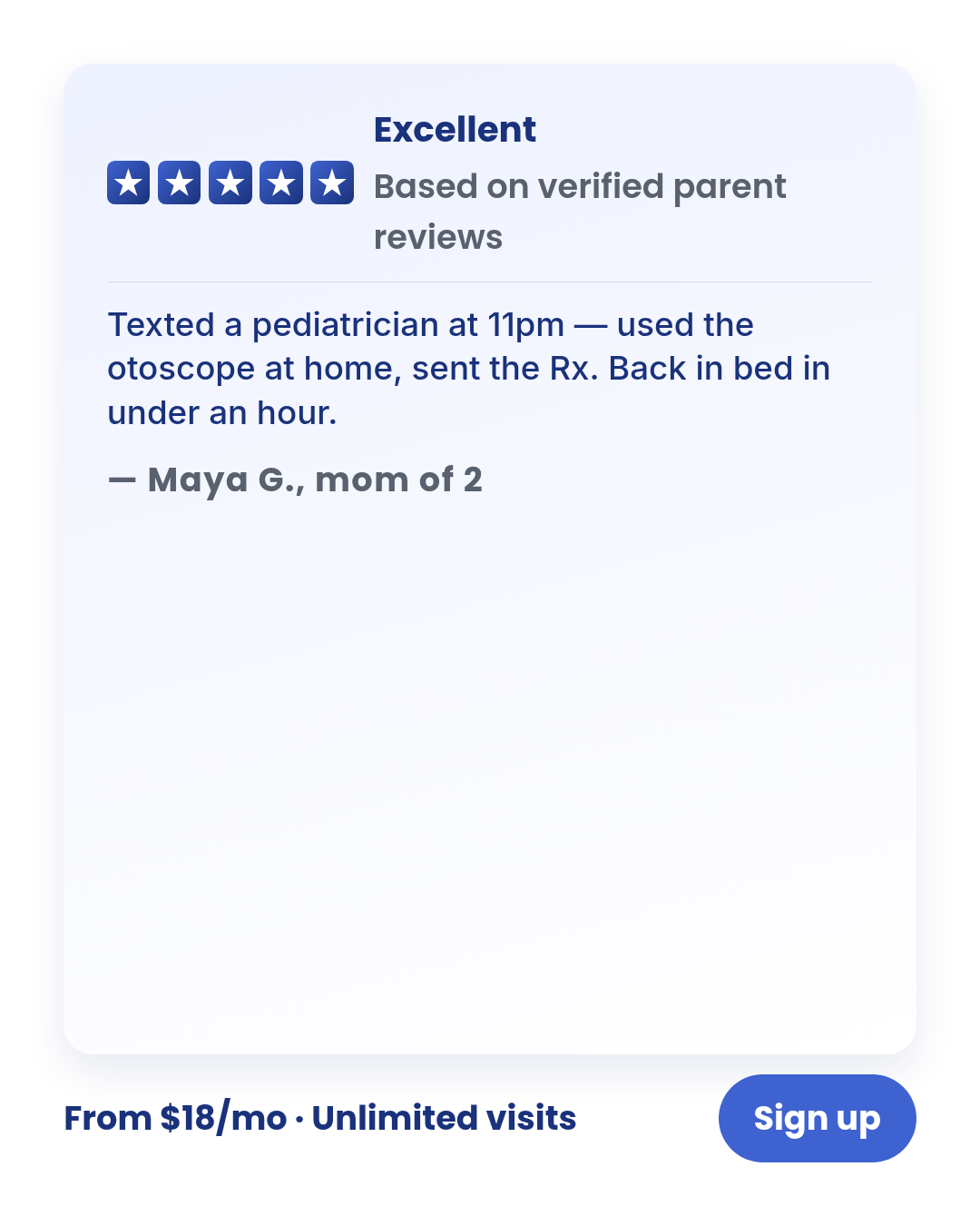
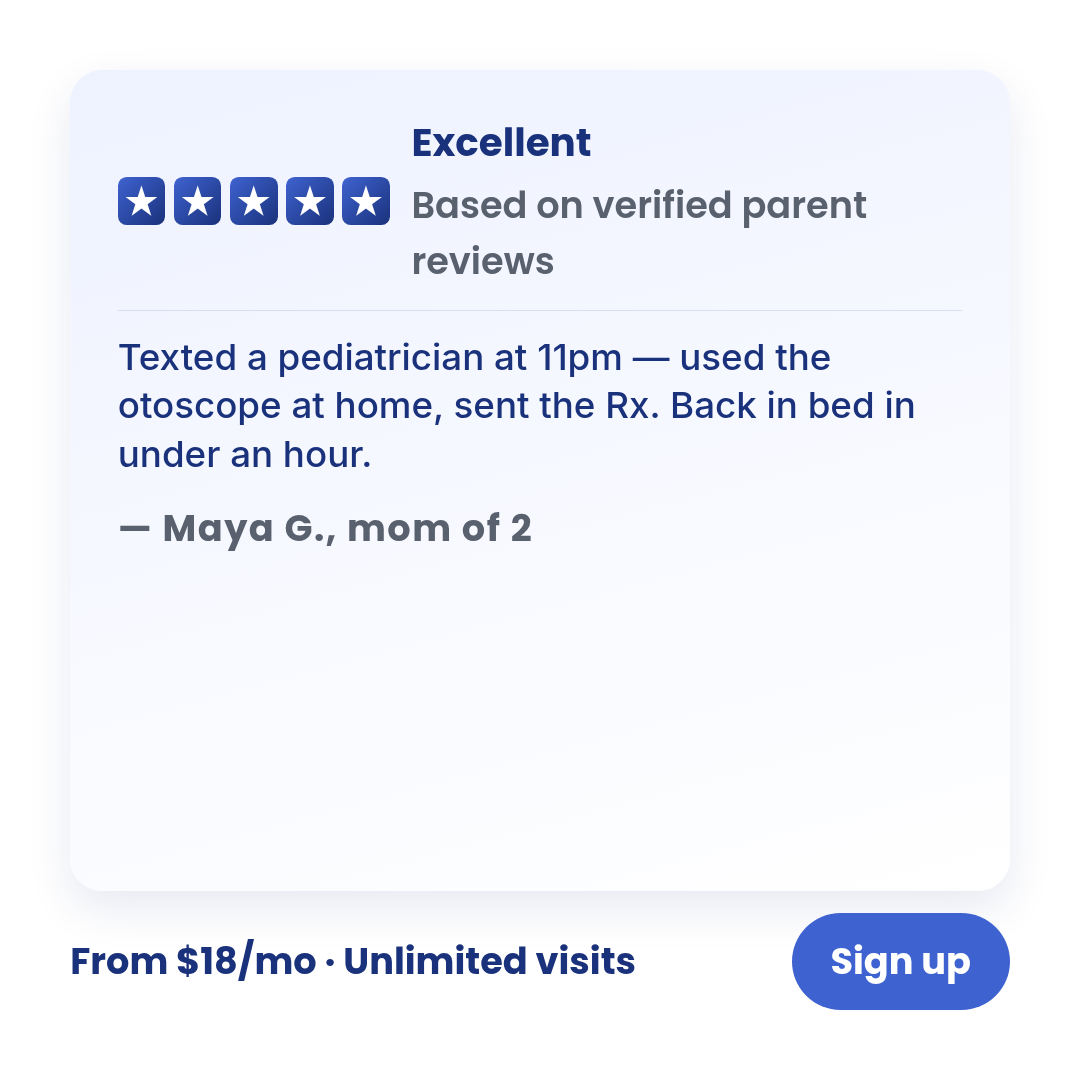
Full description
Review-quote — rated consumer verdict ad. 5-star feel, app-store / product-review vernacular. One template with 4 layouts (app-store-card, rating-and-line, compact-rating-grid, trustpilot-style) × 3 aspect ratios. Differentiation guardrails: STAR RATING is required (NOT a quote without a rating — use `quote-card`); review-card vernacular not narrative arc (NOT named-protagonist proof — use `case-study`); platform-agnostic review chrome, not Twitter/IG/Reddit chrome (NOT post-inside-platform — use `social-post-mockup`). Source: data/templates/batch2/review-quote-research.md.
social-post-mockup
4 layoutsSocial post mockup (Motion H&W #1 spend-use) — ad wraps peer-voice body copy in simulated social-platform chrome.
Layouts: x-tweetig-postsms-threadreddit-comment
Show all 12 renders
Full description
Social post mockup (Motion H&W #1 spend-use) — ad wraps peer-voice body copy in simulated social-platform chrome. Single template with 4 layouts (x-tweet, ig-post, sms-thread, reddit-comment) x 3 aspect ratios (1:1, 4:5, 9:16). Layouts differ on platform chrome — pick with layout prop. Differentiation guardrails: body never carries an offer number (vs offer-first-banner), never opens with Dear X (vs letter), always includes platform chrome (vs case-study), uses authored peer copy not real UGC screenshots (vs ugc-overlay). Native-style chassis: per Harrison 2026-05-11 (msg 19e17eca147c73f7), Pass 1 brand-styling is exempt — chrome stays platform-native (system font fallback, X/IG/SMS/Reddit visual rhetoric preserved). Only the chassis-level brand-mark below the platform card uses the Blueberry wordmark image (Amendment C, msg 19e18bdac7b88b8f) — old text+dot replaced 2026-05-11. Compliance: stylized-not-counterfeit platform chrome, our own @blueberrypediatrics handle by default, Sponsored label in finePrint where the ad could be read as organic, pediatrics is text/call only (NEVER video — all bubble/comment defaults audited 2026-05-11).
split-screen
4 layoutsSplit-screen — SAME entity in two states (chaos vs calm).
Layouts: top-bottom-dividerleft-right-dividerphone-screen-pairdiagonal-split
Show all 12 renders

Full description
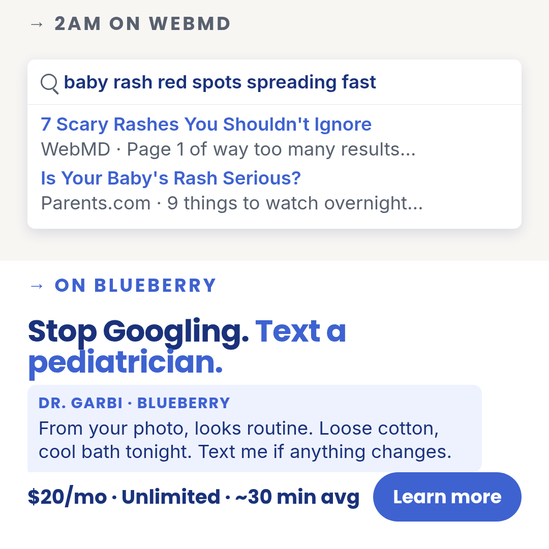
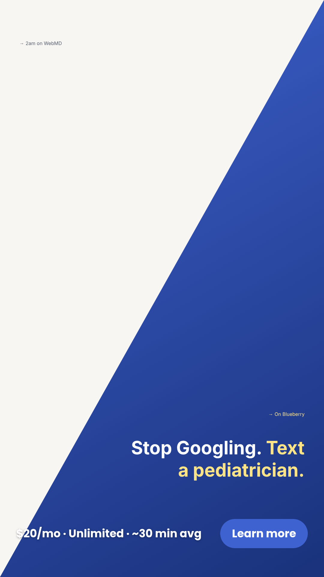
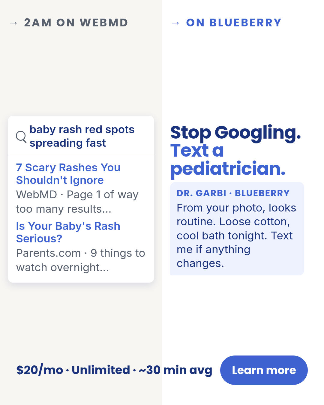
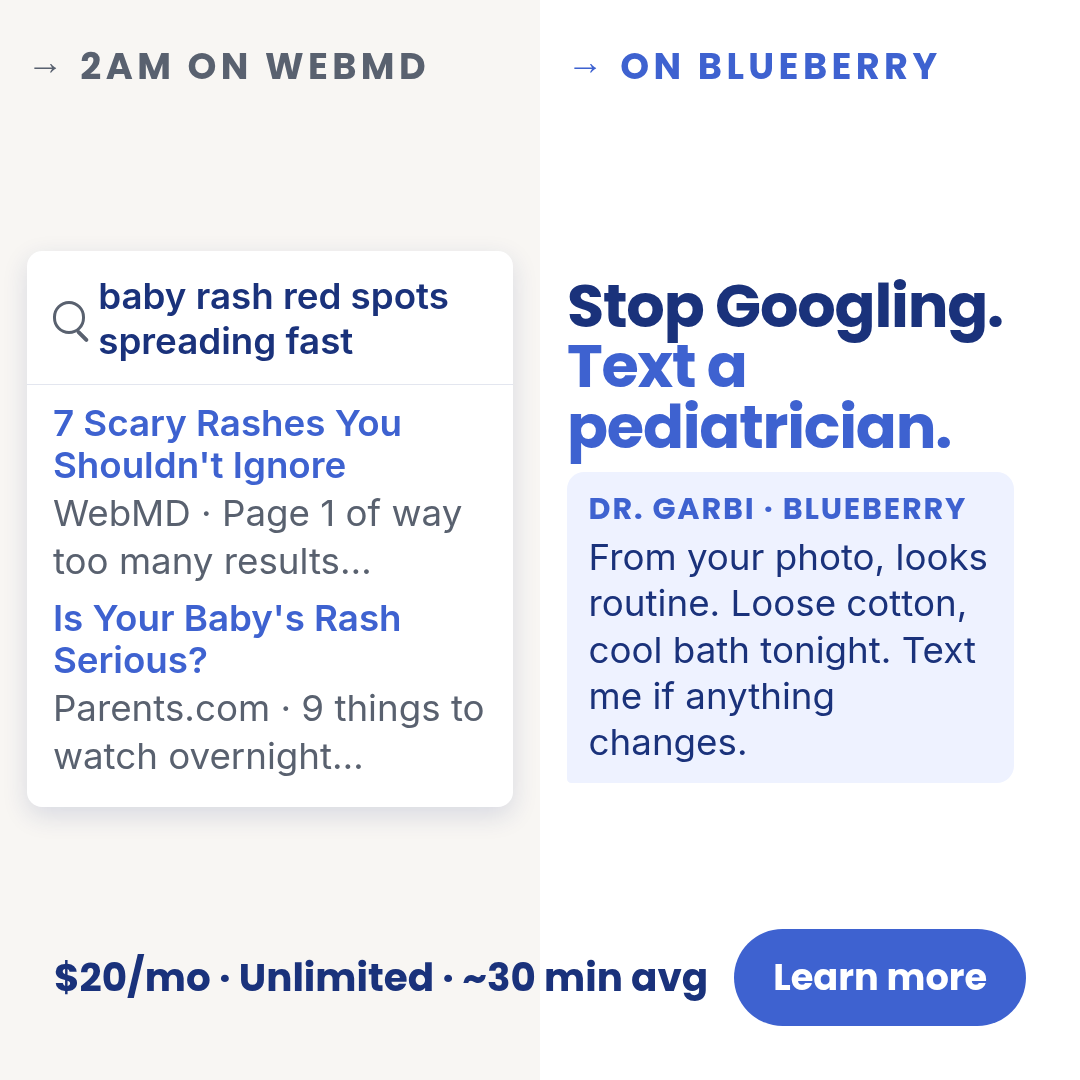
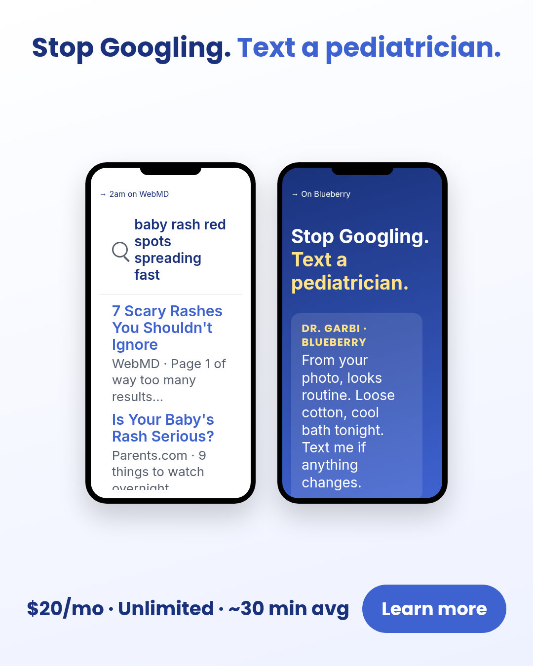
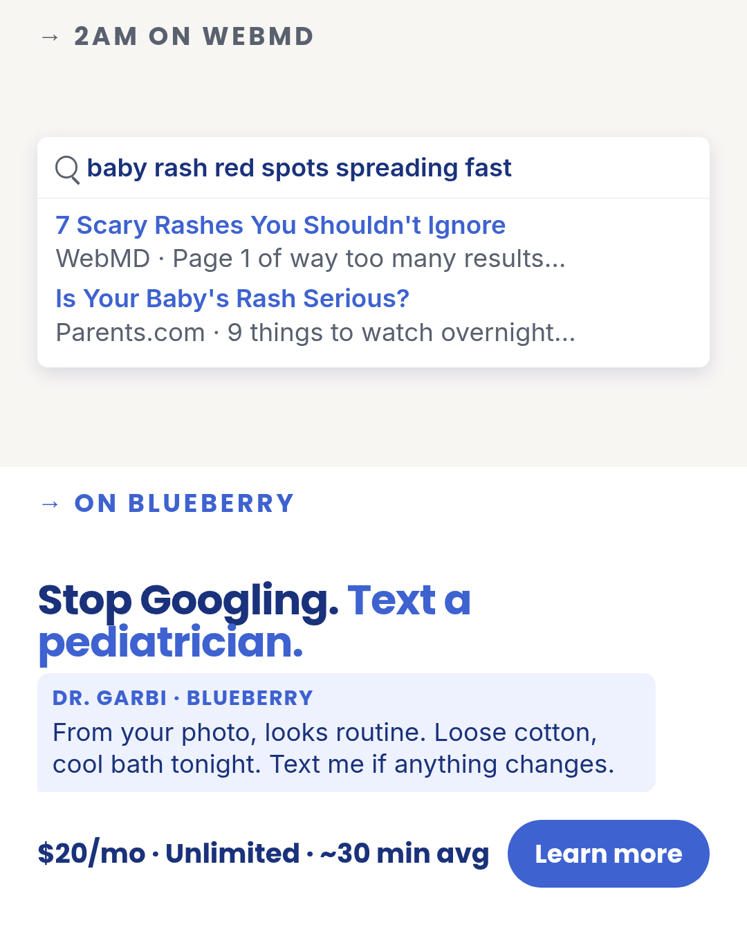
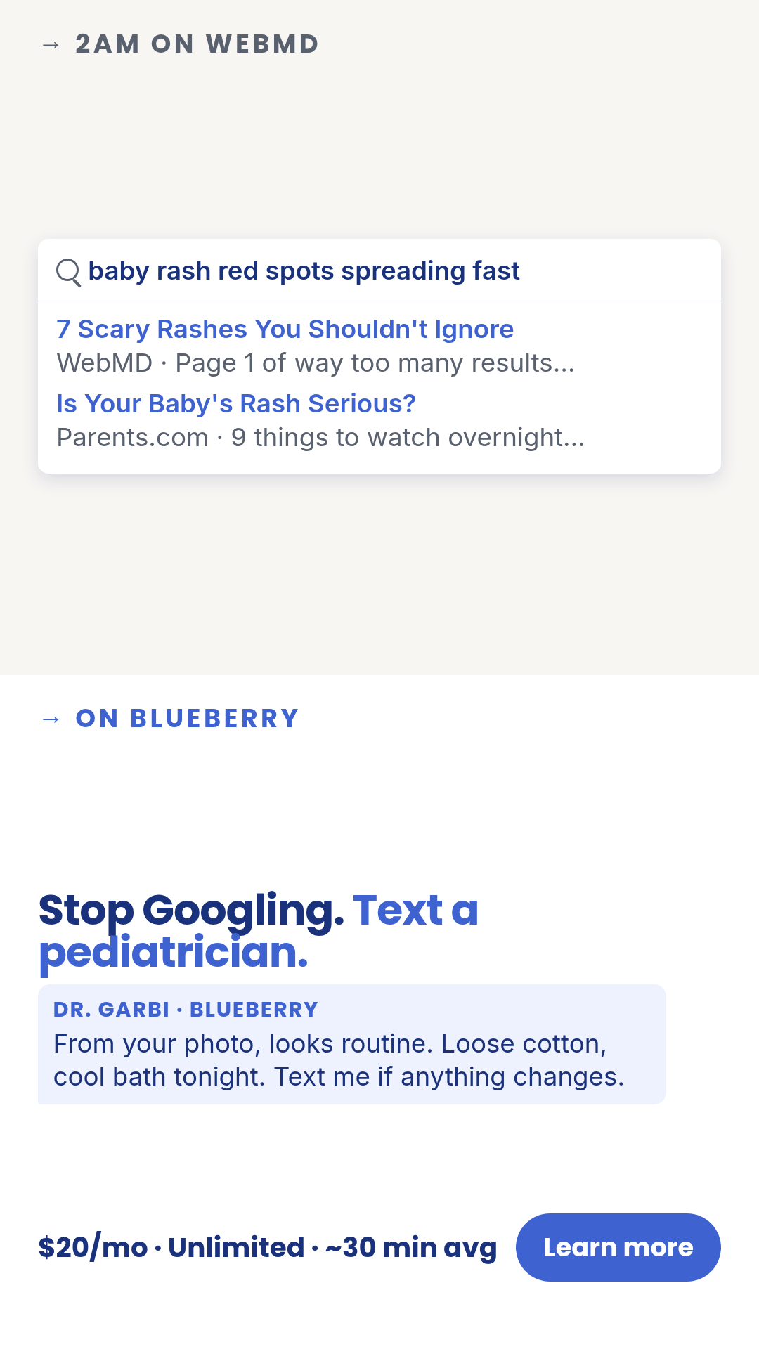
Split-screen — SAME entity in two states (chaos vs calm). One template with 4 layouts (top-bottom-divider, left-right-divider, phone-screen-pair, diagonal-split) × 3 aspect ratios. Differentiation guardrails: SAME entity in two states (NOT a chronological before/after with explicit BEFORE/AFTER labels — use `transformation`); NOT cross-entity contrast — Blueberry vs urgent care (use `comparison-vs`); NOT a problem-only frame (use `problem-agitation`). Rhetoric: 'WebMD spiral → clean chat with a pediatrician', 'cluttered counter → tidy counter on the same device.' The default layouts pair a browser-results card (chaos) with a doctor chat bubble (calm); these can be replaced via the search-results and doctor-message props. Source: extracted from TR-PA-01 (WebMD spiral) — peace-of-mind-ads-v3 TRIAGE renders. Research input: data/templates/batch2/split-screen-research.md.
stat-card
3 layoutsStat-card — single huge stat as the hero.
Layouts: hero-numbernumber-with-photobig-numeral
Show all 9 renders
Full description
Stat-card — single huge stat as the hero. One template with 3 layouts (hero-number, number-with-photo, big-numeral) × 3 aspect ratios. hero-number is a full-bleed branded card; number-with-photo places the number alongside a lifestyle photo; big-numeral is pure typography on a clean ground. Differentiation guardrails: ONE number is the entire ad (NOT 3 supporting stats — use `infographic`; NOT 2 numbers contrasted — use `stat-comparison`). Use when ONE number is enough to carry the message: '24/7', '14 min', '$20/mo', '50 states'. Source: data/templates/batch2/stat-card-research.md.
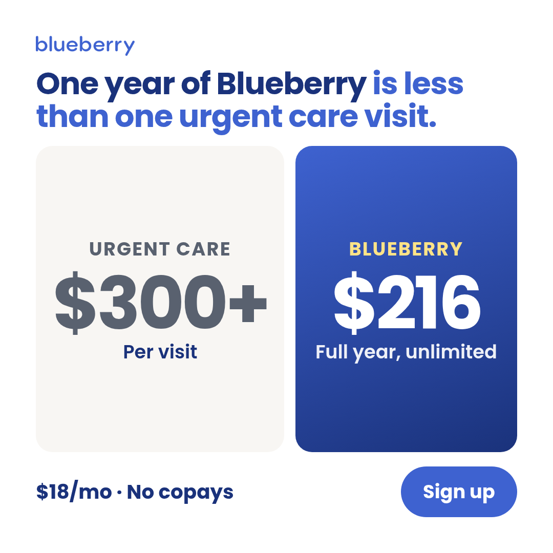
stat-comparison
2 layoutsStat-comparison — TWO numbers placed adjacent for direct contrast (pricing math, time math).
Layouts: big-vs-bigstacked-numbers
Show all 6 renders
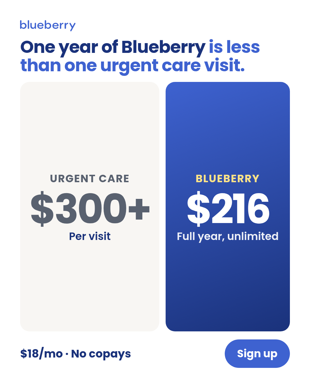
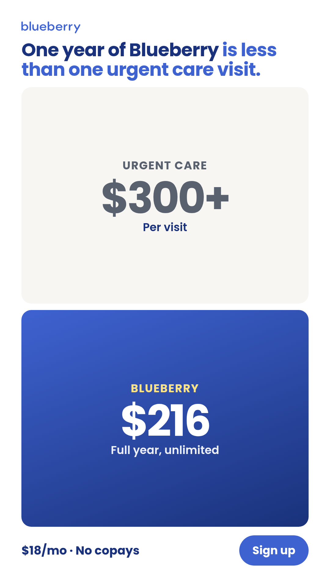
Full description
Stat-comparison — TWO numbers placed adjacent for direct contrast (pricing math, time math). One template with 2 layouts (big-vs-big, stacked-numbers) × 3 aspect ratios. Differentiation guardrails: TWO numbers (NOT three supporting stats — use `infographic`; NOT one hero number — use `stat-card`); the contrast IS the message; use for $ vs $, time vs time, count vs count. For non-numeric cross-entity contrast use `comparison-vs`. Source: extracted from TR-PR-01 (insurance math) — peace-of-mind-ads-v3 TRIAGE renders.
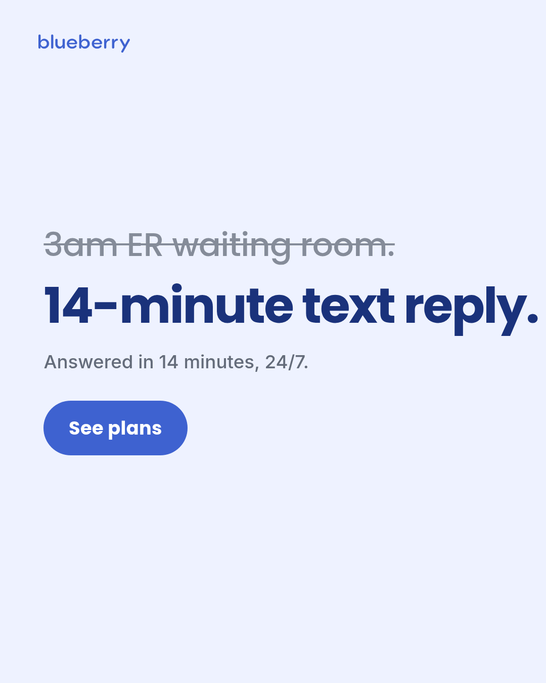
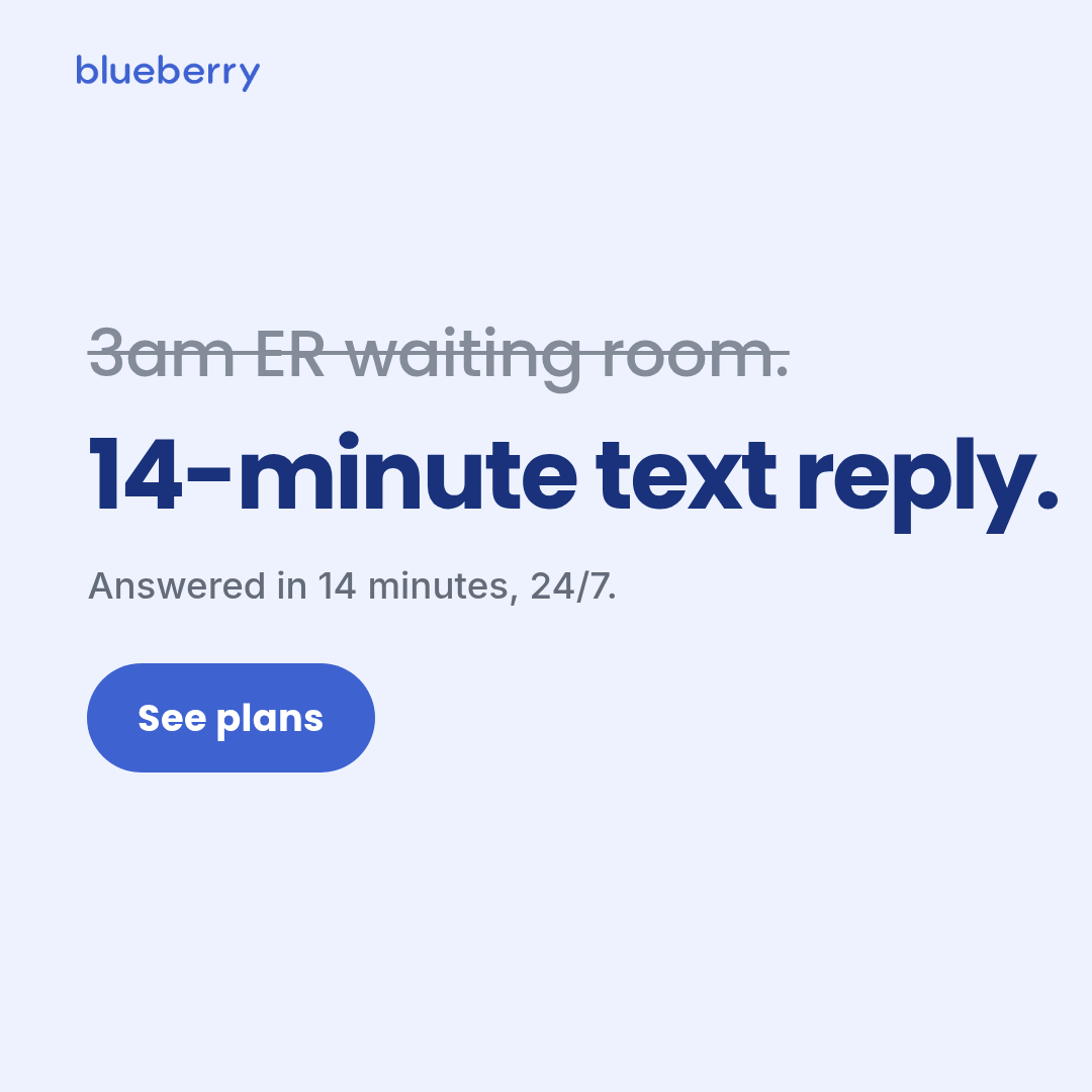
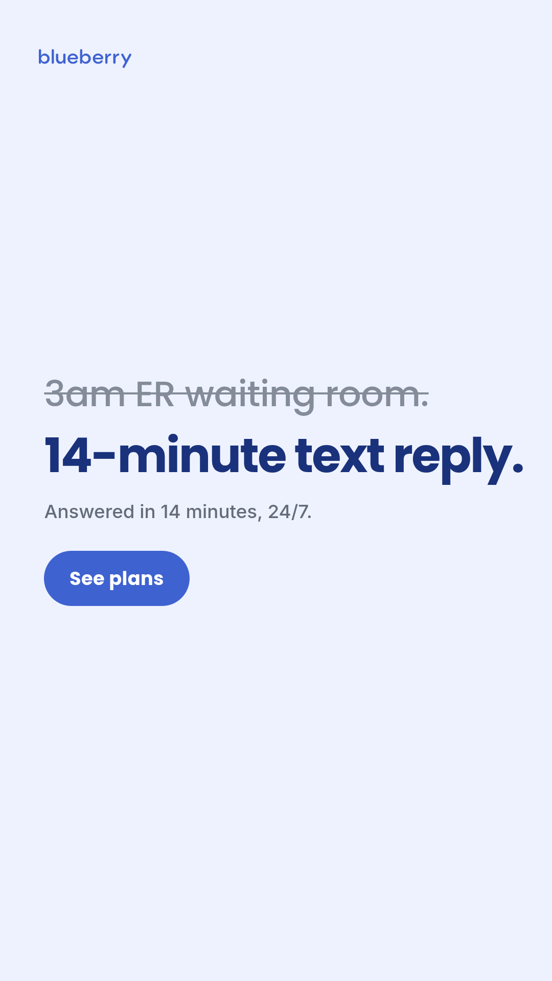
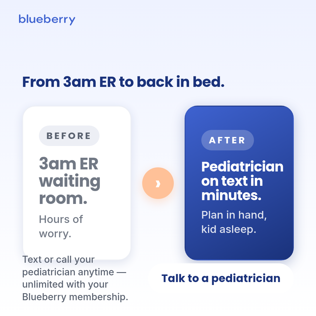
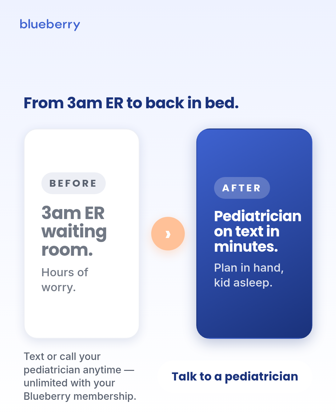
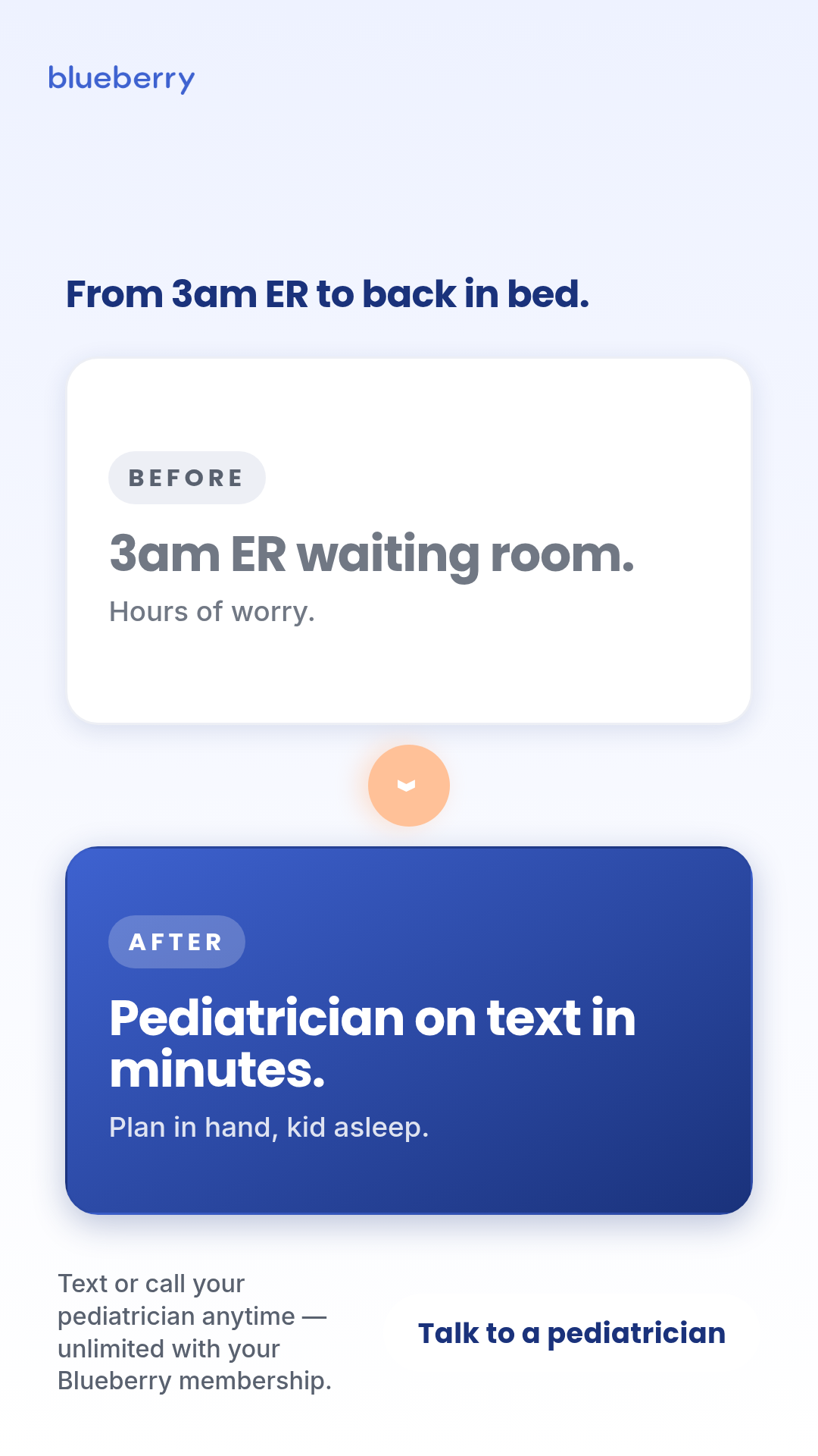
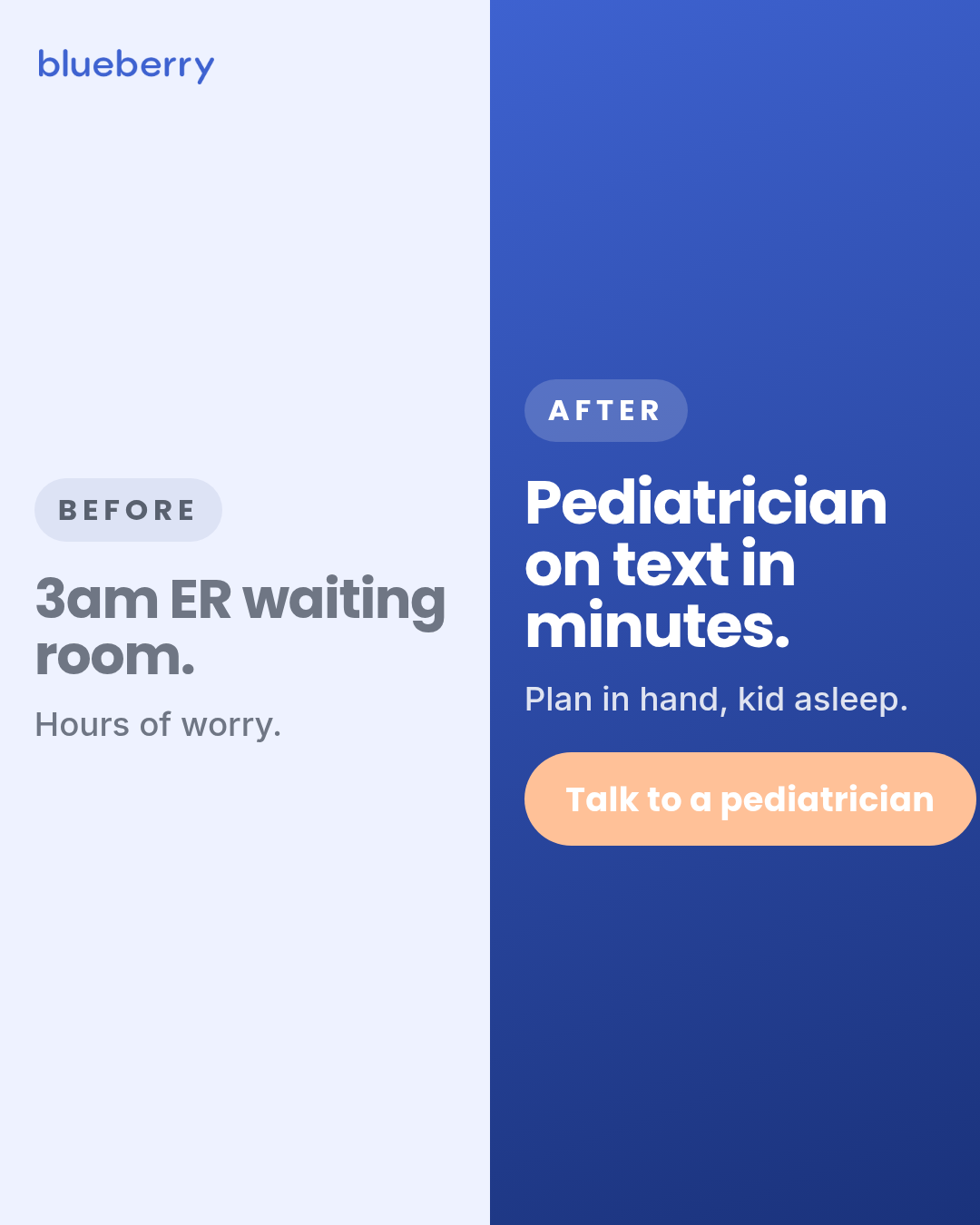
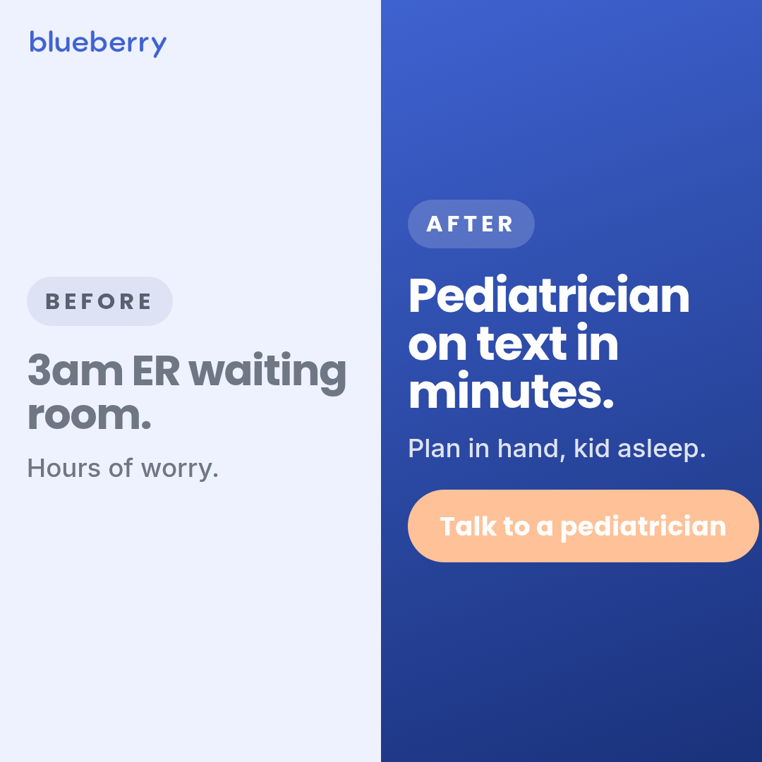
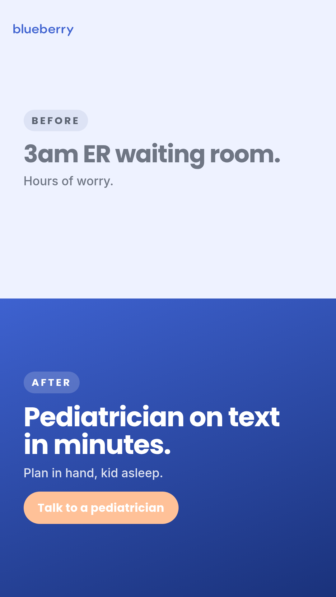
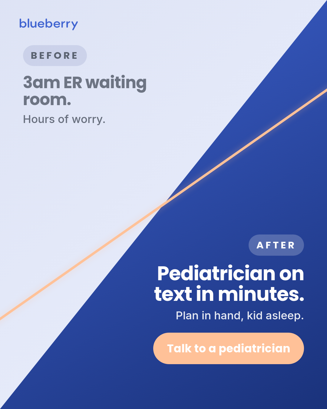
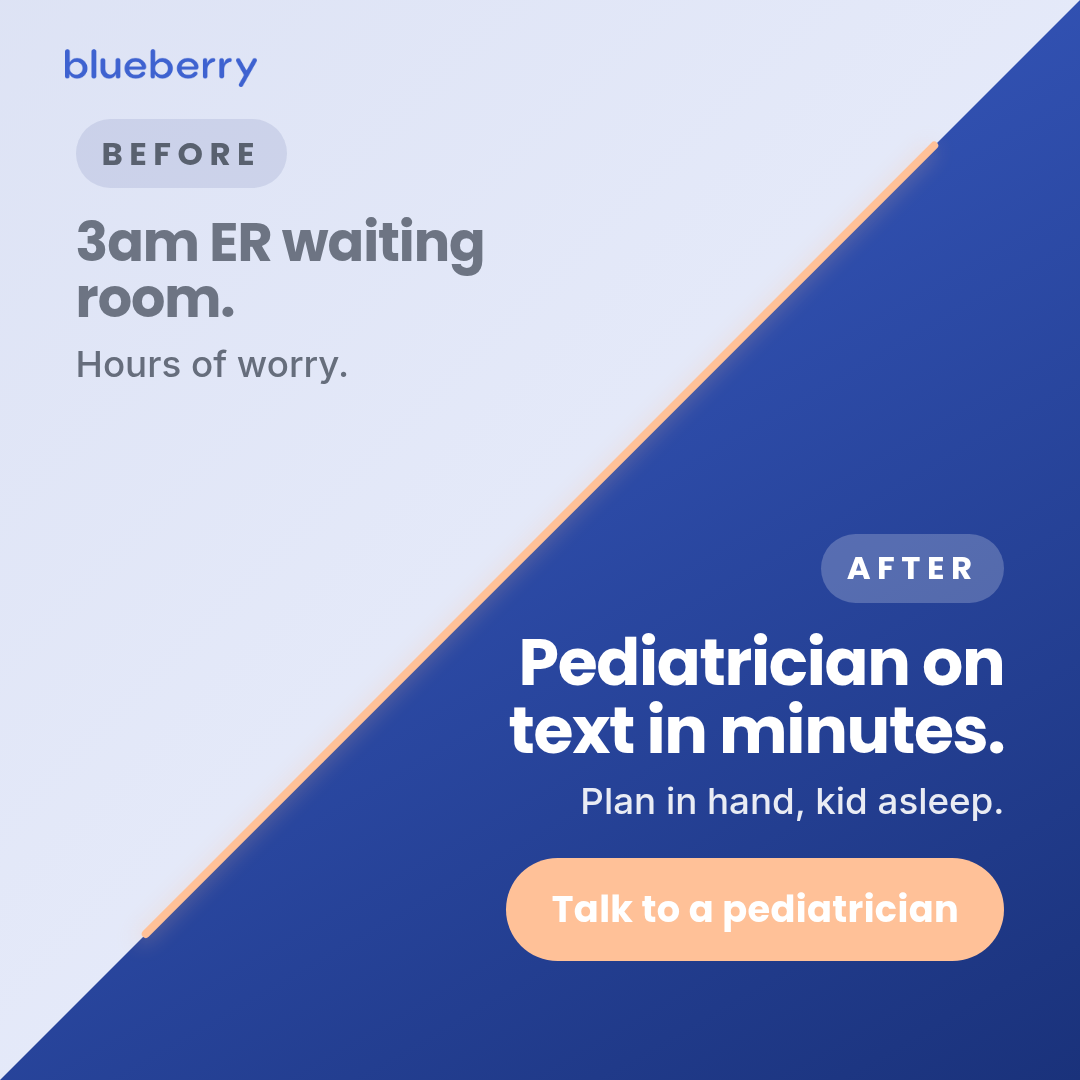
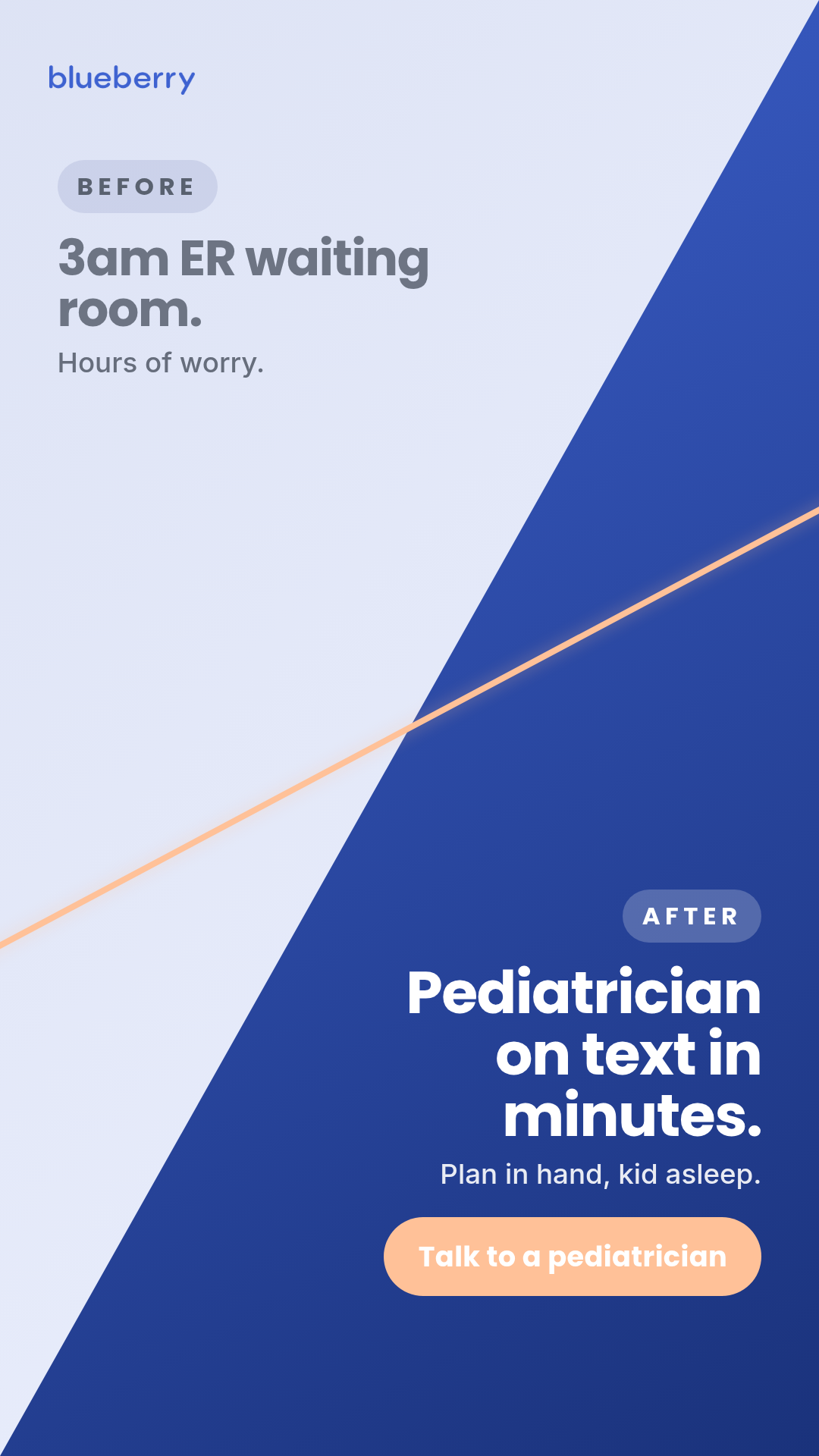
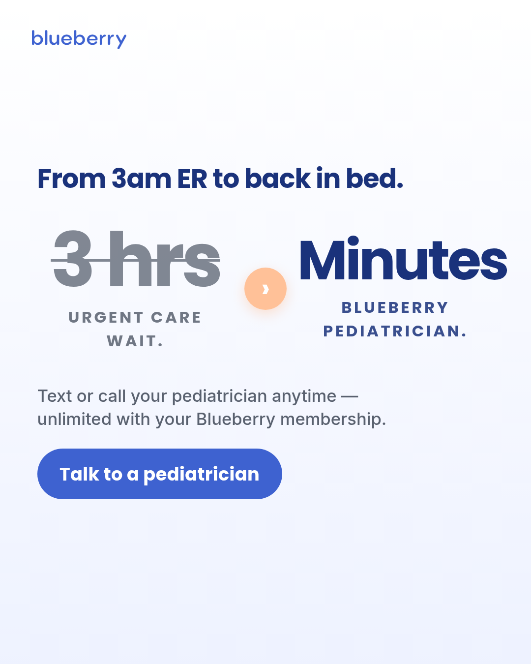
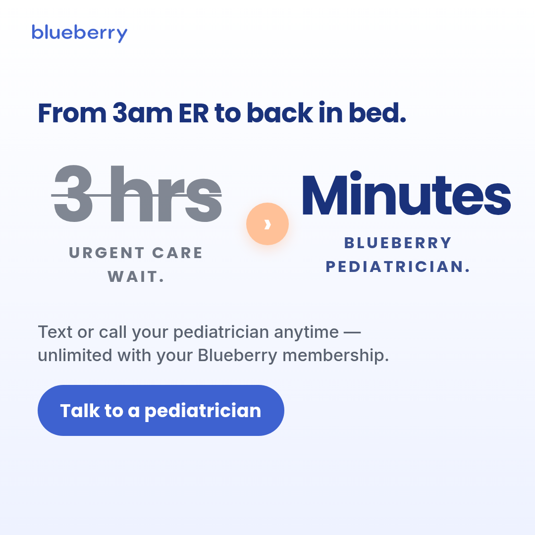
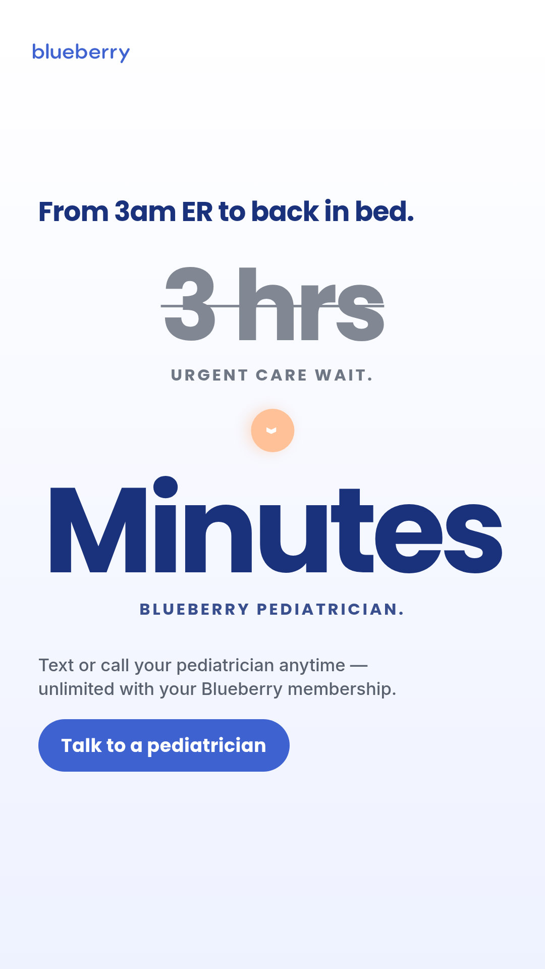
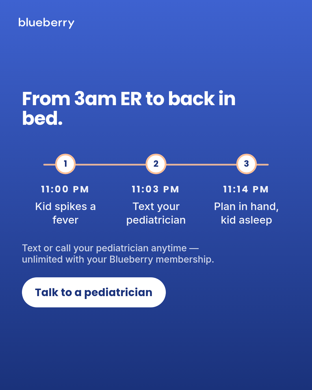
transformation
5 layoutsTransformation — Motion H&W spend-use scale format (#9).
Layouts: side-by-sidearrow-transitiontimeline-of-changesplit-diagonalstat-delta
Show all 15 renders
Full description
Transformation — Motion H&W spend-use scale format (#9). Two discrete states (BEFORE/AFTER) presented adjacently with a direction signal. For Blueberry, the transformation is an access/time lifestyle shift (3am ER waiting room -> short pediatrician text or call), not a medical outcome. Single template with 5 layouts (side-by-side, arrow-transition, timeline-of-change, split-diagonal, stat-delta) x 3 aspect ratios (1:1, 4:5, 9:16). Differentiation: transformation shows an EXPLICIT state change (vs offer-first-banner's price/offer), uses authored brand typography (vs social-post-mockup platform chrome), is comparative/paired (vs letter's single-state first-person), is two-states-at-a-glance (vs case-study's narrative arc), is explicit-with-labels (vs billboard two-line-contrast's implied opposition), works typographically with no photo dependency (vs ugc-overlay's photo requirement). All five layouts share one prop schema so meta-ad-creative can bulk-fill across layouts without branching.
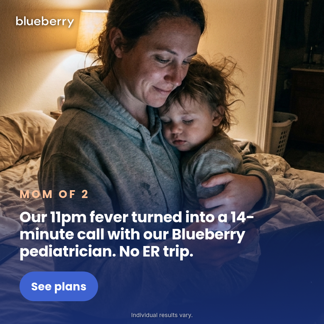
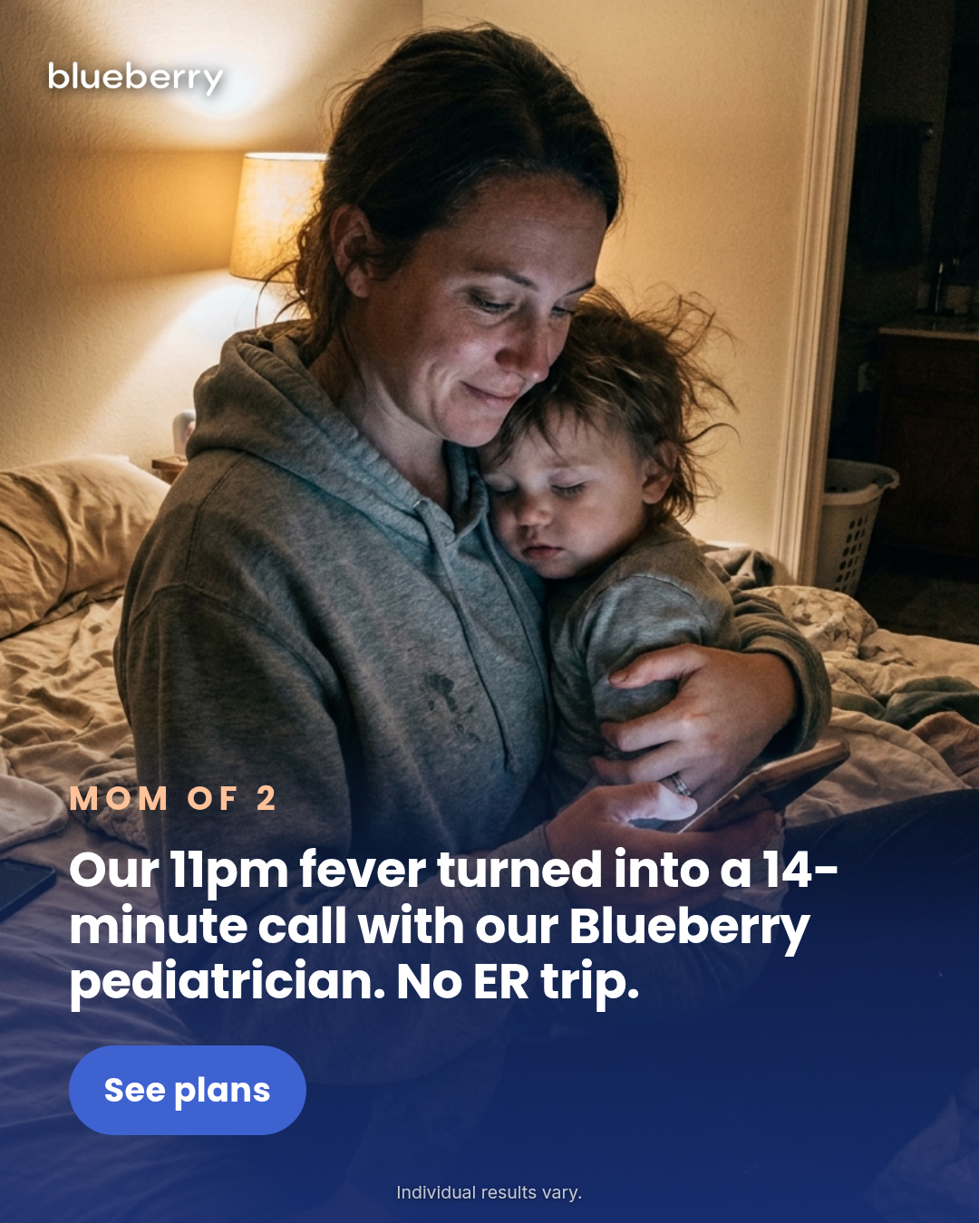
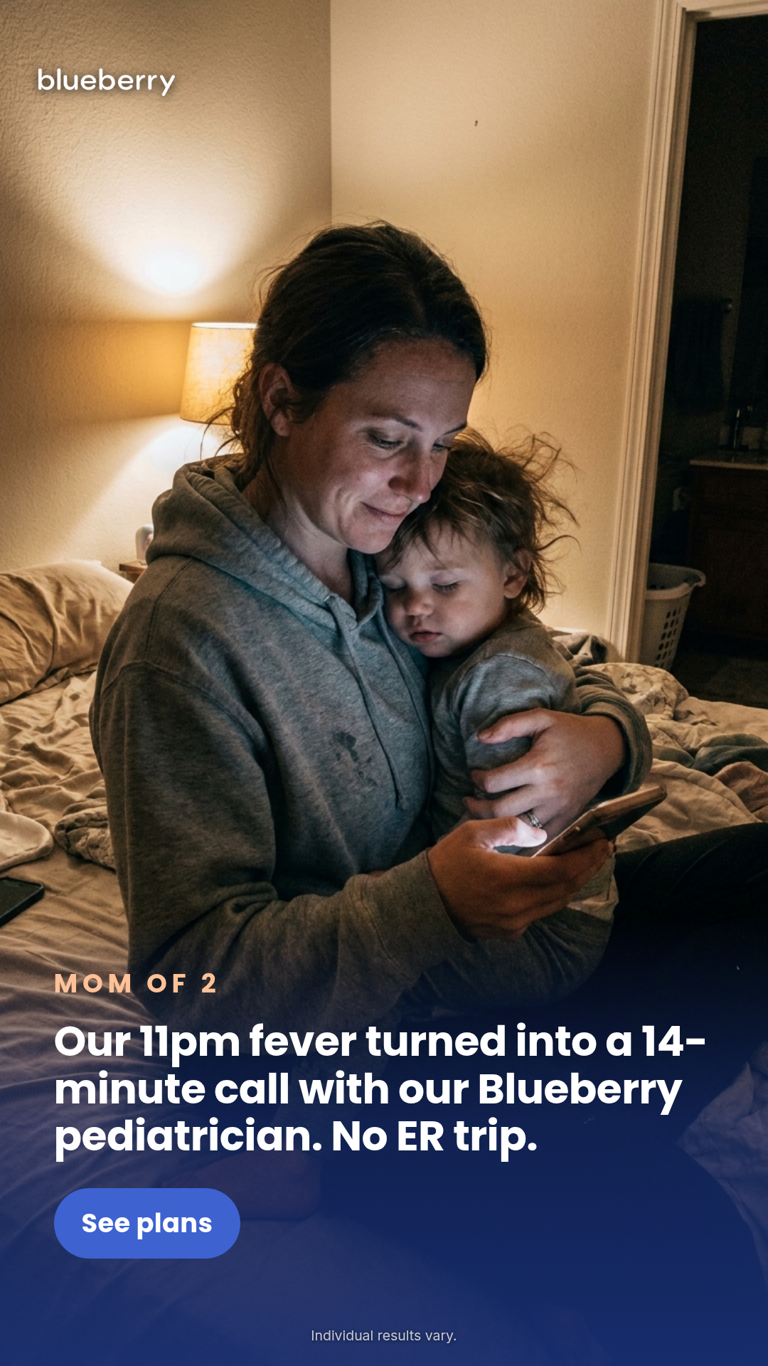
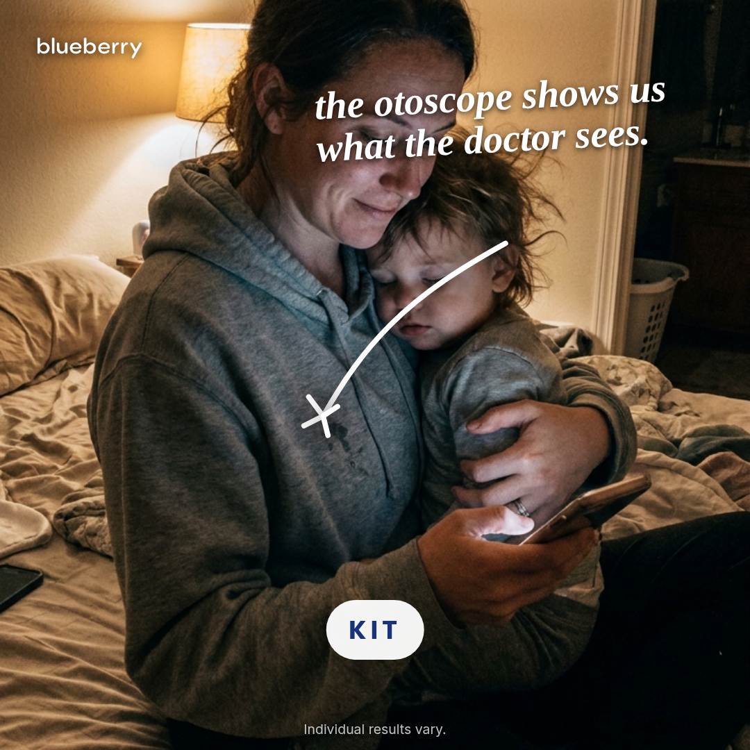
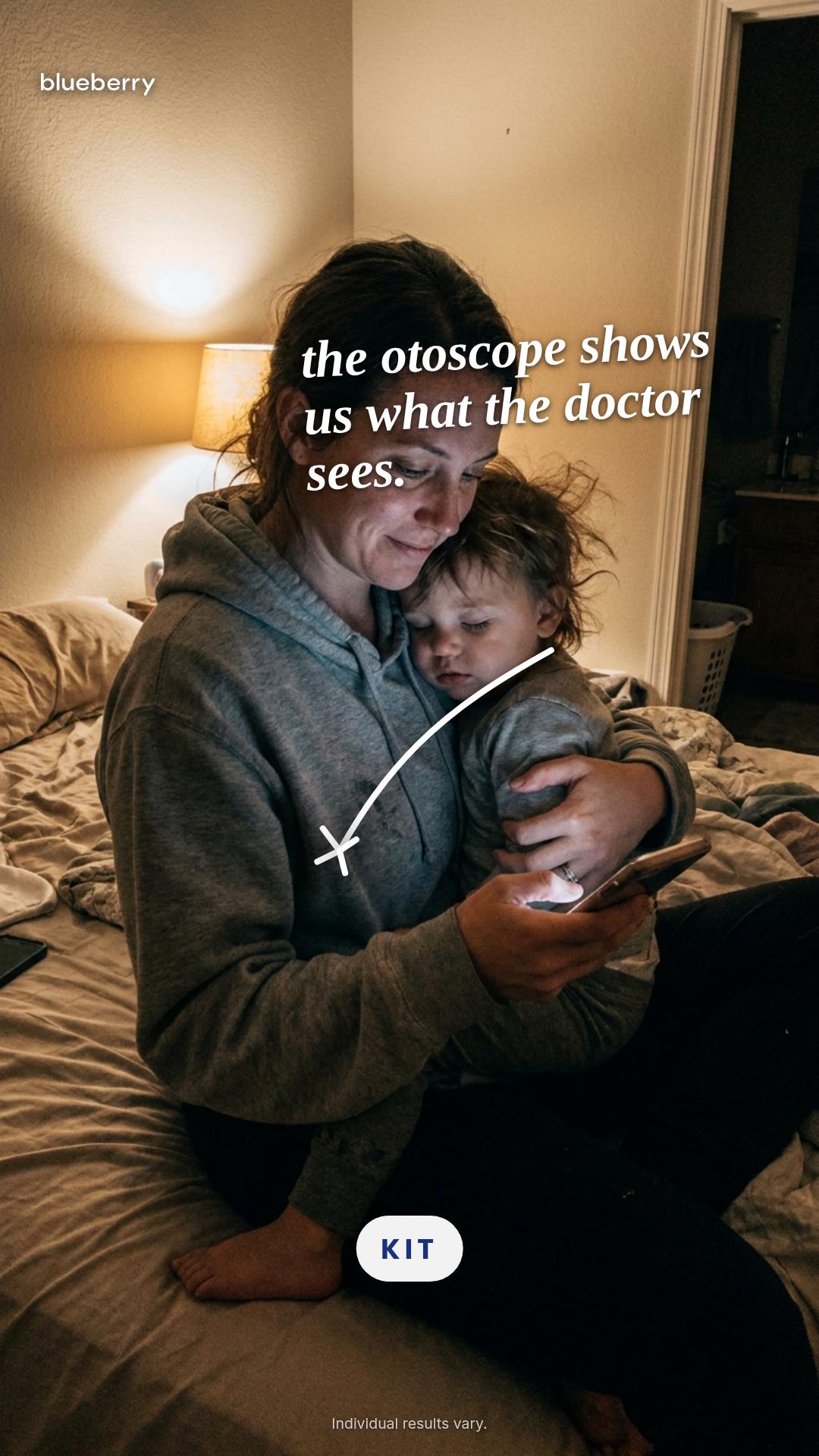
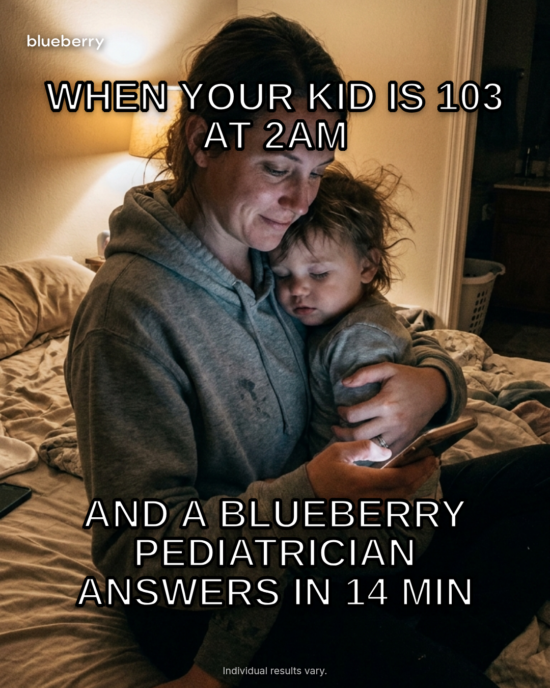
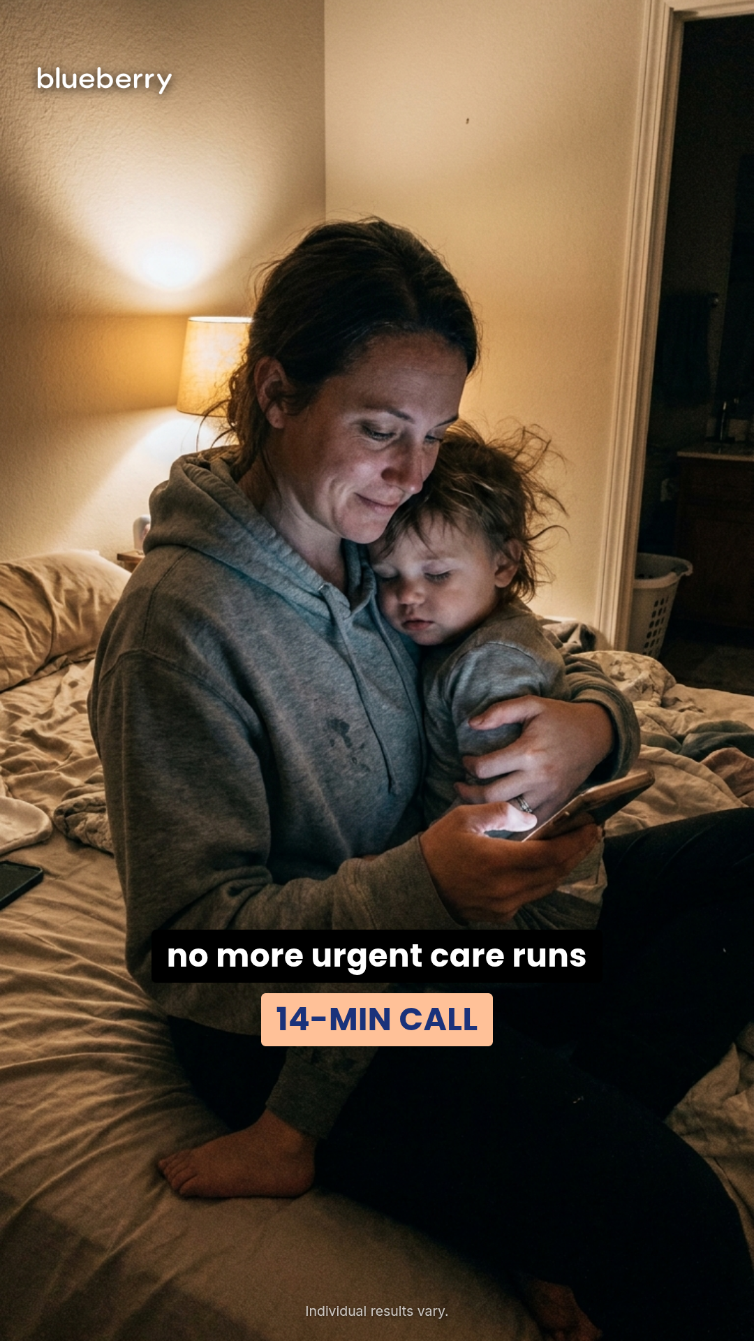
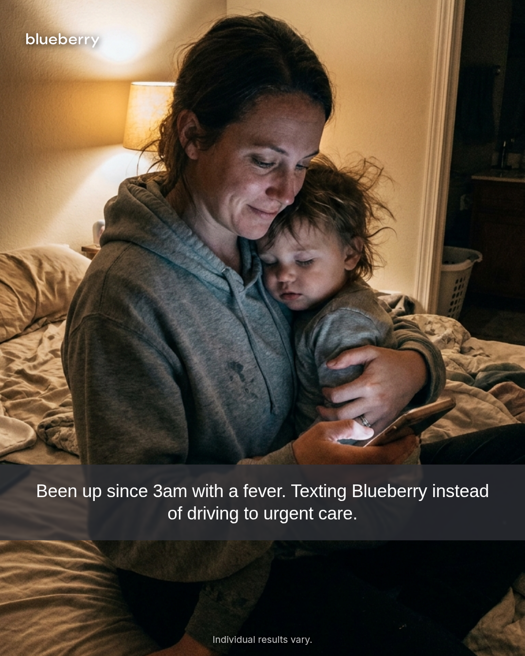
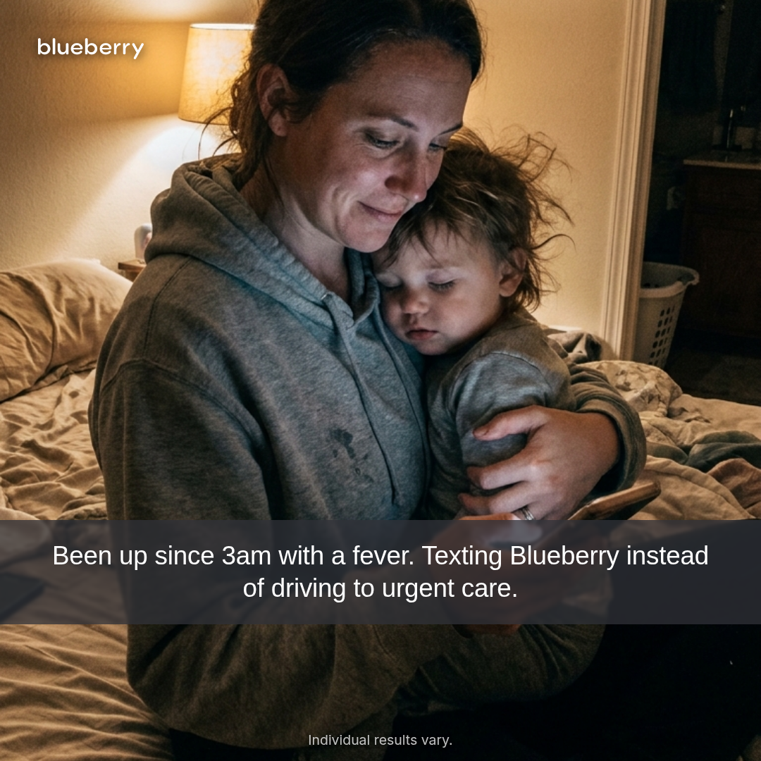
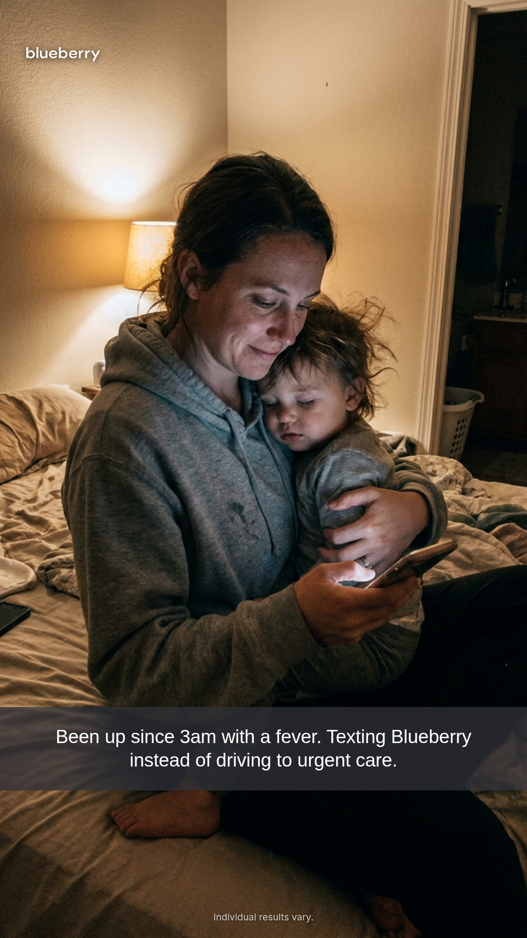
ugc-overlay
6 layoutsUGC overlay (Motion H&W #7 spend-use) — full-bleed UGC photograph with authored typographic overlay.
Layouts: bottom-text-barsticker-captionhandwritten-annotationmeme-textscreenshot-captionsnap-caption
Show all 18 renders

Full description
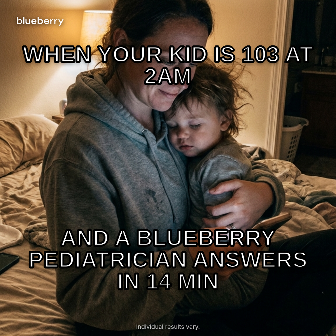
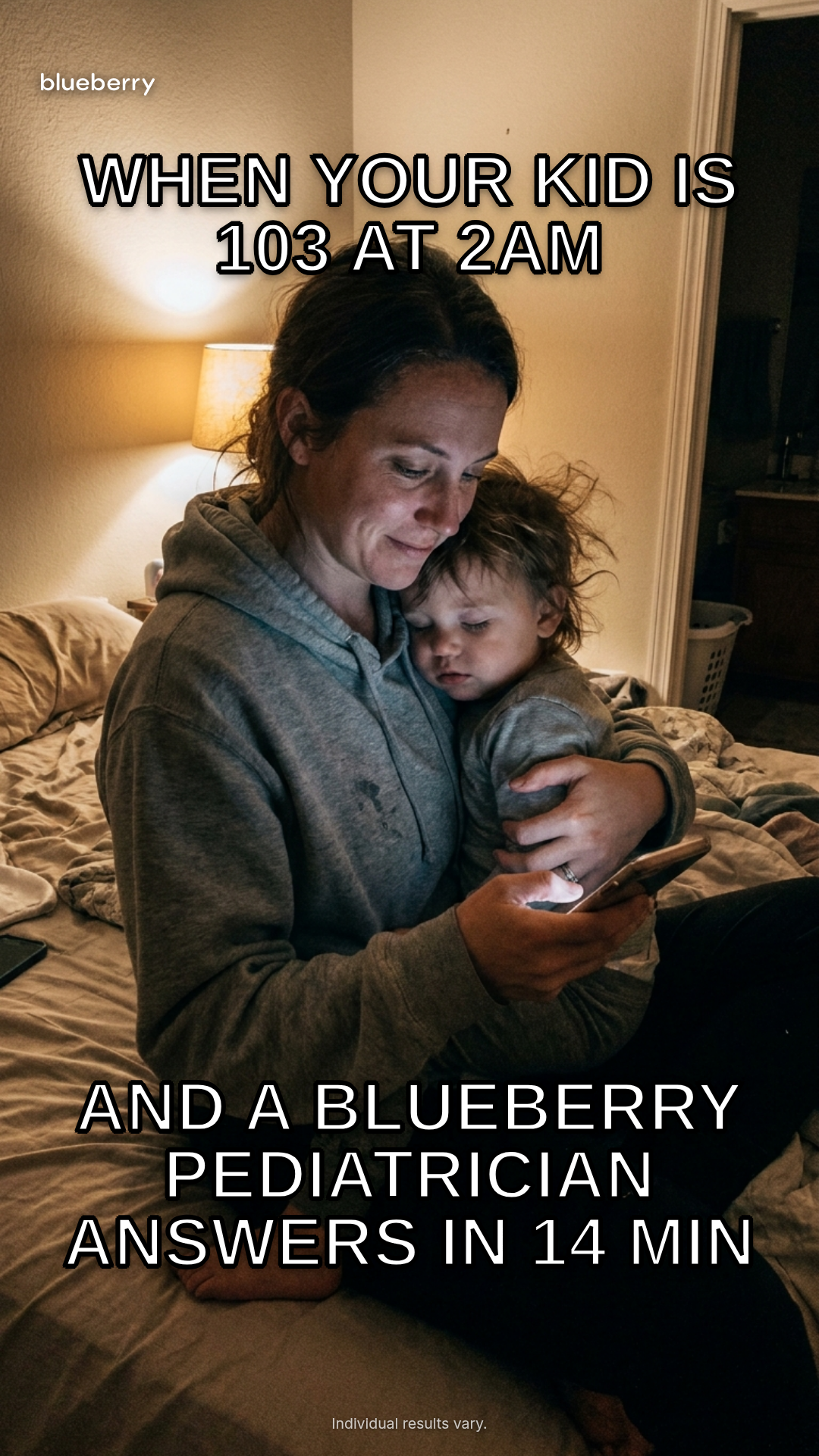
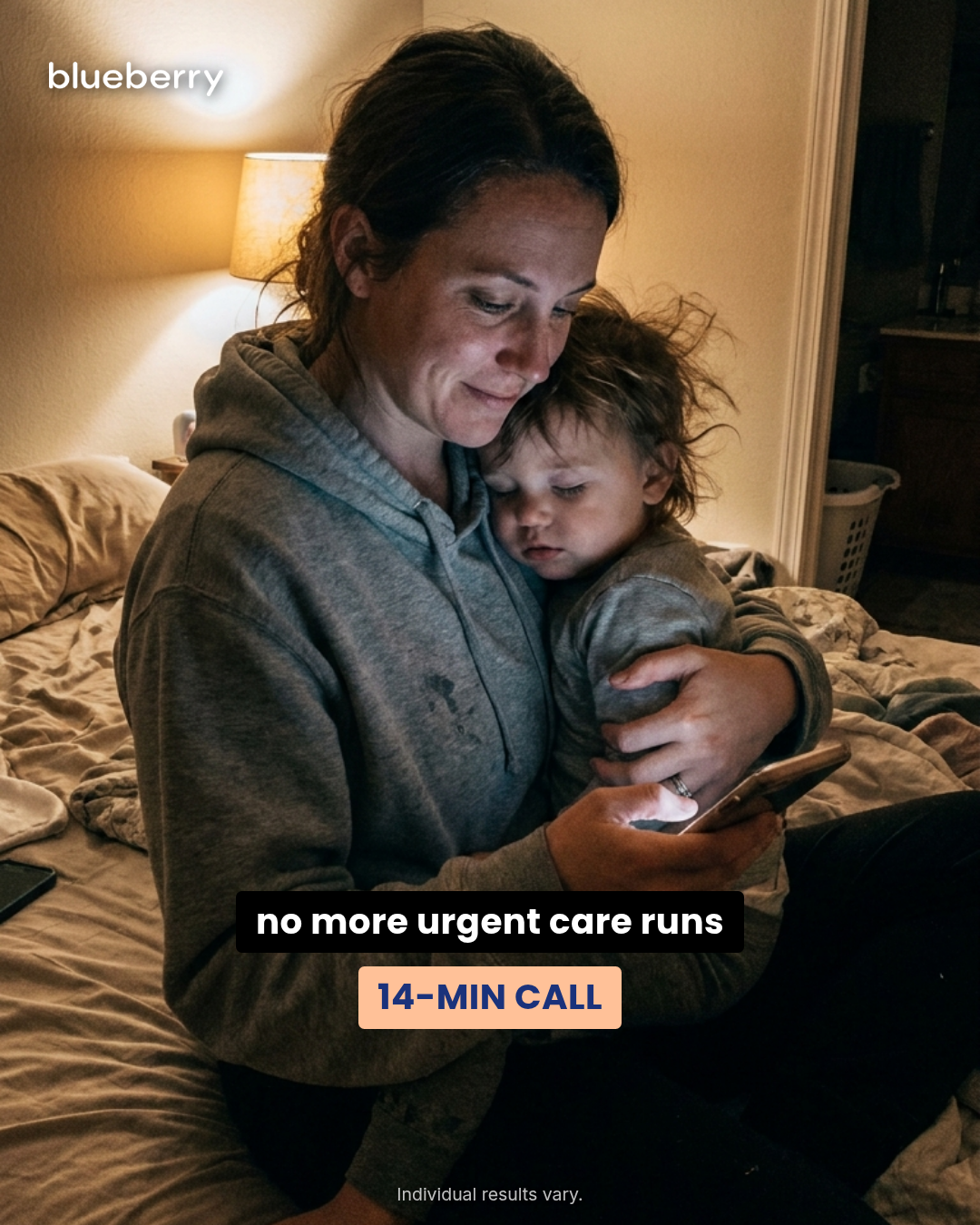
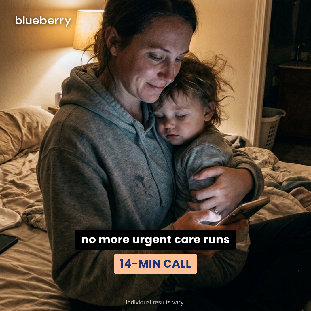
UGC overlay (Motion H&W #7 spend-use) — full-bleed UGC photograph with authored typographic overlay. Six layouts (bottom-text-bar, sticker-caption, handwritten-annotation, meme-text, screenshot-caption, snap-caption) × three aspect ratios (1:1, 4:5, 9:16). Typography is the ad layer; photograph is the trust layer. Three layouts intentionally use non-brand fonts because the chassis rhetoric requires them: handwritten-annotation uses a cursive/script stack, meme-text uses Impact, snap-caption uses Helvetica/system-sans (native Snap caption register). The other three layouts and all chassis-level chrome use Poppins (headings) + Inter (body) via {{{brand.fontsHref}}}. Amendment C wordmark (2026-05-11): chassis-level brand identity uses the wordmark image — white by default, since every layout sits on a photograph. Differentiation guardrails: overlay never wraps in platform chrome (vs social-post-mockup), never includes a separate quote card (vs case-study / quote-card), never opens with 'Dear X' (vs letter), never leads with a numeric offer (vs offer-first-banner), always photograph-based (vs billboard). Compliance: photograph release is assumed upstream; overlay is authored peer-voice copy (not verbatim customer quotes unless released); fine print is for 'Individual results vary.' style disclaimers, NEVER 'Sponsored' (Meta auto-renders that label). Ad-copy compliance contract — Gates A–F walked on every default copy string: Gate A (business model): text/call only — NEVER 'video'. The previous default ('Our 11pm fever turned into a 14-minute video visit') REMOVED; replaced with 'a 14-minute call with our Blueberry pediatrician'. memeBottom's '3 MIN' specific-response-time claim replaced with canonical '14 MIN' (the library's substantiated response-time claim used by billboard, case-study, social-post-mockup, etc.). Gate B (DTC, not MCO/payer): the legacy CTA 'Check my benefit' reads as MCO/employer 'is it covered by your plan?' framing — REPLACED with 'See plans' (the DTC consumer-subscription CTA used across billboard, pediatrician-expert, etc.). Gate C (no trial language): clean. Gate D (specific claims): 14-minute call-back time is the canonical Blueberry response time (library-wide ratified claim, paired with 'Individual results vary.' disclaimer). Gate E (FB policy / no Sponsored language): finePrint stripped of 'Sponsored' per memory/feedback_no_sponsored_language.md — Meta renders the label as platform chrome. finePrint is now 'Individual results vary.' only. Gate F (Naive-Scroller Read — composition-level anchors): every default copy slot is framed as personal-experience ('Our 11pm fever → 14-min call with our Blueberry pediatrician', 'the otoscope shows us what the doctor sees', 'no more urgent care runs') rather than category-claim. The chassis-level wordmark image (white, layout-gated) names the brand on every layout. Capability claims that reference the home kit ('handwrittenNote: the otoscope shows us what the doctor sees', 'handwrittenSubject: KIT') carry the F2 mechanism anchor inline. The caption's 'with our Blueberry pediatrician' phrasing implicitly names the unlimited-subscription mechanism (membership IS the moat). Layouts with only a single short line of overlay (meme-text top/bottom, sticker-caption left/right, snap-caption single line) lean on the chassis-level wordmark + 'Blueberry' in-copy reference for both anchors. Default imagery (Pass 4): bundles a 9:16 portrait UGC photograph (mom holding sleepy toddler at night, warm bedside-lamp light, real bedroom, phone visible in her hand) — generated via Gemini Pro 3 with a prompt for 'authentic, approachable, not-stock, centered composition with negative space top and bottom'. Photo crops cleanly into all three aspect ratios (1:1, 4:5, 9:16) via background-size: cover with centered focus. Briefs can override via `photo: 'file:///…' | 'https://…' | ''` (empty triggers the placeholder gradient).
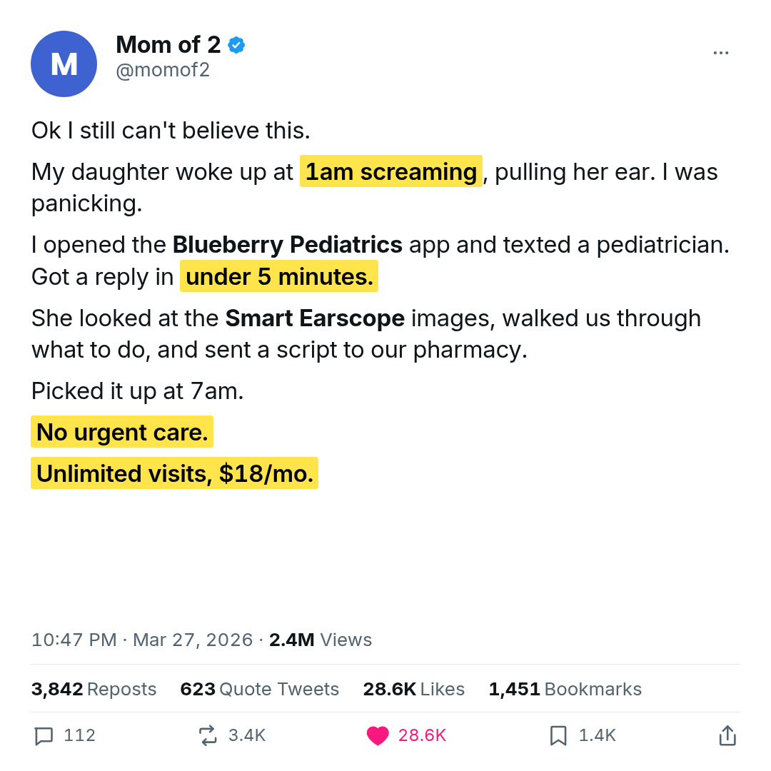
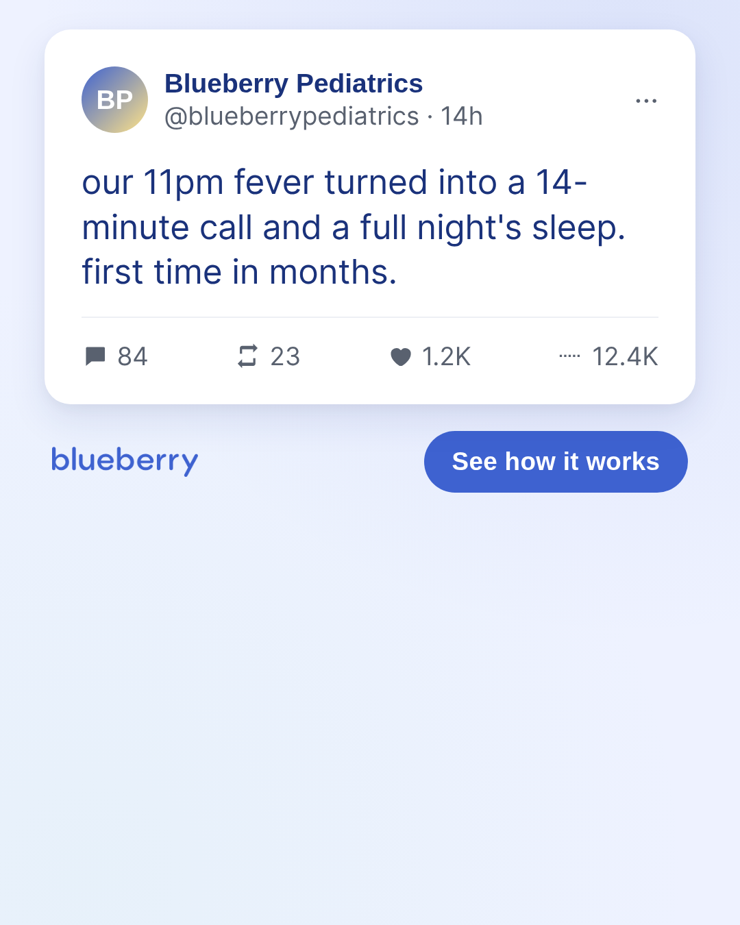
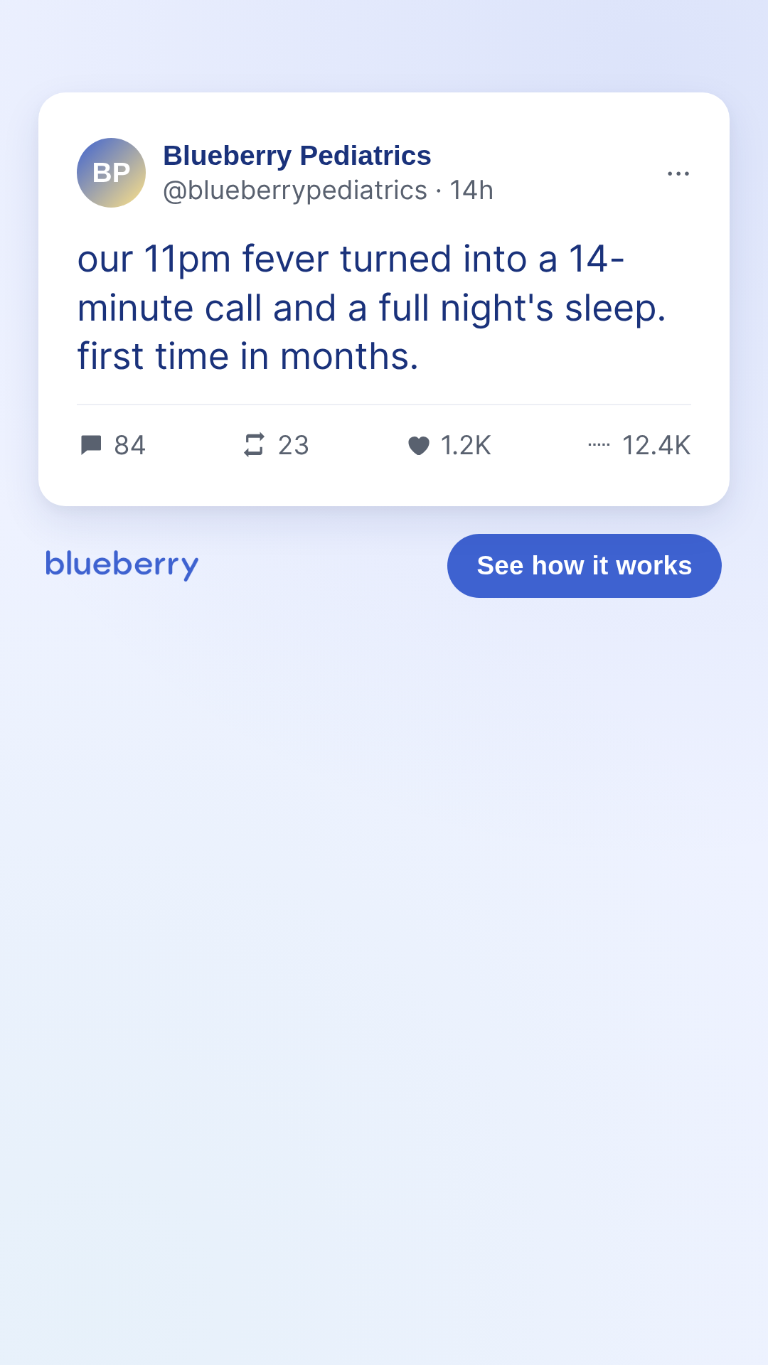
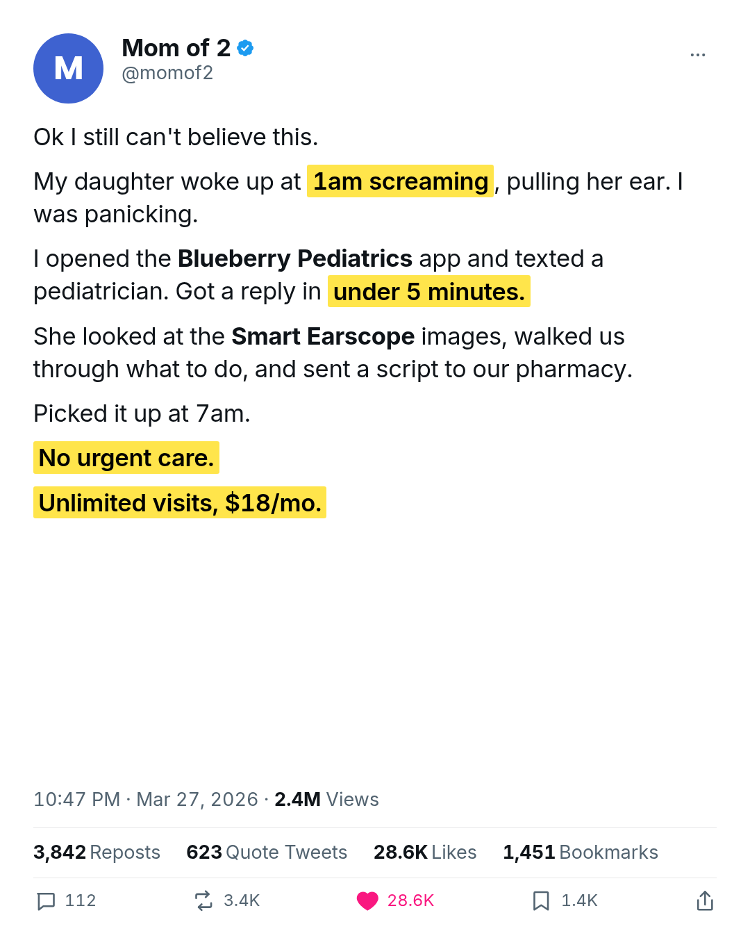
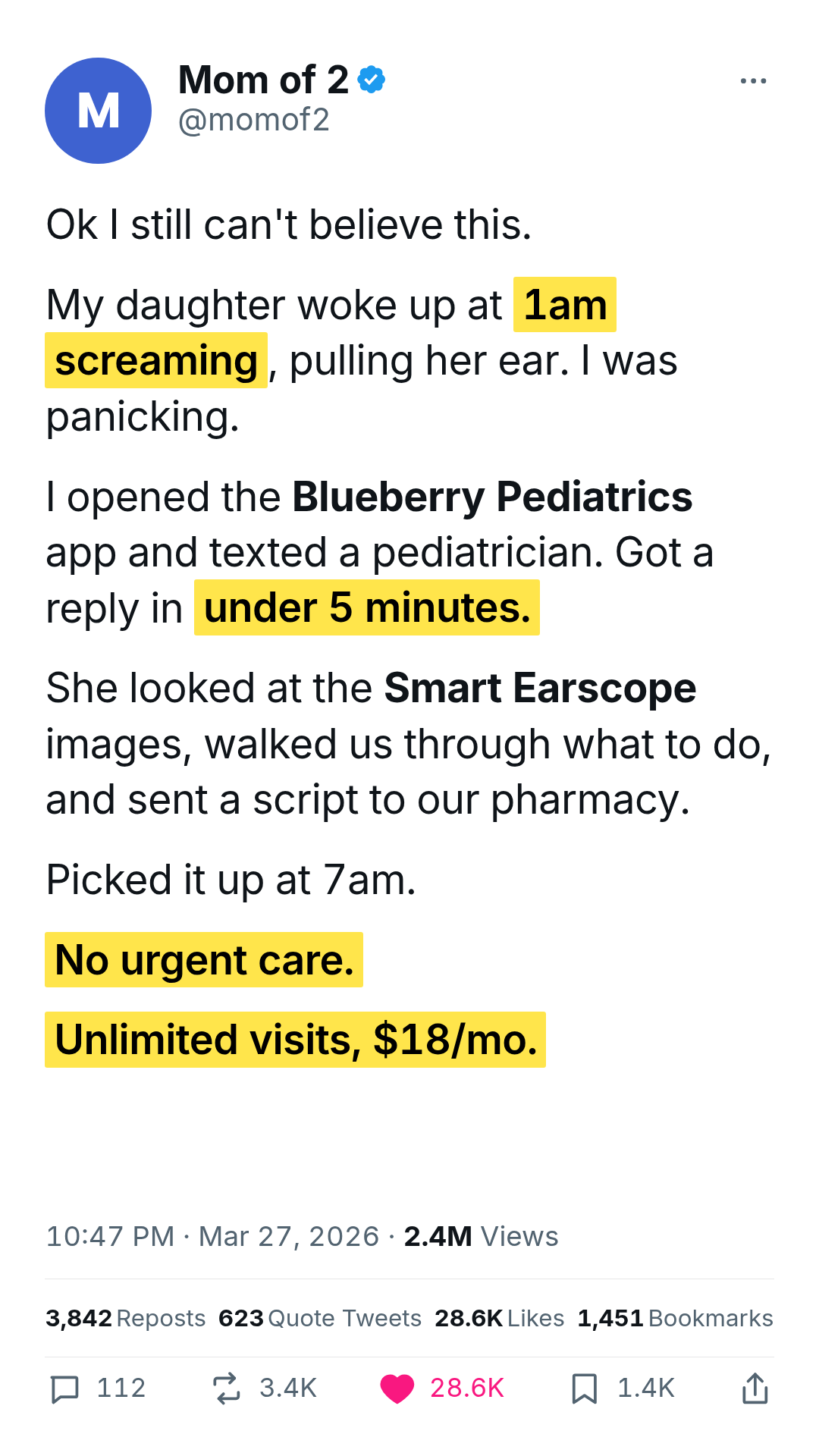
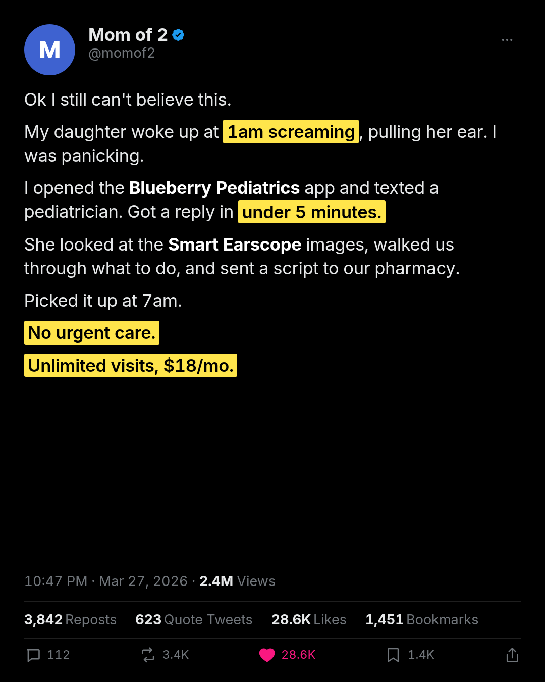
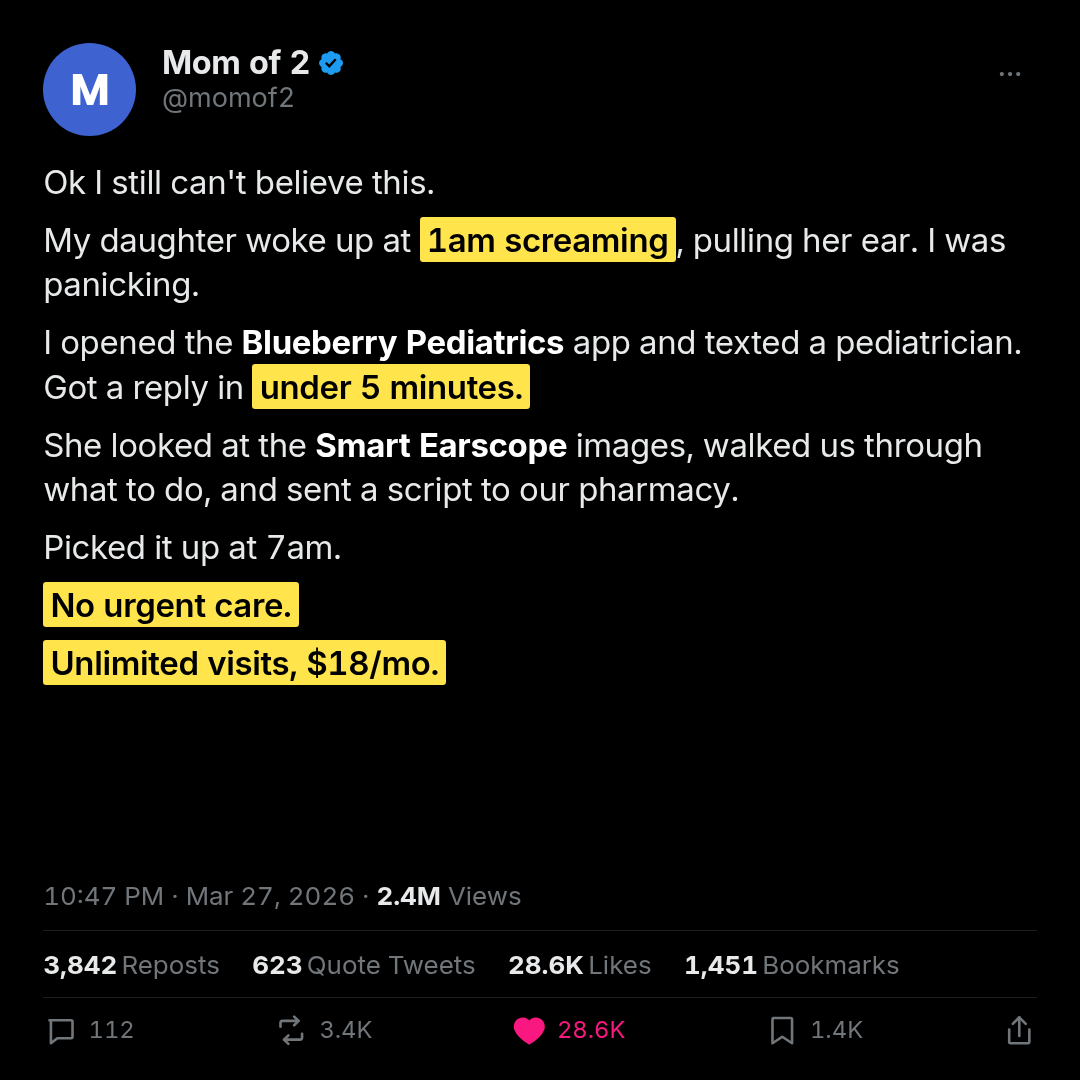
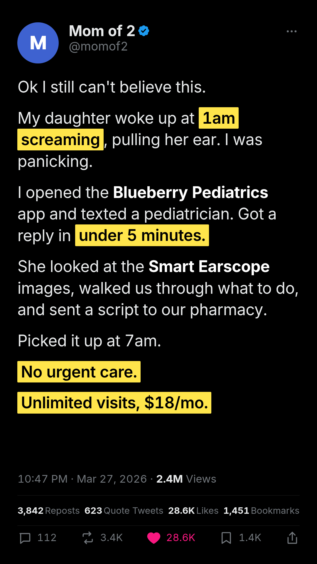
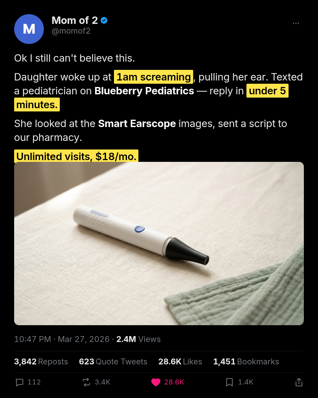
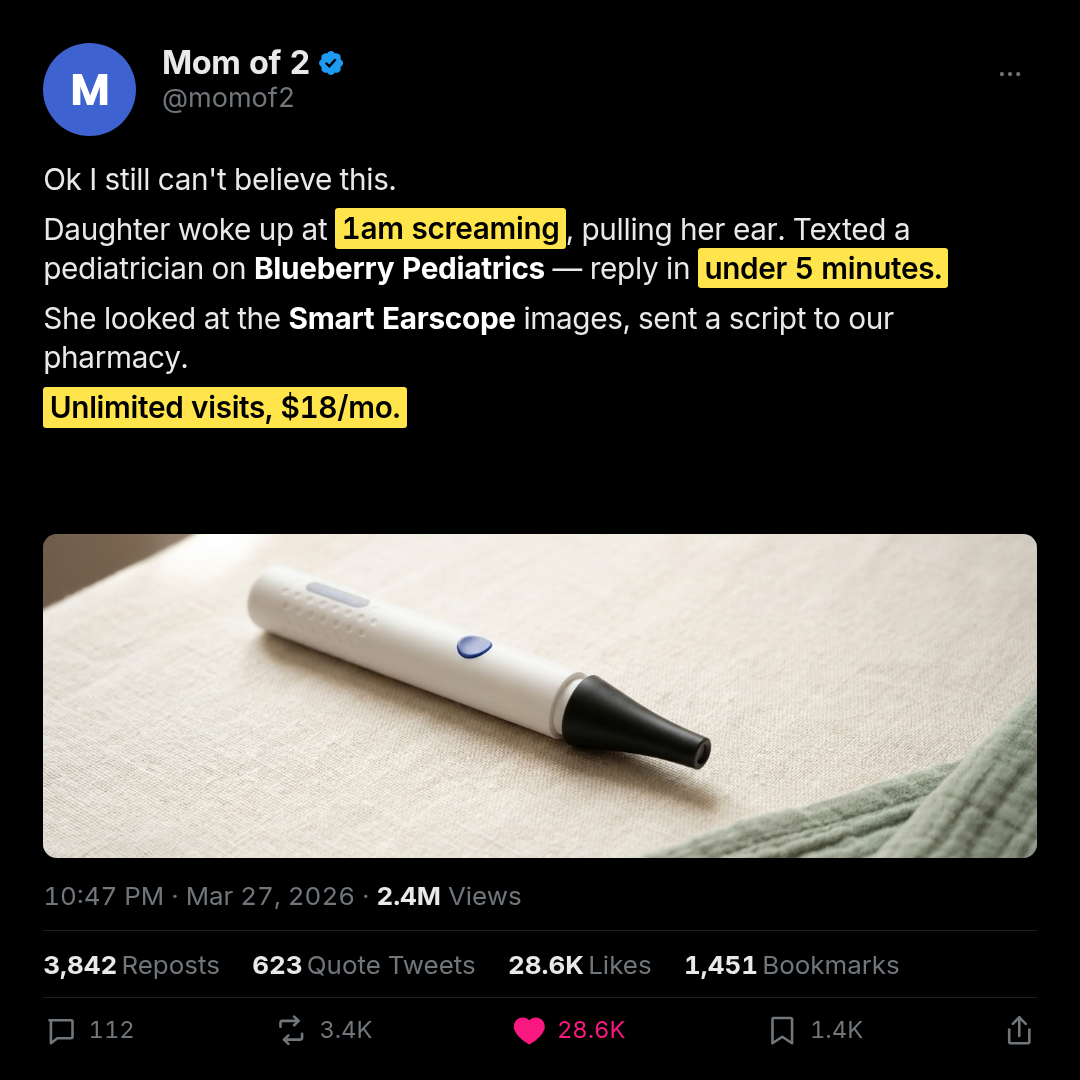
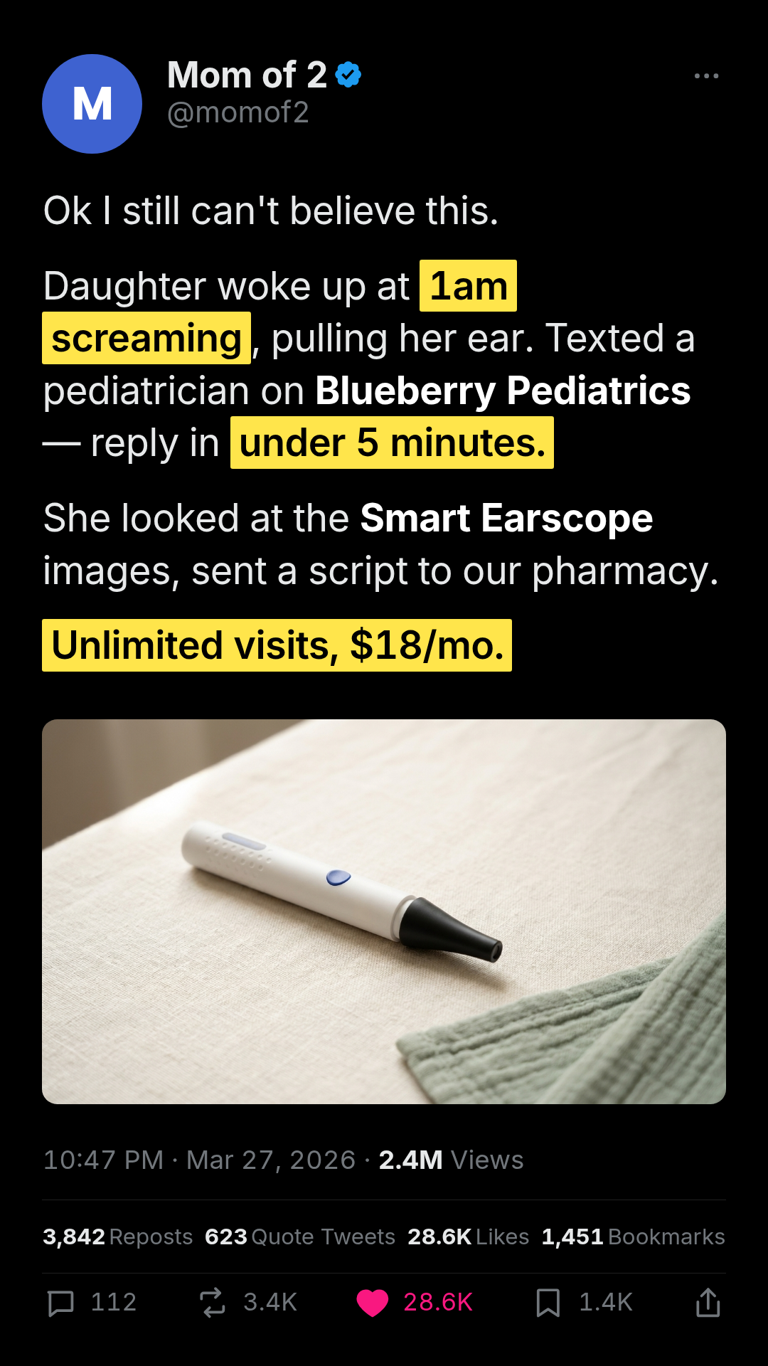
x-tweet-screenshot
1 layoutX (Twitter) screenshot — full-bleed recreation of a long-form X testimonial post.
Layouts: default
Show all 9 renders
Full description
X (Twitter) screenshot — full-bleed recreation of a long-form X testimonial post. The render IS the X card, edge to edge: avatar + display-name + verified tick + @handle + overflow dots, multi-paragraph tweet body with inline bold + configurable yellow text highlights, optional attached-media card (rounded-corner image between body and meta — pass `mediaImageUrl` or `media: { imageUrl, alt }` to attach), timestamp/date/views meta row, engagement breakdown (reposts / quote tweets / likes / bookmarks), and the action bar (comment / retweet / like with optional filled heart / bookmarks / share). Two themes: `lights-out` (default, X dark — black canvas, white body, brand-yellow highlight) and `light` (white canvas, near-black body, same brand-yellow highlight). A bundled `media-otoscope-hero.jpg` ships at `assets/media-otoscope-hero.jpg` for the with-media-otoscope reference look. Use to mock the kind of viral parent-testimonial post that gets screenshotted and reshared. Differentiation: vs social-post-mockup.x-tweet, this is the long-form testimonial format with inline highlights + full engagement breakdown + theme switch + optional media card + no surrounding brand band; the social-post-mockup x-tweet is the short single-line tweet inside a branded canvas with CTA. Fidelity mode: no canvas, no brand band, no Sponsored fine-print — Meta overlays its own Sponsored label.